


TL;DR: The NHS backlog gets narrated one month at a time, and millions in bonus money ride on the moves. A Process Behavior Chart shows most movement is noise — and the trusts that stay on top are running structurally different systems. The leaderboard rewards everything except what it claims to measure.
Say you manage an NHS trust, and last March you hit the four-hour A&E target hard enough to land in the top ten nationally. You get two million pounds in capital funding, your name near the top of the table– it's a good week. Then, in the next quarter, you slip to the middle of the pack. You didn't change anything. Same staff, same beds, same winter, same flow problems you've had for years. The number moved, and now you're the one explaining why in a meeting.
The part nobody says in that meeting is that the movement might mean nothing at all.
The monthly whiplash
The BMA's latest backlog analysis is a careful, useful document, and I'd recommend reading it. It's also written the way almost all of these are written, comparing one month against the previous month, with each tick described as if it carries a message. Two data points is not a trend.
Take the 28-day cancer figure. Of every hundred patients given an urgent referral for suspected cancer, it counts how many were told within 28 days whether they have it or whether it's been ruled out. The target is that 75 of those hundred get an answer in time. Which also means a quarter of them wait longer than a month: the care delayed, the anxiety dragged out, before anyone even confirms whether there's cancer to treat.
In February, the figure was 80.5%; in March, it fell to 79.4. The BMA report describes this as an “increase.” It plainly isn't, the number went down. Not that the drop matters. A 1.1-point move between two months is most likely noise either way (we'd need a Process Behavior Chart to know). But if you're going to narrate every tick as a story, you might at least get the arrow pointing the right way. And then know whether it's signal or noise.

The article does, at least, provide a helpful run chart with a lot more data and context:
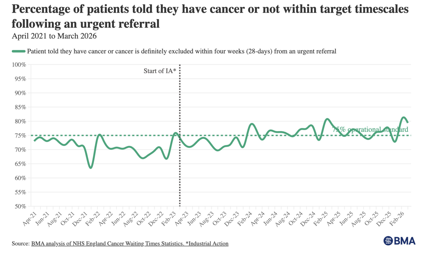
It looks like the figure used to fluctuate around an average of about 70%. Now it seems to be fluctuating around 77% or so. With the target being 75%, there's bound to be some months better than target (often colored green) and some months worse (red). And that's in the aggregate. There's likely very similar variation for any particular trust (an NHS trust is the organization that runs a hospital or group of hospitals, roughly the British equivalent of a US hospital system).
The other measures get the same treatment. A&E four-hour performance (the share of patients fully dealt with, admitted, transferred, or sent home, within four hours of arriving) slipped from 77.1% to 76.9%. Patients waiting over twelve hours for admission went from about 47,000 to about 48,000.
But again, that compares just two data points. Every time. We treat the gap between them as a story, when most of the time it's just the system breathing. A stable process doesn't produce the same number every month. It varies, within a range, for no special reason. It's a bunch of common cause reasons. Call one month's wiggle a decline, or an incline, and you've invented a trend that isn't there.
The honest reaction to two adjacent numbers is almost always the same: we need more data.
Here's the chart BMA provided for A&E waiting times:

Where the better measure already lives, half-noticed
What makes this one interesting is that the BMA isn't blind to good measurement. The same report gives the median RTT wait, 11.3 weeks now against 6.9 weeks in March 2019. The median is the right instinct. It also reports an actual count of twelve-hour waits rather than only a percentage under a line.
So the better tools are in the building. They just aren't the headline for A&E or cancer, where the story stays a threshold percentage, percent seen within four hours, percent treated within sixty-two days. A threshold metric is blind to its own tail. A patient seen at four hours and one minute lands in the failure column right next to one who waited thirty hours, and the percentage can hold flat while the people stuck behind the line wait longer and longer. The number won't tell you, because the number was never looking there.
What a chart does to the argument
Here's a Process Behavior Chart (an XmR chart) that Claude AI drew from the BMA's line chart, estimating the monthly values and calculating limits from them.
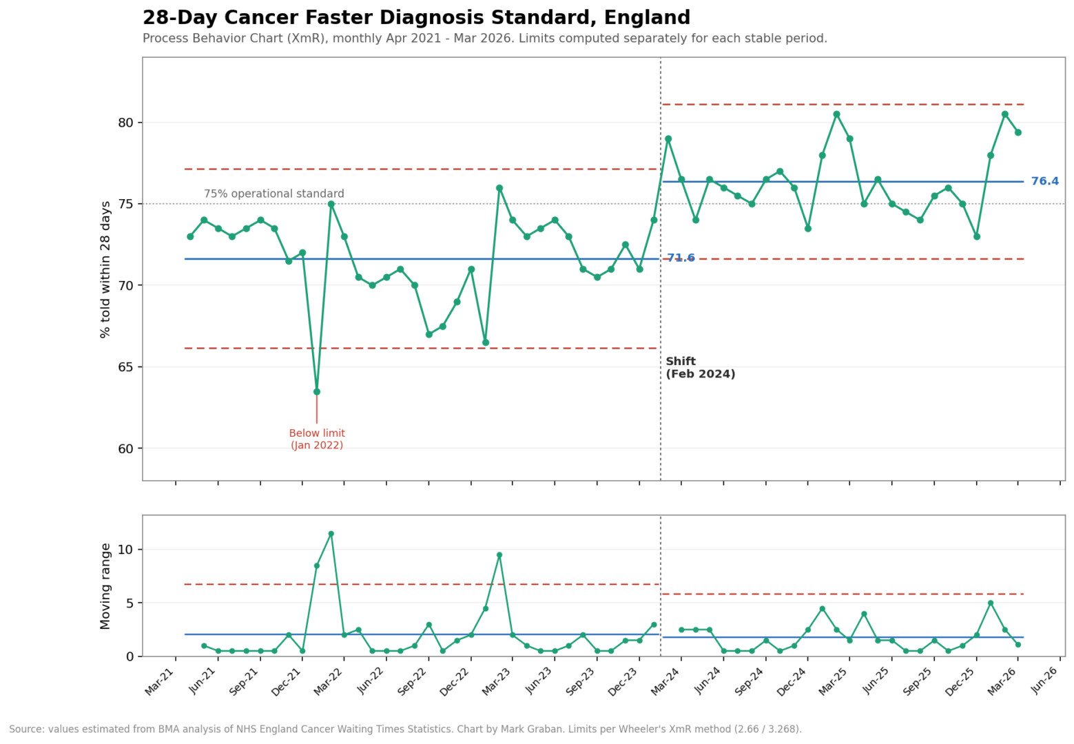
What it shows
Period 1 (Apr 2021 to Jan 2024): center line at 71.6%, natural process limits of 66.2 to 77.1. That's the system the NHS was actually running. It hovered below the 75% target the entire time, and the variation you see, the 67s and the 73s, is just the process breathing. None of it was real movement.
Period 2 (Feb 2024 onward): center line jumps to 76.4%, limits 71.6 to 81.1. The new process clears the 75% line on average. But not every time. Something changed around February 2024, and it held for two years. That's a signal, not noise.
We'd expect the number to keep fluctuating between the limits (again, 71.6 to 81.1). The metric won't be worse, or better, unless the system changes again.
The proof of the shift is in the gap between the two center lines. Period 2's lower limit (71.6) sits almost exactly at Period 1's center line (71.6), and nearly every post-Feb-2024 point lands above the old process entirely. By Don Wheeler's rules, you'd have flagged this within about eight months of sustained points above the old mean. The process relocated.
A couple of details the chart catches that the BMA's line graph buries:
- Jan 2022 dips below the lower limit. That single point is a genuine special-cause signal, the only one in Period 1. It lines up with the COVID/winter crunch. Everything else in that stretch is common cause.
- The mR chart stays mostly in control in both periods, with spikes at the Jan-2022 dip and the early-2023 swings. After the shift, the moving range actually tightens slightly (mRbar 2.06 down to 1.78), so the new process isn't just higher, it's a touch steadier.
Put twelve months of any one trust's four-hour performance on a Process Behavior Chart, the running line with upper and lower limits calculated from the data itself, and the meeting changes. Most of the month-to-month movement collapses into a band of routine variation. The 77.1 to 76.9 step disappears into the noise where it belongs. The 68.6 to 72.8 jump on the sixty-two-day cancer measure might survive as something worth investigating, or it might not, but at least you'd be asking the right question instead of reacting to every twitch.
Want proof? Here's the chart for A&E waiting, which is counts of patients, not percentages.

What the chart shows:
A big rise, then a strange kind of stability
The chart shows the monthly count of patients who waited more than four hours between the decision to admit them and actually getting a bed. The British call these trolley waits (a trolley being what Americans would call a gurney).
The first decade is a process that never settled. In late 2010, the count ran around 4,000 patients a month. I fit natural process limits to those early years, and the data left them behind by 2014 and never came back. The line climbs through 2015, through 2017, through 2019, with winter spikes riding on top, until the monthly count was approaching 100,000 on the eve of the pandemic. A 25-fold rise. No single month-to-month comparison could ever tell that story. Sixteen years on one chart can.
The deep dip in spring 2020 reflects the collapse in A&E attendances during lockdown. Nobody fixed patient flow that month.
Then the climb to today's level. For the past four years and change, since early 2022, the process has been stable in the statistical sense. The center line sits near 132,000 patients a month, with natural process limits ranging from roughly 111,000 to 153,000. Most months land inside those limits and bounce around without any pattern. Predictable.
But “stable” is a description, and it says nothing about being acceptable. A process can be perfectly predictable and predictably terrible at the same time. This one runs at about twelve times the level of the early 2010s. One honest caveat: these are counts, and A&E attendance grew over this period too, so a rate per emergency admission would be the cleaner chart. Attendance did not grow twelvefold, though. The flow problem is real. The percentages are up.
What this chart still can't show
This chart (and the cancer waiting time) is a threshold view. The four-hour percentage from earlier in the post and this count of trolley waits take a continuous experience, how long a person actually waited, and chop it at an arbitrary line. A patient who got a bed at four hours and ten minutes counts once. So does a patient who spent fourteen hours on a trolley in a corridor. The chart treats them as identical events.
Which means the patient experience could deteriorate badly while this line holds steady. If the typical wait among those 132,000 patients stretched from five hours toward nine over the past few years, nothing on this chart would move. I've written about the same dynamic in ER wait time metrics: the threshold number stays flat, or even improves, while the actual waiting gets worse underneath it.
What I'd rather see is the time itself. The average wait from decision-to-admit to admission, or better, the median, since waits skew hard to the right and a handful of thirty-hour outliers will drag an average pretty far. Plot that median, month by month, on a Process Behavior Chart, and we'd know whether the wait is holding, creeping, or shifting, instead of counting heads on one side of a line. The timestamps already exist in every hospital system. The headline metrics just don't lead with them.
The signals that arrive on schedule
Five months since 2022 have broken above even these elevated limits: December 2022, January 2024, January 2025, February 2025, and January 2026.
Look at those dates again.
On a Process Behavior Chart, a point above the upper limit is a signal, evidence of an assignable cause worth investigating. So we investigate, and the cause has a name: winter. Flu season, norovirus, more frail patients, or harder discharges.
There's a question I find more useful than what happened in January. Winter comes every year. Even in England. It arrives on schedule. An analyst could adjust the chart for seasonality, compute winter factors, and watch most of these signals dissolve into an expected pattern. Wheeler describes methods for exactly that. I'm honestly torn on whether the adjusted chart would be the more useful one. The unadjusted chart says something a seasonally-smoothed version would hide: every winter, demand exceeds what this system can absorb, in numbers that break even the loosened limits of a degraded process. We could model that away. Or we could design capacity, staffing, and discharge processes for the winter we already know is coming.
If a signal shows up every January, at what point does it stop being a surprise?
The NHS understands this
Funny enough, there are pockets of expertise about this methodology, also known as Statistical Process Control (SPC). They call the approach, “Making Data Count” and it's fantastic.
Learn more through this podcast: Why NHS Leaders Should Stop Spuddling: Samantha Riley on Making Data Count.
Paying out a lottery
Now the part Dr. Deming would have walked out of the room over.
In 2024, the NHS introduced a capital incentive scheme. The ten trusts with the highest four-hour performance in March each received two million pounds. The next tier got two million for the biggest improvement, the tier after that got one million.
Rank the top ten. Pay them. Tell the rest to learn from the leaders.
This is the “red bead experiment,” run with real money. Deming used to hand willing volunteers a paddle and have them draw beads from a bin of red and white. The red ones were defects. Some workers drew more red than others, purely by the luck of the draw, and Deming would praise the lucky ones, scold the unlucky ones, put them on probation, and watch the rankings reshuffle the next round for no reason anyone could control. The lesson was uncomfortable then and it's uncomfortable now. When the differences between performers come from the system rather than from the people, ranking them and rewarding the top is a lottery dressed up as a leaderboard.
Play the red bead game online or have me come facilitate it for you in person.
I've watched this happen with real organizations, not a bin of beads. Years ago, I looked at performance across the US Department of Veterans Affairs regions, quarter over quarter. A city sitting at the top of its region one quarter would turn up near the bottom the next, then climb again, with no outliers and no real separation between any of them. Common cause variation, the whole way down. If you'd handed out a bonus to the leader each quarter, you'd have rewarded a different region almost every time, and none of them would have done anything to earn it or lose it.
It was random. Which is why Dr. Deming pointedly (and correctly) called incentive schemes like this a “lottery.”
The BMA, to its credit, half-sees this. The report flags that the incentive scheme “risks creating perverse incentives” and could pull support away from where it's needed most. That's the right worry. But it stops at the edge of the deeper problem, which is that you can't reward the top ten on a noisy measure without paying out, on average, for luck.
Go look at the BMA charts. Did the incentive programs improve performance? For A&E, the answer is a clear “no.” That's the metric the money targeted, and the process keeps fluctuating in the same range. For the cancer waiting times, performance DID shift upward, in early 2024. But cancer waiting times were never part of this incentive scheme. The money was aimed at A&E. So the one measure that genuinely improved is the one nobody was paid to improve. Whatever caused that shift, it wasn't the prize.
One correction for chart readers: the dotted vertical line on the BMA charts marks the start of industrial action by doctors in 2023 (“IA”), not the incentive scheme. The scheme doesn't appear on the charts at all. Read with the line correctly labeled, the cancer improvement arrived a year into the strikes, which makes it more interesting, not less.
The things the meeting can't say
The people closest to these numbers are sharp enough to spot a perverse incentive and name it in print. Then the tables go back to comparing March against February, the funding goes back to the top ten, and the whole apparatus keeps running on the assumption that the differences mean something.
Put twelve months of one trust's A&E numbers on a chart and watch the line wiggle inside its limits, never really pulling away from the pack. If that's what's happening, and I'd put money on it mostly being what's happening, then the two million pounds isn't a reward for performance. It's a prize for landing on the favorable side of common cause variation in a particular month. I keep wondering who, in that funding meeting, is actually allowed to stand up and say so.
Fair questions to ask next: how many trusts got paid over time, and how many sustained it? Are they shuffling randomly, like the VA regions were?
Here's where I have to revise my own thesis. I came into this expecting red beads all the way down. The data showed me something else sitting on top of the luck. The NHS leaderboard isn't ranking identical workers drawing from one bin. It's ranking different bins.
Did the winners stay winners?
The fair test of a leaderboard is time. So I went looking for what happened to the trusts that won.
First, the scale. The scheme has grown each year: a winter 2023/24 version offering qualifying trusts a share of 150 million pounds, the March 2024 expansion described above (up to 30 awards), and a 2024/25 round spreading another 150 million across roughly 70 awards to trusts and integrated care boards. The Royal College of Emergency Medicine tracked the four-hour and 12-hour winners across two full years of monthly rankings. The short answer to “how many sustained their success” is about ten. And they were the trusts that never needed the scheme.
At least six trusts held top-10 four-hour positions across both years, running at 85 to 95 percent the whole time, with little movement as deadlines approached. Four more did the same on the 12-hour measure. Several are specialist women's and children's trusts: narrower patient populations, more predictable flows. The scheme paid them for their service model.
In red bead terms, they were drawing from a bin with fewer red beads in it. Ranking them against general acute trusts tells you about the bins. Nothing in their two-year run tells you their managers are more skilled. It tells you a children's hospital and a general trauma center are different systems, and the table treats that difference as a performance gap.
The climbers crashed. One trust jumped from 67.1 percent in February 2025 to 88.4 percent in March, a 21.3-point leap, landing precisely in the deadline month. By April, three trusts that had surged into the top 10 had fallen back out, the biggest gainer falling hardest. On the 12-hour measure, one winner went from 12.9 percent of patients waiting that long in March to 21.3 percent by June. Nationally, performance slipped in April 2025, right after the scheme closed. Brian Joiner described three ways to make a number look better: improve the system, distort the system, or distort the data. A 21-point sprint that evaporates by summer seems like door number two.
Door number three is in the report as well. A third of the four-hour award winners benefited from having minor injury unit activity mapped onto their main emergency department figures. For six of the eight mapped trusts in the top tiers, the top-10 finish depended on that mapping. One trust ranked 93rd on its own numbers and 8th after mapping. Same hospital, same patients. The arithmetic changed, and two million pounds followed.
What about genuine improvers? The improvement tier did reward trusts that gained 6.6 to 10 points year over year, real movement, mostly from very low baselines. Even after improving, six of those ten still sat below the national average. And RCEM's verdict on the whole program is the line worth reading twice: the changes seen during incentive periods do not necessarily fall outside normal variability, and attributing the gains to the money appears “coincidental rather than causal.” The emergency physicians' own college looked at the leaderboard and concluded it could not tell signal from noise. They are one chart away from saying so.
So, of the trusts paid for being the best, most were the best before the scheme existed and would have been without it. Of the trusts paid for improving the most, the sharpest gains were the least likely to survive the month after the money was secured. A leaderboard that claims to rank management performance is mostly sorting case mix and arithmetic. Skill is the one thing it can't see.
The month everything worked
Buried in the RCEM report is the detail I keep coming back to. Clinicians at one of the improved trusts described what March looked like on the ground. Leaders were visible every day. Discharge decisions got challenged on the wards. The surgical same-day unit started pulling patients to it. They added a porter, moved a clinical support worker into the ED, and kept an operations manager in the department until 10 pm. None of it was expensive. Flow started, the department decompressed, and performance jumped. One clinician admitted the speed of it was a surprise.
Then the deadline passed, the funding was secured, and the system drifted back.
That sequence quietly answers the question the whole scheme begs. The constraint was never capability. Same staff, same beds, same winter — the trust manager from the top of this post. What two million pounds bought was a month of management attention. Which complicates my own systems argument, and I'll own that. Focused attention moved a number. It just couldn't hold the number without redesigning the system underneath it.
If a hospital can run that way for one month when prize money is on the line, what's standing in the way the other eleven?


