


If your emergency department metric improved this quarter and you felt good about it, the problem might not be your emergency department.
It might be your metric.
Most hospital leaders have been in this meeting. The percentage of patients seen within some threshold — 15 minutes, 30 minutes, four hours — ticks up a few points, and the room relaxes. Progress. We're heading the right direction. The target gets a green highlight on the slide (or maybe even a smiley face emoji), and the conversation moves on.
But what if the metric is improving while the patient experience is getting worse?
A Metric That Can Smile While Things Deteriorate
Consider a simulated example. Here's what the board sees — the percentage of E.D. patients seen within 15 minutes, tracked monthly over a year:
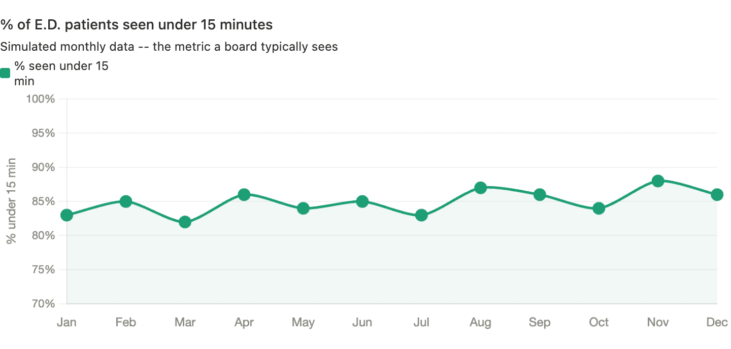
That looks like a story worth celebrating. Starting at 83%, peaking at 88% in November. Whatever we're doing seems to be working. A linear trend line, if added, would show “improvement.”
Now here's the same department, same patients, same year — but tracking average wait time instead:
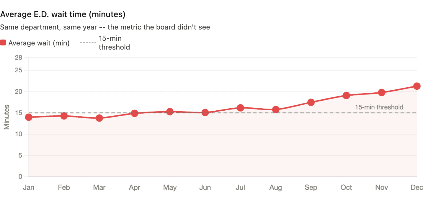
Average wait time climbed from 14 minutes to over 21 minutes. The actual patient experience deteriorated every single month. And the metric everyone was watching said things were getting better.
How is that possible?
The mechanism is straightforward.
Over the year, the department got slightly better at triaging fast patients quickly — pushing a few more under the 15-minute line each month. But patients who didn't make the cut waited much longer. The long waits got longer. A patient who used to wait 18 minutes was now waiting 35. The binary metric can't see that. It only registers whether each patient crossed the threshold, not by how much.
A 14-minute wait and a 30-second wait are both “green.” A 15:01 wait and a three-hour wait are both “red.” All the detail about what the system is actually doing gets thrown away.
The Metric That Made Smart People Do Absurd Things
This isn't just a statistical curiosity. Binary threshold metrics change behavior — and not always in the direction you'd hope.
Years ago, I wrote about what happened when the British National Health Service imposed a four-hour target for A&E (emergency department) visits. On paper, the results looked impressive — the percentage of patients waiting longer than four hours dropped from 23% to about 5%.
But look at how hospitals hit the number.
Patients were often admitted to a ward at the 3-hour-58-minute mark — whether or not admission was clinically appropriate. Ambulances idled in the car park (driveway) so patients technically hadn't “arrived” until staff were ready to receive them — the clock didn't start ticking. Extra staff were pulled into A&E during reporting periods while surgeries elsewhere in the hospital were canceled.
The target was hit. The system wasn't improved. In some cases, it got worse.
I don't blame frontline staff for any of that. Their behavior was entirely rational. When leaders impose hard targets backed by consequences, people will do what's necessary to avoid punishment. As Deming said,
“A bad system will beat a good person every time.”
As Brian Joiner wrote in Fourth Generation Management, three things can happen when people are pressured to hit a target without proper support and an effective improvement methodology. The first two are dysfunctional — and too often easier than the third:
- Distort the numbers
- Distort the system
- Improve the system
The NHS examples hit both of the first two. Ambulances idling outside so the clock doesn't start? That's distorting the numbers. Admitting patients to a ward at 3:58, whether or not they need it? That's distorting the system. Improving the system — the only option that actually helps patients — was the hardest path, and the target structure didn't encourage it.
What a Process Behavior Chart Reveals — and Conceals
So what would happen if we applied Donald Wheeler's Process Behavior Chart method to both metrics?
Let's start with the percentage data. Here's the same “% seen under 15 minutes” data from Chart 1, plotted on a PBC with its calculated average and natural process limits:
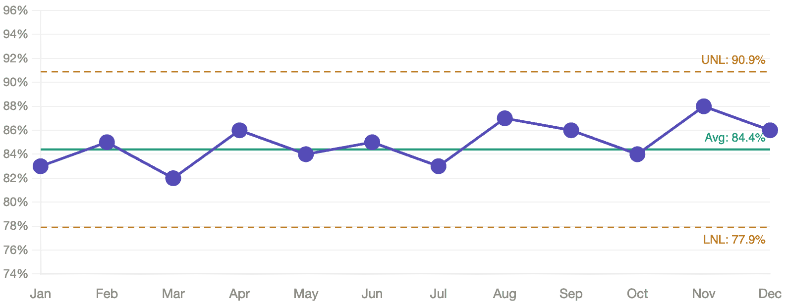
No signals. Every data point falls within the natural process limits. The apparent upward drift from 83% to 88%? As far as the PBC is concerned, that's routine variation. There's no statistical evidence that anything actually changed. A board celebrating this trend might be celebrating noise. Said another way, there are no statistical “signals.” It seems to be fluctuating around that average of 84.4%. There's no reason it's going to continue increasing in the current system.
How do we find signals?
- Any data point outside the limits
- 8 or more consecutive data points on the same side of the average
- 3 consecutive (or 3 out of 4) data points that are closer to a limit than to the average
But here's the part that matters: even if the PBC had detected a signal in the percentage data — even if the “improvement” were real — the metric would still be hiding the deterioration in actual patient experience. A signal in a bad metric is still a bad metric.
Now here's the average wait time on a PBC:
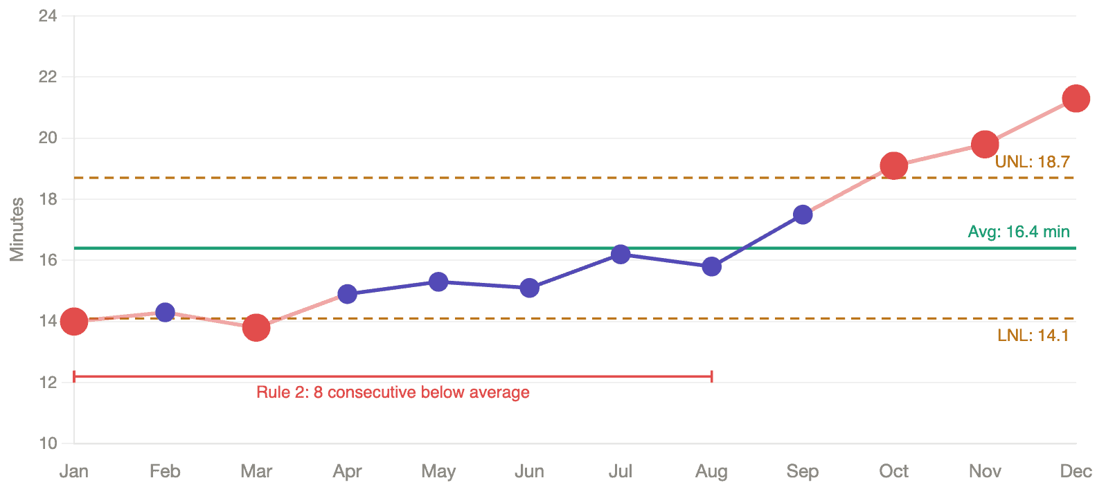
This chart lights up. Five data points fall outside the natural process limits — a Rule 1 signal that tells us the system has changed. The first eight months all fall below the average — a Rule 2 signal, eight consecutive points on the same side of the center line, which is another form of statistical evidence that something shifted.
As I describe in Measures of Success, the Process Behavior Chart calculates its limits from the data itself, not from an externally imposed target. It tells you what the system is capable of producing. When data points fall outside those limits, or when a pattern emerges that a stable system wouldn't produce by chance, you have a signal worth investigating. Everything else is routine variation — noise that will correct itself without intervention.
The contrast between these two charts is the argument in a single image. The threshold metric saw nothing. The continuous metric, plotted on a PBC, caught the deterioration clearly and early.
The Person Who Reads the System
The practical difference is significant. While everyone else is celebrating a percentage that seemed to climb five points, you're the person who can say:
“The threshold metric is improving, but average wait time has been climbing for six months. The system is getting worse, not better. Here's what the data actually shows.”
That's a fundamentally different position to be in. You're not chasing the metric. You're reading the system.
You might not be popular; but you're technically correct. Tough position to be in, I realize.
Managing by Results vs. Managing by Process
What this really comes down to is a distinction Deming drew decades ago: the difference between managing by results and managing by process.
A binary threshold metric is the purest expression of managing by results. You never see the process at all — just a pass/fail verdict delivered after the fact. The four charts above tell the same story from different angles: the first two show what you see versus what's happening; the second two show which method of analysis catches the truth.
A Process Behavior Chart shows you the system — its central tendency, its range of variation, its shifts and signals — so you can manage the system that produces the results. The target still matters. It represents what patients need and deserve. But it sits on the chart as a reference line, not as a gate. When you can see both the target and the process limits together, you get an honest picture: is this system capable of consistently meeting the target, or does the system itself need to change?
That question — “does the system need to change?” — is where improvement actually starts. You don't get there by asking “did we hit the number?”
What the Wrong Metric Really Costs
The most expensive thing about a bad metric isn't the gaming, though the gaming is real. It's the conversations that never happen.
When leaders spend their time celebrating a percentage that ticked up — or scrambling to explain one that ticked down — they're not asking “what is our system doing, and how can we improve it?” One question leads to defensiveness, storytelling, and pressure to manipulate the numbers. The other leads to learning.
Wheeler would tell us to let the data speak.
But first, we have to stop destroying the data before it has a chance to say anything.
Frequently Asked Questions
Tracking actual wait times on a Process Behavior Chart is more useful than tracking the percentage of patients seen under a threshold. A PBC plots individual data points over time and calculates natural process limits from the data itself, helping leaders distinguish between routine variation and real signals of change. Binary threshold metrics like “% seen under 15 minutes” destroy information by collapsing continuous data into pass/fail.
A binary threshold metric treats a 14-minute wait the same as a 30-second wait and a 16-minute wait the same as a three-hour wait. It can show improvement even while average wait times are getting worse — for example, if a department triages more fast patients under the line while long waits grow significantly longer. The metric registers whether patients crossed a threshold, not what the system is actually doing.
A Process Behavior Chart — Donald Wheeler's term for what Walter Shewhart originally developed as a control chart — plots data points over time with a calculated average and natural process limits. It distinguishes routine variation from signals that something in the system has actually changed. Unlike arbitrary targets, the limits come from the data itself, reducing both overreaction to noise and missed signals of real deterioration.
When leaders impose hard targets with consequences, staff find ways to technically comply without improving patient care. The NHS four-hour A&E target led to patients being admitted at the last minute regardless of clinical need, ambulances idling outside so the clock wouldn't start, and staff being redirected from other departments during reporting periods.


It would also be interesting to see the individual wait times plotted on the PBC. What are your thoughts on managing the reporting cycles? Most metrics are monthly. I’d typically advocate for shorter durations so we can respond more timely.
Yes, that would be interesting to see. A PBC could be used for each individual patient’s wait times, but the chart would quickly get crowded in a high-volume E.D
I totally agree that monthly metrics lead to VERY slow cycles of improvement and evaluation of potential improvements.