


Process Behavior Charts help leaders distinguish signal from noise in their metrics, so they can stop overreacting to routine variation and focus on real improvement. Instead of asking people to explain every up and down in performance, these charts provide a statistically sound way to understand how a system is actually behaving over time.
This approach, detailed in my book Measures of Success: React Less, Lead Better, Improve More, reframes metrics as tools for learning rather than judgment.
In short, Process Behavior Charts help leaders answer three questions that dashboards usually can't: Are we stable? Are we improving? And when should we actually react?
What Are Process Behavior Charts?
A Process Behavior Chart (PBC) is a time-series line chart designed to help you understand how a process is actually performing over time.
At its simplest, a Process Behavior Chart includes:
- Actual performance data plotted over time
- A central line representing the average
- Upper and lower natural process limits that define expected variation
These limits are not goals or targets. They represent the voice of the process. They tell us what results the current system is capable of producing unless something meaningful changes.

Without this context, it is easy to misinterpret routine ups and downs as success or failure.
Why Traditional Dashboards Mislead Leaders
Many organizations rely on red/green color coding to manage performance. A number is compared to a target. If it is above the target, it is green. If it is below, it is red.
This approach answers one narrow question: Did we hit the target this time?
It does not answer more important questions:
- Is the process stable or unstable?
- Are we improving over time?
- When should we react, and when should we not?
Color coding performance against a target tells you whether a number crossed an arbitrary threshold. It does not tell you whether the process itself has changed.
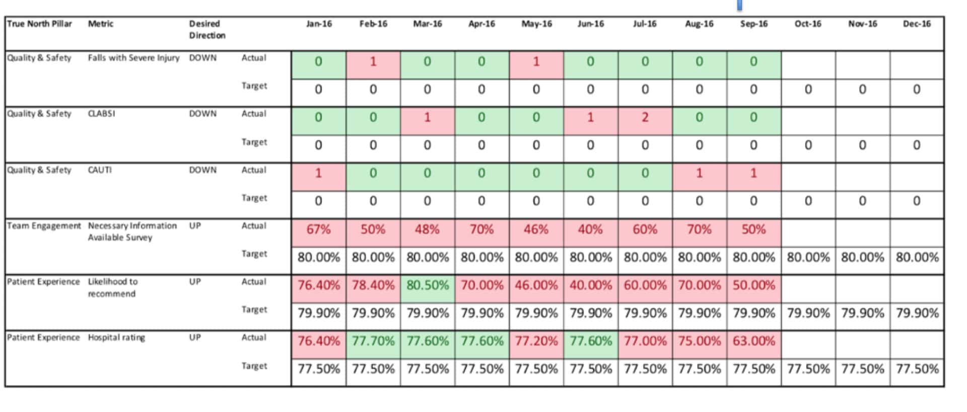
In practice, red/green metrics often drive behaviors that increase stress and decrease learning:
- Leaders demand explanations for routine variation
- Teams spend time justifying numbers instead of improving systems
- People learn to manage the appearance of metrics rather than the work itself
Signal vs Noise: How to Tell the Difference
Every process contains variation. The critical leadership question is whether that variation represents noise or a signal.
Noise is routine, expected fluctuation. It does not require explanation or reaction.
A signal indicates that something meaningful has changed in the system. That change may be good or bad, but it is worth understanding.
Process Behavior Charts help leaders distinguish between the two.

When leaders treat noise as if it were a signal, they:
- Waste time on root cause analysis that cannot succeed
- Introduce unnecessary changes that destabilize the system
- Erode trust and psychological safety
When leaders learn to recognize noise, they gain something rare: the discipline to pause.
The Three Rules for Detecting a Signal
Process Behavior Charts rely on three simple, practical rules to identify statistically meaningful signals. These rules are designed to be visual and usable, not academic.
A signal exists when any one of the following occurs:
- A single data point falls outside the upper or lower natural process limit
- Eight or more consecutive points fall on the same side of the average
- A clustering of points occurs closer to one limit than to the average
These rules tell us that the system has changed. They do not tell us why. That part still requires thinking, curiosity, and investigation.
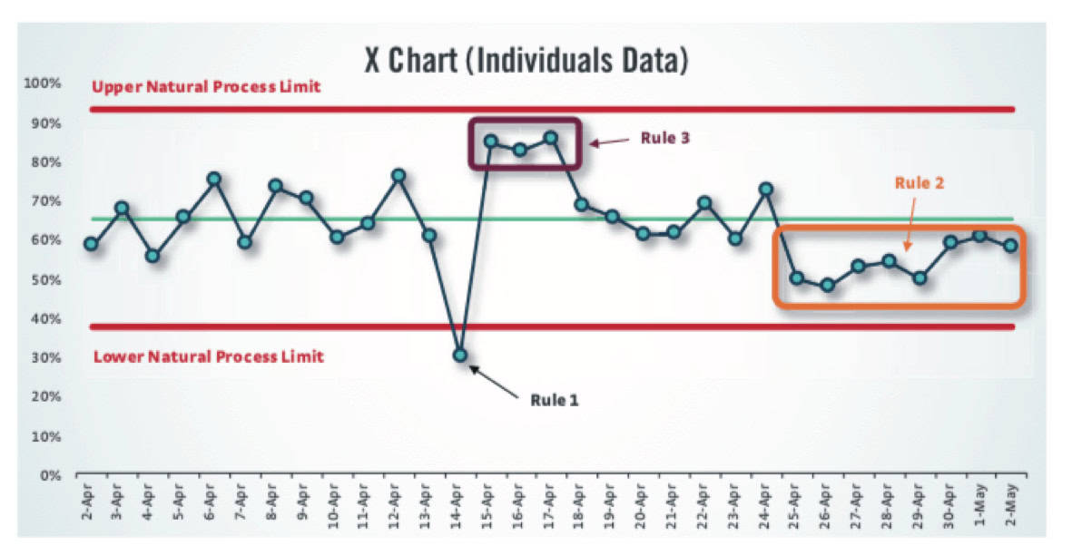
This is a critical distinction:
The chart tells you when to ask “what happened?”
It does not supply the answer.
How to Calculate PBC Limits
To calculate the Natural Process Limits for a PBC, you need two things first: the average of your baseline data points and the Average Moving Range (MR-bar).
The Moving Range for each data point is the absolute value of the difference between that point and the one before it. The first data point has no MR. Once you have all the MRs, average them to get MR-bar.
Then the limits are:
Lower Natural Process Limit = Average – 2.66 * MR-bar
Upper Natural Process Limit = Average + 2.66 * MR-bar
(That's the simplified form. The longer version is Average +/- 3 * MR-bar / 1.128 — same thing, different presentation.)
For the MR Chart, there's only an Upper Range Limit:
MR Upper Range Limit = MR-bar * 3.268
One thing worth emphasizing: you don't choose these limits. They're calculated from the data — the voice of the process, not a target or a goal. And once you've established them from a baseline (ideally around 20 data points), don't keep recalculating them as new data comes in.
See more including an instructional video: How to Create a Control Chart for Managing Performance Metrics
From Managing Metrics to Managing Systems
Most performance problems are not the result of individual effort or attention. They are properties of the system.
Process Behavior Charts reinforce a shift in leadership thinking:
- From blaming people to improving processes
- From reacting to numbers to understanding systems
- From managing outcomes to managing capability
This is why the subtitle of Measures of Success matters:
React less. Lead better. Improve more.
When leaders stop reacting to noise, they free up time and attention to do real improvement work. When they react to genuine signals, their actions are more timely, fair, and effective.
Why This Matters for Culture and Improvement
Organizations today are drowning in metrics. Dashboards multiply. Data refreshes accelerate. Expectations to explain every fluctuation increase.
Without a method to distinguish signal from noise, more data does not create more insight. It creates more confusion.
Process Behavior Charts offer a way forward. They provide clarity without oversimplification and discipline without rigidity. They support better decisions, healthier cultures, and more sustainable improvement.
If you want a practical guide to using Process Behavior Charts in real leadership situations — including how to respond to signals, how to avoid overreacting to noise, and how to coach others using data — my book Measures of Success: React Less, Lead Better, Improve More goes step by step through real examples from healthcare, business, and operations. It's written for leaders who want better decisions, better conversations, and better results from their metrics.
You can learn more about the book, get a free preview, or order a copy here.
Frequently Asked Questions About Process Behavior Charts
What is a Process Behavior Chart?
A Process Behavior Chart is a time-series chart that shows how a process performs over time using actual data, an average, and natural process limits. It helps distinguish routine variation from meaningful change so leaders can understand system behavior instead of reacting to every up or down.
How are Process Behavior Charts different from dashboards?
Dashboards compare results to targets at a single point in time. Process Behavior Charts show performance over time, revealing whether a system is stable, improving, or changing. They help leaders answer better questions than “Did we hit the target?”–including whether reacting is appropriate at all.
What problem do Process Behavior Charts solve?
They prevent overreaction to routine variation. Many leaders demand explanations for every fluctuation, even when nothing meaningful has changed. Process Behavior Charts help leaders focus attention only when there is a real signal that the system has changed and learning is possible.
What do the natural process limits represent?
Natural process limits represent the expected range of variation produced by the current system. They are not goals, targets, or specifications. They show what the system is capable of delivering unless something meaningful changes in how the work is designed or managed.
What is the difference between signal and noise?
Noise is routine, expected variation that does not require explanation or action. A signal indicates that something meaningful has changed in the system. Process Behavior Charts make this distinction visible so leaders know when to investigate and when to leave the system alone.
How do you detect a signal in a Process Behavior Chart?
A signal exists when a data point falls outside the natural process limits, when eight or more points fall on the same side of the average, or when points cluster closer to a limit than the average. These rules indicate change, not its cause.
Why do red-green metrics cause problems?
Red-green metrics encourage leaders to react to numbers crossing arbitrary thresholds. This often leads to blame, stress, and wasted analysis of routine variation. Over time, people learn to manage the appearance of metrics rather than improving the system that produces the results.
How do Process Behavior Charts support better leadership?
They help leaders shift from reacting to numbers to managing systems. By reducing unnecessary reactions, leaders create space for learning, fairer conversations, and better decisions. This supports psychological safety, improves culture, and makes continuous improvement more sustainable.


