

Even in Japan: A Target of Zero and a Process That Lives Near Seven Percent
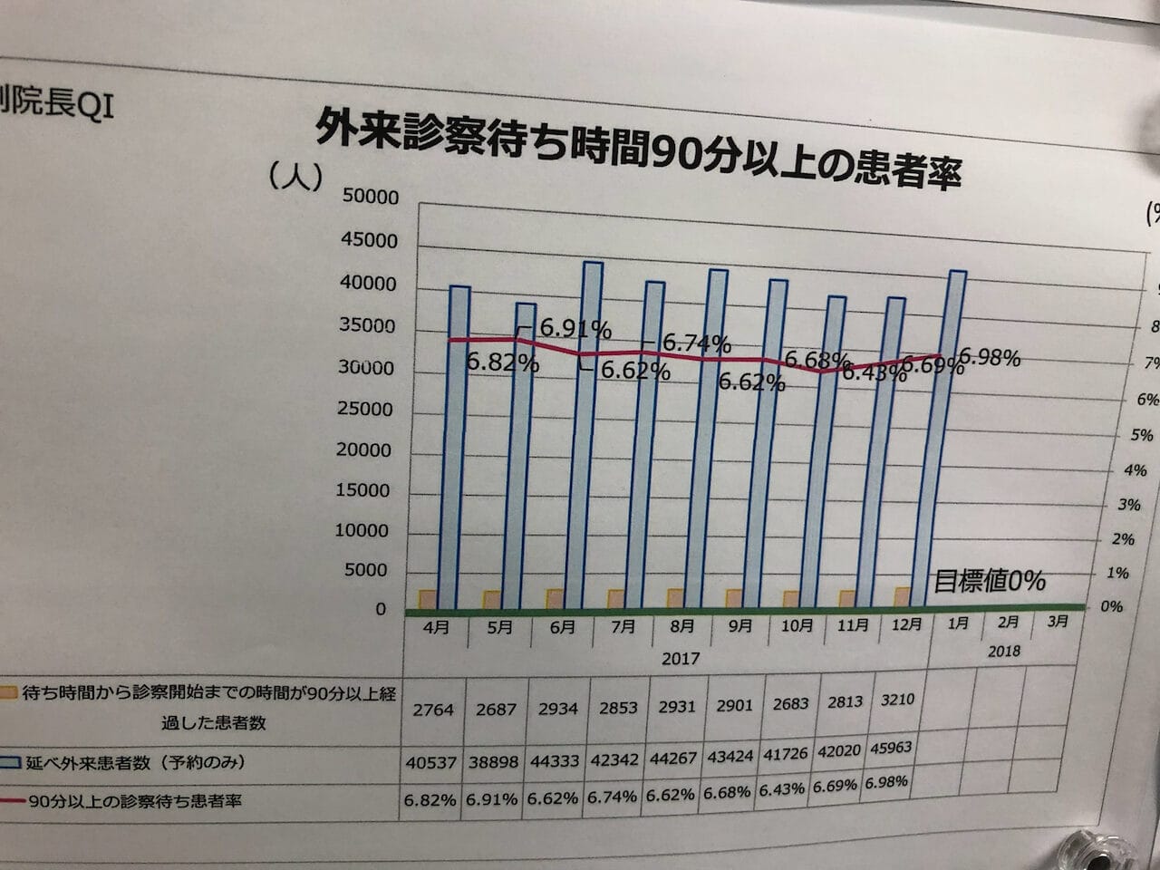
The target printed on the chart was zero percent. The red line had never been near zero. Not in the nine months posted on the wall, and probably not in any month before them. It sat between 6.43% and 6.98%. Every month, someone updated it. And every month, I'd guess, someone was asked why the number had moved a little up or a little down.
That's the part that stays with me. Someone was being asked, month after month, to explain a line that was always going to land right about where it had landed every month before.
I saw this chart years ago, on a visit to a hospital in Japan, on a wall of quality indicators. It showed a common type of metric: the percentage of outpatients who waited 90 minutes or more to be seen. The target, in a tidy box near the bottom, was zero.
And I've seen versions of it before. In American hospitals and on factory walls. A target of zero. A process that has never been close to zero. And a standing ritual of looking at the gap and asking people to account for it.
A couple of months ago, I wrote about an emergency department whose wait-time metric looked like it was improving while the patient experience quietly got worse. That example was simulated, built to make a point. This one was real, and it was hanging on a wall on the other side of the world. Same lesson, different hemisphere.
Plot the dots, then ask a better question
The red line invites a particular question. Why was the worst month (6.98 percent) worse than the best month (6.43 percent)? What went wrong? What did we do differently in the good months?
That's the wrong question, and answering it is how a review meeting burns an hour without learning anything. In Measures of Success, the whole method comes down to telling the difference between signal and noise before you start explaining a number. So I took the nine months off the chart and built a Process Behavior Chart, an XmR, the individuals-and-moving-range pair that Donald Wheeler popularized.
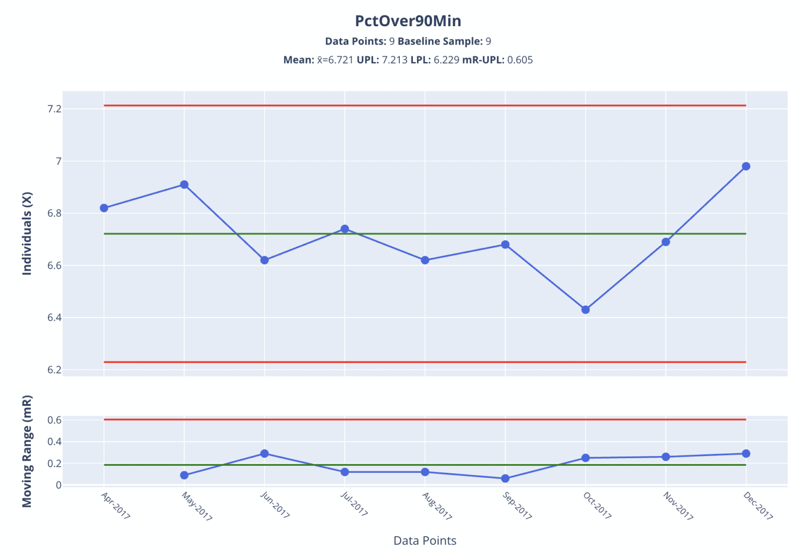
The chart says nothing happened
The average of those nine months is 6.72%. The natural process limits, calculated from the data, fall at 6.23% and 7.21%. All nine points sit inside the limits. No signals. The moving range chart agrees: not one month-to-month change comes close to its upper limit.
The picture is clear enough. The dip to 6.43 and the rise to 6.98 are the same stable system doing what stable systems do: producing variation. It's the cousin of the ER chart from that earlier post, where the percentage looked like it was drifting upward and turned out to be flat.
The limits are not the target, and they were not chosen by anyone. They describe what this system produces. The voice of the process. That distinction is the whole game.
Is the volume the explanation?
Here's the story almost everyone reaches for. The busiest month had the most visits of the period, about 46,000, so of course the wait metric ticked up. More patients, longer waits. Case closed.
Except the volume is also a stable, predictable process. I charted it too. The average runs around 42,600 visits a month, with limits near 36,700 and 48,500, and all nine months fall inside. No signal there either.
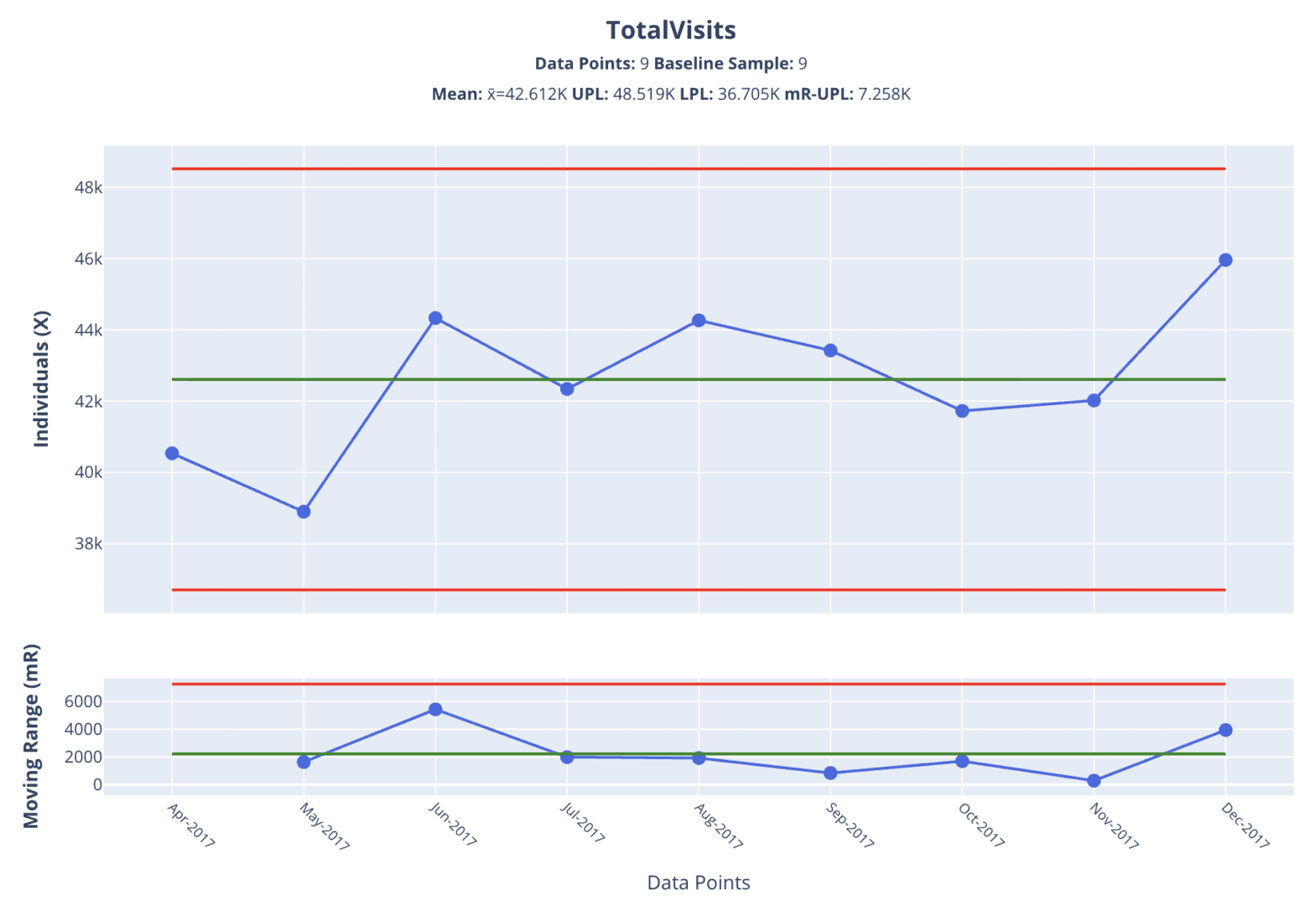
And the story doesn't even survive contact with the data. The quietest month of the nine, the one with the fewest visits, had the second-highest wait rate on the chart. If volume drove the rate, that month should have been one of the best. It was one of the worst.
This is one of the harder habits to break. We see two numbers move and we connect them. But explaining one noisy number by pointing at another noisy number isn't analysis. Measures of Success puts it plainly: don't waste time explaining noise, because there's no single root cause for it. Volume would earn a place in the explanation only if it showed a special cause, a real signal, that lined up in time with a signal in the rate. Neither chart has one. So there's nothing to explain, and nothing volume can explain.
The metric can't see the worst waits
There's a second problem with this metric, separate from the target. It's a threshold count, the same issue at the center of the ER post. It records whether each patient crossed the 90-minute line, not by how much.
A patient who waited 91 minutes and a patient who waited four hours land in the same bucket. A patient who waited 89 minutes and one who waited ten both count as fine. So the metric can sit at a stable 6.7% while the patients inside that 6.7% wait longer and longer, and the chart would never flinch. A threshold metric can hold perfectly steady while the experience it's supposed to track gets worse (or better) in the tail.
The more honest measure is the average wait time itself, plotted on a Process Behavior Chart, with the spread of waits behind it. (The average has its own blind spot: it can hide a worsening tail too, which is why I'd want to see the distribution, not just the mean. But the average is a long way ahead of a pass/fail percentage.) I don't know whether this hospital captures the average wait time. The count and the total visits were on the wall, so those are what I could chart. If they have the raw waits, that's the chart I'd want to stand in front of.
The target of zero is the deeper trap
The chart shows a predictable system running around 6.7 percent, a target of zero, and nothing anywhere on the wall that shows how the work would change.
In my book's terms, the voice of the process is saying one thing (about 6.7%, month after month) and the voice of the customer, the target, is saying zero. That gap is real, and it deserves attention. A 90-minute wait is something a patient feels in their body. But a target by itself is a wish. Dr. Deming would have asked how you intend to get there.
The common cause variation comes from how the clinic actually runs: how patients are scheduled and how rooms turn over. A predictable system will keep landing in its range until somebody changes that system. Highlighting the target in red, or printing it a little larger, or asking the team to try harder, won't move a single dot.
Which brings us back to the person updating that chart. We can finally name what they've been asked to do: explain noise, against a target the system was never built to reach. That's the Respect for People cost of the wrong metric. It doesn't build urgency. It teaches people that the chart on the wall has nothing to do with the work in front of them.
I keep coming back to Deming's question. By what method? The chart on that wall answers every question except that one. It shows the gap in detail, month after month, and stays silent on the only thing that would close it.