


TL;DR: An “out of control” chart doesn't mean panic–it means something changed. Process Behavior Charts help leaders respond thoughtfully to signals instead of reacting to noise.
Here's the latest cartoon collaboration with a skilled artist and medical assistant, Carrie Schurman (see past cartoons). You can find her on LinkedIn.
The idea for this cartoon came from Maggie Millard, the director of marketing at KaiNexus. Maggie has learned about Process Behavior Charts from me, and some of the stories are incorporated into my book Measures of Success.
See this blog post for one example of that application of PBCs:
Anyway, Maggie was on a conference call and heard a reference to an “out of control chart,” which is one way of saying a metric (and the underlying system and processes) is not predictable.
Here is the doodle that Maggie made and sent to me:
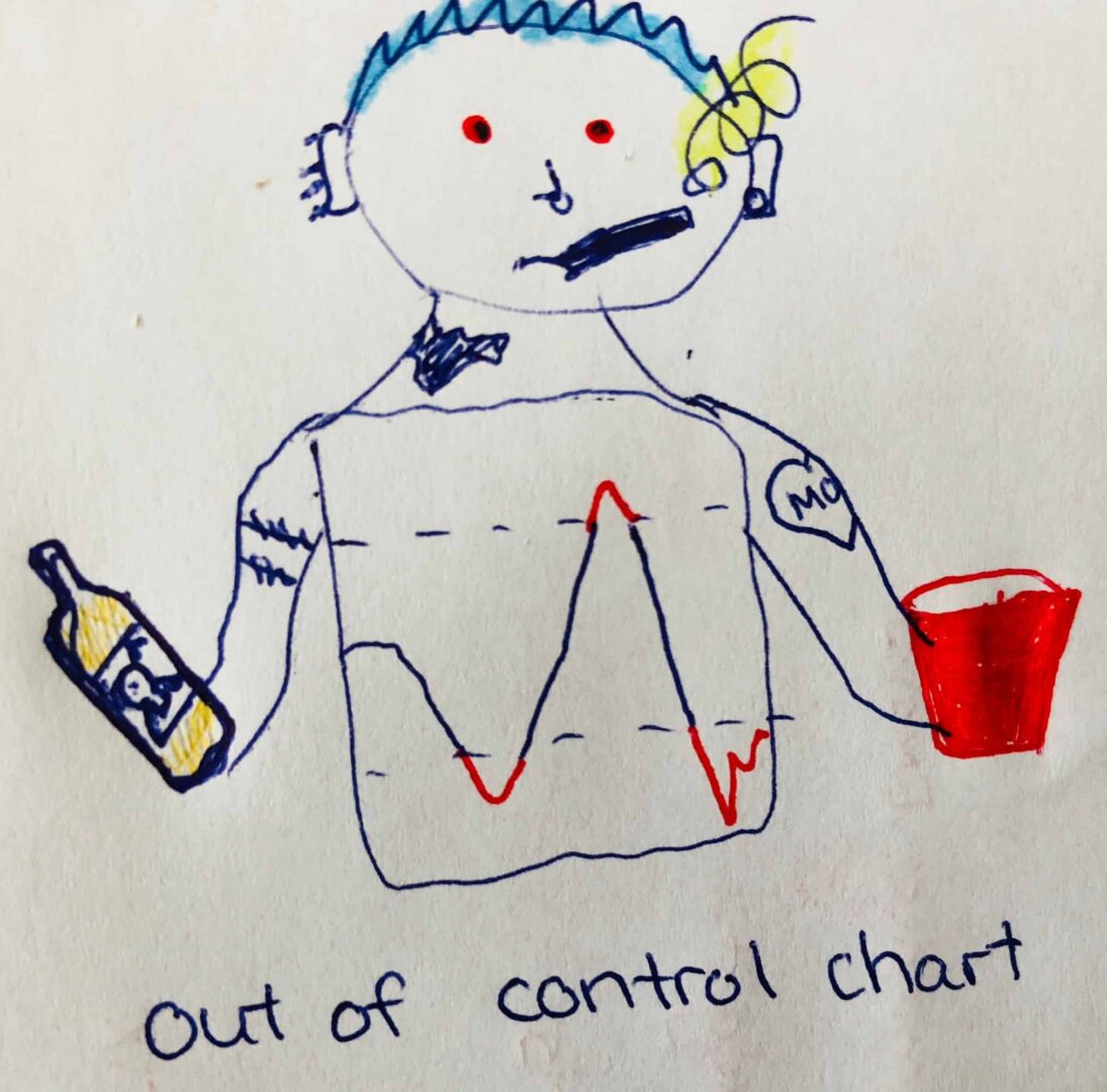
The liquor bottle, the tattoo, the red solo cup, the blue hair, the cigarette… yeah, “out of control” in a very different way. It made me laugh, and it led to the cartoon collaboration with Carrie:
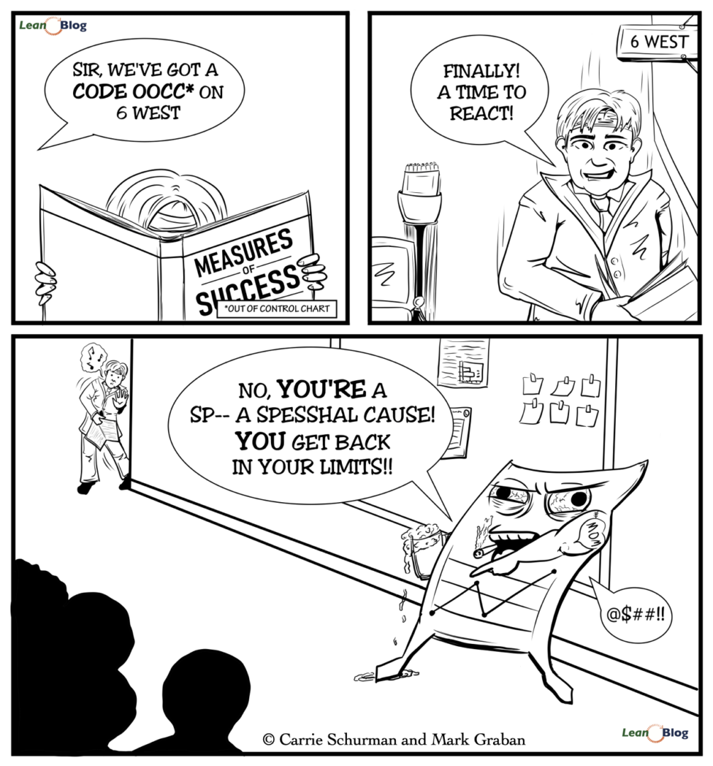
The story is as follows… you might remember the “gemba walking” executive from a previous cartoon who might have mistakenly thought the purpose of the walk was exercise, hence the sweatband and the hand weights:
So, in this cartoon, we imagine that the hospital leader has gotten his hands on a copy of my book.
He's reading, he's learning… he's not reacting to the “noise” or every small up or down in a metric.
But, he gets a call about an out-of-control chart. In the Process Behavior Chart methodology and parlance, we often say there is a “signal” that indicates that something has changed in the process, and it's worth investigating.
The term “out of control” comes from the term “Control Chart” or “Statistical Process Control Chart.” I prefer the terms “Process Behavior Chart,” “Unpredictable,” and “Signal,” as taught by Don Wheeler, who wrote the foreword for my book.
Anyway, the executive is excited to have something to react to. To his credit, he realizes he should go to the “gemba” (or the actual workplace) to find out what has happened.
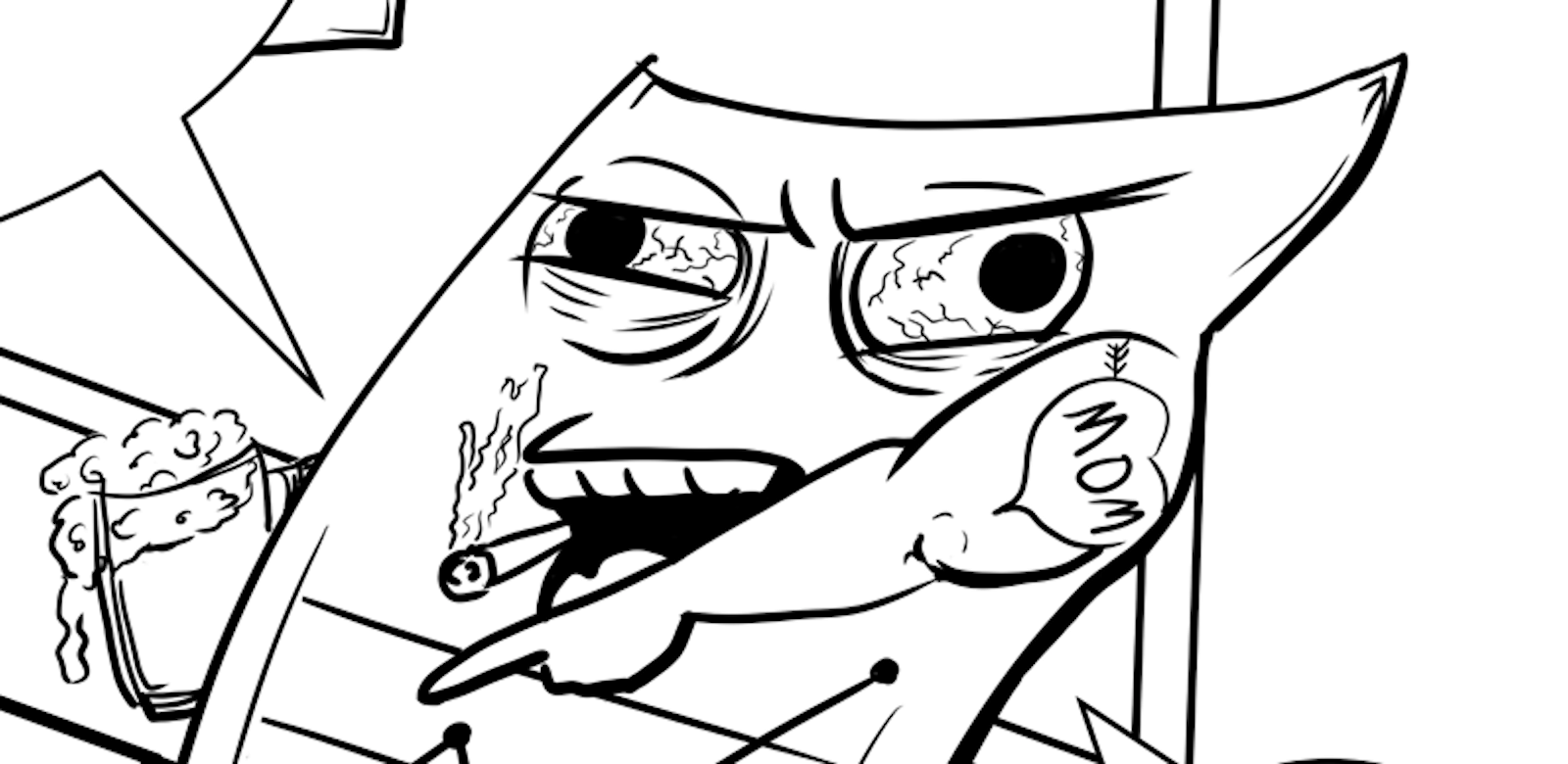
But, of course, he finds something really scary… LOL.
I hope your charts aren't that scary! Finding a signal in a Process Behavior Chart is an opportunity to learn and improve — it's nothing to be afraid of. And my book makes this methodology easy to understand and to apply in your workplace (as the positive reviews on Amazon say).
Thanks again to Maggie for the original concept and thanks to Carrie for collaborating to create a cartoon that I really like…
Update: Here's a webinar where I was dressed in a costume that was inspired by these drawings:
A Signal Isn't a Crisis–It's a Chance to Learn
Finding a “signal” in a Process Behavior Chart isn't a cause for panic — it's an invitation to learn. It's a sign that something has changed in your system, and that's worth exploring. Whether you're a seasoned leader or just getting started with continuous improvement, remember: reacting to noise wastes energy. Responding to meaningful signals? That's leadership.
If you're curious to learn how to make sense of charts (without overreacting to every data point), Measures of Success can help you get there. And if you're already using PBCs, I'd love to hear your stories — funny, scary, or somewhere in between.
FAQ: Understanding “Out of Control” Charts and Process Behavior Charts
What does “out of control” really mean in a control chart?
It means there is a signal that something in the process may have changed. It does not automatically mean there's a problem, a failure, or someone to blame.
Is an “out of control” chart a reason to panic?
No. An out-of-control signal is an invitation to learn, not a crisis. Overreacting can waste time and create fear instead of improvement.
What's the difference between signal and noise in performance data?
Noise is routine, expected variation in a stable system.
Signal is evidence that the system has changed in a meaningful way. Process Behavior Charts help distinguish between the two.
What should leaders do when they see a signal on a chart?
Leaders should:
- Pause before reacting
- Go to the gemba (the actual workplace)
- Ask what changed in the system
- Learn before taking action
This is about responding thoughtfully, not reacting emotionally.
Why are Process Behavior Charts better than simple trend lines?
Trend lines can be misleading and suggest improvement or decline that isn't real. Process Behavior Charts use statistically derived limits to show whether changes are meaningful or just random variation.
Does “out of control” mean someone made a mistake?
No. Most signals reflect system behavior, not individual performance. Treating signals as personal failures undermines psychological safety and learning.
What's a common mistake leaders make with control charts?
Reacting to every up-and-down as if it were a signal. This creates noise, confusion, and frustration instead of improvement.
How do Process Behavior Charts support continuous improvement?
They help teams:
- Focus on real changes that matter
- Avoid wasted root cause analysis
- Test whether improvements actually worked
- Improve systems instead of blaming people
Where can I learn how to use Process Behavior Charts correctly?
The book Measures of Success: React Less, Lead Better, Improve More explains Process Behavior Charts step by step, with practical examples for leaders.
If you’re working to build a culture where people feel safe to speak up, solve problems, and improve every day, I’d be glad to help. Let’s talk about how to strengthen Psychological Safety and Continuous Improvement in your organization.


