


I presented a free webinar today, Wednesday, October 31st at 1 pm ET… as you might have noticed, it's Halloween day!
In this post, I'll tell you more about the webinar. This post originally contained a reader comment and a reader question, but you can now read that here in a separate post.
Below, you'll find the description from the KaiNexus website… and if you click on the link, you can register to view the recording (and a PDF of the slides). You'll also be notified about other webinars that are less spooky. With this webinar, I tried to illustrate and teach some comments in a fun way. You can read the blinded feedback (positive or otherwise) here.
Metrics & Statistics Don't Have to be Scary
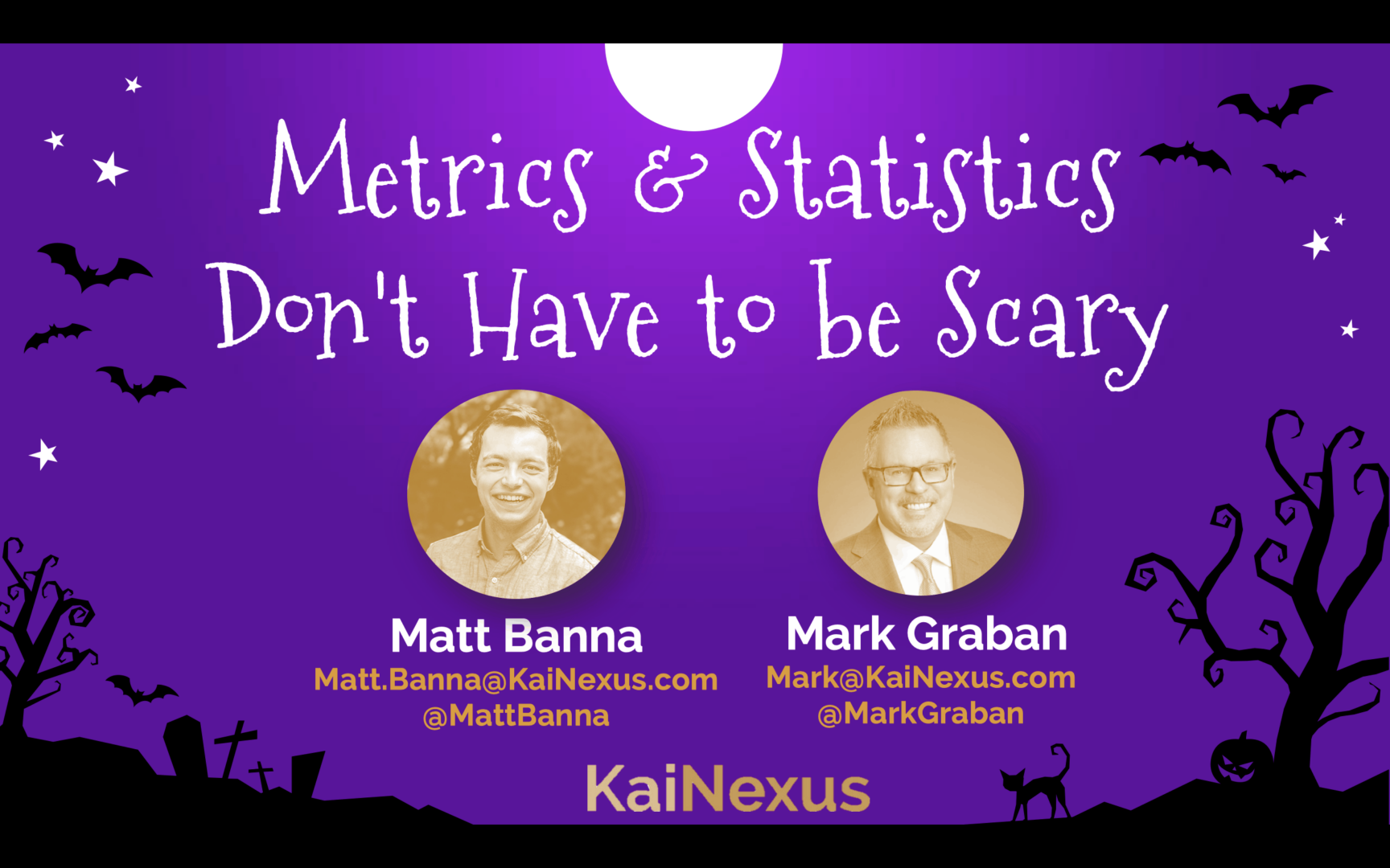
The webinar description:
Happy Halloween! Do metrics and charts haunt your dreams? Does your organization jump or scream “Boo!” every time a metric is worse than the day, week, or month before? Are you terrified by explaining every up and down in the metric?
To celebrate this scary day, Mark Graban, a Senior Advisor at KaiNexus, will give a presentation that will help you and your leaders stop being metrics zombies who stagger around saying “Brains! Above average data point…. brains….”
In all seriousness, Mark will share some proven and time-tested methods that are, contrary to popular opinion, not older than Dracula. Are these methods magic and witchcraft? No, they're based on simple statistical methods that anybody can learn and use, even Frankenstein's monster.
In this webinar, you will learn:
- How to replace your orange and black — I mean red and green — boo-wling charts with Process Behavior Charts
- How Process Behavior Charts helped our director of marketing and CEO stop howling at the moon every time a metric was a little bit worse
- How you can apply these decidedly non-spooky methods in any type of organization
Click here to register…. if you dare!
Webinar Highlights
Some of the goofiness in the webinar might (possibly) make more sense if you watch the SNL David S. Pumpkins sketch with Tom Hanks:
I had some fun with some traditionally scary Halloween imagery, but I also like the strange / funny David S. Pumpkins vibe. There was a lot of feedback from participants that I made this fun… and two people who didn't care for the creativity for a webinar they were viewing in the workplace.
You can, if you like, get a more straightforward treatment of this material in this earlier webinar and the companion video and post that shows how to create a Process Behavior Chart. You can view all of my Process Behavior Chart webinars here.
Some of the goofiness was my costume… I was an “Out of Control Chart” come to life, as inspired by this recent cartoon.
Yeah, it was a bit much. It's the type of joke that's funny to just a handful of people… but it's REALLY funny if you're into these charts. That's a prop cigarette and an empty bottle. OK, but on to the content…

Here is a recording of the Halloween webinar and I'll share some highlights below.
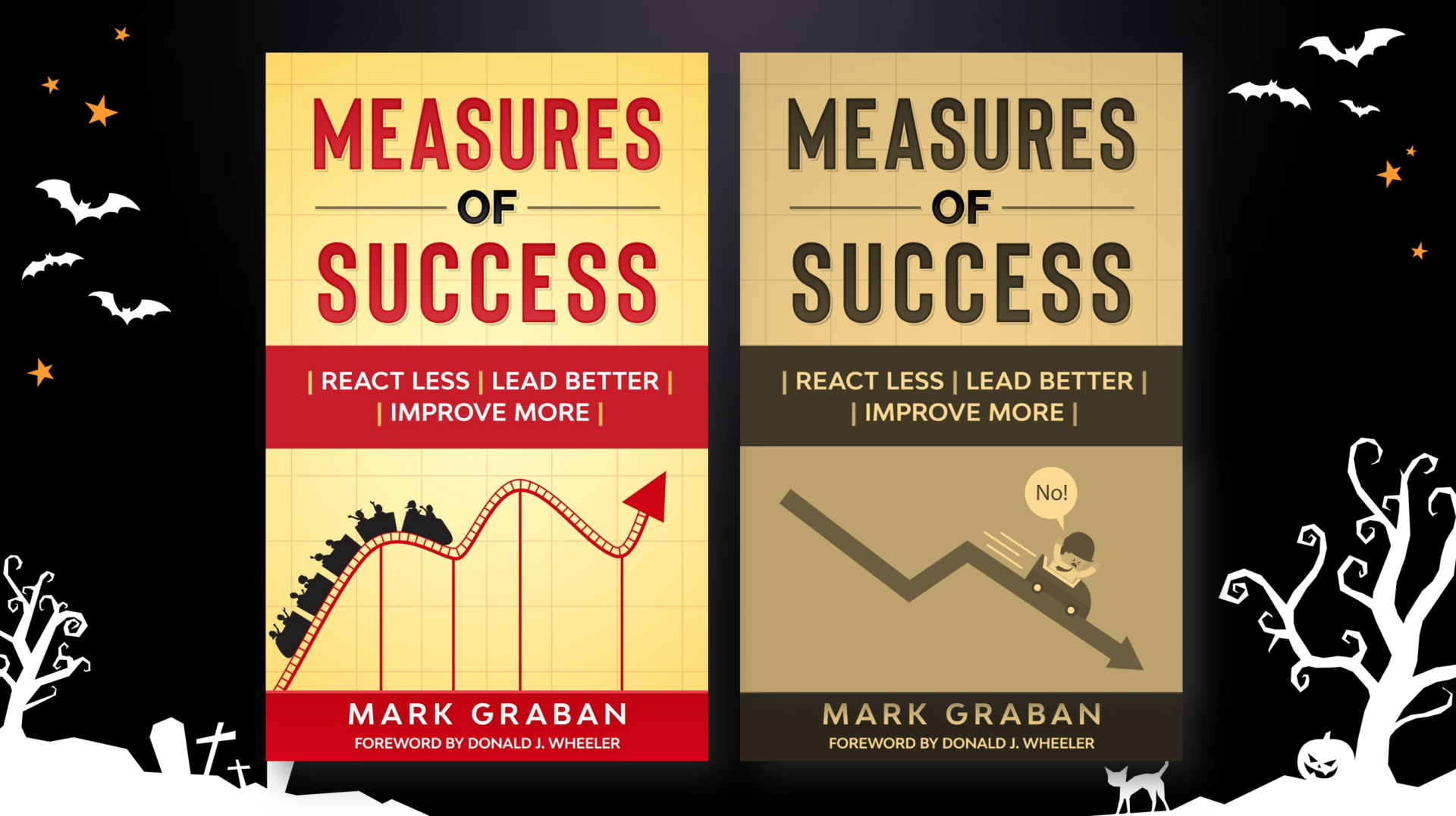
I shared a darker, gloomier version of my book's cover for Halloween:
I warned people to look out for “zombie managers” who slowly roam the hallways looking for “red” metrics (data points that are worse than the goal or target). Why do these zombie leaders so often ask for a “root cause” for a particular data point? Is that really the right approach?
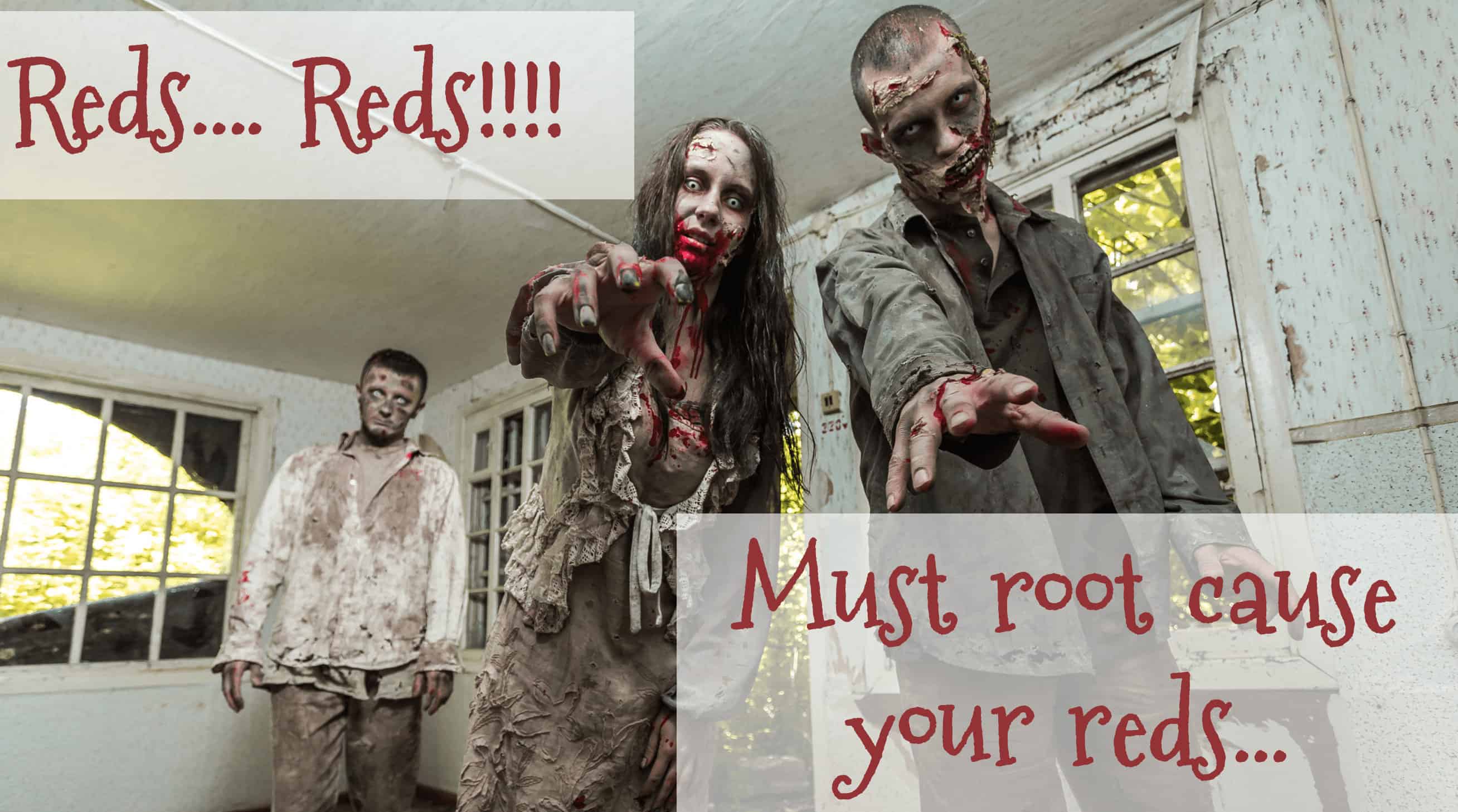
When we react to every red… or every worse-then-average data point… the Process Behavior Chart methodology teaches us that overreacting to “noise” in a metric can be a real waste of time. There is no “root cause” for any particular data point that's within the range of our metric's routine variation. More about that in a bit.
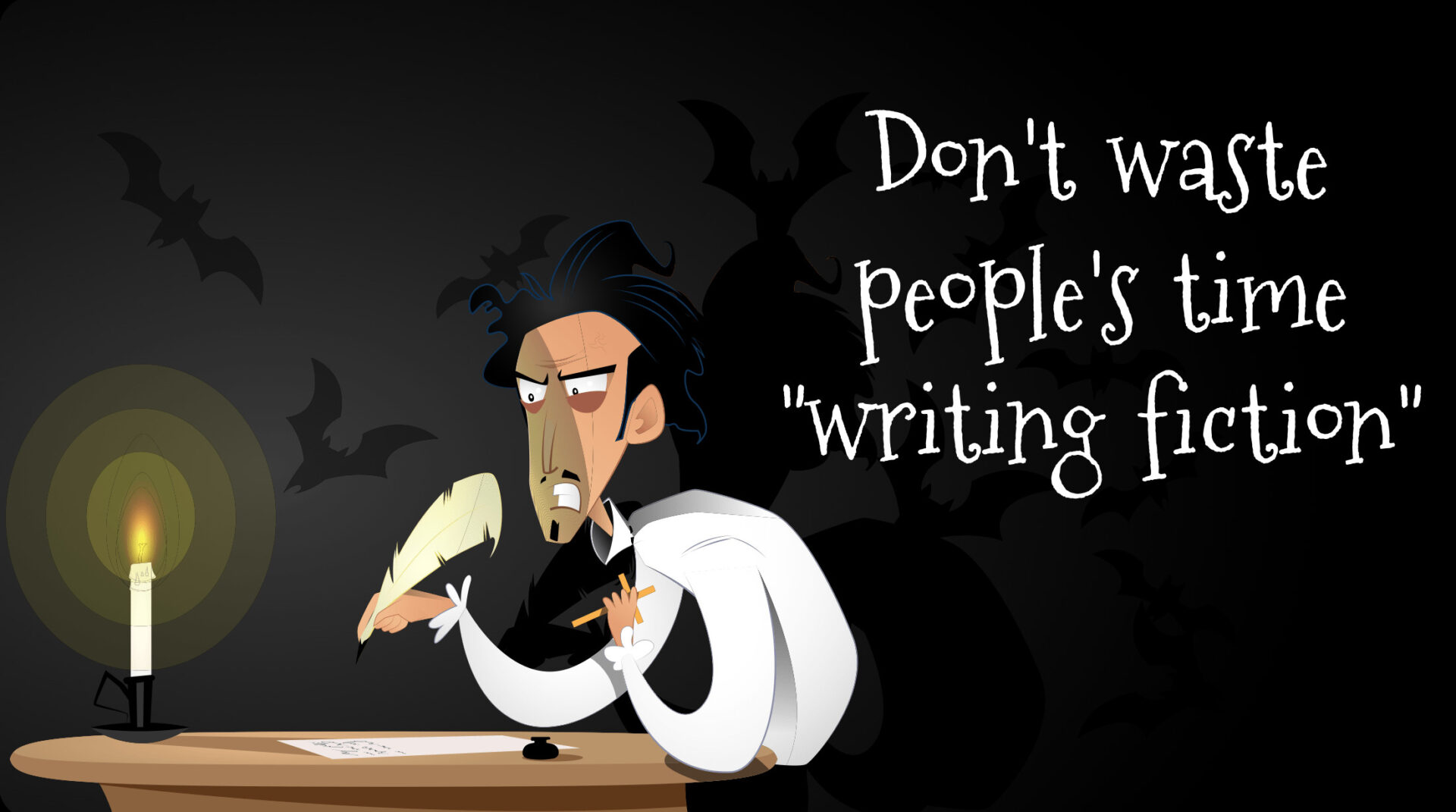
When we ask people to cook up explanations for small changes in our metric, we end up “writing fiction” as Don Wheeler calls it. Don't waste people's time. That time could be spent improving the system in more systematic ways, as we learned at KaiNexus (a story I've blogged about and included in my book).
The overly reactive approach might feel good, but it could up being a real “time suck.”

Scary, right?
Every metric has variation. The question is “how much is normal?” Process Behavior Charts help us answer that.
This Halloween webinar had about 330 people register. That's above average, not it's not an outlier, as the PBC that we have in our KaiNexus system shows me (I input data here after each webinar, using functionality that many customers utilize for their metrics):
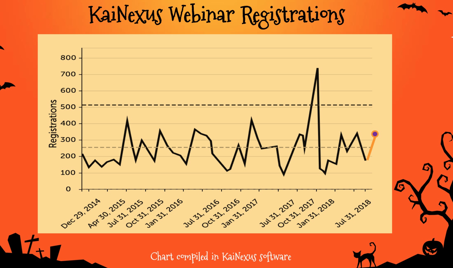
This chart helps me avoid getting too disappointed by any particular “below average” webinar and I don't get too excited or see optimistically false trends when there's an uptick. There was a webinar with over 700 registrations, which was a “signal” in this methodology.
The chart tells you when there's a signal. It doesn't tell you why it was an outlier. It doesn't magically tell you what was different in the system. Sadly, we never figured out how to repeat that success (even the follow-up webinar by the same presenter, Jess Orr, didn't attract as high of an audience, which is a shame because it was also excellent).
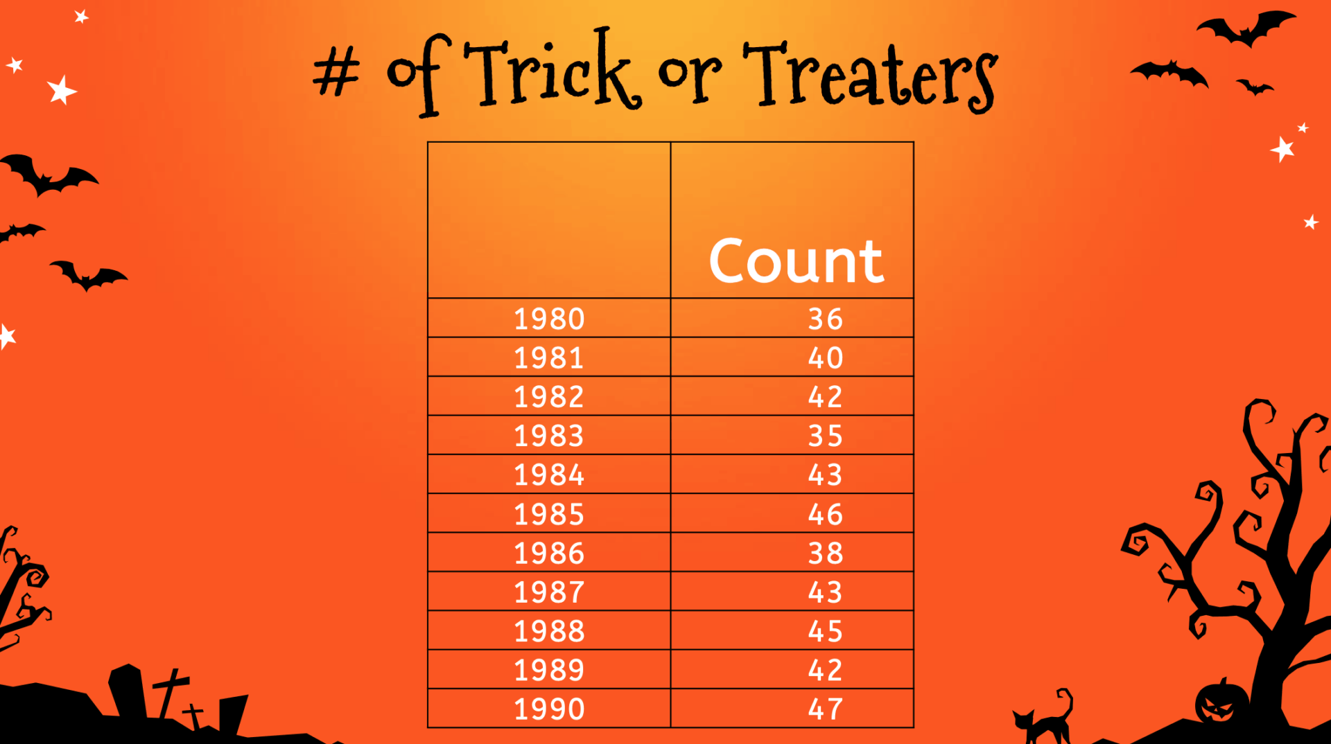
I posed a Halloween scenario… can we predict how many trick or treaters will come to our door this year?

Each year when I was a kid, my parents would keep what was basically a “check sheet” to track how many kids had come to the door. I don't think they kept the data from year to year, but I think they tried to mentally log the previous year's number for next year's candy planning.
The data (which I'm making up) might have looked like this (although the numbers might have been higher):
It's really hard to detect trends from a list of numbers. Yet, people do this all the time in the workplace (as I blogged about recently):
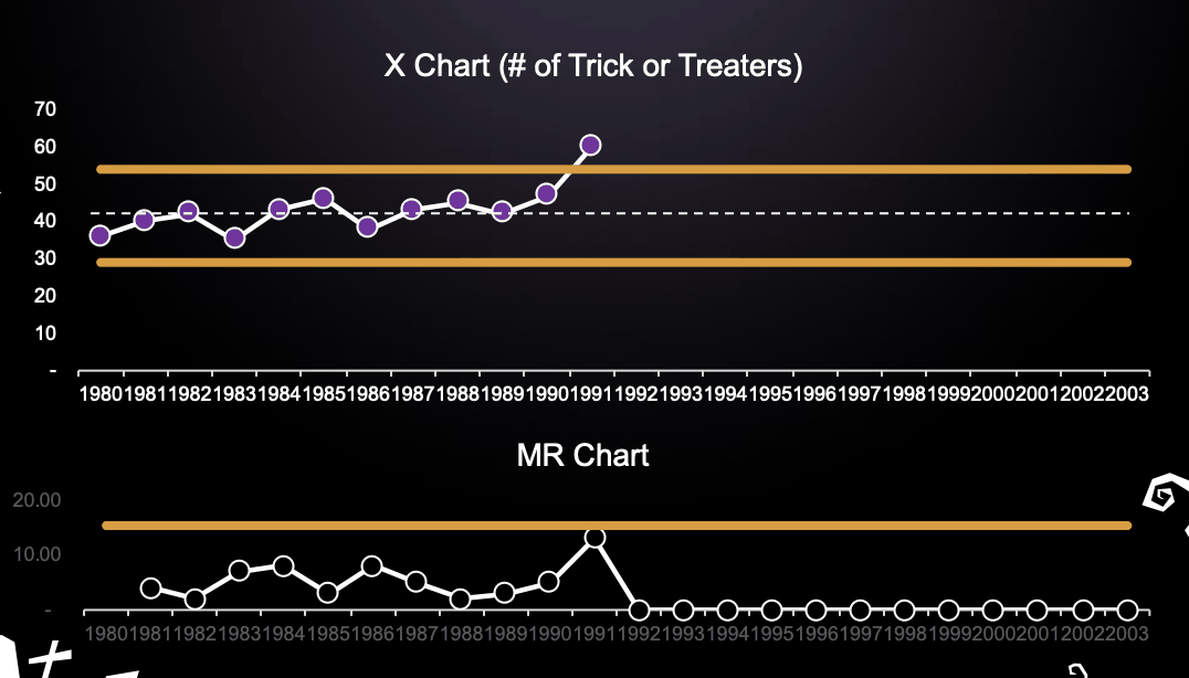
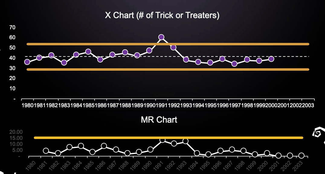
If we made a “Run Chart” out of that Halloween data, we'd get a better sense of trends and it would be easier to spot outliers. How consistent is the number from year to year? Could we predict the number of trick or treaters who would come in 1991?
A Process Behavior Chart (a form of “control chart”) helps us even more, with the calculated average and “natural process limits” on the “X Chart” (the data) and the companion “MR Chart” (plotting the “moving ranges” or the absolute difference between each data point and the one before it.
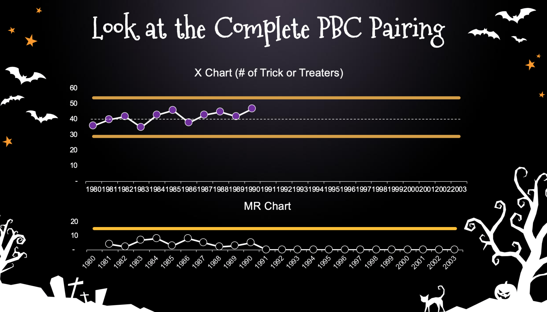
There are no “signals” to be found here in either chart. It's a “predictable process.” That means that we could predict that the number of trick or treaters would fall between 30 and 53 and the average is 41.
If we wanted to make sure we didn't run out of treats, we might buy enough for 53 (or a little more). The PBC tells us that 53 is the highest number we'd expect to see — unless something changed in the system. Was a new subdivison built a few streets over, which means there are probably more kids in the neighborhood? If we know about a change to the system, we might expect to see a shift in the metric.
If you want to see how those are calculated, click here.
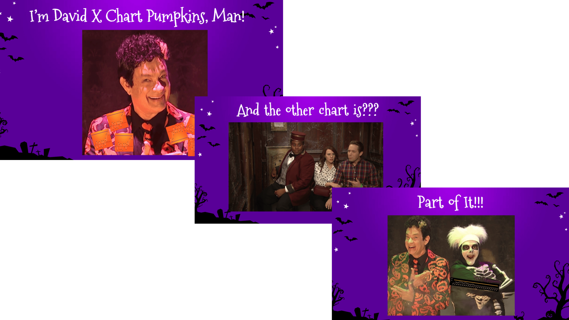
There was a bit of silliness… with “David X. Chart Pumpkins” making an appearance (he is the twin brother of David S. Pumpkins?).
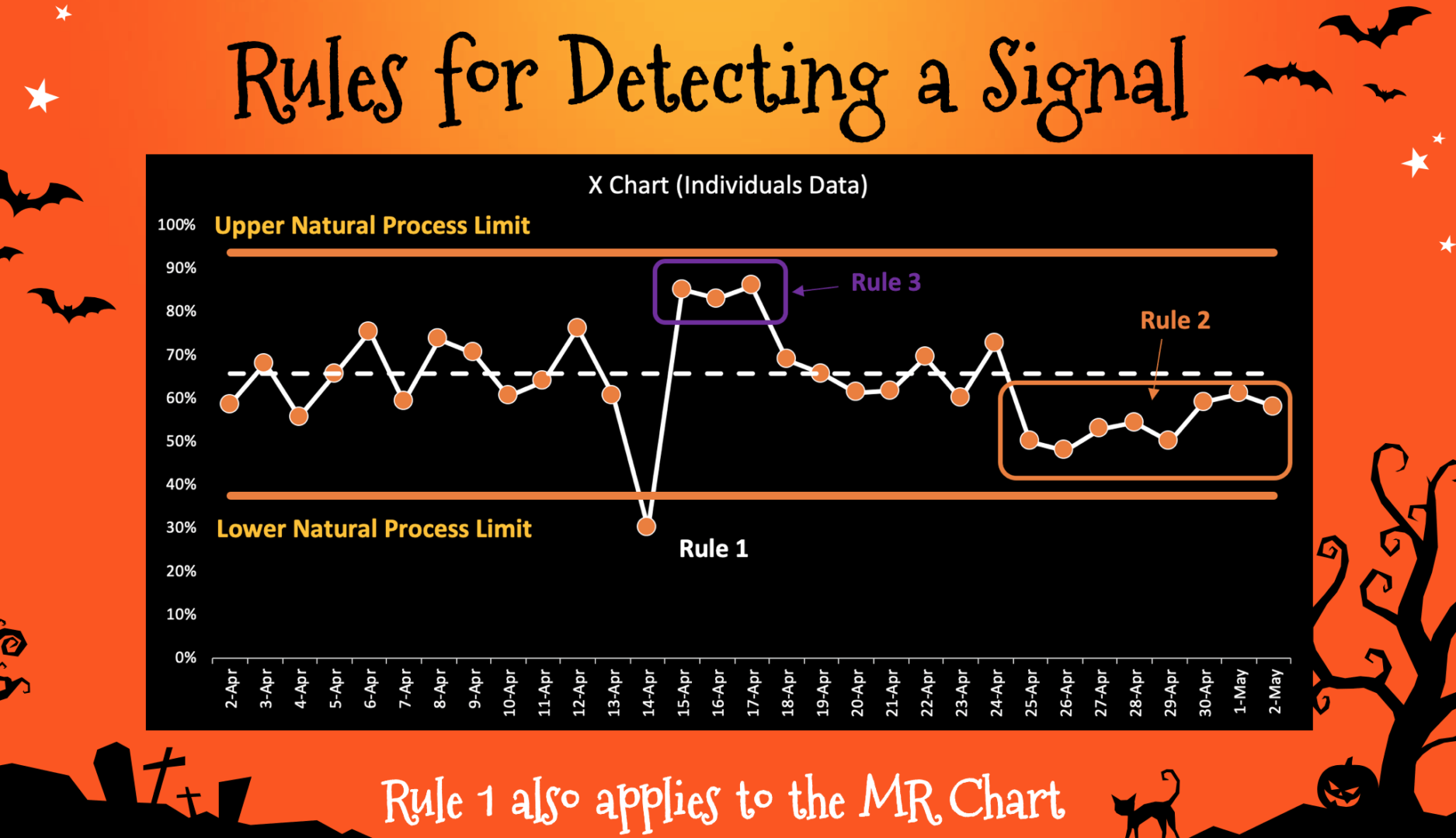
There are three rules we use to find signals in the X Chart or the MR Chart, as illustrated below:
Anyhoo, back to the Halloween story…
Let's say we saw this increase in trick-or-treaters in 1991… that's a Rule 1 signal. There is a root cause… something changed in the system:
That doesn't necessarily mean this is the beginning of a trend. Depending on the “special cause” or root cause, it could have been a one-time event. Or it's the beginning of a shift in performance, where the number will now fluctuate around a higher average.
If this happened… eight consecutive years below the old average, that's a different signal with its own cause:
There are no signals in the MR Chart in either case.
Sometimes people decide not to use the MR Chart for the sake of simplicity. There are some situations where there would be a missed signal if we don't use the MR Chart. But, you can learn to look for huge swings in the X Chart that seem unusual even if there's not a point outside of the X Chart limits.
That was basically it for the webinar… I told the KaiNexus story… there was some more spooky silliness. Anyway, I hope you find this to be helpful and fun.
If you have questions, you can contact me.
Please scroll down (or click) to post a comment. Connect with me on LinkedIn.
Let’s work together to build a culture of continuous improvement and psychological safety. If you're a leader looking to create lasting change—not just projects—I help organizations:
- Engage people at all levels in sustainable improvement
- Shift from fear of mistakes to learning from them
- Apply Lean thinking in practical, people-centered ways
Interested in coaching or a keynote talk? Let’s start a conversation.


