


I've been writing blog posts about using “process behavior charts” – a form of “Statistical Process Control (SPC) chart” or “control chart” that can be very useful to leaders as a way to better manage our business metrics and performance measures. I have also been teaching a workshop on this method.
This topic might seem really technical and esoteric, but I think it's a really useful management method… and it's not hard to learn. See my blog post and video about creating and interpreting these charts.
In this recent blog post (and in the
EDIT: See the recording of my talk from Lean Startup Week.
There are times when I get the opportunity to coach the KaiNexus team on these approaches. These are methods that can be used in manufacturing, healthcare, startups, or any setting where we track metrics and want to improve.
A Story from KaiNexus
My ears perk up when I hear people like our director of marketing (who is amazing) say things during a web meeting like:
“I'm really concerned about the number of contacts this month.
It's low. I don't want it to be low.”
She's referring to the number of new contacts that we get into our sales and marketing database when people sign up for blog subscriptions, register for webinars, request demos, etc.
The number of new contacts for a company perhaps isn't the most vain of the “vanity metrics” (as they say in The Lean Startup movement – see this blog post by Eric Ries). Some contacts turn into “leads,” some of those become “qualified leads,” and some of them will become paying customers (a metric that matters for the long term).
Vanity Metrics: “They might make you feel good, but they don't offer clear guidance for what to do.” – Eric Ries
When Maggie expressed her concern, I heard her talking about a single data point (this month) and that point being below average or below expectations or desires. If a number is lower than the previous month, is that really worth reacting to? Is that data point a “signal” (or part of a signal) or is it “noise?”
Long story short: I suggested to Maggie that she not overreact to this single data point (and I had a statistical basis for stating this, it wasn't a guess or an opinion). I coached her to not to spend time coming up with a “reason why” the data point was lower and to, instead, focus on things that could improve the system, doing things she thought would generate more new contacts over time.
How I Determined This
During our web meeting (it was just the two of us), I suggested that we look at the chart to see a longer trend than two data points. We use our KaiNexus software platform to track our internal improvement work and our metrics, so we thankfully had a run chart to pull up and view together. Here is that chart, but I've covered the Y-axis numbers:
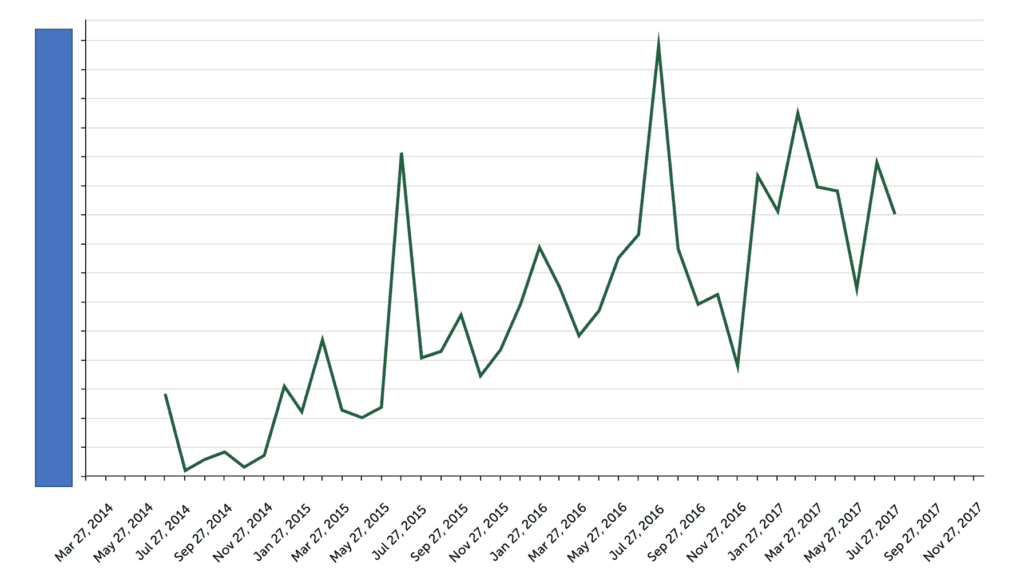
The good news is that the number of leads appears to be increasing over time. It doesn't look like a “stable and predictable” system with flat performance and results that fluctuate around a consistent average, like this following chart that I used in this article.
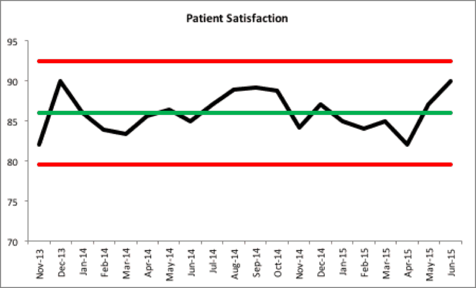
In that sort of system, we'd learn to recognize that the results are going to be higher some months than others. Some will be above average and some will be below average. We'd expect that, unless something significantly changes in the system that patient satisfaction in the next month would be between 80 and 92 percent based on our calculated upper and lower control limits.
The key to improving a stable system is not asking “why was performance lower last month?” but instead asking “how do we improve the system's performance?” We need to better understand the ongoing “common causes” of month-to-month performance variation instead of trying doing root cause analysis that might look for a single “special cause” explanation for that month.
See my book “Measures of Success” to learn about this methodology and “process behavior charts”:
I downloaded the “new contacts” data set from KaiNexus to create a control chart (aka a “process behavior chart”) in Excel. I calculated an average and the control limits based on the first 20 data points and got this chart with some calculated upper and lower limits (these limits are calculated based on the “moving ranges” between consecutive data points – learn more here).
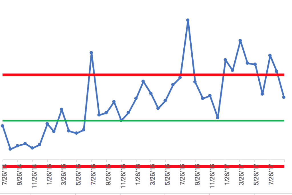
The chart confirms (more mathematically than me just eyeballing it) that the number of new contacts is not a flat, stable, and predictable system over time. We see a data point around 7/26/15 that's above the upper limit and we see a run of far more than eight consecutive data points above the established average (the green line) – these are both indicators of “special causes,” meaning they are statistically not likely to be the result of noise or normal variation. We could ask “what happened?” in those situations and we might more likely find an explanation or a root cause.
The next question in my mind is “is the system increasingly linearly?” or “do we see a series of step function increases in performance?” While we talk about continuous improvement, the reality might be there were just a few significant changes to the system as opposed to continued changes and improvements each month.
Throwing in an Excel linear trend line suggests (perhaps incorrectly) that the number of new contacts will keep increasing forever. I'm not sure that assumption is true.
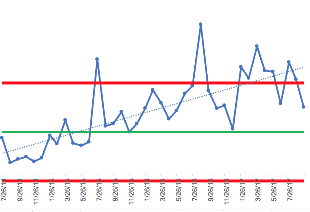
Instead of being satisfied with the linear trend line, I looked for statistically significant shifts (step function changes) in performance, where the average and control limits shift.
Long story short, I ended up with a chart, below, that I think better reflects reality.
The process behavior chart suggests that there are three different systems over time. There appear to be two step-function increases in the average number of contacts being collected each month. What happened to shift the average performance up? We're not really sure, unfortunately. Had we been using the process behavior chart at the time and detected those signals, it would have been easier, perhaps, to develop a theory about why it improved. Charts like these tell us there's a signal – it doesn't tell us why (that's up to us as the users of the charts).
The chart also shows a single data point, in August 2016, where it would have been a good use of time to ask, “what happened that month?” The number of contacts was much higher than would have been expected. The upper and lower limits give the boundaries of performance that would have been “noise” in the system.
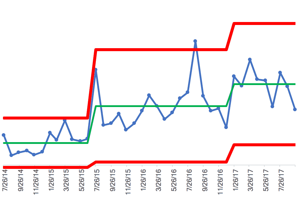
There also appears to be a shift up in December 2016, with five consecutive points that are above the “1 sigma” limit (another one of the Western Electric rules) and there are eight points in a row above the old average (two of them are slightly below the average – I might have been fudging that rule a bit).
Either way, it appears to be a system that's flat and fluctuating around what I'll call that third average. I don't see evidence that it's continually increasing every month like a linear trend line.
Back to Maggie's original concern – the number of new contacts seemed low to her through September 20. We extrapolated that number for the entire month (multiplying it by 1.5) and that number was between the lower limit and the average.
Asking “what happened in September?” wouldn't be a good use of time because that question is looking for a “special cause” when we have “common cause” variation.
Maggie said, “So I shouldn't lose any sleep over September's number?”
I said no. Don't overreact to the noise in the data, the natural ups and downs that occur. The same system that produced a higher number in August is the same system as September and that same system might produce a higher number in October.
That said, if she isn't satisfied with the current average number of contacts, she can do things to improve the system. Instead of trying to explain September's number by asking what changed (when it's likely nothing changed), she can run experiments and spend her time doing things that might increase the number of contacts (such as writing an additional eBook).
What Do You Think?
Does your organization ask you to over explain every up and down in performance measures? Would that time spent cooking up an explanation be better spent improving the system?
Please scroll down (or click) to post a comment. Connect with me on LinkedIn.
Let’s work together to build a culture of continuous improvement and psychological safety. If you're a leader looking to create lasting change—not just projects—I help organizations:
- Engage people at all levels in sustainable improvement
- Shift from fear of mistakes to learning from them
- Apply Lean thinking in practical, people-centered ways
Interested in coaching or a keynote talk? Let’s start a conversation.


")


Note: the term “process behavior charts” and this methodology is something I learned from Donald J. Wheeler and his fantastic book “Understanding Variation.”
Hi Mark
I just discovered your blog and am enjoying it.
Don Wheeler and I have collaborated on many projects and recently co-authored an article on using process behavior charts to monitor changes in my prostate cancer treatment.
I will send you an electronic copy of the article. Or you can go to the on- line publication Oncogen and access the article yourself.
I would be interested in your reactions to our application of process behavior and celeration charts in this case.
Al Pfadt
Hi Al – I’m sorry that missed replying to this comment… you can reply to the notification email about hits comment if you’d like like to send me the article.
Mark,
I truly appreciate your consistent teaching of the benefits of using Process Behavior Charts. They are such a simple but powerful tool that are rarely ever used and even less rarely used correctly. The current emphasis on 6 Sigma helps demonstrate that most people assume the more complex the tool, the more useful. Nothing could be farther from the truth. Keep up the good work.
Thanks, Kenneth!
What if we do find a signal in our trend? What’s the best way to deep dive? For example, if I have 100 stores and I’m looking at their sales in aggregate and it gives me a signal. Do I need to create 100 charts to review each store’s trend? Or is that a time to use point to point analysis?
Great question! If you were charting total sales, the aggregate of all 100 stores, and you saw a signal in that chart… that’s worth investigating and understanding.
I’d want to know if sales were up at all 100 stores… or are there certain stores that have a signal in their own individual sales.
You could maybe chart by district… is there a signal in all or some districts?
At most, you could draw 100 charts, one for each store. That would be a time-series Process Behavior Chart for each store.
As always, the signal tells you something has changed. The next step is to figure out what changed and why… hope that helps.