


The other day, I saw a post on Twitter that included a few photos related to what's often called Lean Daily Management practices in a hospital.
The spirit of my post is not meant to come across as “they're doing it wrong” but more in the spirit of “they're doing a lot of great things, but it would be better if…”
If Lean Daily Management is supposed to be, at its core, about identifying opportunities for improvement, I'd hope they wouldn't be offended by my recommendations, but I also don't want to link to the Twitter post or call them out by name. I will pass along private feedback through a channel I have. But, I'm writing a post because what I see here is VERY common in different organizations (not just healthcare).
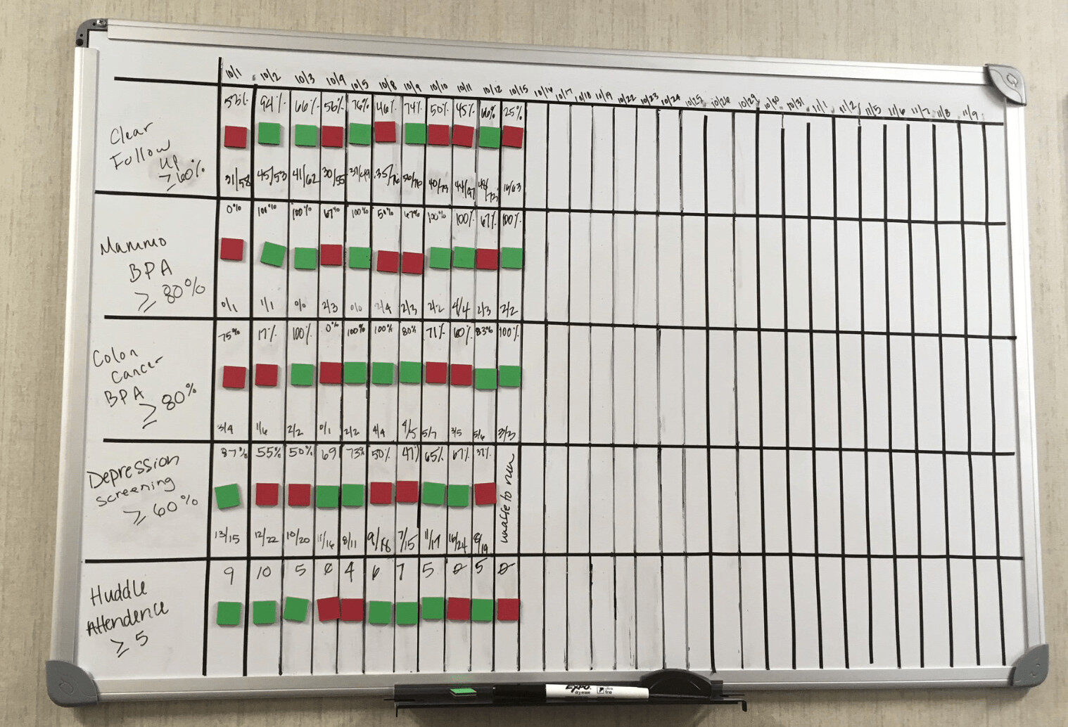
Below is a photo that shows some daily metrics for a clinic. It's good to be tracking metrics and defining success. It can be helpful to have a target or goal. It's even better (as other photos showed) to be engaging everybody in Kaizen or continuous improvement so we're not just making people feel bad about the “red” data points that are worse than the goal. But, there's a risk that management and the team overreact to reds that are “noise” in the data. I'll show an alternative approach in this post.
Here is the board:
The tweet said the organization asked three questions:
- How did we do yesterday?
- Are we set up for success today?
- Ideas to improve tomorrow?
With all due respect, I don't think those are the most helpful questions. “How did we do yesterday?” could be replaced with a better question of “Is yesterday's performance signal or noise?” It's possible for a metric to fluctuate between red and green (it depends on how the goal is set, which is an art in and of itself) and that fluctuation does NOT mean that anything has changed.
Asking “what happened yesterday?” might be a poor use of limited time if yesterday's data point (regardless of being red or green) is part of the routine variation that's exhibited by a “predictable” process. Every system (and metric) will show variation – the question is “how much?”
To the second question, “are we set up for success today?” might imply a couple of things, such as:
- Will performance fluctuate into the green today through no result of any change to the system?
- Will performance predictably fall within a range that's pretty much guaranteed to be ALWAYS better than the goal?
Asking how to improve is important, but “improving tomorrow” isn't the same as “improving the system.” If a metric has fluctuated down into the red, waiting and doing nothing might lead to fluctuation back into the green the next day… before it fluctuates back into the red again…
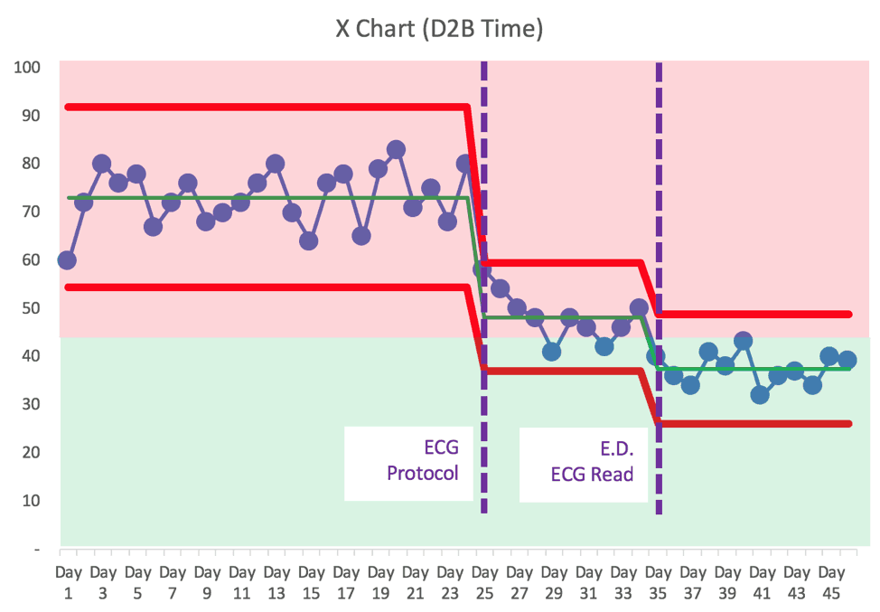
As I write about in my book Measures of Success, “process behavior charts” are a method that's more helpful than a list of numbers with red and green color coding. It's not just about the visualization… it's about how we improve.
Let's take a closer look at the metrics, one by one:
Clear Follow Up
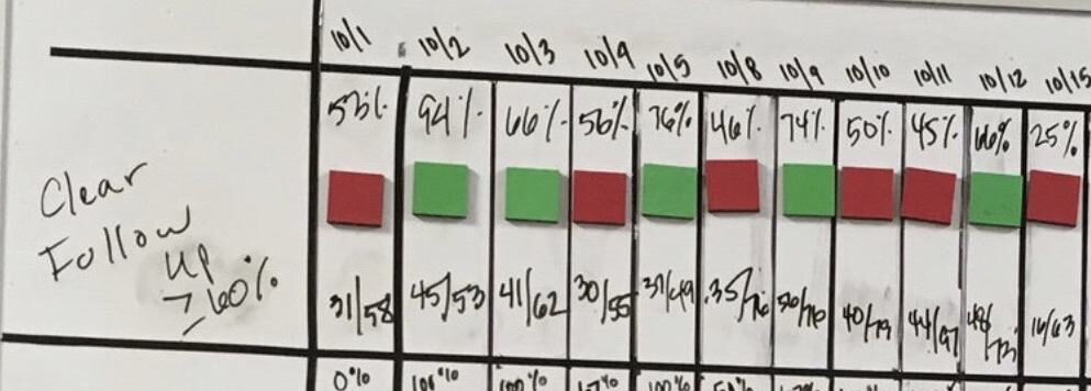
What can you tell from the metric? Some days, it's green (better than 60%) and some days it's red. How would you react to 10/15 being at 25%? Does that mean something changed for the worse? Is there a “signal” or is it just “noise?” Is there a root cause to be found (hint: only if there's a “signal” that tells us the system has changed… otherwise, it's just fluctuating). We have five reds and six greens. Three of our last four data points are red. What does that tell us?
What about data from September? Isn't October 1st the continuation of that system? Why would you start a new month with a literal blank slate? We can do better, as I blogged about here about starting the new year with blank charts.
Drawing a Process Behavior Chart can be done easily by hand, or you can use the free templates I provide.
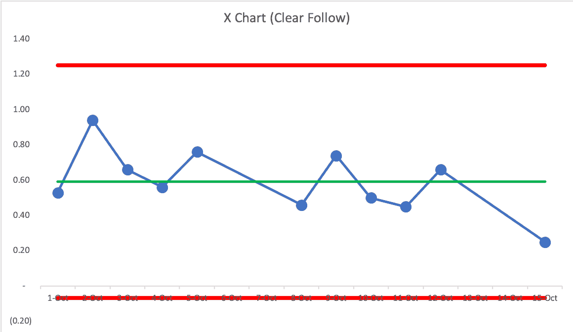
What does the chart tell us? It tells me that it's a “predictable system” with a lot of variation. The calculated “natural process limits” (learn more) are negative and greater than 100%. That tells me that this system will just as likely produce a number between zero and 100%.
There are no signals found in the chart (see my PDF handout about the 3 main signals we look for in a PBC).
Instead of asking “what happened yesterday?” it's more helpful to step back and ask systemic questions (and maybe using an A3 problem-solving approach):
- How can we make the system perform more consistently?
- How can we improve the system in a systematic way?
That requires process knowledge that I don't have as an outsider (I know even know what the metric is measuring exactly).
In the chart above, it might be tempting to draw a “linear trend line” (which might help convince somebody that performance is getting worse). But, we have to be careful with linear trend lines, as they can mislead us in ways that a Process Behavior Chart will not (read more).
Mammo BPA
Here is the second metric:
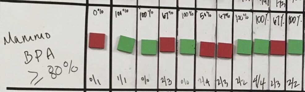
Again, can you see trends there from the list of numbers and the colors? It's “visual” but is it as helpful as it could be? What does the Process Behavior Chart (PBC) show us?
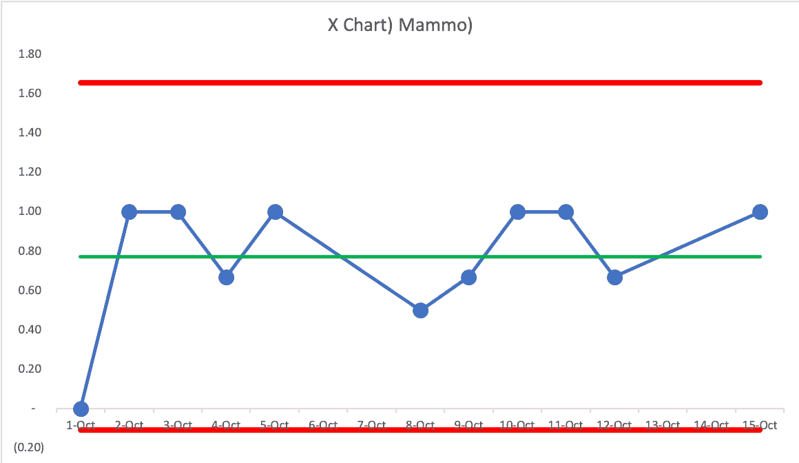
Again, none of those data points are signals. We can predict that, for future days, that the rate will be between zero and 100%. We have a process that's predictable, but not capable. What can we do to make the system more consistent? Is there standardized work? Is it being followed?
Asking about yesterday's number in isolation might not give us the answer we need to improve the system. One other challenge with this data is that the “n” or denominator is pretty small, which is one reason this metric can fluctuate a lot. But, a more consistent process might fluctuate between 75% and 100% instead of zero and 100%.
Colon Cancer BPA
Here's the third metric:
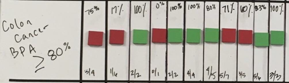
What do you make of that? More red and green fluctuation. The last two data points are red – does that mean the problem is solved?
Let's look at the PBC:
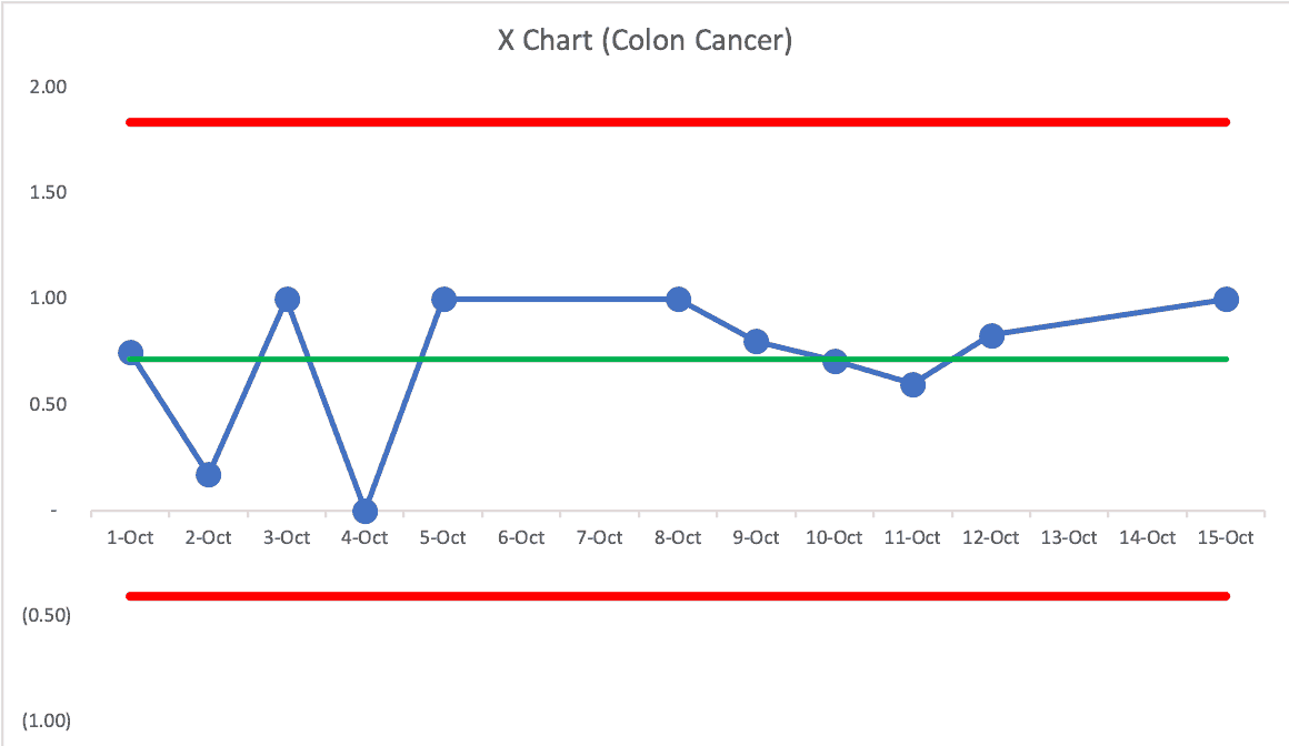
Same story… no signals. We have a predictable system with more variation than we'd like. We almost, but don't quite, see eight consecutive points above the average, which would be another signal that the system has changed for the better.
As with all of these metrics, they aren't green every day… so it means we need to improve the system. Again, I'll suggest we can do so more effectively if we're less reactive and more systematic in our approach.
Depression Screening
Here's the next metric:
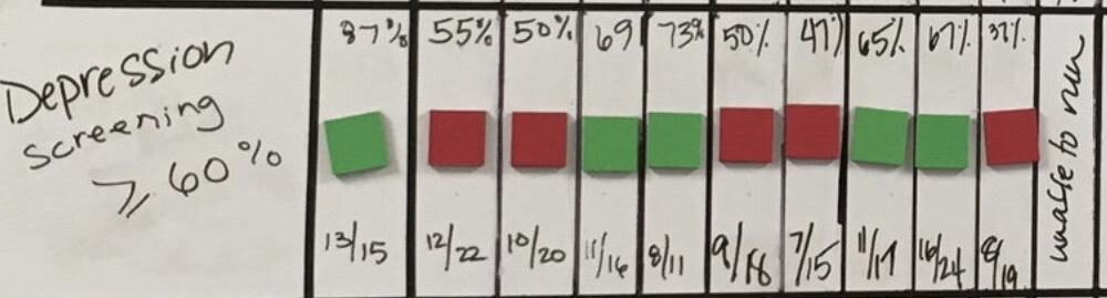
Again, green and red. Seeing a pattern? Maybe there's a pattern that each chart has green and red… but is any metric getting better or are they just fluctuating?
The PBC:
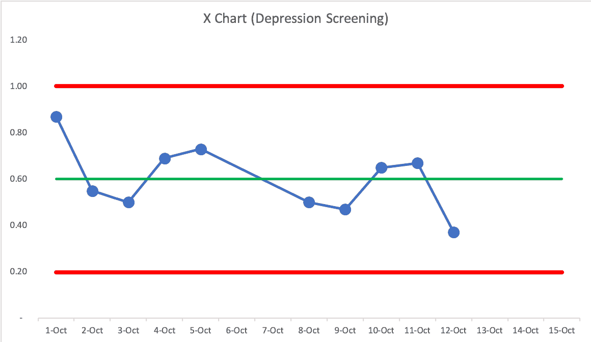
Again, it's a predictable chart. The good news is that there's slightly less variation so we can predict, given the calculated natural process limits, that the next day will fall between 20% and 100%. That's not where we want it to be… and it's not always hitting the goal, so let's improve the system.
Huddle Attendance
The final metric, as a number, not a percentage:
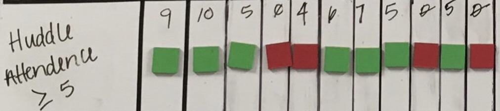
Here is the PBC:
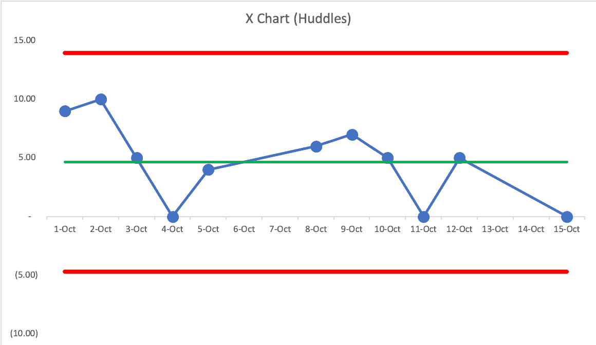
Again, it's predictable, but not capable of hitting our target consistently. We might ask why there are some days when attendance is zero… but that happens enough that there is probably some “common cause” that happens a lot instead of there being “special causes.” Instead of asking “what happened on the 15th?” we can ask a more systemic question about “what leads to the huddle not happening some days?”
Some Other Charts:
Here is an example that I use in presentations about PBCs. This is a chart that's just fluctuating between red and green… it's all “noise” or “routine variation,” so no single day is worth doing a root cause analysis on. But, we can systematically improve the system nonetheless.
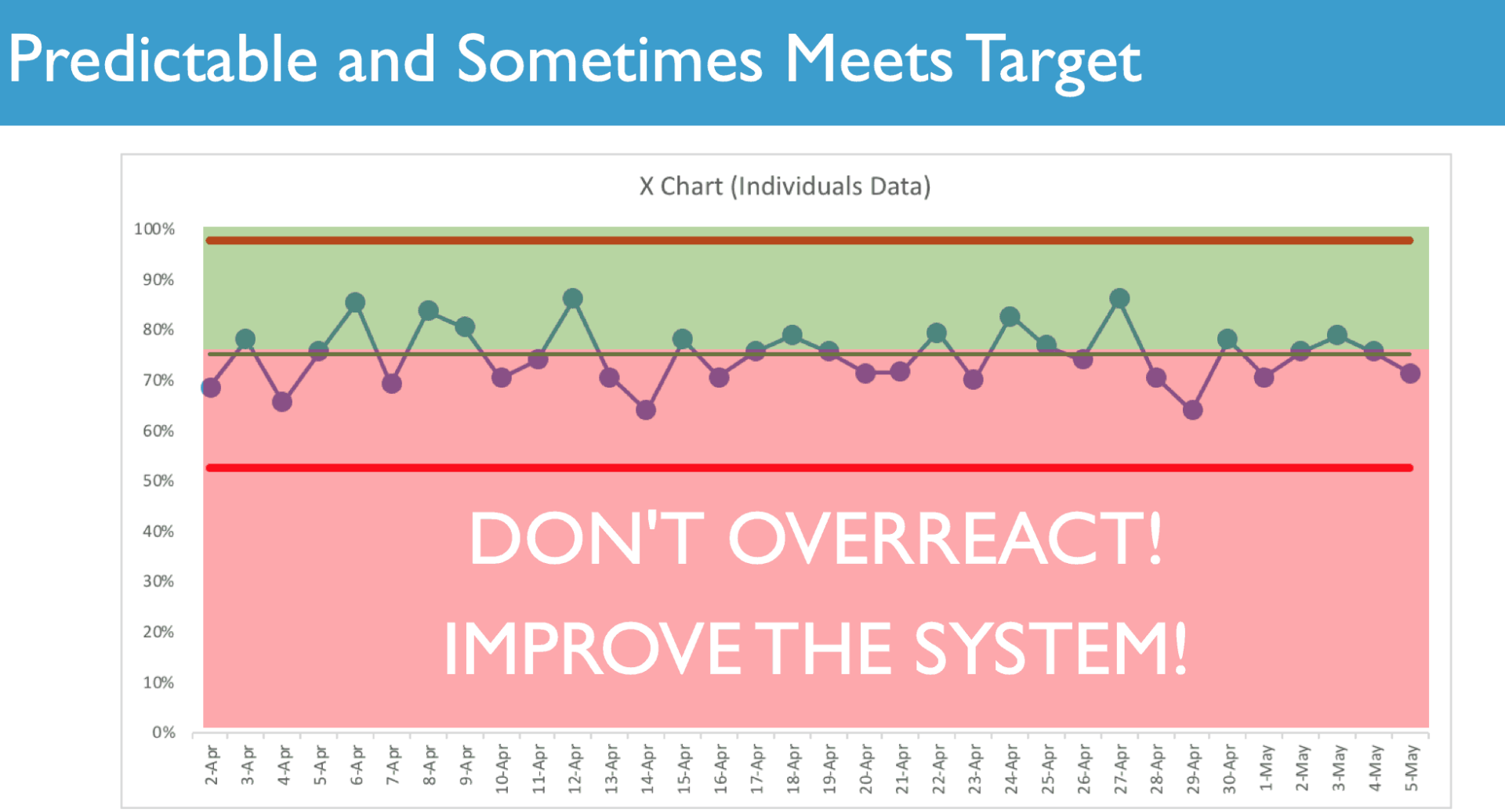
And here's an example of an improved system where the average and the natural process limits have been shifted in a good way… (an example from the book):
And better yet, from another example, here's a chart that's predictably ALWAYS going to be in the green because the new lower natural process limit is right at the target or goal:
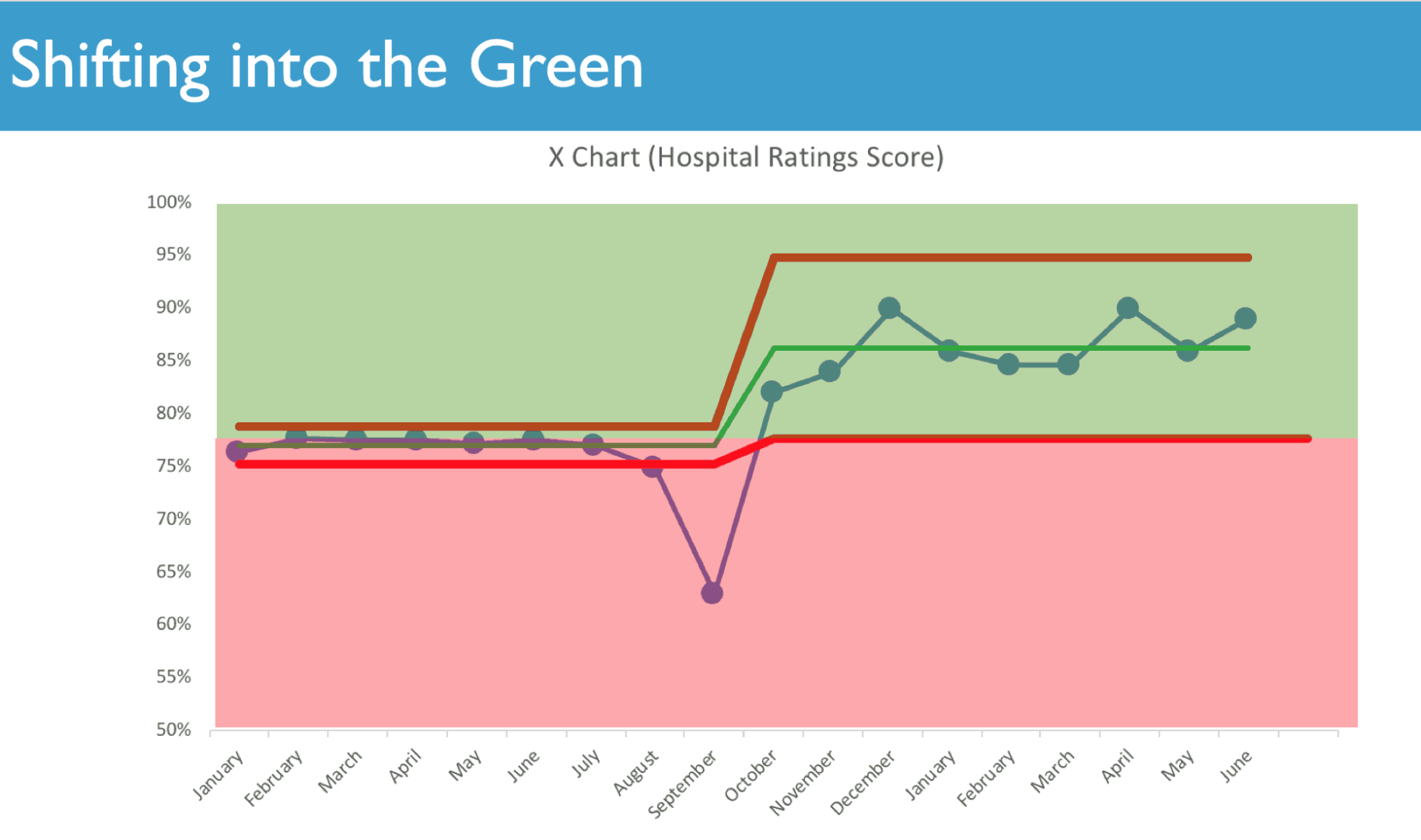
Either way, I hope you're convinced that charts are a better visualization than tables of numbers. Red or green matters… we charts tell us more than looking at the most recent data point does.
You can learn more in my book or the webinars that I've done on the subject (including the fun webinar I'm doing on Halloween).
What do you think? I've heard a lot of stories from readers of my book about how they are incorporating Process Behavior Charts
Please scroll down (or click) to post a comment. Connect with me on LinkedIn.
Let’s work together to build a culture of continuous improvement and psychological safety. If you're a leader looking to create lasting change—not just projects—I help organizations:
- Engage people at all levels in sustainable improvement
- Shift from fear of mistakes to learning from them
- Apply Lean thinking in practical, people-centered ways
Interested in coaching or a keynote talk? Let’s start a conversation.


There are two different discussion threads on LinkedIn, one on my post and another started by Kevin Meyer:
and Kevin’s post, which I can’t embed apparently.
My issue wouldn’t necessarily be with the use of RYG vs a control chart. Because either way, you’re probably not going to find root cause of poor HEDIS performance. I typically haven’t seen strong enough correlations between BPA compliance and HEDIS screening rates. So if you’re using a primary metric that’s not predictive of your desired outcome performance, visualization doesn’t really matter as much.
And where BPA is a driver, you tend not to see it if your viewing it as a homogenous population. You’re only going to see drivers if you’re segmenting your data (by payor type, demographic, specialty, etc ). I worked with a hospital that struggled with Prenatal Screening performance even with a high BPA rate. Turns out that the BPA was firing if there was a positive pregnancy test in primary care and Ob/Gyn, but NOT when it was ordered in Peds. So a 13 yr old girl whose pediatrician found out she was pregnant wasn’t immediately scheduled with a prenatal appointment. I’ve seen similar issues HEDIS performance drivers by race, insurance type, and a few other factors that would never been seen unless you’re segmenting data appropriately (ie does it matter if your HbA1C screening is in the 90th percentile if your African American patients are in the 25th percentile; and how would you know just by looking at the data above?).
So run regressions to make sure you have the right metrics. Then bring in SMEs to identify the right way the stratify your data. Otherwise you’re just creating pretty wallpaper.
Thanks, Robert. That’s why “what” to measure is a very important question. I’ll defer to domain experts about that question. I’m more qualified to speak to how we visualize a metric and how we respond to changes (or the lack thereof) in a metric.
Applying Process Behavior Charts to the wrong metrics isn’t going to help, I agree.
Even a hand-drawn Run Chart would show variation and trends better than a list of numbers. I don’t mean to imply that spreadsheets are the only way or the best way to do this…
Yeah, I go back and forth on things like the. Assuming you have actionable metrics (hardly ever a safe assumption), being able to visualise variation and trends is always better. But at the same time, you still have to meet the teams where they are. Some teams just don’t “get” graphs. If RYG is more accessible to them and they can take ownership of it every day, it can be a great place to start (and incrementally introduce more mature tools and concepts). Kamishibai boards can accomplish the same thing. You won’t see trends, but they can provide an actionable snapshot of daily performance.
I dunno, I’ve never seen a team not be able to “get” graphs. Does anybody ever “get” a list of numbers?
Is the goal “accessibility” or teaching people a better way to improve?
The problem is when “actionable” leads to wasted motion (“explain that red data point!”) that doesn’t lead to improvement. It feels good, but doesn’t help.
Great post, thanks. Organizations will improve results if they adopt this systemic view of results.
Thanks, John.
That was an amazing article. Thanks for sharing !