


This content originally appeared in a post about my Halloween metrics webinar, but I decided to carve it out (not like a pumpkin) into its own post.
I've been getting a lot of nice comments from readers who are finding my book Measures of Success to be very helpful.
One Lean consultant from Australia wrote:
“I have been ‘control charting' like a mad man since reading your book which has enabled me to provide some great insight to a couple of my clients.
It's been a while since my statistics and six sigma days and so it's been like reacquainting with an old friend.”
If you're using Process Behavior Charts (aka “control charts”), I'd love to hear your stories… you can contact me here.
One person wrote:
Thank you so much for a great book Mark!
(Actually it's ANOTHER great book, Lean Hospitals is also on my top 5 books on lean).
My previous experience is in healthcare but I recently started working with process improvement at a credit union. In addition to that, I'm on the board for a non-profit organization.
I have a question about financial statements I would like to hear your perspective on:
The way I see it, financial statements are ultimately a reflection of processes, and since there is natural (common cause) variation in every process, wouldn't you expect the same in a financial statement? In financial statements, we are putting a lot of analysis into what is basically a single data point and, at most, we are comparing to last year's / month's financials (and that two data point comparison is a big no-no in process improvement).
Should we be using financial statements in that way or is there a better approach given our knowledge about different types of variation? Or am I completely off track?
Thanks Mark!
Yes, I think it's a good use of Process Behavior Charts to look and ask the three key questions that I pose in my book:
- Are we achieving our target or goal?
- Are we improving?
- How do we improve?
We can ask if our revenue numbers, or profit, or any other financial measure appears to be a “predictable system.” Do we see evidence of any signals that show the system has changed? I agree with the reader who realizes that there might not be a good explanation for every up and down in a metric if that variation represents “noise” in the system.”
Process Behavior Charts are, of course, our tool and methodology that helps us detect signals… separating signal from noise so we can react less, lead better, and improve more.
I shared an example in Measures of Success where I created a Process Behavior Chart to look at monthly revenue for a local wine bar that my wife and I had once considered purchasing in Texas.
Here is the “X Chart” (showing the data) and the “Moving Range Chart” (showing the point-to-point variation) from that data (click here to learn more about how to calculate the limits for these charts) or you can find this in the Appendix of my book:
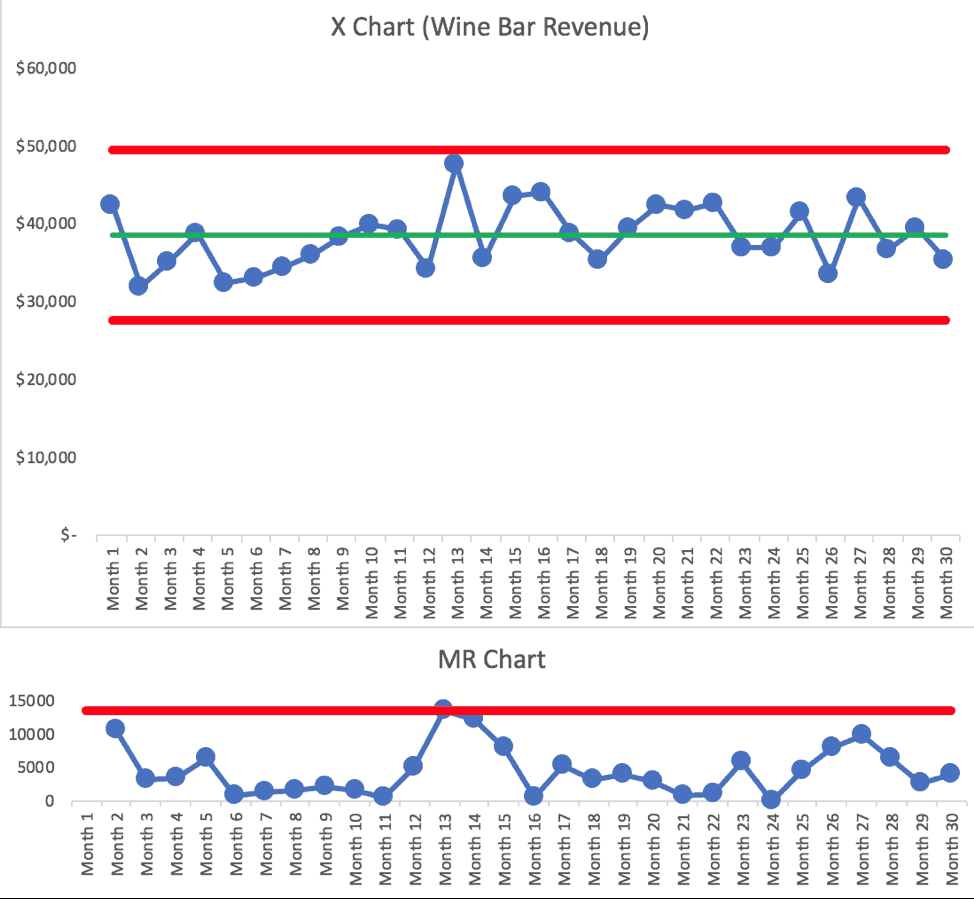
From the book:
“Looking at the X Chart for revenue, we don't see any signals. It appears that the wine bar system, as a predictable system, could be expected to produce anywhere between the Natural Process Limits of $27,615 and $49,588 each month, with average revenue of $38,601.
Looking at the MR Chart, there is a Rule 1 signal in Month 13, where the MR value is slightly above the Upper Range Limit. This is a case where the MR Chart detects a signal that is not visible by using the X Chart alone.
I asked the owner if he knew why revenue had fluctuated more in Months 12, 13, and 14 (going up more than usual and then going back down immediately). He didn't know. The manager couldn't point to anything and it didn't appear to be due to seasonality.
The PBC tells us that, most likely, something was different in that time frame. It's hard to have a good recollection looking back 18 months, which is one reason why it's important to use PBCs for real-time management, not just as a retrospective analysis tool.
We decided, for a number of reasons, to not purchase the business. Had we bought the bar, I would have taught the manager how to use PBCs to look at some key monthly, weekly, and daily metrics. I would have reinforced the importance of not reacting to or explaining every up and down in the metrics. We wouldn't have wasted time on root cause analysis when no signals were present.”
Are you using Process Behavior Charts to look for signals in high-level business data?
Please scroll down (or click) to post a comment. Connect with me on LinkedIn.
Let’s work together to build a culture of continuous improvement and psychological safety. If you're a leader looking to create lasting change—not just projects—I help organizations:
- Engage people at all levels in sustainable improvement
- Shift from fear of mistakes to learning from them
- Apply Lean thinking in practical, people-centered ways
Interested in coaching or a keynote talk? Let’s start a conversation.


Mark,
This is exactly what I have been looking for. I’m a practice Manager for a behavioral health agency, which is still in it’s infancy of using data to guide business decisions and process improvement. We had one month in which visits and revenue were down as compared to previous month and same time during the prior year, and the knee-jerk reaction by the CEO was to lay people off, which unfortunately is a continuous cycle here. I have minimal LSS experience and have never thought about applying control charts to financial statements. This was perfect timing. Thanks
Thanks for your comment, Joe. I’m glad this was helpful.
Making the charts is relatively easy. What’s much more difficult is helping change behaviors and mindsets… I hope you can help temper the knee-jerk reactions from the CEO. Hopefully, the visualization of a Process Behavior Chart is helpful. Feel free to reach out privately if you want help or coaching with this.
I think I recall this from Wheeler’s book, and I wonder if you talk about it in your: Often financial statements are in comparison to a previous period. Does it make sense to do PHB charts based on delta from the previous (like) period, instead of raw numbers? This assumes that there _is_ a trend. If the period-to-period changes average around zero, then there is no point.
Or maybe the “voice of the customer” is that they _want_ a 2% year-on-year growth rate… But that the system itself gives very different signals.
I think it requires less “mental gymnastics” to plot the actual profit number as a Process Behavior Chart instead of plotting a change or a percentage change. I have one example though, where plotting “net change in members” for an organization (which could, of course, be positive or negative) provides more insight than plotting “new members joined” and “memberships canceled” in two different charts.
A chart with many data points provides so much more context over a two data-point comparison, as Wheeler and I write about. Sales are up compared to last month. That’s good? But sales are down compared to the same month last year. That’s bad? It could all be “noise” in the metric and a Process Behavior Chart tells us that.
Hope that helps…
Also, I see MANY business metrics with that two-data point time period comparison. What’s today’s number vs. yesterday? This month’s number vs last month. It’s not just financial statements… it’s a lot of operational metrics.
And you see it in news headlines and stories too. Some number is down 20% from last year… well guess what, it had previously fluctuated up 20% from the year before. The media talks about “noise” data points as if there’s a special cause. Look at how small changes in the daily stock indices get analyzed. The Dow was down 3.8 points today (which is nothing)… all the talk about “why?” There’s no single cause, no special cause… it just breeds confusion instead of insight.