


The average NFL score is around 44-46 total points per game — but that number hasn't always been stable. Has scoring truly surged, or are fans reacting to short-term noise?
TL;DR: NFL scoring trends reveal a real system shift–not just year-to-year noise. Process Behavior Charts show when increases are meaningful signals versus normal variation, a discipline leaders can apply to avoid overreacting to business metrics.
2026 context: While the 2020 season produced a clear statistical signal, scoring through the 2024 and 2025 seasons shows regression toward a higher long-term average–not a continued surge. NFL scoring didn't “keep exploding”; it stabilized at a new level. That distinction is critical for how leaders interpret metrics in any system.
Key takeaway for leaders: a signal doesn't mean permanent acceleration. It often means the system changed–and then stabilized.
What Is the Average Score of an NFL Game?
The average NFL game score is about 44-46 total points per game, meaning the typical final score might look like:
- 27-17
- 35-10
- 24-20
On a per-team basis, the league average is roughly 22-23 points per team per game, depending on the season.
Scoring spiked in 2020 but has since stabilized at a slightly higher long-term average.
2025 Update: While NFL scoring dipped slightly after 2020, long-term data still shows step-changes driven by system shifts–rule changes, pace of play, and offensive strategy–not random year-to-year swings.
I do enjoy watching football, so this headline caught my eye:
“Why Are N.F.L. Scores So High This Season?”
If you know me and my book Measures of Success, you know my first question was:
“Is this a statistically meaningful signal–or just expected variation that looks dramatic in the short term?”
Is NFL Scoring Really Increasing–or Just Fluctuating?
From the article:
“N.F.L. teams have been scoring points at an unprecedented level in the season's opening four weeks, an augmented efficacy that if sustained will rewrite the league's 100-year-old record book.”
That's a long-winded and sophisticated way of saying “scoring is at an all-time high.”
Well, every data set (including business metrics) has a “highest number ever” but that doesn't mean it's a statistical signal worth explaining.
We need more data. We need more context, as Don Wheeler says.
The article continues:
“Through four weeks of the 2020 season, the average combined score of a game is 51.3 points, an increase of 16 percent over the same period a year ago…”
Why Year-to-Year Comparisons Are Misleading
OK, those are facts. The math is right. Is 2020 a signal worth explaining?
Also, as the article does point out, we are only four games into the 2020 season, so it's not “apples to oranges” compared to other seasons (we aren't into the bad weather of early winter when scoring probably drops — I'd want to see the data that confirms that dispels that assumption I am making).
This is exactly the type of situation where leaders often overreact–drawing conclusions before understanding whether early data reflects a system change or normal early-season volatility.
As always, we have to be careful with two-data-point comparisons. Scoring is up 16 percent from the year before. How much does scoring normally fluctuate from season to season? Show me the data! #PlotTheDots, as my NHS England friends say.
The Times adds another two-data-point comparison, saying:
“…roughly 20 percent increase in the average score of games since 2000.”
That's a fact, but is 2020 a signal??
The Times does show a chart (and it's, annoyingly, a column chart when I much prefer a run chart for time series data):
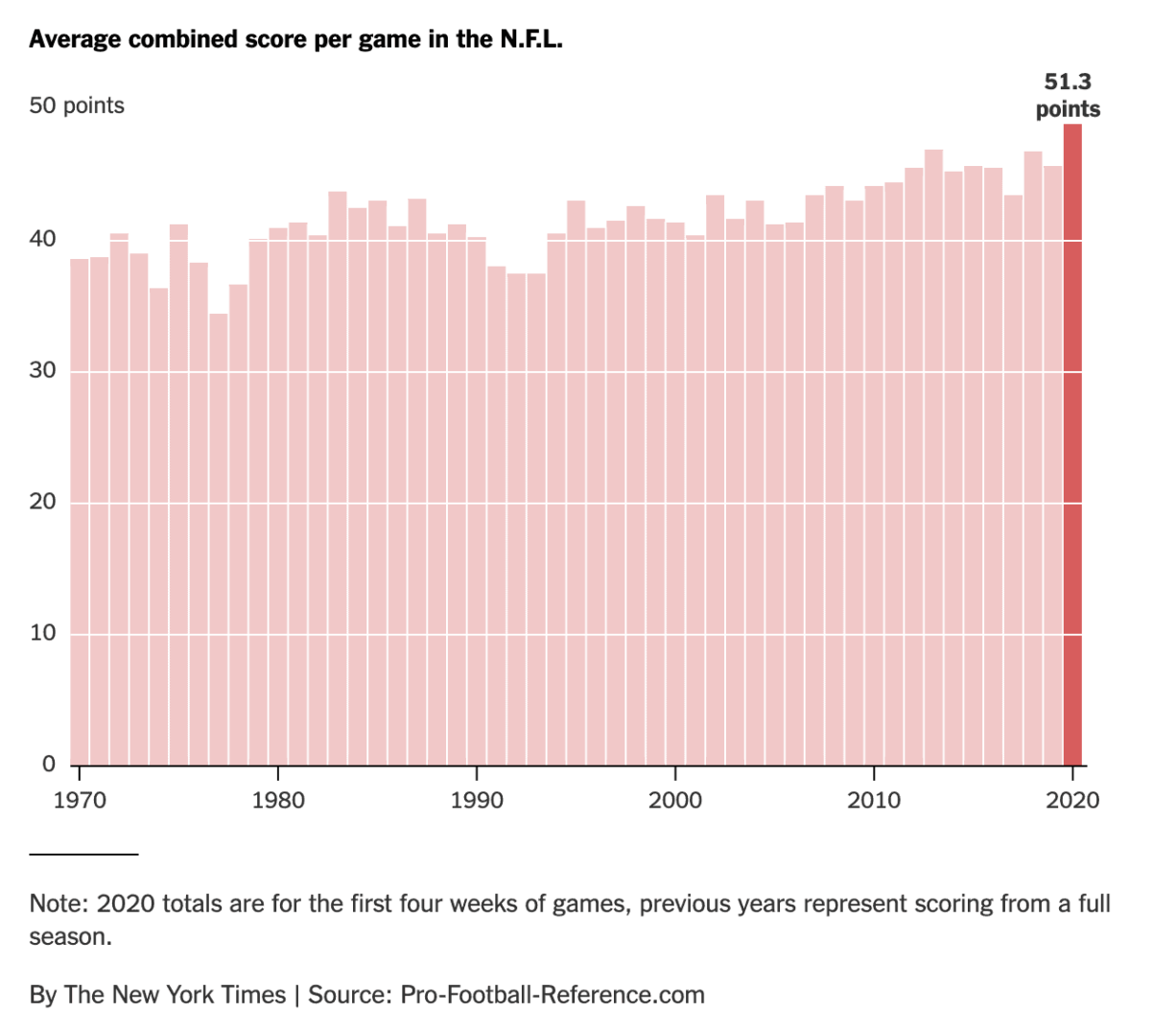
So is that last data point, 51.3 points (for both teams), a statistical signal? It's hard to eyeball it. There does appear to be an upward shift in the scoring of the '70s and '80s.
I also went to pro-football-reference.com, but I started out simply creating a run chart… going back just as far as 1996 to start. 25 years, 25 data points.
Is my chart better than the column chart? I think so. It uses less ink, well that is, if we are still printing newspapers.
How Process Behavior Charts Separate Signal From Noise
What's more helpful is a Process Behavior Chart… where we calculate an average (in green), and two other lines called the lower and upper limits (in red). Learn more about how to do this.
A Process Behavior Chart helps answer a specific question: Has the system changed in a way that makes past performance a poor predictor of the future?
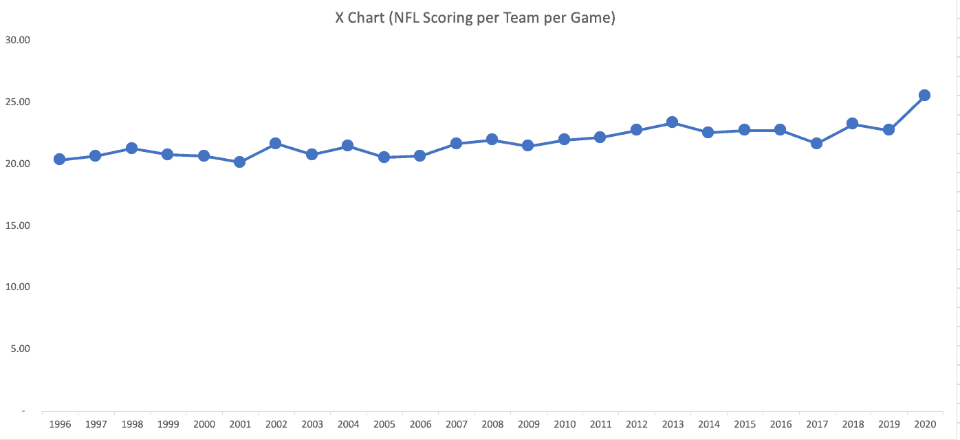
Here is what's called the “X Chart” (not to be confused with the XFL, but it sounds cool like that):
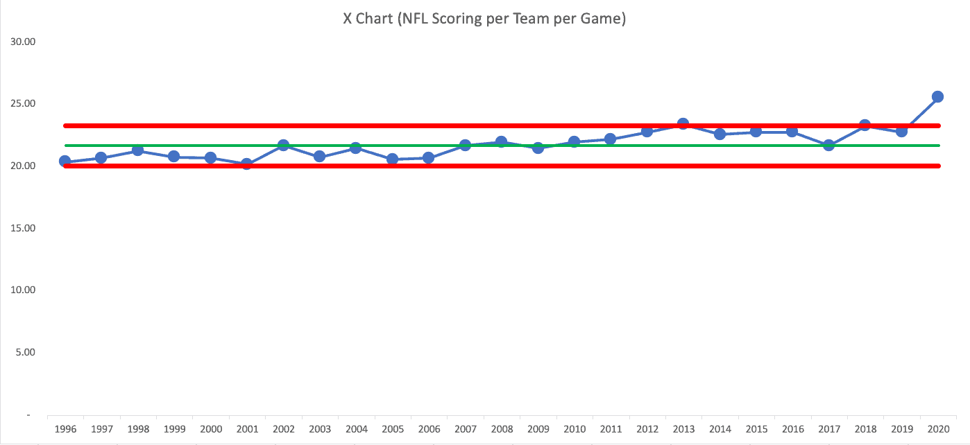
So 2020, so far, IS a signal. Often, when I do this analysis, the data point is within the limits, so I end up writing about how we shouldn't overreact to “noise” in a system or a metric.
Dr. Wheeler outlines a small number of practical rules that help distinguish real system change from noise–rules I explain in detail in Measures of Success:
- Any data point outside the limits
- 8 or more consecutive data points on the same side of the average
- 3 consecutive (or 3 out of 4) data points that are closer to a limit than to the average
We can see that 2013 was also a signal (above the upper limit). I'll change the Y-axis to make some of this easier to see (and be careful to not to make the Y-axis misleading in the workplace):
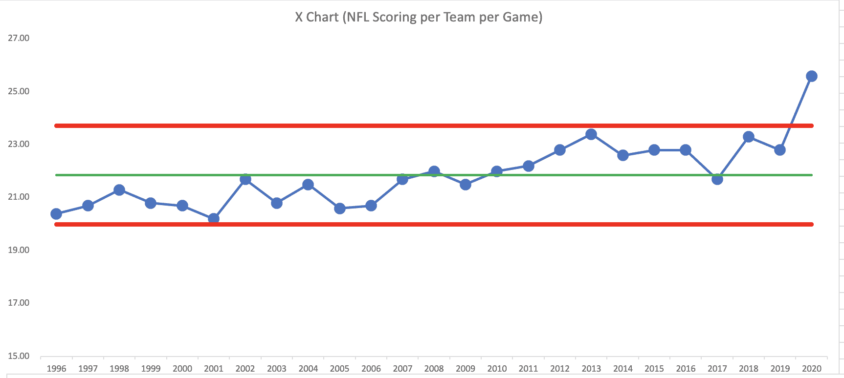
While 2013 was barely above the upper limit (creating the risk that it's a “false positive” signal, 2020 is a very strong signal.
Beyond that, the last three years are a “Rule 3” signal. The upward shift in scoring didn't really start this year.
Look at the totality of this chart… we have many years below the average followed by many years above the average (2017 scoring is 21.7 while the average is 21.71, so technically it's below average, but I think the trend is clear.
There's not a single “system” over time. It looks like two systems and maybe that new system starts in 2010.
When a system changes, combining all the data into one chart can actually hide what's happening.
I can calculate averages and limits for two different time ranges… then the chart looks like this:
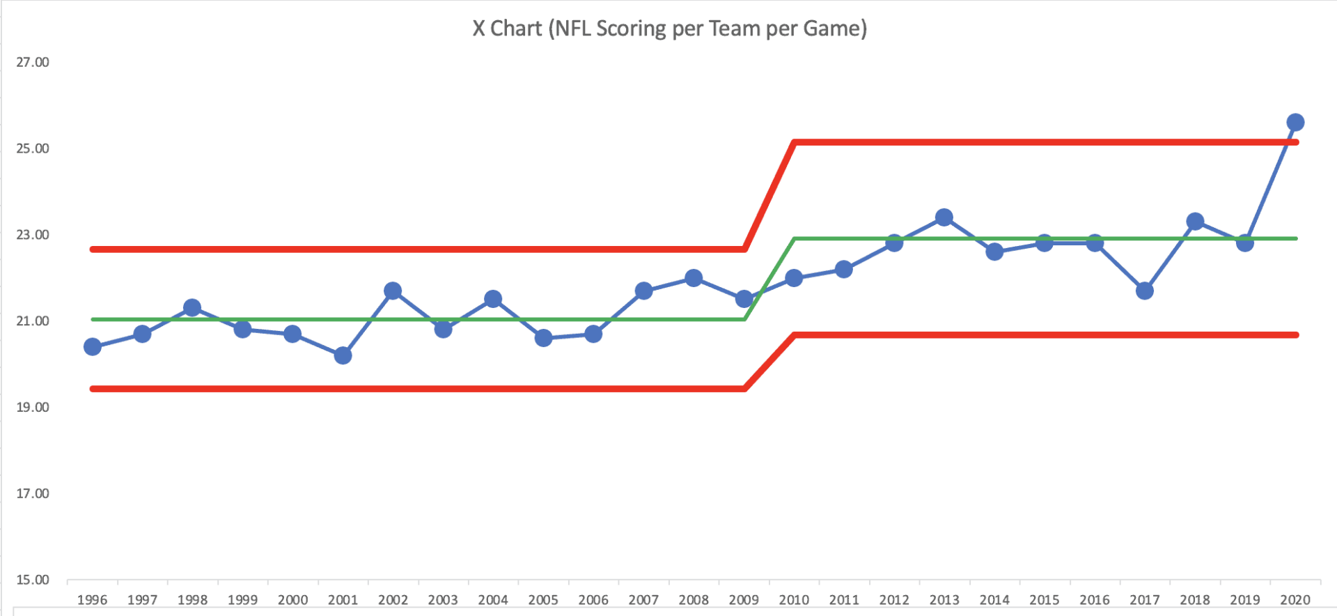
This chart shows how scoring had been fluctuating around an average… then it shifts upward… sort of fluctuating around an average and now 2020 is a signal (and these stats were not including the Monday Night Game).
This is a crucial point. The data suggests a step change in the system–not a gradual upward trend. That means post-2010 scoring should not be evaluated against pre-2010 expectations, just as leaders shouldn't judge today's performance using yesterday's system assumptions.
Had I gone back further in time, we'd likely see additional shifts in scoring — caused by rule changes or other factors.
What Changed in the NFL Scoring System?
A Process Behavior Chart doesn't explain why a change occurred–it simply tells us that the system changed in a statistically meaningful way.
There are many possible reasons for this “signal” — what we would call a “special cause.” As with any business metric, a signal in the Process Behavior Chart tells you the system changed… but it doesn't tell you WHAT changed. You have to figure out the cause-and-effect.
Possible causes of this signal include:
- No fans (or limited fans) reduces some of the home field advantage, so scoring is higher for road teams (we could look at the data on that)
- Lack of a pre-season means that defenses are at a disadvantage compared to offenses
And, from the Times:
“Theories on the cause of the scoring surge have proliferated, including the advantages afforded road teams since they are no longer tormented by raucous home crowds, a curious drop in the number of penalties called and a decline in tackling skills resulting from the cancellation of preseason games.”
I'd say this is all a bit premature, given that we are just four games into the season. A better comparison would be a chart that shows “points per game through the first four weeks of the season.”
These hypotheses are tempting–but the chart reminds us that explanation should follow evidence, not precede it. The signal tells us when to investigate, not what conclusion to reach.
What This Teaches Us About Metrics (Beyond Football)
This is where sports analytics becomes a leadership lesson.
Either way, the point for business metrics is the same… don't react to every up and down in a metric. Look for signals instead of reacting to all of the noise. Don't just compare two data points… instead look for the context that we get from additional data points.
Here is the spreadsheet that I used, via Dropbox.
Late December Update
It's not surprising that scoring has dropped a little bit as we get toward the end of the season… there have been more games with a lot of rain and/or win. The league scoring average is still an all-time high… of 24.8 points per game.
Updating that last chart makes it look like this… the upper limit is now calculated as 24.86. This last data point is now a smidge below that upper limit…
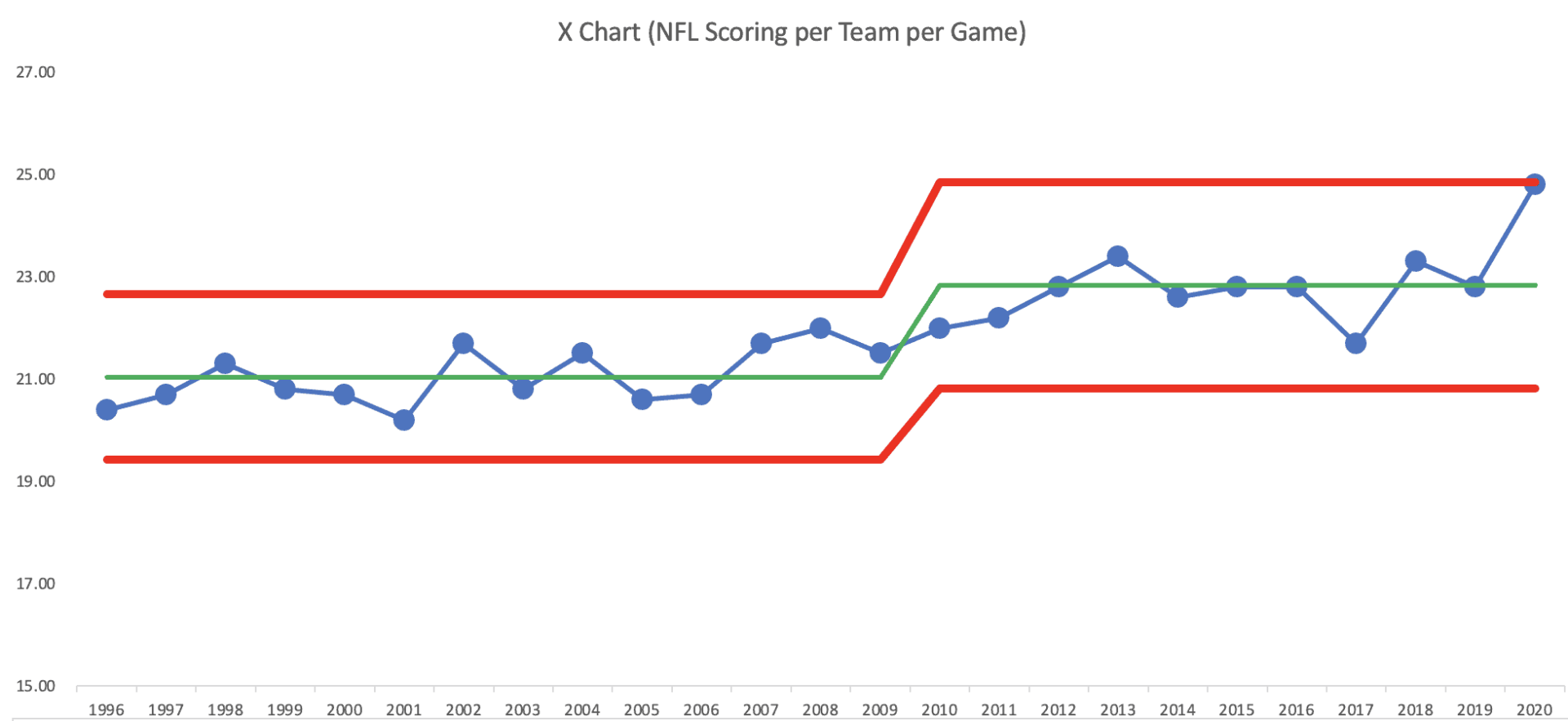
Statistically, it no longer qualifies as a signal–but it remains meaningfully elevated relative to the prior system.
It's technically not a signal, but it's close. It's probably worth examining the question of “what's different this year?” It will be interesting to see if scoring regresses back to that mean next season.
END OF SEASON UPDATE: 24.8 is the final number for the regular season.
2026 Update — Scoring Through the End of 2025
- Here is a Process Behavior Chart showing the full season averages through the end of the current 2025 season. Thanks to Chris Chapman and his PBC Pro tool.

I'd describe NFL scoring as such:
- It was fluctuating around an average of about 21 points per game through 2007
- It then started fluctuating around a higher average of about 22.7
- The 2020 season was an outlier (or “signal') because scoring was above the upper limit
- Scoring regressed to the mean and is still fluctuating around that average
The key takeaway: the system changed, then stabilized. Leaders who kept reacting as if scoring would keep rising would have been responding to noise–not learning from the system.
It seems quite likely that the 2020 scoring was an outlier — maybe because of the lack of racuous home fans in some stadiums?
Conclusion for Executives: What This Means for Business Metrics
What the NFL scoring data ultimately shows isn't something unique to sports–it's a leadership lesson about how we interpret metrics and how we respond to them.
Too many organizations react to every uptick or downturn as if it demands an explanation, a meeting, or a corrective action. That behavior creates noise, distraction, and frustration. Worse, it teaches people that metrics are something to fear or defend, rather than a tool for learning.
Process Behavior Charts offer leaders a better alternative. They help answer a crucial first question before any action is taken:
Has the system actually changed–or are we just seeing routine variation?
When leaders learn to separate signal from noise:
- They stop chasing explanations for normal fluctuation
- They focus improvement efforts where change is real and meaningful
- They create more psychological safety by reducing blame-driven reactions
- They make better strategic decisions using data with context
That's the core message of my book, Measures of Success: React Less, Lead Better, Improve More. The goal isn't statistical perfection. The goal is better leadership behavior around metrics–fewer knee-jerk reactions, better questions, and more effective improvement.
If you're an executive who wants metrics that inform decisions instead of driving overreaction, I work with leadership teams to:
- Redesign how performance data is displayed and discussed
- Coach leaders on how to respond to variation constructively
- Apply Process Behavior Charts to real business, healthcare, and operational data
- Build a culture where metrics support learning, not fear
If you'd like help making your organization's data more useful–and less stressful–I'd remind you that the real opportunity isn't better charts. It's better conversations and better decisions, supported by the right analysis.
Frequently Asked Questions About NFL Scoring and Statistical Trends
Why are NFL scores so high recently?
NFL scoring increased due to rule changes, offensive strategy shifts, and temporary factors such as reduced preseason play in 2020. However, data shows scoring stabilized at a higher long-term average rather than continuing to rise indefinitely.
Is NFL scoring still increasing?
No. While there was a significant spike in 2020, scoring has since stabilized around a higher average. The data suggests a system shift followed by normal variation within that new range.
What is the average NFL game score?
The average combined score of an NFL game is typically between 44 and 46 total points. That number fluctuates slightly year to year but usually stays within a predictable range.
How can you tell if scoring changes are meaningful?
Statistical tools such as Process Behavior Charts help determine whether a change is a real signal or just normal variation. A signal indicates the system has changed in a meaningful way.
What is a Process Behavior Chart?
A Process Behavior Chart is a time-series chart with an average and calculated limits that show expected variation. It helps distinguish real system changes from routine fluctuations.
What can business leaders learn from NFL scoring trends?
Leaders can learn to avoid overreacting to short-term metric changes. Looking at data over time helps determine whether performance shifts reflect meaningful change or normal variation.
Why shouldn't leaders react to every metric change?
Most metric changes represent noise, not system shifts. Reacting to normal variation wastes time and can create blame or instability. Leaders should respond only when data shows a true signal.
My book Measures of Success walks through this step-by-step, using practical examples that leaders can apply immediately.


Hello Mark,
This post really caught my eye since I love football. I also have realized how much more the total score has gone up. I feel like the major factor to this is the no fans. This takes away from a home and an away game feeling and gives the away team an advantage to other years. By looking at the charts you have made it looks like scoring has been slowly increasing over the course of the past 20 years but nothing compared to this year. Could 2020 be an outlier due to the change in atmosphere at the stadiums. Im curious to see what these stats compare to 2021 and to see if fans really have such a big impact.
The signal could be caused by “lack of fans” — but we’d have to run the data to see if road team scoring is higher this year and if that’s a statistical signal. There are also some NFL stadiums with some fans and some with no fans. We could run the numbers to make comparisons.
Thanks for sharing the data, it’s fun to use real-life sports examples to explain concepts. Since there appears to be a general upward trend, I created a control chart on a trend. Trend line is 7% increase each year, and it seems to fit pretty well. Image is in the website link (https://www.biz-pi.com/wp-content/uploads/2020/10/NFL_Scores_By_Year.jpg)
If this season continues, it does look like it might be an outlier, and those reasons seem likely. Might be interesting to validate some of these ideas around home/away, crowd sizes, missed tackles, etc at the end of the season.
1977 might also be an outlier, so I wonder if anything changed much that season. They did change the rules in 1978 to open up the offense, but I wonder if they were responding to an outlier or just noise…
Thanks, Brion, for making the linear increase PBC. There are still signals, as shown here:
So it’s still not a “predictable” increase — there are signals over that timeframe… and 2020 is (so far) a signal. But of what?
For comparison, here is the “horizontal” traditional PBC that I made going back to 1970:
Both charts show a signal (a shift upward) starting in 1979… the two charts tell pretty much the same story, but the traditional PBC method is certainly easier and less time consuming.
My math was wrong. Not 7% rate of increase. About 0.3% increase each year on the trend. I think you’re right, stages seem like a better way of displaying the chart, which likely corresponds with rule changes or changes in offensive or defensive schemes, not a gradual change over time. And your standard PBC is definitely easier to create!
Hi Mark. This is a really fascinating approach to an ever-changing situation. I saw these statistics on social media recently, and I’m glad you were able to break it down and make more sense of it with an analytical approach. The general prevailing theory I personally have seen is that Covid has impacted defenses much more than offenses, potentially resulting from the lack of film on opposing offenses. I would predict as the teams play more games and offenses show more plays, the defenses will respond. I am really interested in seeing this play out and potentially being revisited after week 17.
Hello Mark,
This article caught my attention because I am a big New England sports fan. Sports have definitely been different this year, and I do believe this change has definitely affected the scoring since there was a shortened preseason, practices changed, lack of fans and there is no home-field advantage. The charts show that scoring has slowly been increasing over the years, but not as dramatic as this year’s jump. But, is this year just an outlier because of the new COVID guidelines, or are scoring numbers slowly rising? There are still many questions surrounding this topic, but I feel as though only time will tell.
After 8 weeks, the NFL per-team–per-game scoring average is 25.2, compared to 25.6 earlier in the season… still a signal above the Upper Limit.