Why Process Behavior Charts Reveal KPI Insights That Bar Charts and Color Codes Miss

319
0

tl;dr Color codes and bar charts answer “Are we hitting the target?” but not “Are we improving?” or “How do we improve?” Process Behavior Charts reveal true signals in the data so leaders stop overreacting to noise and start improving the system.

Are Your Charts Leading You to the Wrong Conclusions?

Data is everywhere in today's organizations, but are we using it in the most effective way? Many businesses rely on traditional bar charts and color-coded dashboards to monitor their performance. But what if these visuals are giving us a false sense of security–or worse, distracting us from real opportunities for improvement?

During a recent visit to an organization, I encountered charts that looked helpful at first glance but were, in fact, misleading. While they had good intentions, their approach made it difficult to see what was really happening with their processes. Let's dive into why these common metrics fall short and explore a better way to visualize data for true continuous improvement.

That organization had a mix of business metrics posted, all in this sort of format–column charts:

An image shows four separate color-coded column charts arranged in a two-by-two grid. Each chart displays monthly performance data from July 2023 through June 2024 using vertical bars that shift between green, yellow, and red based on preset thresholds. All four charts compress the data vertically, making month-to-month differences appear small.

The top-left chart shows values mostly in the low to mid-90s, with bars alternating between green and yellow depending on the goal cutoff. The top-right chart shows similar uniform yellow bars in the high-80s to low-90s range, offering little visual distinction across months.

The bottom-left chart includes several red bars among mostly yellow bars, with values dropping briefly in the low-80s before returning to the high-80s and mid-90s. The bottom-right chart shows one green bar in July 2023 followed by a series of yellow bars that gradually decline from the high-80s into the low-80s.

Across all four charts, the heavy use of color coding emphasizes arbitrary thresholds rather than actual variation, and the equal-height y-axis scales obscure meaningful patterns or signals in the data.

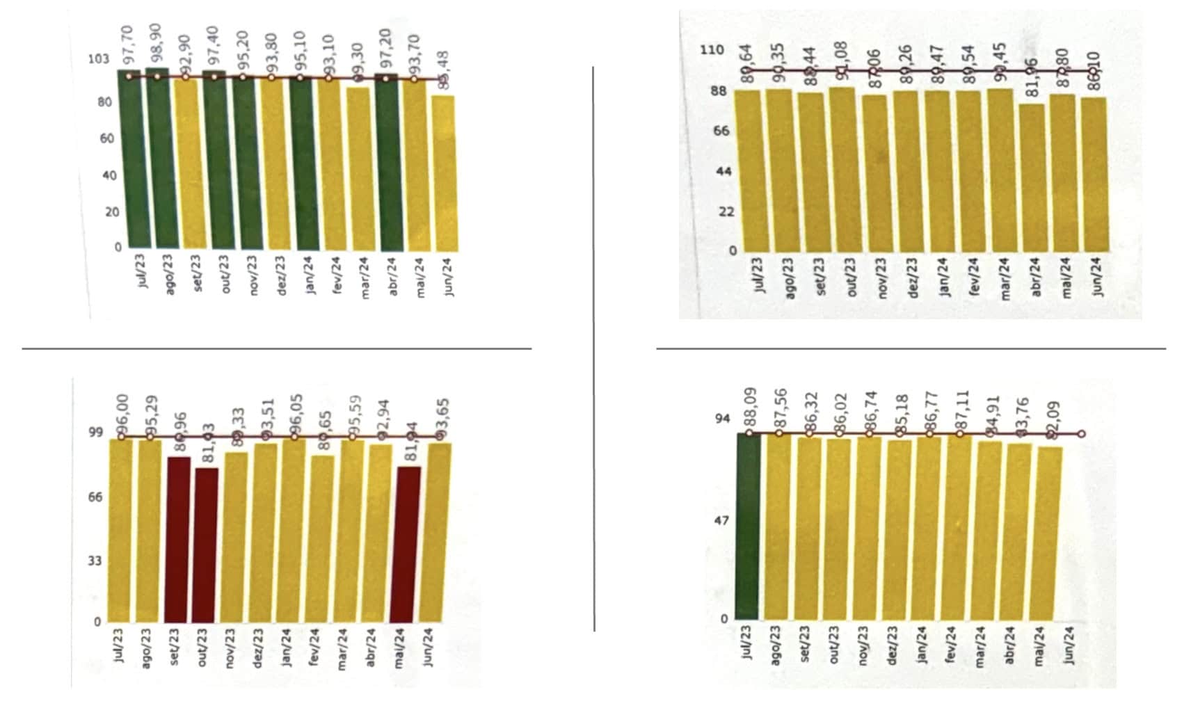
I do appreciate that they were looking at 12 data points. That's better than unhelpful two-data-point comparisons. And I like that they show a rolling 12 months period (instead of starting a new calendar year with a blank chart, which is also pretty unhelpful and unnecessary).

They're relying on color coding (red, yellow, or green) to illustrate how the process is performance against goals. That's one way to look at a process over time, but the goals and thresholds for those goals are quite literally arbitrary.

As I teach in my Measures of Success workshops (and the book), we need to answer three key questions about each of our Key Performance Indicators:

  1. Are we achieving our target or goal?
  2. Are we improving?
  3. How do we improve?

Color coding only answers the first question. It's hard to answer the other two with the column charts, if not impossible.

What else do I dislike about those charts?

For one, I think line charts (a.k.a run charts) are better for time series data than bar charts (a.k.a column charts). I remember an expert in data visualization saying that column charts are bad because your eye is drawn to the middle of the column, where the real data point is the top of the column. So it can be visually misleading.

Secondly, with the y-axis scale going from zero to 100, the differences in month-to-month performance are compressed (or squooshed together).

Those issues are all addressed with Process Behavior Charts, as shown below.

Using Process Behavior Charts

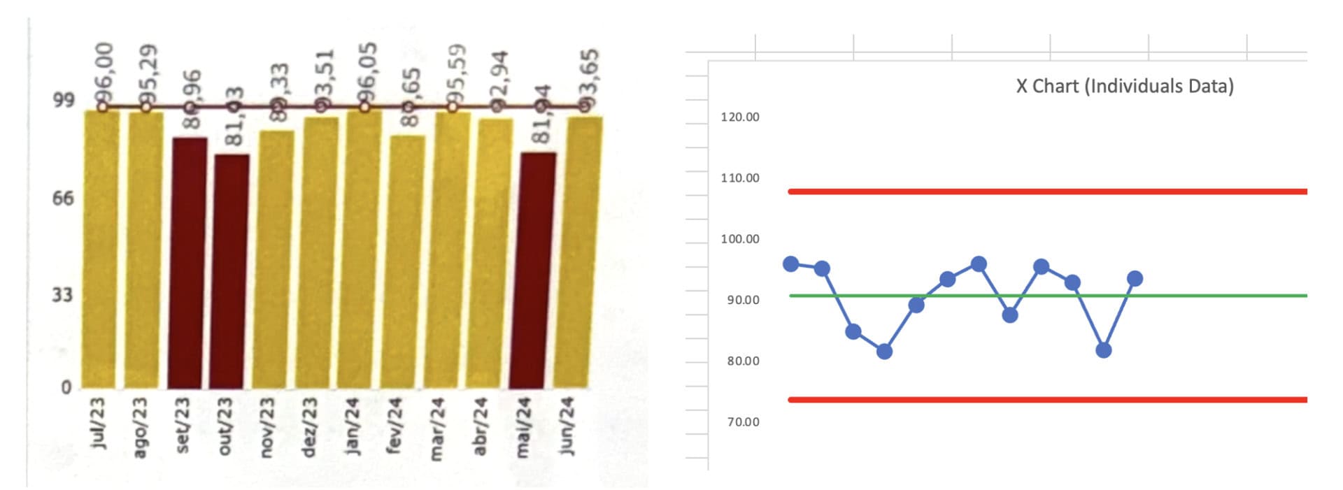
Here's the first chart compared to a PBC that I created with my free Excel template:

The image shows two charts side by side. On the left is a color-coded column chart displaying monthly performance values from July 2023 through June 2024. Each vertical bar is colored green, yellow, or orange based on target thresholds. The numbers printed above the bars range roughly from the high 80s to the high 90s. Because the y-axis begins at zero and extends to just over 100, the month-to-month differences appear small, and the color coding draws attention to goal categories rather than actual variation in the data.

On the right is a Process Behavior Chart (X Chart) showing the same data as individual points connected by a line. A horizontal green line marks the average, and two red lines show the upper and lower natural process limits. Unlike the column chart, the PBC makes the underlying pattern more visible: the values fluctuate around a stable average with no points outside the limits and no signs of a meaningful trend or shift. The chart shows that performance is stable and that none of the small ups and downs represent a statistically significant change.

Together, the two charts illustrate how color-coded bar charts can obscure the true behavior of a metric, while a Process Behavior Chart provides clearer insight into variation and system performance.

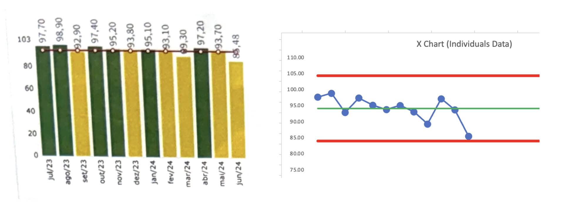
We could answer the first question about how performance compares to the goals if we overlaid color coding.

The PBC helps answer the second and third questions.

Are we improving? No. Performance is fluctuating around an average that seems stable over these 12 months. And the difference between “green” and “yellow” performance is not statistically meaningful. We shouldn't demand a root cause analysis for the yellow data points.

How do we improve? That last data point is near the calculated Lower Limit (see my blog post about how the math works). We don't see any “signals” in the chart based on the three key rules:

  1. Any data point outside the limits
  2. 8 or more consecutive data points on the same side of the average
  3. 3 of 3 or (3 of 4) consecutive data points that are closer to the limit than they are to the average

How do we improve? Not by asking for an explanation for any of those data points. There no statistically-meaningful “trend” (and I wouldn't use a linear trend line calculation).

We improve by asking how we can improve the system that generates those metrics — how can we do so systemically? That means understanding the system (and studying the way the work is done), to look for opportunities to improve.

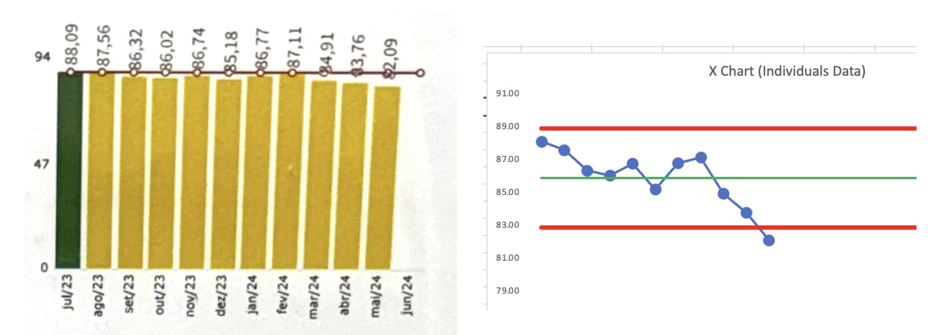
Here's a second PBC with its column chart:

The image contains two charts placed side by side. On the left is a color-coded column chart showing monthly performance data from July 2023 through June 2024. Each bar is shaded yellow or red depending on how the value compares to preset goal thresholds. The numbers printed above the bars range from the low 80s to mid-90s. Several bars, particularly in September and October 2023 and May 2024, are shown in red, suggesting poor performance based solely on the goal cutoffs. The rest of the bars are yellow, giving the impression of unstable or inconsistent performance.

On the right is a Process Behavior Chart, or X Chart, displaying the exact same data over the same time period. Individual data points are plotted as blue dots connected by a line. A horizontal green line marks the calculated average, and two red horizontal lines represent the upper and lower natural process limits. All points fall within the limits, and no runs or patterns signal a meaningful change in the system. In contrast to the left chart, the X Chart shows a stable process fluctuating around an average in the low 90s, with no statistical evidence that any single point--red or not--reflects an actual shift in performance.

The comparison highlights how color-coded bar charts emphasize arbitrary goal thresholds and can falsely indicate problems, while a Process Behavior Chart reveals whether the system is truly stable or changing.

This chart shows, again, that performance is fluctuating around a stable average. We see no signals, only noise. The difference between yellow and red is not statistically meaningful for this metric.

It would be a mistake (a waste of time) to use a single red data point to trigger an A3 or such. Even a rule of thumb like “do a root cause analysis if you have two reds in a row” is not a statistically-valid rule or approach.

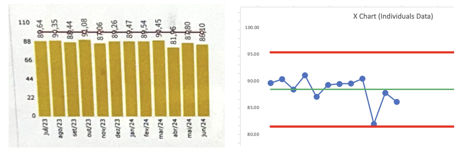
Here is the third chart:

We see a clear signal in the last data point, as it's below the calculated Lower Limit. THAT is a data point worth reacting to. Why did performance get worse? Do we understand the cause? If so, how do we eliminate the cause and put performance back to where it had been, if not better?

The image contains two charts shown side by side. On the left is a color-coded column chart with monthly performance data from July 2023 through June 2024. The columns are mostly yellow, with one green bar in July 2023. The numerical values shown above the bars range from the low 80s to high 80s. Each bar appears nearly the same height because the y-axis begins at zero and extends up to roughly 94, compressing the visual differences between months. The consistent yellow coloring suggests that performance is below a preferred threshold, but the chart offers no insight into whether the process is stable, improving, or declining over time.

On the right is a Process Behavior Chart (X Chart) of the same data. Each monthly value is plotted as a blue dot connected by a line. A horizontal green line represents the calculated average, and two red lines mark the upper and lower natural process limits. The chart reveals meaningful detail that the bar chart hides: performance fluctuates around an average in the mid-80s, with no points outside the limits for most of the period. Toward the end of the chart, the last data point approaches--and nearly touches--the lower limit, suggesting the beginning of a potential signal or noteworthy change.

The comparison shows how the bar chart obscures variation and compresses differences, while the Process Behavior Chart highlights system behavior and makes emerging patterns easier to detect.

The column chart suffers from the difference between data points being tightly compressed. The column chart doesn't clearly show the last data point as being an outlier. The PBC makes this clear — the visual depiction combined with the math that decides the lower limit is about 83.

The time to react is not the difference between the first data point (green) and the second (yellow). The difference between green and yellow is arbitrary. The difference with that last yellow data point is statistically meaningful. Again, that's a signal and a time to react, investigate, and improve.

And the fourth:

The image displays two charts side by side. On the left is a yellow color-coded column chart covering monthly performance from July 2023 to June 2024. Each bar is nearly the same height, with values printed above ranging from about 86 to 99. All columns are yellow, indicating performance below a target threshold, but the chart's y-axis ranges from zero to roughly 110, which compresses the month-to-month differences and makes the visual pattern appear flat and uninformative. The chart suggests underperformance but provides no visibility into variation or whether the system is changing.

On the right is a Process Behavior Chart (X Chart) showing the same data points plotted as blue dots connected by a line. A green horizontal line marks the calculated average, and two red horizontal lines show the upper and lower natural process limits. The data fluctuate around the average in the upper 80s and low 90s. One point in April 2024 falls sharply toward the lower limit, standing out more clearly than in the bar chart, while the rest of the data remain within normal variation. The PBC reveals that the system is generally stable, with typical ups and downs, and highlights the one potentially meaningful low value that the color-coded bar chart obscures.

The comparison illustrates how the column chart hides useful information by compressing the scale and relying on arbitrary color thresholds, while the Process Behavior Chart makes the actual behavior of the process visible.

This column chart shows that all of the data points are yellow. The PBC shows that the third-to-last data point is “almost” a signal. It might be worth investigating. Investigating that one data point would be better than trying to explain every up-and-down in the data.

Conclusion

If we want to truly drive improvement, we must move beyond simplistic color-coding and arbitrary goal thresholds. The process behavior charts (PBCs) provide the visual clarity and statistical rigor that column charts lack, allowing us to focus on meaningful signals rather than chasing random noise.

By embracing PBCs, we can better understand whether we're improving and, more importantly, how to improve. It's not about reacting to every data point, but rather improving the system that generates those metrics. In the end, meaningful improvement comes from studying the system, not just reacting to arbitrary colors.

Download a free preview of my book, Measures of Success.


Please scroll down (or click) to post a comment. Connect with me on LinkedIn.
If you’re working to build a culture where people feel safe to speak up, solve problems, and improve every day, I’d be glad to help. Let’s talk about how to strengthen Psychological Safety and Continuous Improvement in your organization.

Get New Posts Sent To You

Select list(s):
Previous articleRyan McCormack’s Operational Excellence Mixtape: September 20, 2024
Next articleEmbedding Change Management into your Continuous Improvement Initiatives – Webinar Preview
Mark Graban
Mark Graban is an internationally-recognized consultant, author, and professional speaker, and podcaster with experience in healthcare, manufacturing, and startups. Mark's latest book is The Mistakes That Make Us: Cultivating a Culture of Learning and Innovation, a recipient of the Shingo Publication Award. He is also the author of Measures of Success: React Less, Lead Better, Improve More, Lean Hospitals and Healthcare Kaizen, and the anthology Practicing Lean, previous Shingo recipients. Mark is also a Senior Advisor to the technology company KaiNexus.

LEAVE A REPLY

Please enter your comment!
Please enter your name here