


tl;dr: The “two consecutive reds” rule persists because reacting feels like leadership — but it generates wasted investigations, false success stories, and eroded trust. Process Behavior Charts tell you when variation actually means something changed.
I'm writing about something that costs organizations far more than most people realize: the habit of reacting to “red” data points in workplace metrics. And more specifically, about why the habit persists even though it doesn't work.
Here's a scenario I've watched play out dozens of times:
A team tracks daily or weekly performance on a “bowler chart”. Two data points in a row come in above the target — they turn red. A manager sees the two reds and tells the team to do a root cause analysis. Maybe an A3. The team meets. They struggle to find anything that's actually changed. They either come up empty or land on something that sounds plausible. Nothing meaningful changes in the process. Then… performance drifts back into the green on its own.
The manager congratulates the team for their great improvement work. Maybe celebrates a “downward trend.” Then a single red appears. The manager gets frustrated. Performance drifts back to green again.
Now here's the truly expensive part. The manager walks away believing the investigation worked. The team walks away believing the investigation was pointless. Both beliefs persist. The manager calls the next meeting with more confidence. The team attends with less. And the gap between those two experiences quietly becomes the culture.
The rule behind all of this is easy to state:
“React when you have two consecutive data points that are worse than your target.”
It's simple. It's memorable. And it has no valid statistical basis whatsoever.
A rule of thumb being easy to remember — and easy to execute — doesn't make it valid. Being written and published in books doesn't make it valid.
Why the Rule Survives
The “two reds” rule doesn't persist because people have evaluated it and found it sound. It persists because it solves an emotional problem. When a number turns red, doing nothing feels negligent. When two numbers turn red, doing nothing feels reckless. The rule gives managers permission to act, and acting feels like leadership.
The trouble is that “feels like leadership” and “is leadership” are not the same thing. Reacting to noise looks like attentiveness. Not reacting to noise — because you understand the system well enough to know it's noise — looks like indifference. The second is far harder and far more valuable, but it will never produce a satisfying meeting where someone slaps a table and says “we found it.”
When the system is not perfoming to the target, we can improve the system in decidedly non-reactive ways. Being super reactive wastes time that could be used in more systematic ways.
I'll give the “two reds” approach some credit — it's better than reacting to every single red with a root cause analysis. But “red” just means “worse than the target.” It doesn't mean the data point is a statistical outlier. It doesn't mean the system has changed. It doesn't mean a root cause exists to be found.
If the target happened to be set a little higher, those same data points would be green. Would anyone investigate? Of course not. The data hasn't changed — only the color coding.
The reds could easily be part of the system's normal, expected variation — what statisticians call “common cause” variation. Unfortunately, most managers don't learn about this concept in their MBA or MHA programs, and most senior leaders don't teach it either.
So how do we know whether a data point represents something that actually changed?
Process Behavior Charts Tell You When to Stop and When to Keep Walking
We create a Process Behavior Chart (PBC). These are also known as “control charts” or “Statistical Process Control (SPC) charts.” They were created by Walter Shewhart just over a century ago. That doesn't make them outdated — it makes them well-tested.
Here's a video that shows you how to create the charts, but let's focus first on what they do for you. You can also learn much more in my book Measures of Success (get a free preview).
The most important thing a PBC does is not statistical. It's economic. It tells you where to spend your time.
The “two reds” rule seems easy, but it generates an enormous amount of wasted work — meetings that chase ghosts, corrective actions that correct nothing, celebrations for improvements that didn't happen. A PBC takes more effort to set up, but it pays for itself almost immediately by keeping you from spending hours on problems that don't exist.
Let me walk through a real example.
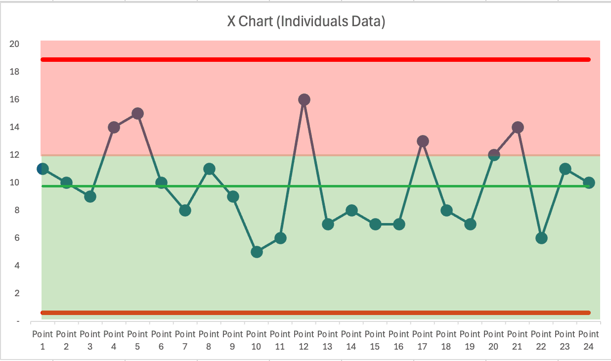
Below is a PBC I created after collecting 24 data points — well after two reds had appeared on the bowler. No root cause analysis was attempted after those two reds. The process kept chugging along and fluctuated pretty consistently around a stable average of 9.75 defects.
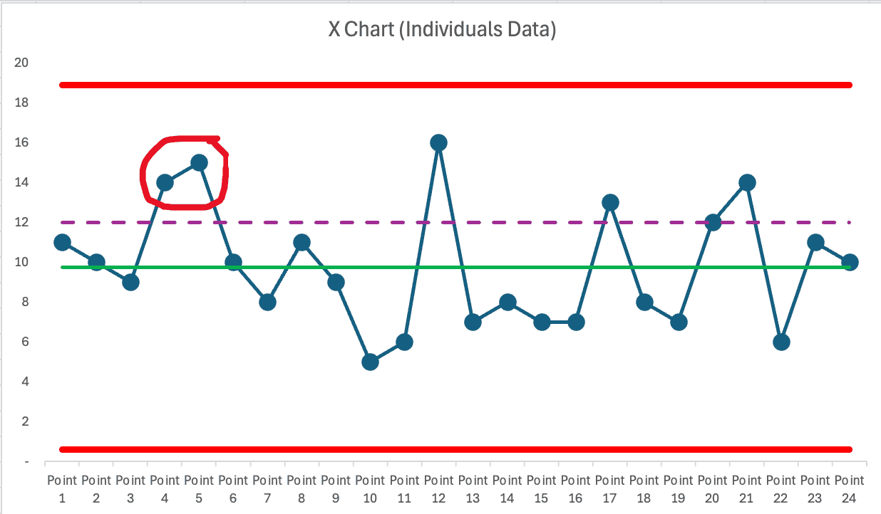
The target is shown by the purple dashed line. People sometimes add color coding like this:
The color coding doesn't make the rule of thumb any more correct.
What does the PBC tell us? Quite clearly: NONE of those data points are statistical outliers. Every single one falls between the calculated lower and upper limits.
While the target is chosen by someone, the limits are calculated from the data itself. That distinction matters. A target is an opinion. The limits are what the system is actually telling you.
The Three Signals That Actually Matter
A PBC tells us to investigate only when one of three conditions appears:
Any data point outside the calculated limits. Eight or more consecutive data points on the same side of the average. Three out of three (or three out of four) consecutive data points closer to a limit than to the average.
Notice that “two consecutive reds” is not among them. It's not a rule that Shewhart, W. Edwards Deming, or Donald J. Wheeler ever determined, validated, or endorsed.
“Two reds” depends entirely on wherever someone decided to set the target. The three signal rules depend on what the data itself is saying. That's the difference between reacting to an opinion and reacting to evidence.
Where the Data Came From
This isn't made-up data. It's from a time I facilitated the Red Bead Experiment — a demonstration that Deming made famous. Each data point is the number of red beads that appear on a paddle with 50 holes after the paddle has been dipped into a container.
That container holds close to 20% red beads. When we keep dipping the paddle, we'd expect a long-term average of 10 red beads. That's easy to predict. What's hard to predict is the range of variation. Will the numbers fall between 8 and 12? Or 5 and 15? We don't know until we play the game and collect data.
The PBC helps us with that. In this case, it tells us we'd expect the count to fall between 1 and 19. Everything within that range is normal variation — not a signal, and not a reason to react.
If we expected the histogram to form a perfect bell curve… we'd be wrong, at least in the short term. That's difficult to predict, too.

The Same Pattern With a Different Metric
The same thinking applies to a metric where higher is better — with a max of 100 and a goal set to 86.

Again, two consecutive reds. Again, not a statistically valid reason to react. But a manager might have chewed out the team… only to see a “big increase” right afterward. That manager might draw a faulty conclusion: yelling leads to improved performance. They might also “learn” that the effect was short-lived and that performance dropped because the team “slacked off” or “took their eye off the ball.”
This is one of the most dangerous things about overreacting to noise — it creates false cause-and-effect stories that feel completely convincing. The manager doesn't just make the wrong decision once. They build a mental model that makes the wrong decision feel right every time after that.
A PBC, again, shows us that ALL of these data points are part of the common cause variation of a stable system.

What Overreacting Actually Costs
The statistical argument against the “two reds” rule is clear enough. But I think the bigger cost is what it does to people and to the culture you're trying to build.
Every unnecessary root cause investigation takes time that could have gone toward studying the system and running small experiments that might actually shift the average. That's the visible cost. The invisible cost is worse.
Teams get frustrated: “Why are we doing another root cause analysis when nothing has really changed?” Leaders unintentionally signal that they don't understand the system or the data, and that chips away at credibility. People start to see improvement work as something they perform for the boss rather than something that actually improves their work. Once that belief takes hold, it's very hard to reverse.
And the false conclusion that “we fixed it” when performance naturally returns to green? That might be the most expensive part. It teaches the organization that the improvement process works — when what actually happened is that the numbers bounced back on their own, as stable systems do. You end up with a growing inventory of success stories that aren't real, and a team that knows it.
Every hour spent investigating noise is an hour not spent understanding the system. That's the trade-off, and it's not a close call.
What to Do Instead
If you're unsatisfied with the average level of performance or the range of variation, you can work to improve the system. Study how the work is actually done. Look at the inputs, the standardized work, the variation that exists within it.
Improve the system in systematic ways instead of being reactive. That's a far better use of your time — and your team's time and energy.
The irony is that the “two reds” rule feels like diligence, and studying the system feels like going slow. But one of them generates meetings about nothing, and the other generates understanding that can actually move the average. It's worth asking which one you'd rather be spending your Tuesday mornings on.
As the subtitle of my book Measures of Success says: React Less, Lead Better, Improve More.
A Standing Invitation
If you think I've cherry-picked easy examples to make this point, I'd welcome the chance to show otherwise.
Do you have a performance chart — a bowler or line graph — that shows “two consecutive reds”? Send it my way. If you're willing to share the data (anonymously, of course), I'll review it and offer feedback on whether the variation is meaningful or just noise.
You'll get a private analysis and a learning opportunity. And with your permission, I may share your anonymized example in a future post or video to help others see the difference too.
Connect through my contact page. I'm genuinely curious what you'll find when you look at your own data differently.


Is it a good rule to say, “If there are 2 red data points in a row, do a root cause analysis”?
What Claude AI says:
Why 2 red points is unreliable
A process behavior chart shows that repeated misses on a target (red points) can still be normal variation in a stable but incapable process. Reacting every time there are two “bad” months in a row leads to wasted effort, staff frustration, and overreaction—especially in healthcare, where processes and outcomes naturally fluctuate.
Two points in a row is a very common, expected event in many stable systems.
With even moderate variation, stable processes often go “red-red” multiple times per year.
The result is “tampering”—hunting for special causes when nothing abnormal has actually happened (Deming’s term).
Better: Use PBC signals to trigger investigation
Root cause analysis should be reserved for signals of true change: points outside control limits, sustained runs, or new patterns.
Chapter 11 in Lean Hospitals covers this. Process behavior charts clarify when to engage deeply and when to focus on system design instead.
PBCs protect your staff’s energy—directing improvement where it matters.
The bottom line
Don’t tie RCA to a red-red rule. Use process behavior chart signals instead. Focus on system redesign for stable-but-not-capable processes, and investigate only when the data show a true signal—not just a couple of misses. Forcing root cause every time there are two reds just wears people out and chases noise.