


tl;dr: Most charts don't actually show improvement–they show routine variation. Without enough data and without using tools like Process Behavior Charts, it's easy to mistake noise for meaningful change. Before claiming a trend, get more history, look for statistical signals, and make sure the chart can back up the story.
I saw this chart recently. It shows the monthly average length of stay (LOS) at a hospital:
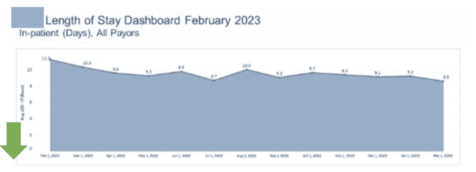
The narrative about the chart said it was:
“continuing a trend of reduced variation and improvement in length of stay results, [down a total of] 24% past 12 months”
But is there really a statistical trend there?
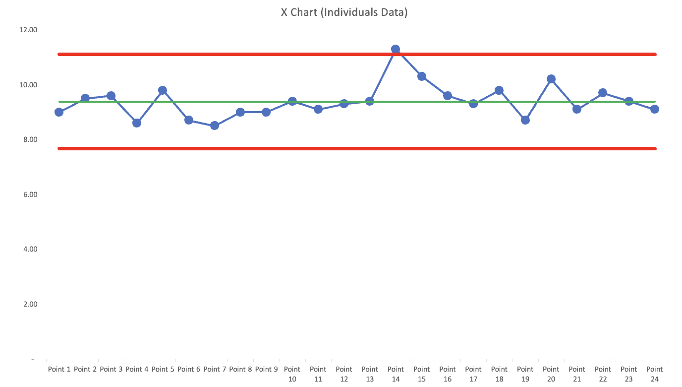
Of course, I used those 13 data points to create a “Process Behavior Chart.” Actually, it's the pairing of an “X Chart” (the data) and an “MR Chart” (or the Moving Ranges). Together, it's called an “XmR Chart” (as discussed in my book Measures of Success: React Less, Lead Better, Improve More):
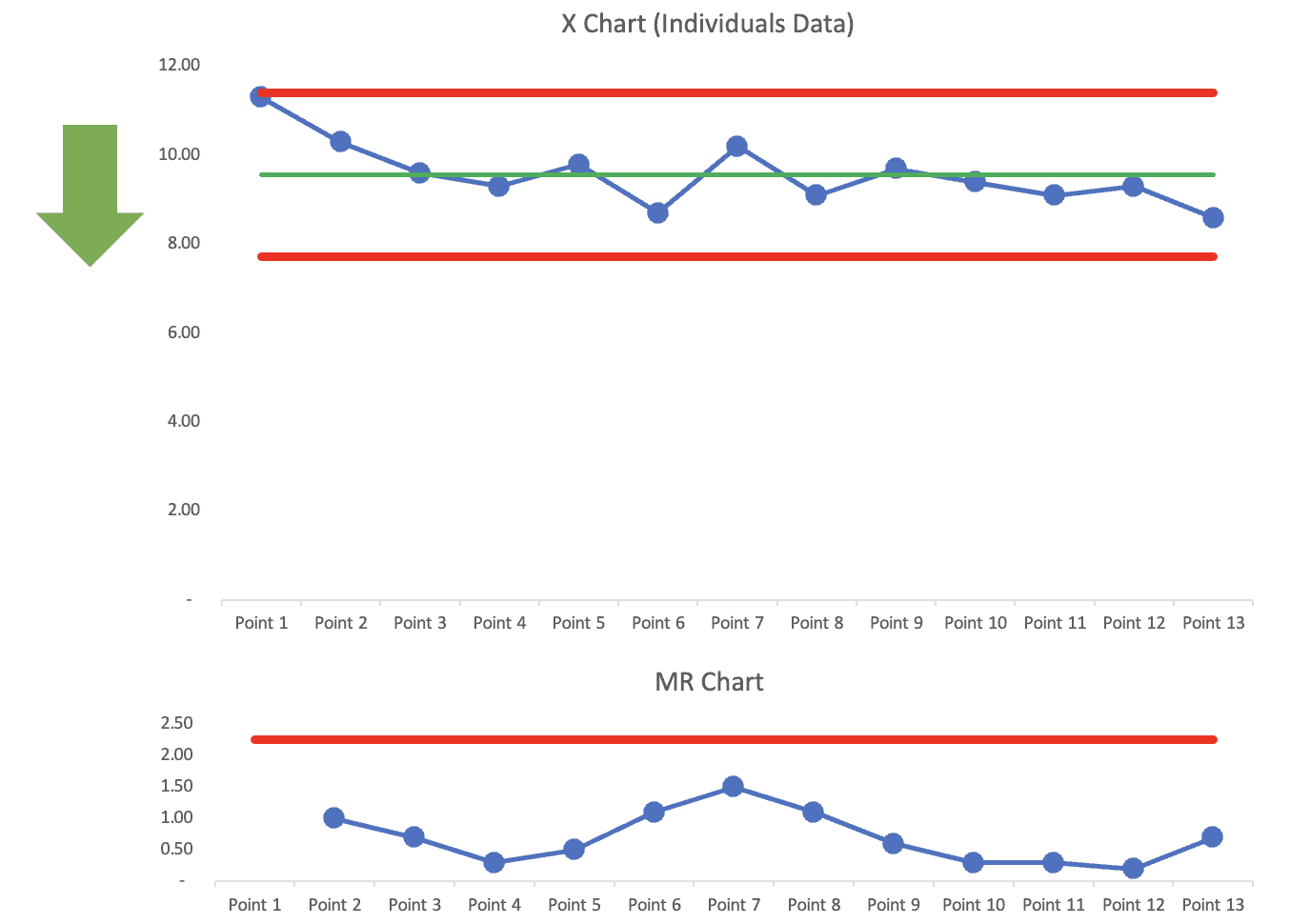
What does the X Chart show us?
There's no evidence of any statistically meaningful signals. Yes, the first data point is very near the calculated “upper limit,” but it's quite possible the monthly average is just fluctuating around a stable average.
The MR Chart shows no signals, either.
With two clicks, I can add a linear trend line in Excel (the light blue dotted line):
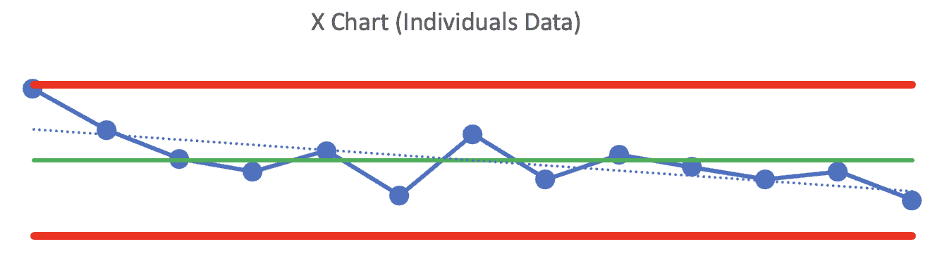
We have to be very careful with linear trend lines. They're mathematically correct, but can be easily misleading. They're very sensitive to the first and last data points and can show a positive trend (or a negative trend) when the metric is really just fluctuating around that average.
If we remove the last few (oldest) data points, the linear trendline becomes… flat.
Hence, the problem with linear trend lines.
What do we need?
Show me the data! More data points!
We would be able to make a better determination about any sort of purported “improvement” or “trend” if we had additional historical data points. This chart shows a missing history that I'd love to fill in:
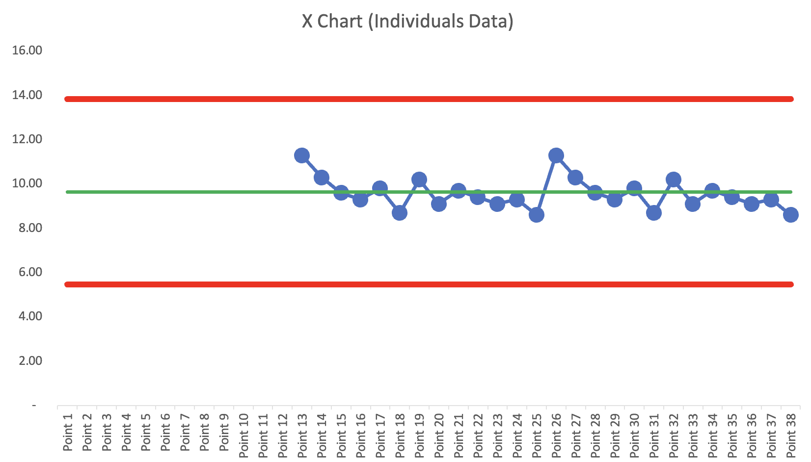
Since I don't have the data (and wasn't able to get it), all I can do is make up scenarios for illustration purposes.
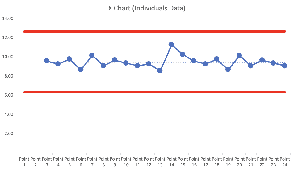
What if There's Seasonality and the Previous Year Was the Same?
What if the previous 13 data points were literally the SAME as the 13 data points originally shown?
The X Chart shows no signals. The MR Chart shows one blip of unusual variation between data points 13 and 14.
If this were the real scenario, I'd say:
- No improvement
- No trend
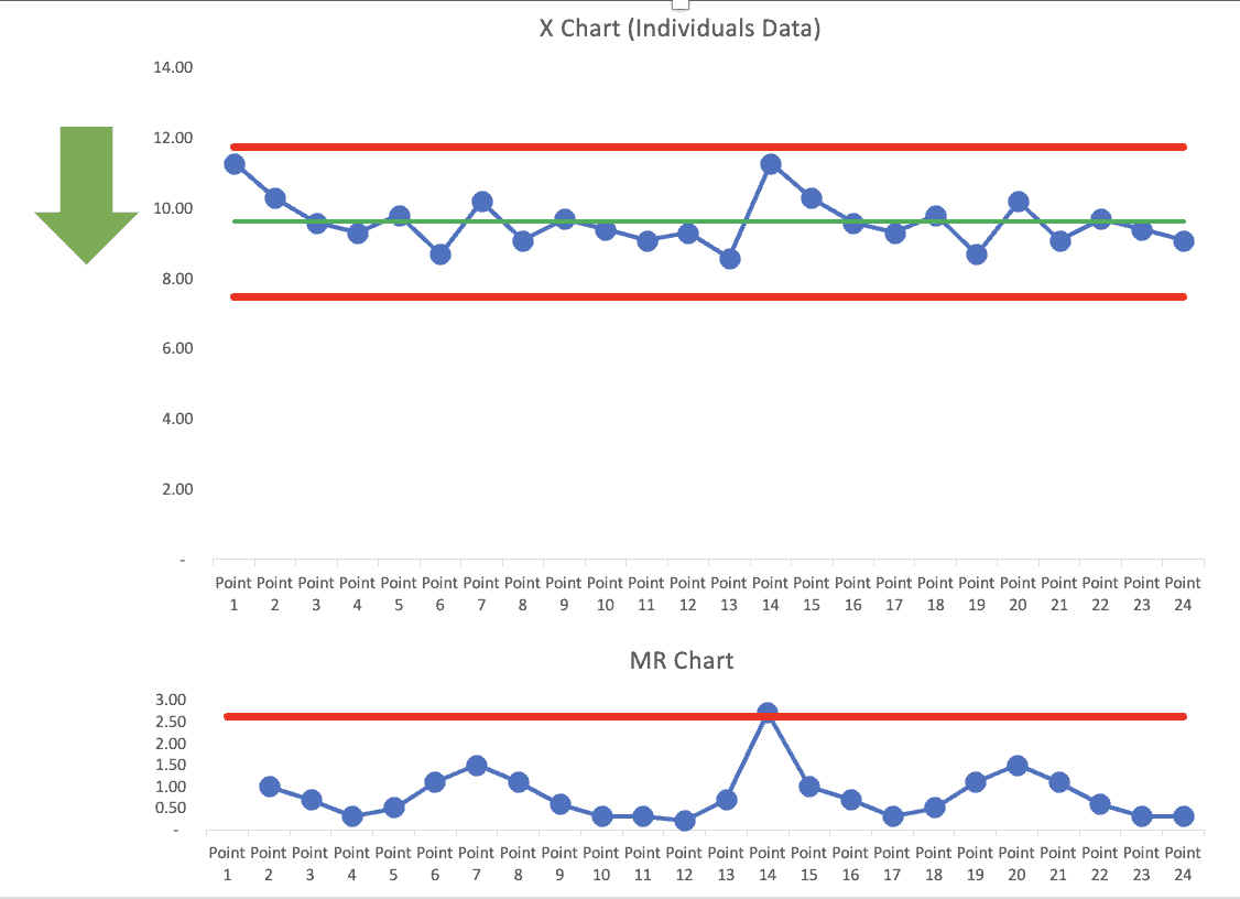
Maybe There Was a One-Time Shift (No “Trend”)
Maybe the organization had a major improvement event (or an external factor) that changed the system, as illustrated in this X Chart?
This would be impressive… but I'd conclude:
- BIG improvement
- No trend
The X Chart could be updated to show the shift — the change in the average and the change in the limits at that one point in time:
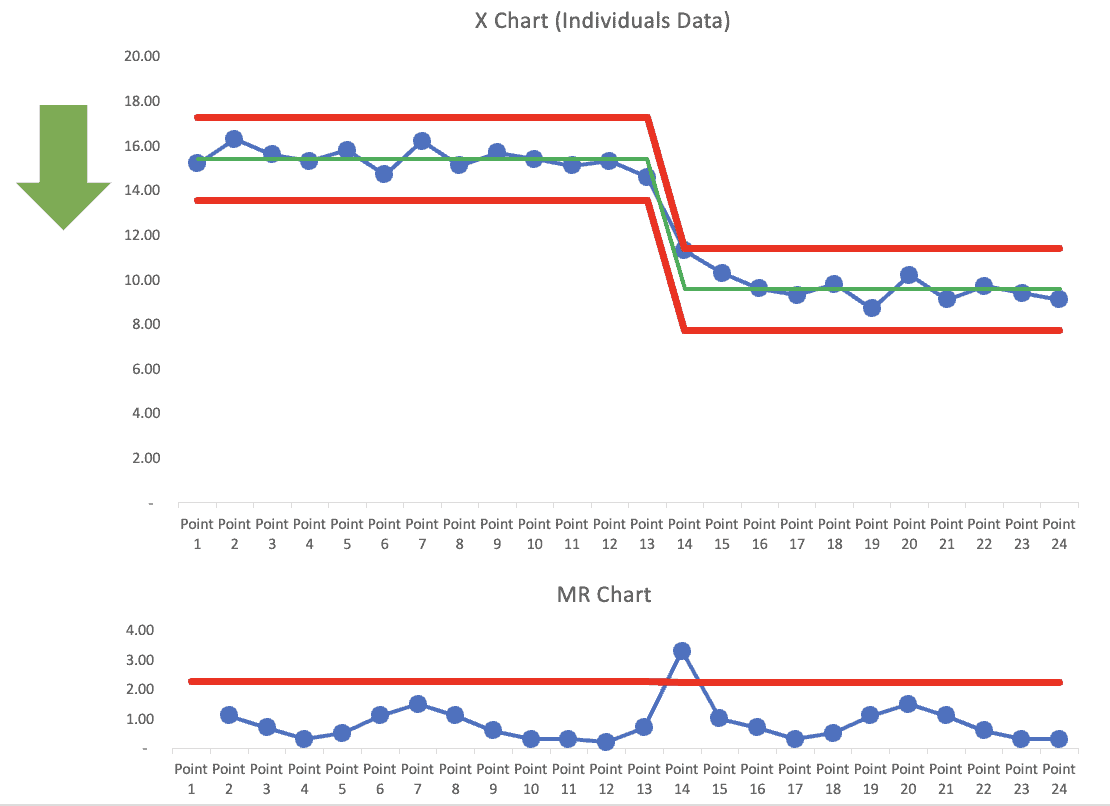
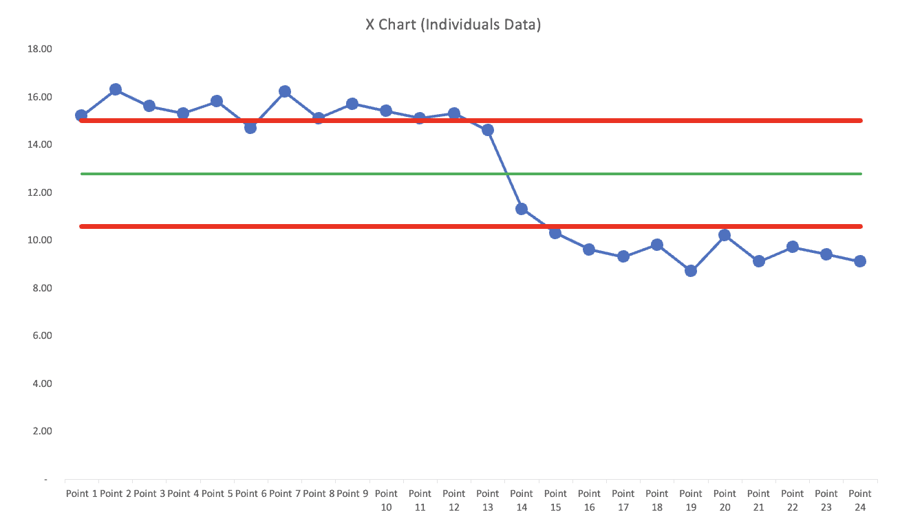
What if That One Month Was a Blip?
This would be a troubling scenario:
This would be “troubling” because I'd conclude, in spite of the claims:
- No improvement
- No trend
That one high data point is a “signal” in that it's above the calculated upper limit.
So we'd want to ask, “What happened?” What changed? Why was it a strong but temporary effect? How could we prevent that from happening again? Was it naturally occurring or was it the result of some policy or system change we had put in place?
The Moral of the Story?
So what should we learn from this scenario?
- Be careful about claims made in words that cannot be backed up by a chart.
- If you have just 12 or 13 data points… get more data (another 12 months)
I hope this helps. Again, you can learn more about Process Behavior Charts in previous blog posts, webinars, or my book, Measures of Success.
What this example illustrates is how easy it is to confuse routine variation with real improvement. Without enough historical data and without using tools like Process Behavior Charts, leaders risk reacting to noise, celebrating false wins, or launching unnecessary improvement efforts. Control charts don't eliminate judgment–they discipline it. They help us ask better questions, focus on meaningful signals, and avoid overreacting to normal ups and downs in performance. If we want better decisions, better improvement efforts, and a healthier learning culture, we need charts that can actually support the story we're telling.
FAQ: Reading Charts and Understanding Improvement
How can you tell if a chart shows real improvement?
A chart shows real improvement only when there is a statistically meaningful signal, such as a sustained shift or trend, not just routine up-and-down variation.
Why are trend lines misleading on dashboards?
Trend lines are mathematically correct but highly sensitive to the first and last data points, which can make random variation appear to be meaningful improvement.
How many data points do you need to assess improvement?
With fewer than 12-13 data points, it's very difficult to distinguish signal from noise; more historical data provides better context for decision-making.
What is the role of Process Behavior Charts?
Process Behavior Charts help distinguish common cause variation from special cause signals, preventing leaders from overreacting to normal fluctuations in performance.
Why does this matter for leadership?
When leaders misread charts, they risk wasting time, creating fear, and undermining trust; clear data interpretation supports better decisions and psychological safety.


")
