

Deciphering the World Series Home Run Surge: A Data-Backed Analysis of MLB Data
If you watched this year's World Series, you saw a lot of home runs. There were many dramatic home runs in late innings or extra innings.
It might have seemed like a significantly high number. My friend Dan Markovitz asked me, via a Twitter DM, to look at this.
Before speculating about cause-and-effect, let's look at the data.
In the news, we see headlines and news stories with a lot of “descriptive statistics,” including:
Astros, Dodgers combine for most home runs in World Series history
Yes, it's a fact that the combined 25 home runs in the seven-game series was the highest number ever in a World Series. Does that mean it's a significant outlier from previous years? Is there any “signal” or meaningful cause to look for? Or are we just wasting time investigating or thinking about that?
How often do we hear comparisons like this at work?
- Emergency department waiting times were the longest ever last month
- Sales and conversion rates were the highest in company history
- Infection rates hit an all-time low
These statements might be factually correct. But, I'd ask if these facts are helpful or if they're just organizational trivia.
Does the “highest ever” or “lowest ever” tell us if the process or the system is changing or improving? How do we know if that highest or lowest number is statistically significant?
Our friend the “Process Behavior Chart” [PBC) can help.
Signal or Noise?
I found statistics for each World Series via Baseball-Reference.com. I looked back to 1982 since we generally want 20 or more “baseline” data points for creating a PBC. I manually added the number of total home runs by both teams each year, so it's possible that I added wrong or have a slightly incorrect data point. My spreadsheet with the raw data and my chart calculations can be downloaded here if you'd like to check my work.
The next thing I did was to calculate a “home runs per game” number, since a World Series has anywhere between four and seven games played. There are sometimes extra innings, but I ignored that.
In the PBC methodology, we choose a baseline timeframe. I calculated the average of the first 20 years to be 1.82 home runs per game. For each data point, we calculate the “moving range” (the absolute value of the difference between each year's number) and then the average of those moving ranges, which was 0.75.
The cells are shaded for me to see which data points were used to calculate the average and “natural process limits.” These limits are calculated as to eliminate about 99% of the “noise” in the data so we can detect “signals” that signify something may have changed in the system.

Those limits are basically +/- 3 sigma around the average.
The Process Behavior Chart with all of the data looks like this:

There's no single data point that's higher than the calculated natural process limit. That suggests that every single data point here is “noise,” even 2017. It's noise even though it's the “highest number ever.”
Yes, it's closer to the upper limit than any other data point, but it doesn't mean that it's a “signal” or that there's any likely “special cause” that would explain the 25 home runs. One view is that it was “bound to happen” that the same “system” (the game of baseball) is going to produce more home runs some years than others.
All of those data points are “common cause variation” and there are many causes of variation in a system like this, including:
- the characteristics of the teams that made the World Series (are they “power hitting” teams or not),
- the weather
- the sizes of the stadiums in which the games were played
CONCLUSION: The “most ever” number of World Series home runs per game is NOT a signal, it's not statistically significant. This year's number, while high, is part of the “noise” or “common cause” variation.
In a “stable and predictable” system with stable and predictable outputs, there are often DOZENS of causes of common cause variation. Asking “what happened that year?” isn't likely to lead to a root cause.
Note: As an experiment, I used all 35 years of data to calculate a baseline. I got basically the same average and limits. There's still no indication of a signal. That's a separate tab in the Excel spreadsheet.
Are There Causes?
People love speculating about “special causes” for “common cause” variation. As I talked about last week at Lean Startup Week, looking for a root cause or an explanation for a single “noise” data point is wasted motion or a waste of time.
Yet, there are many headlines for articles with such speculation.
Making sense of the home run-happy World Series
That article mentions the theory that the baseballs were “juiced” or different (although that last link is about regular season home run totals, something else that hit an all-time high).
Even the New York Times got into the speculation game:
After Barrage of Home Runs in the World Series, Juicy Theories as to Why
It makes sense that pitchers would blame the ball :-)
“I think the balls are juiced, 100 percent,” Astros pitcher Dallas Keuchel said after his team evened the World Series with a 7-6 victory in 11 rollicking innings of Game 2. “Major League Baseball wants to put on a show. We crushed the home run record this year. Honestly, I think the balls are juiced.“
It's just a a theory.
Now, it's POSSIBLE that there was a change to the system and that the balls are “juiced.” The PBC just wouldn't encourage us to go looking for a cause. Major League Baseball denies the balls are different.
The Commissioner said:
“We're using two different labs that have been looking at the ball on a continuous basis all year,” Manfred said. “Balls are within specs; there's been no movement even within the range of the specifications in terms of the baseball. I've said before I think there's other issues causing the home runs other than the baseball — principally, the way the game's being played, the tolerance for strikeouts, power pitching, guys changing their swing.”
I'd love to see their data about the lack of movement within the range of baseball specifications. Don Wheeler and others would remind us there's ALWAYS variation in a process, it might just be very small. But, I don't expect the MLB Commissioner to speak precisely about statistics and process capabilities.
Some speculated about the weather (it was hot in L.A. and there's proof given in the article about how the ball travels farther and there are more home runs when it's hotter):
Home runs are flying in the World Series; does the weather get an assist?
I think it's obvious to even the casual fan that the game has changed since 1982. Players are striking out more and teams are OK with that (modern analytics suggest an out is an out, so striking out or grounding out doesn't matter). It does seem statistically significant for the league to have the “most strikeouts ever” for TEN seasons in a row.
Players also are learning that uppercut swings lead to more home runs (I think that's been known, but more players are adjusting their swings that way) and players aren't afraid to swing harder (because strikeouts aren't as shameful anymore).
The system has changed… but the Process Behavior Chart doesn't show a signal. If you follow and use the Western Electric Rules, we might look for six consecutive years of year-on-year increase or eight consecutive years above the old average to suggest there is another form of signal there.
Regular Season Home Runs
It's interesting, and maybe a bit surprising that the World Series PBC (showing a predictable system over 35 years) co-exists with regular season home run numbers that are NOT a predictable system.
Again, I used “home runs per game” numbers because:
- More teams added to MLB over time means more games per season
- Some seasons were shortened by strikes, lockouts, labor trouble, etc.
So here's that chart, using the first 20 years as the baseline for the average and limits… clearly not a stable and predictable system over time (or even over those baseline 20 years):
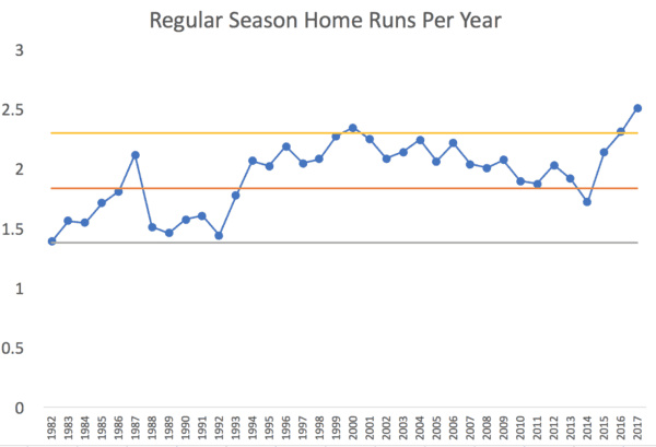
The long term average (1.84 home runs per game) is almost exactly the same as the World Series per game average of 1.85.
The spike the chart, in 1999 to 2001, is considered the peak of the “steroid era” in baseball.
CONCLUSION: This 2017 season with the most home runs ever IS statistically significant. It's a “signal” that the system has changed. It's worth asking “why?” if we so choose.
Somebody should have asked “what happened?” when there was the 2000 data point above the upper limit.
The run of eight consecutive years above the average, starting in 1994, should have raised questions too. 1994 was the year when the World Series was canceled, so speculation has always been that MLB turned a blind eye to steroids as a way of making the game more popular again.
Then, we see a decline in home runs as steroids were (we think) drummed out of the game. Then, an increase the last three years and another two “special cause” points.
But, I'd consider post 1994 to be a “new system” with a new average and new limits:
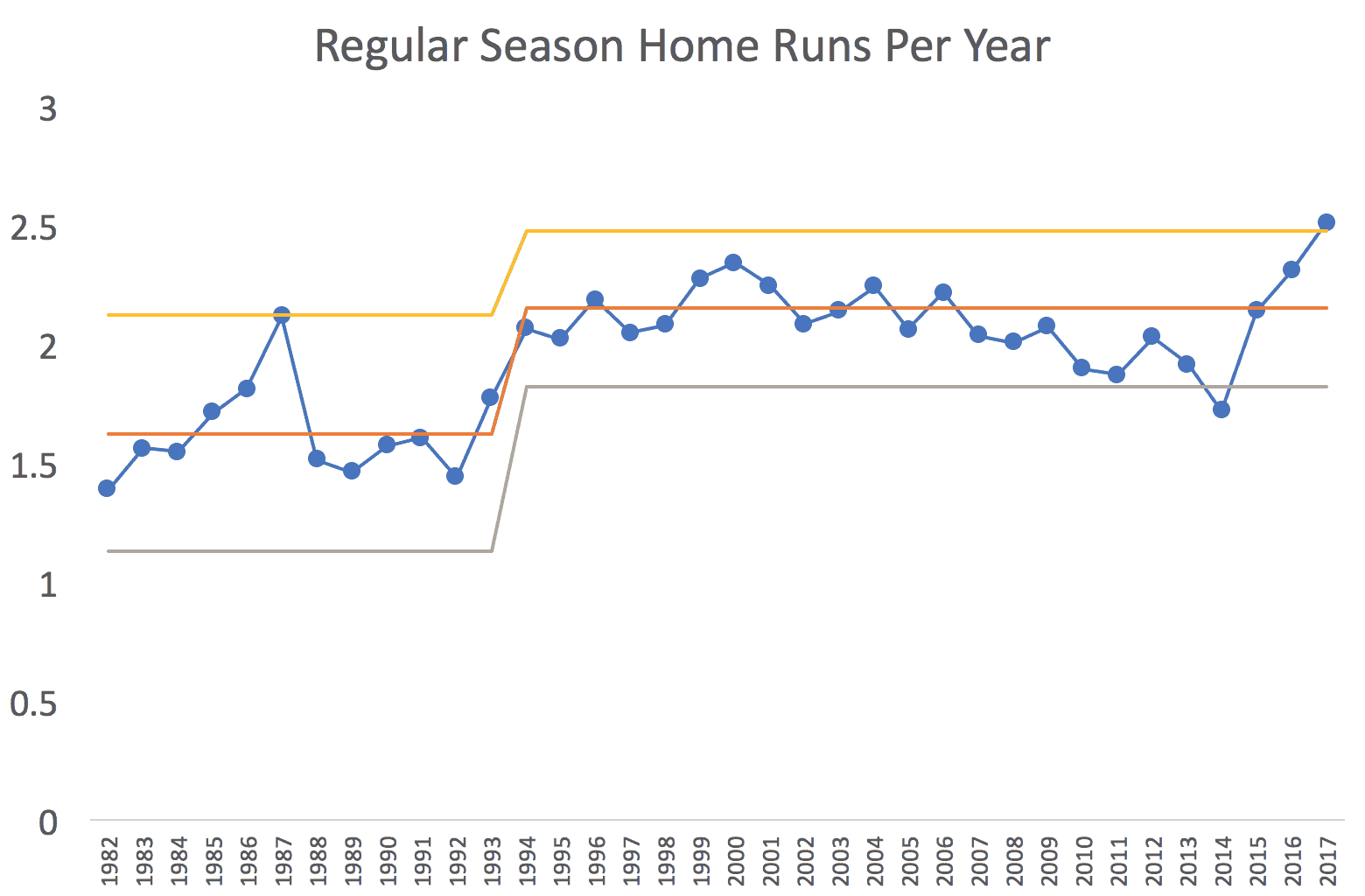
This chart, then, begs the questions:
- Why were home runs so high in 1987?
- Why were they so low in 2014?
- Why were they so high in 2017?
Those are the “special cause” years outside of the limits. We also see a run of eight consecutive years below the average starting in 2007… which maybe suggests there were three different systems here: pre-steriod era, the steroid era, and the post-steroid era.
The other suggested causes such as different baseballs, uppercut swings, a willingness to strike out, better fitness and training, etc. could all be causes of the “special cause” data points. But, with many things changing at once, it's hard to prove cause and effect for each factor.
It's still fascinating that World Series home runs were stable and predictable over these 35 years. Hmmmm. Maybe we should be surprised that World Series home runs were not higher during the steroid era? Is that because championship pitching beats championship hitting, to some extent (compared to the regular season)?
What are your thoughts on this treatment of data and metrics? Does it help you dig into your own metrics when you hear things like “all-time high” or “20% higher than five years ago?”


LinkedIn comment:
Keith Dorricott
A really nice example of using the tools we all know to challenge over-simplistic conclusions such as “highest ever”. Mark Graban, thank you for bringing sense into the use of such data!
My reply:
Thanks, Keith. I was surprised to see that “highest ever” World Series home runs was NOT a signal, but “highest ever” regular season home runs IS statistically significant.
I like this example as a way to approach our data and determine what it is and isn’t telling us. The baseball fan in me couldn’t help digging further into this specific question.
I’m not too surprised that there was a signal for the regular season, but not the World Series. With only 4-7 games of data for each World Series, I would expect the variability to be much wider than over a full season. This would widen your control limits and make it more difficult to separate the signal from the noise.
I was also curious about the reasons for the increase and took a deeper dive using Fangraph’s full season batted ball data (only available back to 2002). A quick review showed no obvious change in fly ball %, a long-term trend up in hard-hit rate and down in medium-hit rate, and a sharp increase in HR/FB the last three years (including an out of control signal in 2017). I couldn’t figure out how to isolate World Series data, but it would be interesting to see, especially the HR/FB rate.
To me, this all adds up to proof that something has changed, but doesn’t really explain why. It could be that the swing changes have resulted in more solid contact (though, curiously, not more flyballs) or that ball changes have resulted in harder contact through less movement of the ball, making it easier to square up, or that they are “juiced” (but within a wide specification) and are just flying farther and faster.
Thanks for the comment and analysis, Justin.
Great point that the calculated natural process limits are WIDER for the World Series. As you say, smaller sample size of games will mean more variation. Spot on.
There are more strikeouts. I’m surprised there aren’t more fly balls. I wonder if the percentage of BATTED balls that are fly balls is higher than before (more fly balls than ground outs).
Justin, I see the Fangraph website and their general numbers, but do you see where to find year-on-year data?
As for the ball specs, here is what the rules say:
The difference between 5 and 5.25 ounces… a 5 ounce ball is 4.8% lighter. Does that ball travel farther?
The rules don’t have defined specs for how tightly wound the ball is, how low the laces/seams are, how shiny the ball is after being rubbed with mud by the umpires. What about specifications for densities of the inner materials, like the cork?
It seems like there would be WIDE latitude for changing the ball and still being within the rules?
I wonder if their contract with the baseball supplier has more details?
Does Rawlings use SPC charts in their baseball production? Are they simply filtering “in spec” vs. “out of spec” or really aiming to reduce variation as much as possible?
Mark,
I accessed the season-long batted ball data here.
In looking at a couple of other measures, the GB/FB ratio hasn’t really changed either. If anything there might be more ground balls now. I even broke down the fly balls into infield and outfield fly balls. No signals there either. Outfield fly balls haven’t changed and infield fly balls maybe decreased some the last 5 years or so.
One other possible explanation is that with more of an upper-cut home run swing, batters are more likely to miss by hitting a ground ball or missing entirely rather than a weak fly ball?
One other interesting note from the batted ball data: There was a definite increase in balls hit up the middle starting in 2006. I don’t think this has anything to do with the home run discussion, but it surprised me how clear the shift was.
I know there is an “export data” button on that site, but I’d love it if they would automatically generate run charts instead of tables of numbers.
Home Runs as a Percentage of Fly Balls *does* have a special cause data point in 2017.
See my spreadsheet and here is the process behavior chart:
I’m also surprised that there are more balls hit up the middle.
With the increase in defensive shifts, I thought there would be more “pull” hitting… but maybe teams are just adjusting to that pull hitting in a different way.
Here’s a chart for balls hit up the middle. Taking all of the years’ data as a baseline for calculating limits, there’s not a single predictable system.
As you detected, there’s a change starting in 2006.
See spreadsheet and chart:
But if we calculate the limits starting in 2006, we see this:
We almost had 8 consecutive points above the average, but not quite.
I’ve run a lot of numbers here. I’m curious of somebody would calculate the correlation between regular season home runs per game against World Series home runs per game.