


I recently saw a presentation by some leaders from a children's hospital. I was really impressed that their medical quality and effectiveness leaders were outspoken advocates for Lean and Six Sigma, as was their director of process improvement.
They shared a chart that shows a pretty impressive reduction in Central Line Associated Bloodstream Infections, or CLABSIs. Regardless of the statistical method you'd use, this appears to be a meaningful and significant reduction that's unlikely to be due to randomness or “noise” in the data.
As an aside, the medical leaders told a story that's now very familiar to me. Many physicians and leaders had the mindset that infections, while unfortunate, where an unavoidable “cost of doing business,” as they put it.
The medical quality leaders thankfully encouraged people to try process improvement methods – studying the way the work was done to see if it was being done the best way or if it was done consistently. Then, you test and evaluate changes to the process to see what the results are. I've long advocated for using charts that show data over time instead of using simplistic two-data-point “before and after” comparison, as I've blogged about:
Here is their chart:
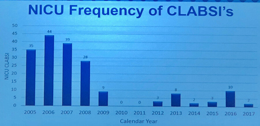
If I remember correctly, their intervention to improve the system (using multiple countermeasures) started in 2008 or so, so the lower data point in 2009 was their first year under this new process. They might have started seeing results in 2008, but having annual data instead of monthly or quarterly data, masks that.
They are proud that they had two years with ZERO infections, in 2010 and 2011. That's great to see!
Here is that data expressed as an Excel line chart (or you could call it a “run chart”):

I'm of the school of thought that says time-series data should always be charted as a line chart instead of a column chart. I've seen people make a compelling argument that a column chart draws your eye to the middle of the shaded in bar, while a line chart draws your eye to the actual data point. A bonus of using line charts – you use less ink! That's a cost savings…
This example shows the limitations of Excel linear trend lines, the line you can add with just two clicks. Easy doesn't mean it's the right thing to do.
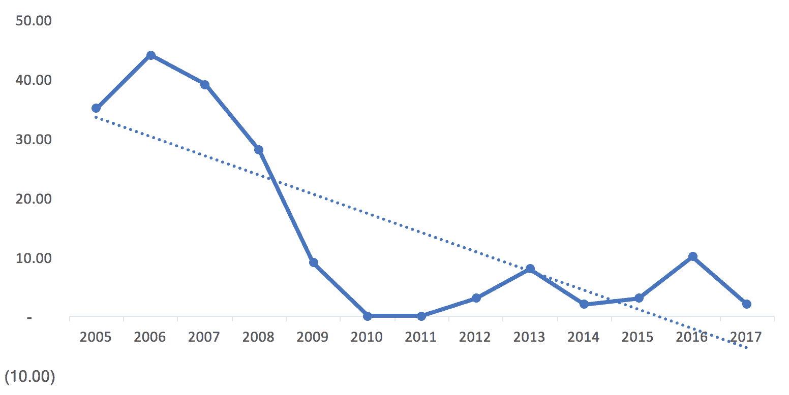
I think the trend line incorrectly implies that improvement was continuous (when the hospital realizes there was a major intervention in 2008 and some reported “backsliding” in 2012 and beyond). This might be three different “systems” over time:
- The old system that generated higher infection rates in 2005 to 2008
- A new system that delivered zero infections in 2010 and 2011
- A degraded system that delivers infection rates that are higher than zero but better than the baseline years.
The trend line also incorrectly suggests that infection rates should go negative. :-)
The data also begs the question of the number of patients receiving central lines was the same each year. What would the percentage of central line patients who contracted a CLABSI look like if you charted that? I understand the argument for charting the absolute number of infections (each infection is a person) instead of using an esoteric-sounding “infections per 1000 line days rate” that some hospitals use). The chart of the number of infections is missing some context, so we should keep that in mind. But, if the hospital has grown and seen more patients over time, it's even better that the number has gone down.
If I try to draw a “Process Behavior Chart” using all of our data points as a baseline, it quickly becomes clear that this is not a “stable and predictable system.” In this case, that's good because we want infection rates to be lower.
Here is the spreadsheet I used to create these charts, via Dropbox, if you want to see it.

Note: the first version of the above chart that I posted had lower and upper limits that are a bit incorrect due to an error in my spreadsheet. Thanks to Shrikant for catching that.
Even though the lower limit is calculated to be -4.32, it gets adjusted to zero since this measure can't be negative.

A few “Western Electric Rules” are violated – data points above the calculated upper process behavior limit, and more than eight consecutive points below the average.
Still, it's better to see this than a stable system that had an average of, say, 35 infections per year, over this time period.
If the “new system” began in 2009, I wondered how the Process Behavior Chart would look using just those nine data points for establishing the average and limits. We get this:
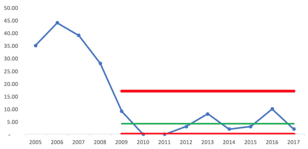
Since the lower limit can't be negative, those two years, 2010 and 2011, are right at the limit. Does that mean there is a “special cause” for those years? Maybe. The hospital said their new processes were being followed very consistently those years.
But, the rest of the years from 2009 to 2017 look like common cause variation around an average of 4.11 infections. Anything between zero and 17 infections (the upper limit) might likely be due to noise in the system, meaning the same system can generate different results in different years.
It just occurred to me that 2017 is a partial year, so that data point might end up being a bit higher.
If we look at 2012 to 2017 being a “system” perhaps, we'd then calculate the average and upper/lower limits off of those data points (using fewer data points for a baseline makes this a slightly less helpful method – our ideal is about 20 data points for a baseline):

Here, we have an average of 4.67 and an upper limit of 19. If the system of work doesn't change, the Process Behavior Chart would tell me to expect anywhere from zero to 19 CLABSI infections each year.
But of course we want to improve the system to drive better results.
That means more systemic problem solving, rather than asking “what went wrong in 2016?”
The hospital should go back to studying the work to improve the work. Questions I'd ask include:
- If people aren't following the 2010-2011 process as closely, why is that? We're not blaming them, we're asking if there are legitimate barriers that get in the way of doing the right thing.
- Is there some other change in the system that the new process didn't account for that is possibly leading to higher CLABSI rates than 2010-2011? Was there a change in supplies, patient population, things like that?
A hospital shouldn't just complain about backsliding… they need to manage and improve their systems and processes that lead to results. No matter how you chart it, they've had significant improvement since 2005, even if we eyeball it.
But, I think the use of statistical methods like “Process Behavior Charts” can better point the way toward sustainable improvement.
One final point – if a measure like CLABSI rates is becoming very low, if the incident is becoming rare, another thing that can be done is to chart the number of days between CLABSI infections and putting that into a Process Behavior Chart format.
How would you and your organization look at data like this? What do you say about their approach? Is there a better way? Are you using methods like this?


")


Run charts and control charts tend to be an organization’s second or third step on the way to true business and operational intelligence. The limitation here is we see the trend but there’s really no way of making this truly actionable. The next step in data maturity would be segmenting by logical subgroup and looking at that distribution (box plots, dot plots, etc). What is CLABSI rate by shift/intensivist/cath site/DRG/etc? We may find out that the big drop was due to no longer running femoral lines, so now the remainder of infections are due to common cause (if the incident rate is consistent across shifts/nurses/etc. Or we may see that the rate is higher when we don’t have an on-duty intensivist or other specific factor. But we can’t get that level of actionable detail on high level time series charts alone.
I agree. Part of their approach was using more PICC lines and having some dedicated staff managing them.
A chart can be “the voice of the process.” It doesn’t tell us how to fix things. It helps us distinguish between:
1) When to use strategies to eliminate special cause problems or sustain special cause improvements
2) When to use strategies for improving a system that only has common cause variation
See also the discussion on LinkedIn.
A comment from Don Wheeler himself:
[…] Graban’s blog post, “What Do We Learn from Charting a Reduction in CLABSI Rates in Different Ways?”, provides a great example of how to plot and analyze […]