

The Bourbon “Bust” That Wasn’t: What Happens When You Zoom Out
Headlines say Bourbon is in crisis:
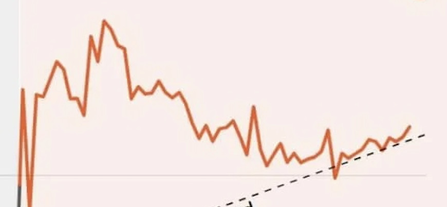
Yeah, this looks bad. Look at that decline! This chart supports headlines like:
- Bourbon, spirits industry suffers ‘significant downturn' after record year for exports
- Kentucky bourbon brands see ‘concerning' decline in sales
And it's not just Bourbon, it's wine and alcohol in general.
- Constellation wine and spirits sales slashed by half
- Under the Hood: Data Show U.S. Wine Industry Decline Is Accelerating
There were plenty more like this.
These headlines are written with total confidence. None of them say “based on a limited time window” or “compared to an unusually high baseline.”
Inside organizations, we often speak with the same false certainty — just with internal jargon instead of newspaper headlines.
Thanks to my friend, David Meier, a former Toyota guy and current Bourbon distiller, for sharing a chart, created by the New York Times, that shows U.S. alcohol sales by month over recent years.
Why Short-Term Metrics Feel So Convincing
A short-term uptick can feel reassuring, just as a short-term dip can feel alarming. But neither tells us whether the system has actually changed.
As “Disco Stu” said in an episode of The Simpsons, regarding disco music records,
“Did you know that disco record sales were up 400% for the year ending 1976, if these trends continue…AY!”

How Charts Create Crisis Narratives
Looking at just part of the data, we see what looks like a dramatic downturn, as many headlines have declared. Yes, I'm intentionally hiding the X-axis for now.

This chart looks dramatic. And that's the point.
When we hide the time scale–or compress it–we invite a crisis narrative. Leaders see charts like this every day in board decks and performance reviews. The visual slope feels urgent, even when the underlying system hasn't fundamentally changed.
U.S. alcohol sales by month over recent years. Let's look at it in pieces, because the order you see the data changes what you think is happening.
Why Two-Point Comparisons Are So Tempting
The most natural thing in the world is to compare two numbers. Sales are down from last year. We're up compared to last quarter. We missed the target this month.
These statements are often technically true. They're also often meaningless — because two data points can't tell you whether a system has changed or whether you're just looking at normal fluctuation.
The danger isn't just analytical. Two-point comparisons drive reactive behavior: leaders demand explanations for normal fluctuation, teams feel blamed for outcomes they didn't cause, and improvement work becomes performative instead of meaningful.
The Danger of Abnormal Baselines
When we pull back to include early 2020, the story changes again. The “decline” now looks less like a failure and more like a predictable response to an extraordinary spike.
In other words, today's numbers are being judged against an abnormal baseline–which is one of the fastest ways to mislead yourself with data.
I think of this as the spike trap. When a temporary surge becomes your new mental benchmark, everything afterward looks like failure — even if performance is exactly where it was before the spike. Pandemic-era alcohol sales were the spike. The “decline” is just the return trip.
As Donald J. Wheeler, Ph.D., puts it,
“Without context, data have no meaning.”
Wheeler wrote the foreword to my book Measures of Success, and this principle sits at the center of it.
When ‘Bad News' Is Just a Return to Normal
Now, let's really pull back to 2016, and I'll show the entire chart. This is the chart leaders need to sit with.
When we zoom out far enough, sales don't look “bad” at all. They look… typical. The data have returned to the long-term trend almost perfectly.
That's not a bust. That's regression to the mean.
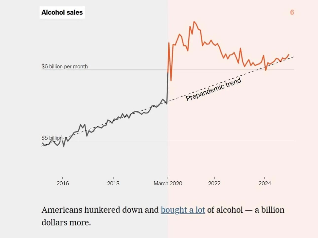
Sales don't appear to be historically low, at least over the time frame we can see. Sales have regressed to the long-term linear trend, almost perfectly.
Yes, it's a “new low” if you're measuring the percentage of Americans who drink. But if you're a producer, like Dave, I think you'd care more about total sales, or sales within your segment.
Seeing the System Instead of the Snapshot
Here's a historical chart for retail alcohol sales that goes back to 1992, from macrotrends.net:
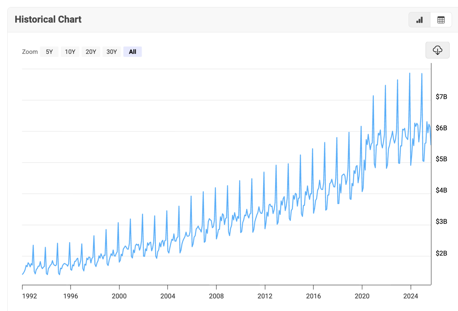
This long-range view makes two things obvious:
- The long-term growth trend is steady
- The spikes and dips are predictable
Holidays, seasonality, and cultural patterns show up clearly when we give the data enough room to speak.
What Better Charts Enable Leaders to Do
Process Behavior Charts help you distinguish signal from noise. Instead of chasing monthly red dots on a bowling chart, you're asking a better question: has the system actually changed, or am I reacting to routine variation?
Note: you can create PBCs that show control limits around a linear trend, not just a flat average — which would be especially useful for data like this.
For more on how to get started with PBCs, see my book Measures of Success.
What This Might Mean for Your Own Metrics
“Don't manage from snapshots” is the short version of everything above.
Whether you're looking at sales, quality, safety, or engagement — insist on seeing data over time. Use tools that help separate signal from noise. And resist the urge to demand explanations when the system hasn't actually changed.
Here's what I keep thinking about: the bourbon distillers who panicked during the “bust” and cut production are going to have less inventory in the barrel when that long-term trend line keeps climbing. The ones who looked at the full picture and stayed the course won't have that problem.
I wonder how many decisions like that are being made right now in your organization — not about bourbon, but about headcount, budgets, or product lines — based on a chart that only shows the last twelve months.