


tl;dr: RAG and bowling charts trigger overreaction and hide real system behavior. Process Behavior Charts reveal whether performance is truly changing, helping leaders focus on causes instead of colors and make better improvement decisions.
In my book Measures of Success: React Less, Lead Better, Improve More, I argue that “Process Behavior Charts” are a better technology than tables of color-coded numbers.
These tables of numbers are often referred to as “bowling charts” or “bowlers.” They are usually taught as a method in Lean classes or workshops. But they are problematic.
Here is an example of such a chart/table from my book:
Can you really make good decisions based on this? We might be able to react… that number is red, grrr…. OK, now what? Does a metric going from green to red (or vice versa) mean that there has been a meaningful change in the system? Not always.
Again, Process Behavior Charts are better; they are more helpful. #PlotTheDots, as they say. Hear this related podcast from an expert from NHS England:
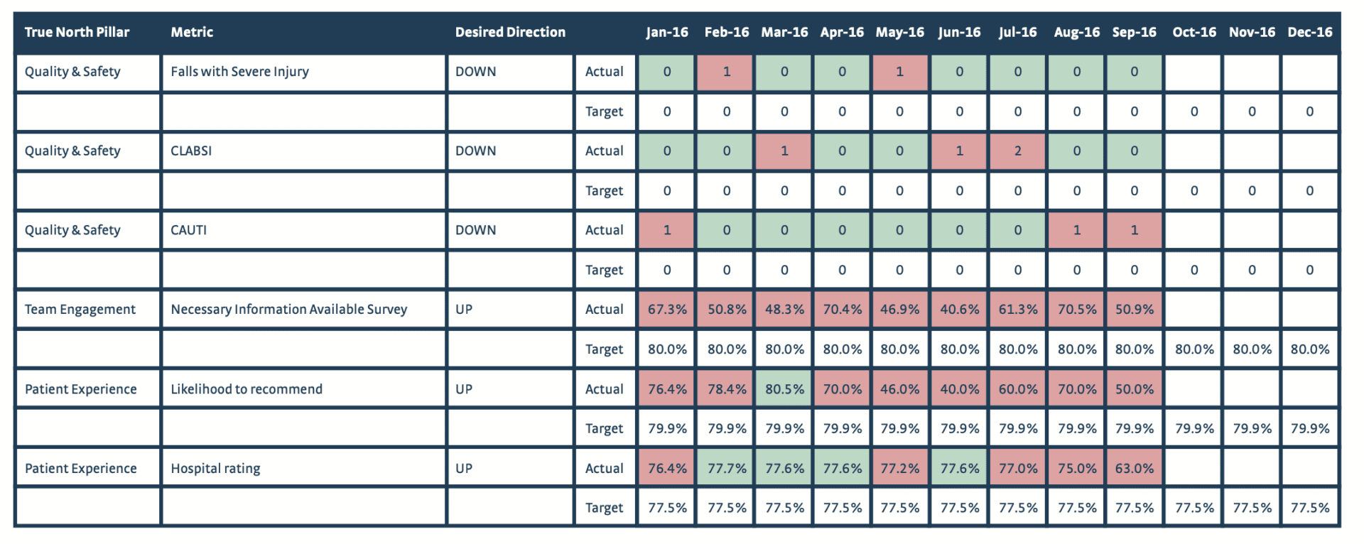
I saw this presented yesterday in a Lean workshop as an example of what they called “visual management.” Well, it is visual:
This showed just a single snapshot in time, which is even worse / less helpful. A single data point, compared to a target, can be very misleading. If you go demand a “root cause” for each of the reds… that might very well end up being wasted motion.
It's visual — but does it help you manage effectively? Again, a Process Behavior Chart helps us react less, lead better, and improve more.
I was taught that “visual management” was about
“knowing the difference between normal and abnormal, right now!”
Here is some recent LinkedIn discussion about this:
On a positive note, I'm very thankful that Samantha Riley and others at NHS England are teaching Process Behavior Charts (a.k.a. XmR Charts). Check out their free publication called “Making Data Count.” It's fab.
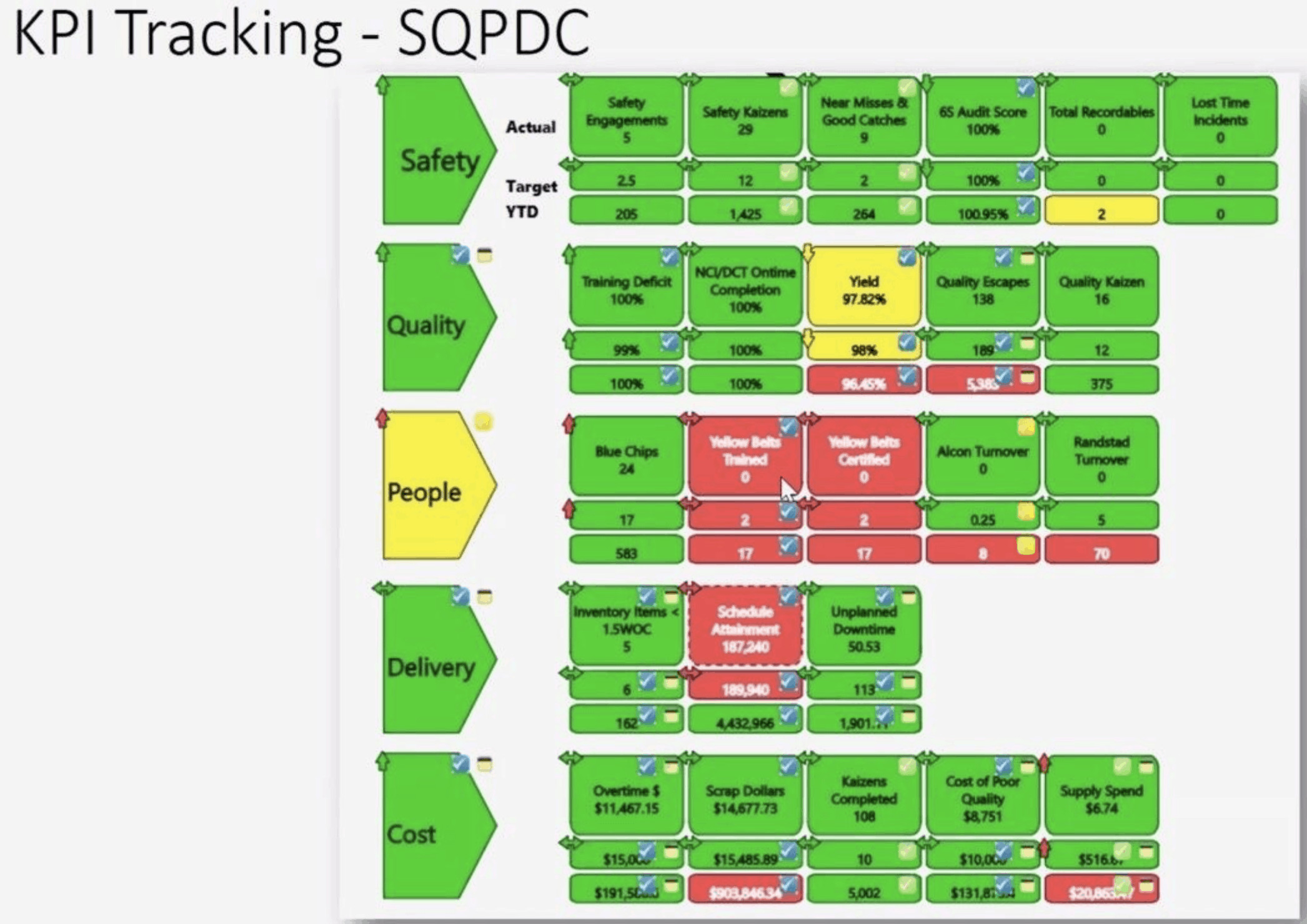
They did an online class today, and they, like I do, frame the “Red Amber Green” (or “RAG”) tables as a problem. It's not a “best practice.” It's not “state of the art.”
They shared an example of what they are helping hospitals and their Boards shift away from:

Yes, we need to do better! Here's one way — a run chart! Or better yet, a Process Behavior Chart.
You could frame the problem as “too many metrics.” That's worth discussing. But boiling it down to just six metrics, visualized the same way, is still going to be problematic.
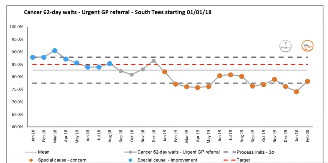
Here is an example that they shared of an XmR Chart:
That metric went from “green” to “red” (it's now worse than the target). But if you look at the left-hand side of the chart (the blue and grey data points), they're just fluctuating [around a stable average]… some data points were better than target, and some were worse than target. But that was just “common cause” variation. The orange data points show a downward shift… the system has gotten worse. We don't know that because the data is “in the red,” we know it because we can see it visually (see it better) in the PBC.
Performance has gotten worse. THIS is a time to ask why, to look for a root cause, and to try to improve the system.
I've written and shared a lot about how PBCs are better, so I won't keep rewriting that post. I'll share a link:
Making it “visual” doesn't mean it's helpful. Reacting to a single data point might be “data-driven decision making,” but that doesn't mean that's good decision-making.
Process Behavior Charts are a solution to a problem (RAG charts, bowling charts) that most leaders don't see as a problem. That's the rub. If we can't agree on a problem statement, we won't even be able to discuss possible countermeasures…
When you see the data this way, the conversation changes. Instead of reacting to every up and down–or declaring victory or failure based on a single month–you can see how the system is actually performing. The chart makes the real shift unmistakable: performance didn't slip because a dot turned red; it slipped because the underlying process changed. That's where leadership attention belongs.
Process Behavior Charts don't just make the data prettier. They make it more honest. They help teams focus on causes, not colors, and on improving the system rather than chasing noise. If we want better decisions, less overreaction, and more meaningful improvement, this is the visual management that supports it.
What do you think? What do you see being taught in the guise of “visual management?”
If you’re working to build a culture where people feel safe to speak up, solve problems, and improve every day, I’d be glad to help. Let’s talk about how to strengthen Psychological Safety and Continuous Improvement in your organization.


Lots of discussion about this on LinkedIn:
‘I was taught that visual management meant, “Knowing the difference between normal and abnormal, RIGHT NOW.”‘
Hi Mark. I really love this statement. Metrics lag behind and if you rely solely on metrics… do you really know your area? Prime example- I took a tour of an Amazon warehouse over the summer. While walking amongst the perceived chaos, my guide clearly saw something out of the ordinary. He immediately started pulling the levers at his disposal, first talking to the process assistant to investigate and then reallocating associates to help solve the problem. He never looked at a computer, he knew something was wrong because he went where the work was being done (bringing back to GEMBA, something Amazon’s FC leadership does daily). Always enjoy seeing articles and posts like this that help you think harder about something right in front of your face. Thanks for sharing, Nick.
Hi Nick – Thanks for reading and thanks for commenting. Great point about not relying completely on metrics, especially when they are slow and lagging. As you describe, we need to see problems with our eyes in real time…