


TL;DR: Two data points don't make a trend — whether it's gas prices, Oscars ratings, or your team's monthly KPIs. Snapshot comparisons (“up from last week, down from last year”) give the illusion of insight without the reality of understanding. Plot the data over time and you'll see what's actually happening. And when a genuine special cause hits — like the March 2026 gas price spike driven by the Strait of Hormuz disruption — a chart makes the difference between “prices are up 45%!” and understanding why the system changed.
We love comparisons.
- Today vs. last week
- This month vs. last month
- This year vs. last year
It feels responsible. Analytical. “Data driven.” But most of the time, it's not.
Let's look at an example that aired on TV recently–what I call “Schrödinger's Metric.” Depending on which pair of data points you choose, the metric is both up and down, better and worse.
Here's the image that prompted this reflection:

Numbers like these seem to offer insight. At a glance, it looks like something's happening.
- “Today's price is better than last week's!”
- “It's unchanged from last month!”
- “It's the same as last year!”
So… what's the takeaway? Is the system improving? Declining? Flat? Stable but noisy?
The honest answer? You don't know. Because two–or even three–data points don't make a trend.
These snapshot comparisons give the illusion of insight without the reality of understanding. And when we act on that illusion, we're more likely to overreact than improve.
What This Looks Like in the Workplace
Let's imagine this isn't gas prices–it's one of your key metrics at work.
If you saw:
- Today is better than last week –> “Nice job, team!”
- Same as last month –> “Let's stay focused.”
- Same as last year –>”Why haven't we improved?”
Are those reactions grounded in reality? Not really. Because without context, you don't know what's normal. You don't know what's noise. And you don't know what's worth reacting to.
This is one of the core messages in my book Measures of Success:
“Put the data in a chart. It will always tell you more than comparing a few numbers.”
A Better Way to See the Story
Now, let's take the same gas price data and plot it as a simple line chart, via GasBuddy.com.
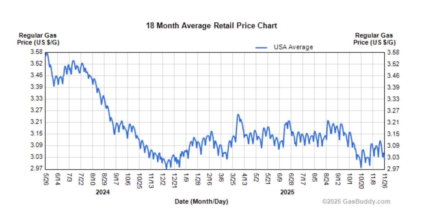
Now that tells a story. Gas prices are indeed quite a bit lower than in May 2024. But since December 2024, prices have fluctuated between roughly $3.00 and $3.20 most of the time. We can't explain every up and down in a complex economic system.
You can see variation, seasonality, longer-term shifts, and perhaps even special causes. You get a sense of:
- What's typical
- What's unusual
- What's “noise” (a.k.a. random fluctuation)
- What might be a “signal” (meaning something has changed significantly in the system)
Even without formal Process Behavior Chart limits, your brain has more to work with. It can recognize patterns that are statistically meaningful. It can ask better questions. And it's far less likely to jump to conclusions.
The Trap of Snapshot Comparisons
In too many organizations, metrics are reduced to red/green boxes or frequent “up/down” commentary. And it leads to conversations like:
- “We're better than last week!”
- “But worse than last quarter.”
- “But better than the 12-month average!”
- “But worse than this time last year!”
This isn't analysis–it's whiplash.
W. Edwards Deming warned us: reacting to every change is not managing.
As Don Wheeler put it:
“The greatest enemy of understanding variation is the snapshot comparison.”
When we mistake noise for signal, we waste time. We burn out teams. We chase ghosts.
What Better Looks Like
If that news broadcast really wanted to inform viewers, they could show a simple chart. And if you want to make better decisions in your organization, you can do the same.
A simple chart gives you:
- Context
- Process insight
- Predictability
- The ability to distinguish signal from noise
And if you take the extra step of applying Process Behavior Charts (a.k.a. control charts), you add clarity to the variation. You gain the confidence to know when not to react–and the ability to recognize real change when it does occur.
“But We Don't Have Room on the Dashboard…”
I've heard this many times:
“Our dashboard doesn't have space for charts.”
To which I ask:
“Do you have space for wasted time, wasted energy, and false alarms?”
If your dashboard is full of numbers but doesn't help people make better decisions, what's it really doing?
Data without context is just noise in disguise.
A Small Shift That Changes Everything
The next time someone shows you a comparison like:
- “Today vs. last month”
- “This month vs. target”
- “This quarter vs. last quarter”
Ask one simple question:
“Can we plot the data over time?”
Even better:
“Can we see this as a Process Behavior Chart?”
It's a small shift. But it changes the conversation–from reaction to reflection. From judgment to understanding. From firefighting to real improvement.
Final Thought
If you want to manage with data, not just react to it… If you want your team to lead with insight, not noise…
Then stop comparing snapshots. Start plotting the dots.
Because again: Two data points don't make a trend. But a chart–a meaningful chart–often does.
If you'd like help moving your organization from comparison thinking to real process understanding, that's why I wrote Measures of Success. And if your team would benefit from coaching or a workshop, feel free to reach out.
March 2026 Update: When a Special Cause Hits
Since I first published this post, gas prices have given us a much more dramatic lesson than the snapshot comparisons I was originally reacting to.
In March 2026, US gasoline futures spiked above $3.20 per gallon — up more than 30% in a single month, on track for the biggest monthly gain since May 2020. Prices are up roughly 45% compared to the same time last year.

The cause isn't mysterious. The Strait of Hormuz has been largely shut down following the US military strikes on Iran, taking roughly 8 million barrels per day offline. Seasonal demand from spring travel and the switch to summer fuel blends added pressure on top of the geopolitical disruption.
This is what a special cause looks like on a chart. For most of 2025, gas prices were fluctuating in a relatively stable range — roughly $1.75 to $2.50 per gallon. That's common cause variation. Normal ups and downs within a system that hasn't fundamentally changed. You wouldn't try to explain why the price was $2.10 one week and $2.05 the next. That's noise.
Then in March 2026, the price broke out of that range in a way that is clearly not noise. Something changed in the system. If you were plotting this on a Process Behavior Chart, the March data points would blow through the upper limit. That's a signal worth investigating — and in this case, the cause is identifiable and external.
The distinction matters for how you respond. When prices fluctuate within normal bounds, the right response is usually: don't overreact. Don't blame or celebrate. The system is doing what systems do. When prices spike because of a geopolitical event that disrupted global oil supply, the right response is different — understand the cause, assess how long the disruption might last, and adjust accordingly.
The news still mostly reports it as snapshots: “Gas up 3.5% today!” “Prices up 45% from last year!” Those comparisons aren't wrong, but they don't help you understand what's happening or what to do about it. A chart with context does.
This is the same principle that applies to your hospital's ER wait times, your factory's defect rate, or your team's monthly revenue. Most variation is common cause — the system fluctuating within its normal range. Occasionally, something happens that genuinely changes the system. The skill is telling the difference. And you can't tell the difference from two data points.


Today, I heard on the news, “Gas prices are down 6 cents from last week, but are virtually unchanged from a year ago.”
That’s true. But good luck making any meaningful sense about why that’s the case or what’s going to happen next week based on that information.