


TL;DR: Year-to-year baseball stats can be misleading. By using Process Behavior Charts to analyze home run data, we can see when a player's performance truly changed (signal) versus when a season was just an outlier caused by normal variation (noise)–a lesson that applies just as much to business and organizational metrics as it does to baseball.
Most debates about baseball statistics rely on year-to-year comparisons and gut reactions. But when you look at home run data using Process Behavior Charts, a different story emerges–one that separates true performance shifts from random fluctuation. Using examples ranging from Babe Ruth to Barry Bonds, this post shows how statistical process control helps us distinguish real signals from noise.
This week, I am at Dr. Wheeler's four-day workshop on “Understanding Statistical Process Control” as I blogged about on Monday.
It's great to learn from Dr. Wheeler in person, and I'll be sharing reflections on the class in a later post (and I'm posting a few things on LinkedIn along the way).
I am still thrilled that Dr. Wheeler wrote the foreword for my book, and I continue learning from him. My body of work and depth of understanding will never compare to his (and I'm not apologizing for that, just stating facts there).
Why Lists of Baseball Statistics Mislead Us
In Chapter 1 of Understanding Variation, Dr. Wheeler points out how charts or graphs are far superior to tables or lists of numbers. He uses a baseball example:
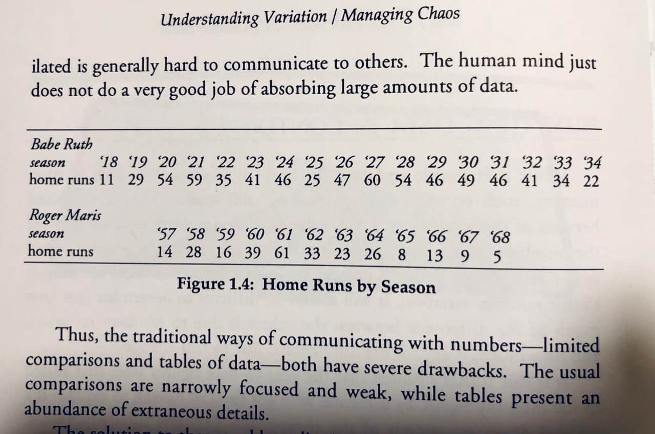
Yes, it's hard for people to absorb and make sense of lists of numbers. It's really hard to see trends or to distinguish “signal” from “noise.” Yet organizations still rely heavily on lists of numbers.
Seeing Home Run Records as Time-Series Data
Below is a chart showing the number of home runs hit by Babe Ruth and Roger Maris per season. Maris was known for hitting 61 home runs in 1961, beating Ruth's previous record of 60, set in 1927.
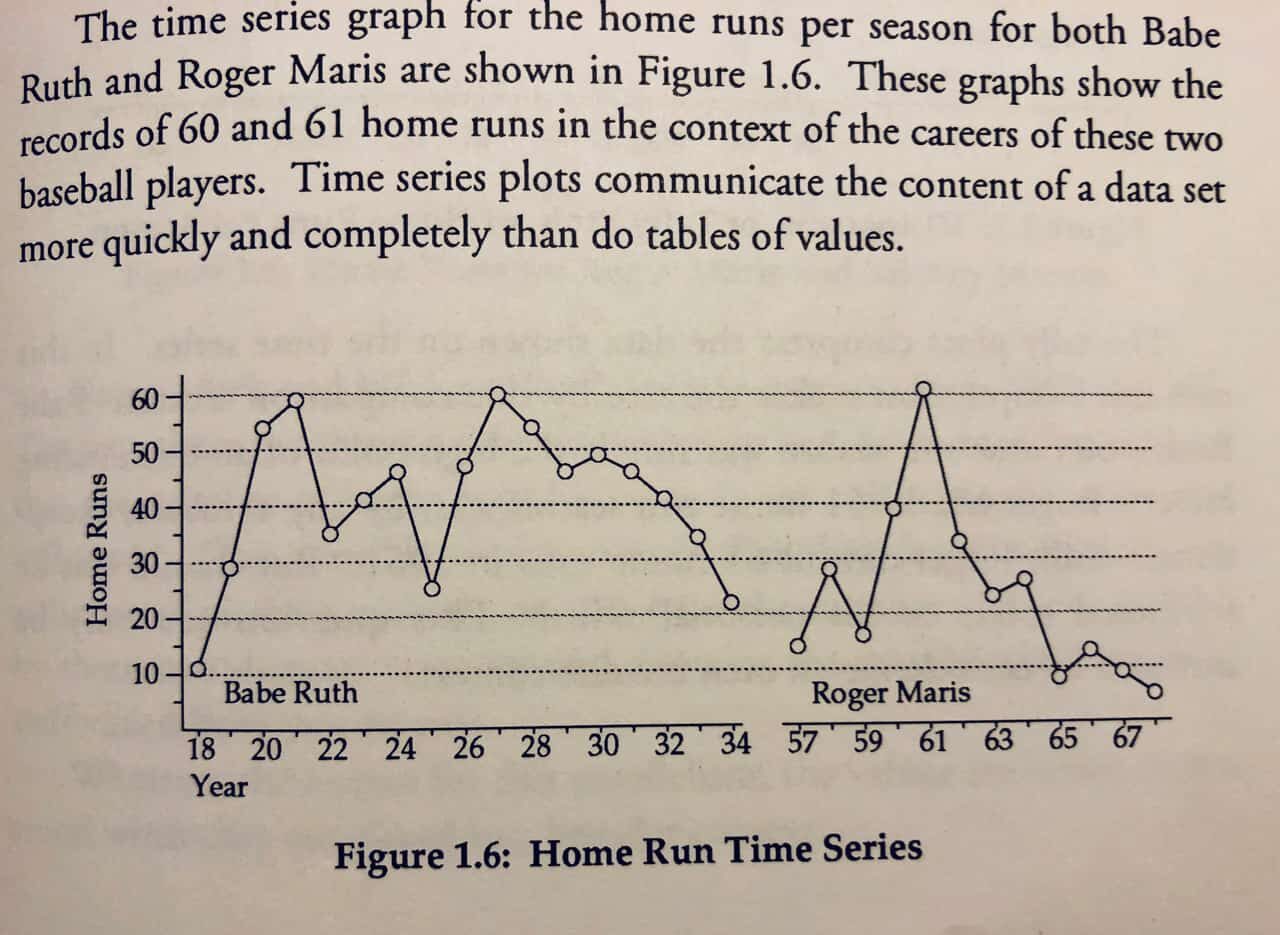
We can also see how much of an outlier the 1961 season was for Maris, compared to his other years.
Wheeler also shows a chart that illustrates the correlation between the home run numbers of Roger Maris and Mickey Mantle, who played together for a while:
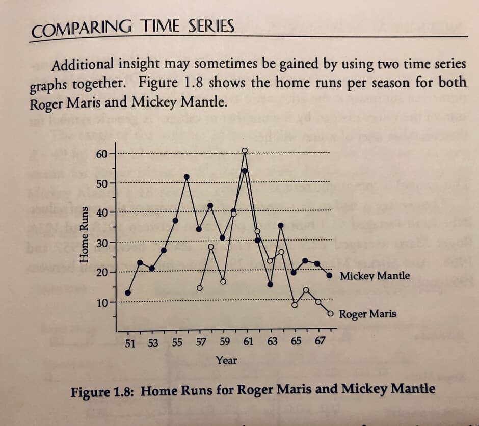
I find great value in “Run Charts” as a way to show time-series data. A “Process Behavior Chart” (a form of “Statistical Process Control” chart) can help determine when a metric value is a “signal.” We don't have to guess.
We can look at the numbers of Mantle and Maris, and we can look at more modern players, as I'll do below.
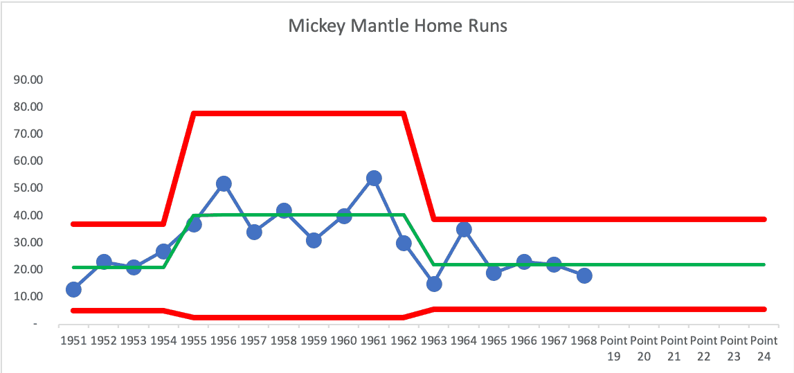
Mickey Mantle: A Sustained Performance Shift
Using my Process Behavior Chart template (which you can get through my book's website), here are Mickey Mantle's career home run numbers by season:
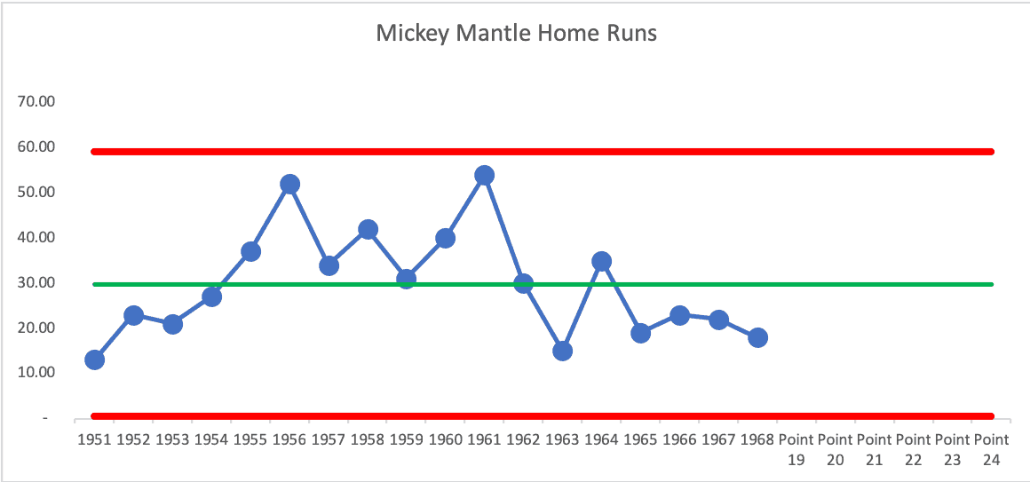
There is an 8-year run in the middle of his career where the number of home runs was above his career average of 29.8, so it's not a single “predictable process” over this career.
Mantle was an appreciably better player in those eight “above average years” years than in his first four years and the last six years or so. You might say, “That's obvious that above-average years show he was better,” but having a sustained run of eight or more consecutive points above the average is not likely to be due to change. There was a sustained effect (or Mantle being better or something else changing in the system over those eight years).
The point of a PBC is to filter out “noise” so we can find “signals” in data. And we can use a PBC to show how a predictable system is likely to continue fluctuating within the range of the Lower and Upper Natural Process Limits until something changes in the system.
This chart shows how Mantle's performance shifted over the years — up and then down (which is not surprising for an athlete). No single year was an outlier.
Roger Maris: A One-Season Special Cause
Now, let's look at Maris, where the 1961 season is a “signal” of a strong, but unsustained change in the system since his season was higher than the Upper Limit. This season would not have been predicted by his performance in any other year.
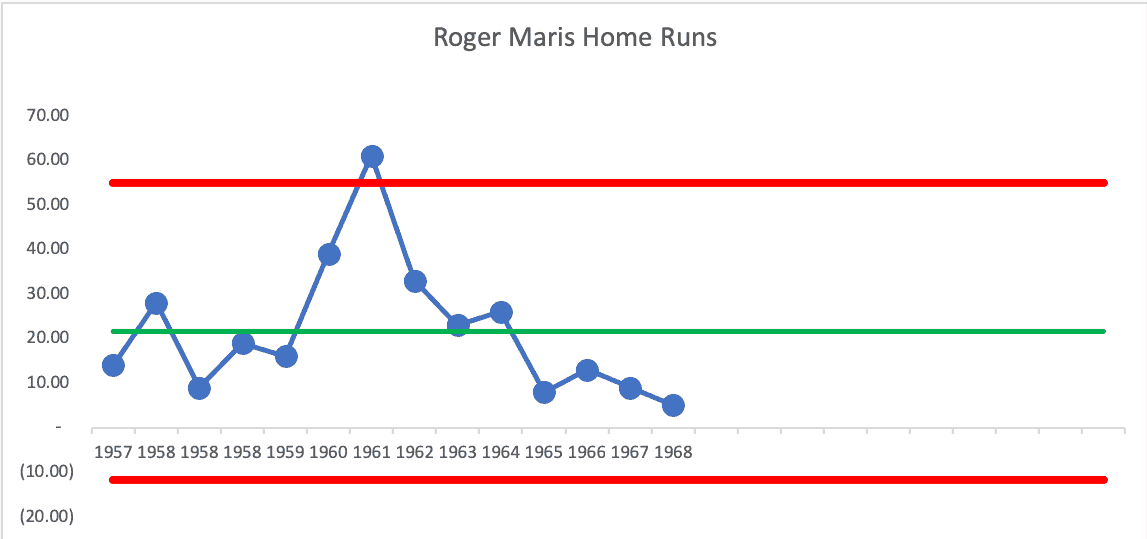
A PBC tells you something was different. It won't tell you what. I've heard many say that Maris hit 61 in 1961 because the season was extended from 154 to 162 games, pitching was weak because of expansion, and he had Mickey Mantle hitting after him, which meant pitchers were more likely to give Maris better pitches to hit to avoid walking him (and Mantle had a great year, making him a significant hitting threat).
Mantle's career showed a sustained performance increase in the middle of his career. Maris was somewhat of a one-season wonder (although his other seasons weren't terrible).
What Process Behavior Charts Can–and Cannot–Explain About PEDs
Steroids and performance-enhancing drugs (PEDs) are often pointed to as a “special cause” explanation for increases in players' home runs in the late 1990s.
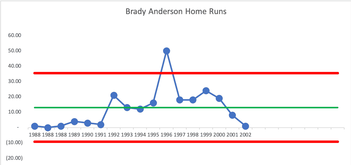
I don't remember Brady Anderson being accused of using PEDs (and some say he was clean), but he sure had an outlier of a season in 1996, as part of a mid-career sustained improvement that we saw in a player like Mantle:
What about Barry Bonds, who had very strong accusations of PEDs? He shows the mid-career sustained increase, and his record-setting 73 home runs in 2001 were an outlier or a special cause. Nobody accused him of using PEDs for just one season, though.
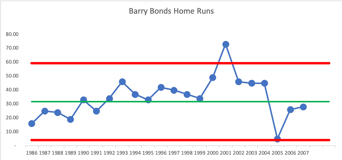
His 2005 season was a very low number because of injury.
Not Every Great Player Shows a Statistical Signal
You might think every player shows this sort of pattern?
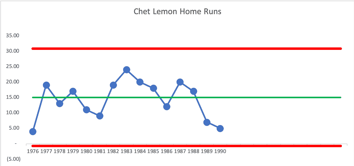
Chet Lemon, a player who played for my Detroit Tigers in my childhood, showed a lot of fluctuation around an average, without shifts or signals (he was not accused of PED use; it was a different era). I remember him as a solid and consistent player, although not a superstar. The chart confirms that memory:
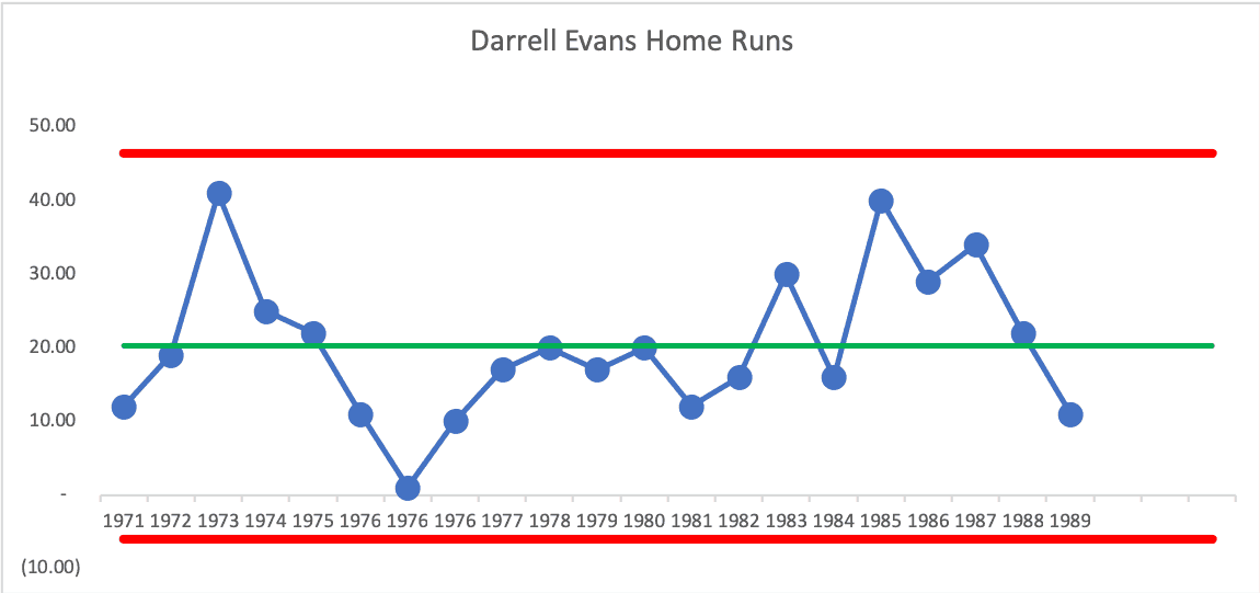
Darrel Evans, another player on the 1984 Detroit Tigers championship team, had two 40+ home run seasons (one early in his career and one late, in 1985). But, he was a “predictable process” home run hitter, with no outliers or shifts. The one season with one home run was a year he only had 166 at-bats. Maybe I should be plotting a ratio of home runs to plate appearances?
Wade Boggs is a player who was famous for having a high batting average but not hitting many home runs. His chart shows an outlier season:
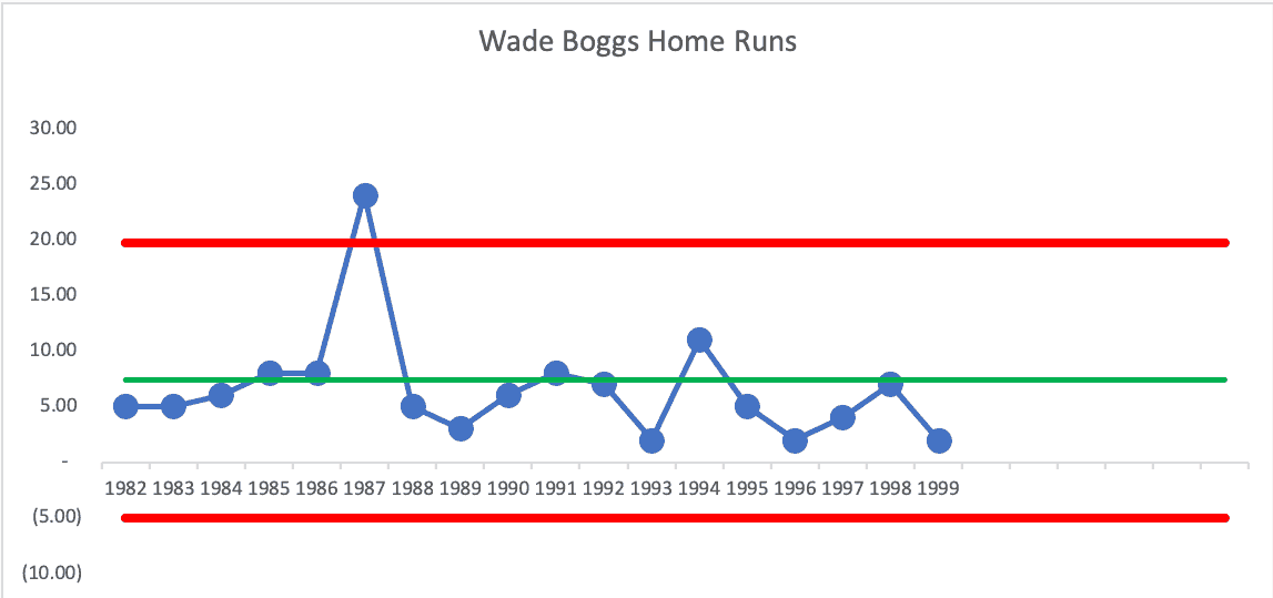
History says that Boggs basically just decided to focus more on home runs that season, maybe to prove to critics he could do it.
Before the 1987 season, Boggs said that he was going to focus more on hitting home runs. He then proceeded to triple his previous career high…
If Boggs's power surge was the result a new focus on hitting home runs, he quickly abandoned that strategy. He hit just five home runs in 1988 and only three in 1989. This spike in home run production is among the most drastic in baseball history, even more extreme than the famous case of Brady Anderson's fifty home run season in 1996. It is possible, perhaps even likely, that a livelier baseball was actually the main cause of this surprising outburst, rather than Boggs's new approach.
Home runs in both leagues spiked sharply in 1987. The American League saw a 15% rise in home runs from 1986 to 1987 and the National League saw almost a 20% rise. At some point in the 1987 season, the lively balls were supposedly eliminated and home run production dipped 28% in the AL and 30% in the NL. Aside from Boggs, ten other American League players reached career highs in home runs that season.
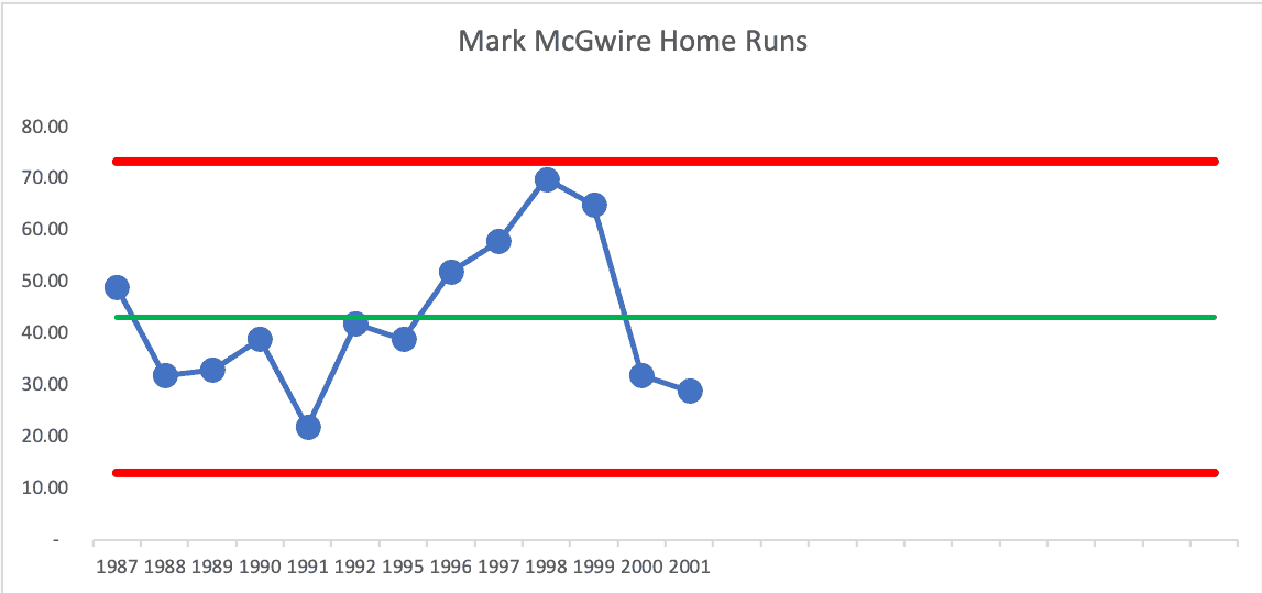
Back to the accused PED users… what about Mark McGwire? I removed two seasons in the middle of his career, where he played very few games due to injury. His chart, even with the 70 home run season in 1998 (then the new record), shows only a “Rule 2 Signal,” unlike Bonds.
There are three consecutive years that are closer to the Upper Limit than they are to the average, 1997, 1998, and 1999.
McGwire later admitted to using PEDs, but claimed he didn't need them to hit 70 home runs. Maybe the chart proves that?
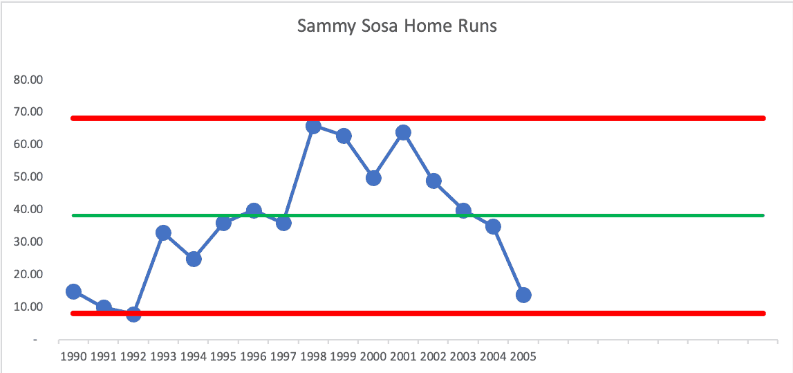
And what about Sammy Sosa? The only signal is the three data points (out of four) that are closer to the Upper Limit than they are to the average (1998, 1999, and 2001). He did allegedly have a positive PED test. The chart seems to suggest that, too.
Rafael Palmiero was a player who failed a PED test (after denying it in front of Congress). His chart shows two near “signal” seasons and a sustained upward shift in the middle of his career (a signal) that wouldn't have been predicted statistically (again, that's not proof of PED use… just that something changed at a significant, sustained level). There are nine consecutive above-average years. And the same “Sosa pattern” (with a lot of years closer to the Upper Limit than to the average, consecutively it seems…)

As with any system or process, the Process Behavior Chart doesn't tell you WHAT changed. It just tells you something DID change in a way that's significant and worth investigating. You need to use your process understanding and knowledge to figure out (if you can) what happened.
This is the same mistake leaders make in organizations–overreacting to a single data point, attributing cause without evidence, or crediting individuals for outcomes driven by the system. Process Behavior Charts don't eliminate judgment; they improve it by telling us when a question is actually worth asking.
Learn how to create Process Control Charts in this blog post or in my book.


So what you’re saying is… Roger Maris used drugs for his one outlier season?
… I mean… need to find some “special cause”, right? ;-)
Maybe Maris is an unsung innovator. ;-)
Here is an online discussion (which is worth as much as you pay for it… like this blog?) on the question of “Did Roger Maris Use Steroids?”
An article from Sports Illustrated, a more reputable source, talks about that season.