


News headlines often claim that MLB batting averages are at historic lows. But comparing one season to the last tells us very little. Using Process Behavior Charts, this post examines long-term MLB batting average data to distinguish real system changes from normal year-to-year variation.
As I mentioned in June, I'm in Knoxville this week to take four days of classes with Donald J. Wheeler, Ph.D. I've long admired Dr. Wheeler and his work, and I was thrilled when he wrote the foreword to my latest book, Measures of Success.
One lesson from Understanding Variation is not overreacting to a report about a single data point.
I recently saw this headline:
Baseball on pace for lowest batting average since 1972

Just because it's the lowest average in 48 years… it doesn't mean this year's MLB-wide batting average is low in a statistically meaningful way.
What can we do? Go get the data. As Wheeler says, “without context, data have no meaning.” As I've done before, I go to baseball-reference.com to find the annual MLB-wide averages.
Why Comparing One Season to the Last Is Misleading
If we did what we see in many workplace reports, we'd report something like “the 2018 batting average of .249 is lower than last year's average of .255.” But we have to, as always, be careful about comparing two data points. Is that lower batting average something that represents a meaningful “signal” or is it just “noise” in the data?
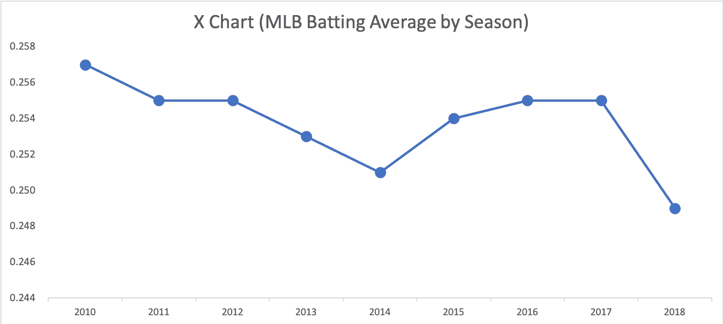
What a Run Chart Shows That Headlines Don't
What can we do? Plot the dots. Even a simple run chart for recent years tells us more than a comparison of two data points:
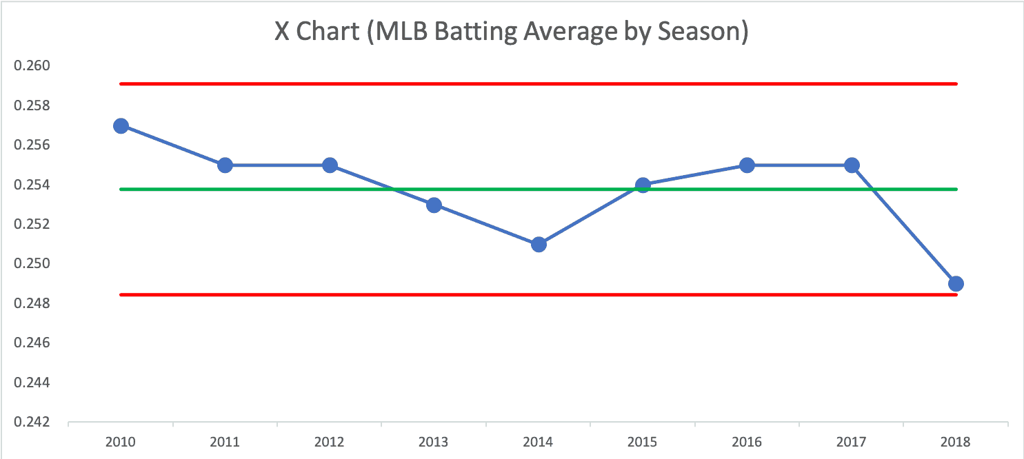
Is 2018 a Statistical Signal?
If we create a Process Behavior Chart with an average and calculated Natural Process Limits for these seasons starting in 2010, the 2018 number is above the Lower Limit, so it's not a signal in and of itself:
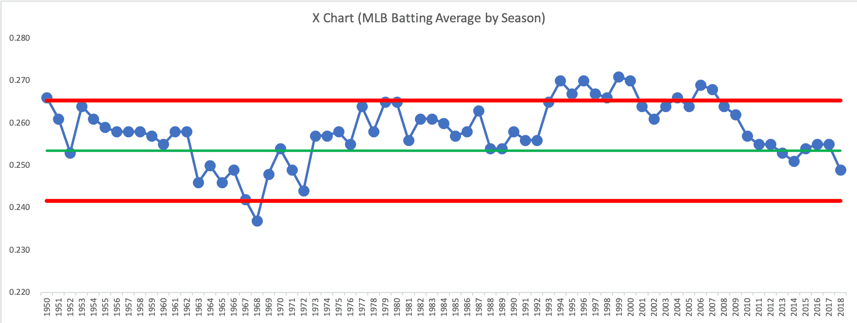
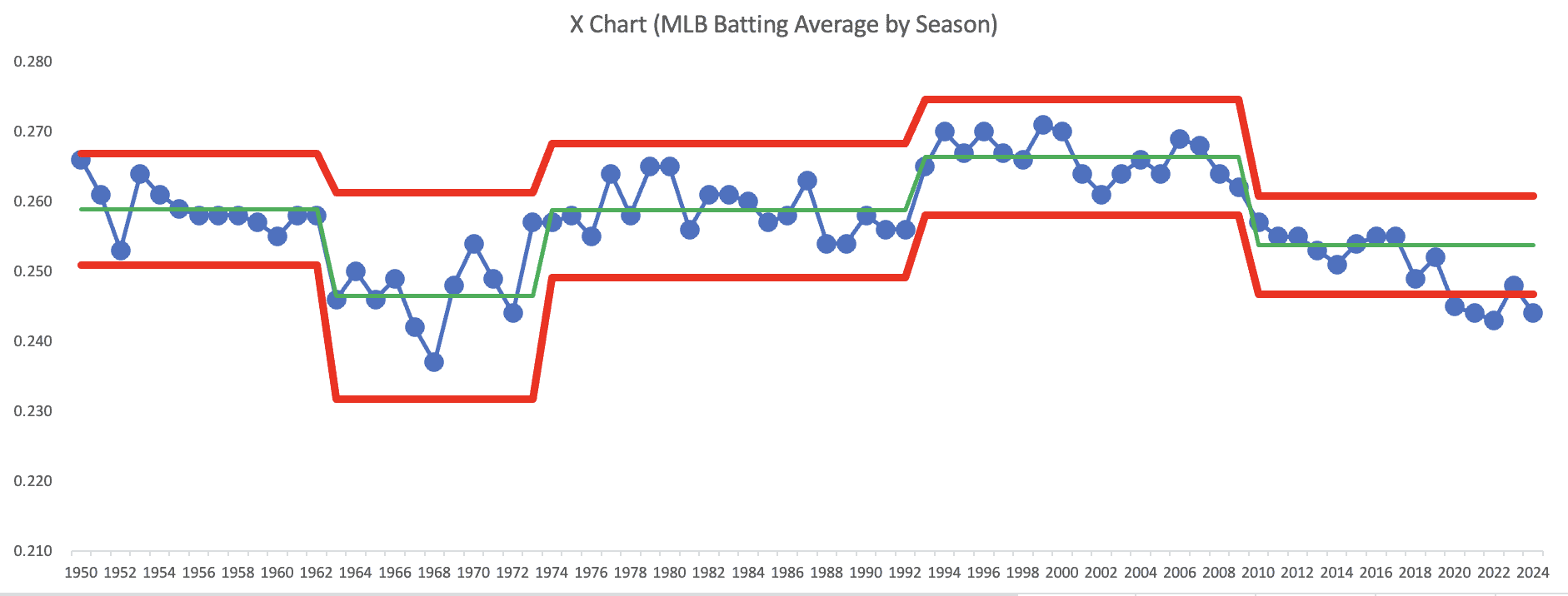
Batting Averages Are Not One Predictable System
But what if we get more data and more context? Here is the Process Behavior Chart that I created, going back to 1950 (an admittedly arbitrary date). I calculated the average of the limits for the first 25 years. We can see how averages have shifted over time. It's not a single predictable system over time. Things have changed in the game of baseball:
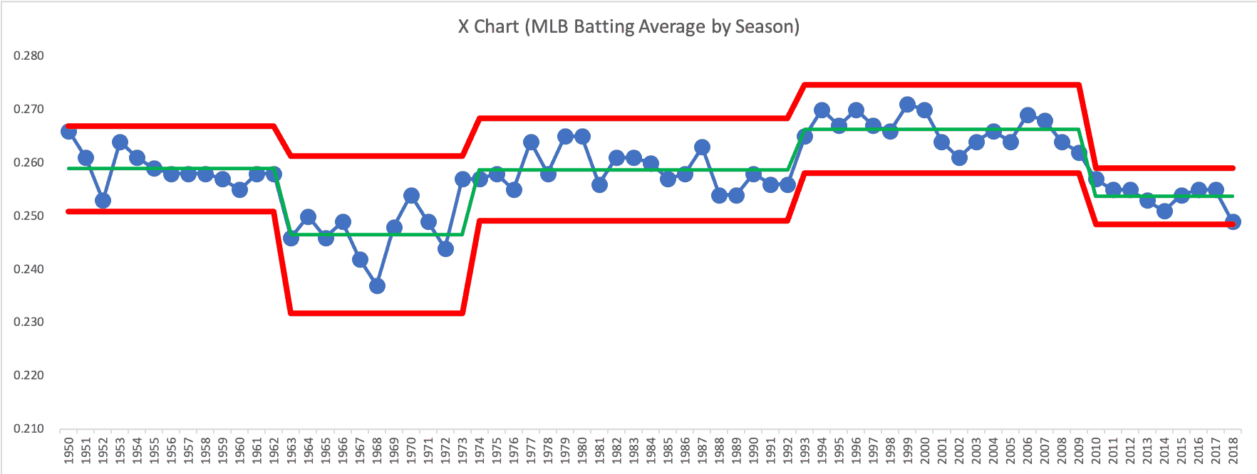
Below, I've shifted the average and limits over time as those changes occurred. We know we have sustained shifts in performance when eight or more consecutive years are above or below the established average (and we look for points outside of the limits).
What Process Behavior Charts Can–and Cannot–Explain
A Process Behavior Chart only tells us that something has changed. It doesn't tell us WHAT changed. We need to understand our system. In a Lean workplace, we'd go to the gemba.
This is the same challenge leaders face in organizations. Metrics fluctuate constantly, but reacting to every up or down creates noise-driven management. Process Behavior Charts help leaders decide when a question is worth asking–and when patience is the better response.
When the System Changed–and When It Didn't
It seems that the shifts occurred:
- 1963 – shift downward (why?)
- 1973 – shift upward (maybe because the Designated Hitter was added to the American League?)
- 1993 – shift upward again (due to the “steroid era?”)
- 2010 – shift downward (due to PEDs being driven out of the game an increase in defensive shifts?)
It's not worth asking “why was the batting average higher or lower?” when those data points are in the realm of noise. It is worth asking why the system changed when we see signals in the metric.
2018's average is low for this century. It's not historically low if you go back more than 50 years.
As the game continues to evolve–through defensive shifts, pitching velocity, and offensive strategy–the more important question is not whether one season looks low, but whether a sustained shift is underway. Only future data will answer that.
Learn more about how to create and use “Process Behavior Charts” in this blog post or my book.
Here's an updated chart through the 2024 season… definitely a shift downward below the old Lower Limit.


Comments and discussion on LinkedIn, including some “Wheeler-isms” I posted as comments to this post:
Here is the spreadsheet (XLS via Dropbox)
Another interesting discussion that could be had is in deciding where to determine when a process change has occurred. For example 1969 could be used as the start of a new period in the chart since MLB lowered the pitching mound in response to the perception that pitchers had an unfair advantage. Or 2003 with the publication of Moneyball and the shift in evaluating players that de-emphasized traditional statistics such as batting average. Or maybe 2008 as it was the first season after the publication of the Mitchell report. And of course there are other points such as expansion years and others that I’m sure I’m missing.
Good question on determining where a process changed. When doing a retrospective chart, you can see signals or evidence of shifts. And then you can ask, “What happened?”
Or you can say, “I know there were changes… did it appear to have an immediate effect?”
You’re right about that change in 1969, but I don’t see a signal in the chart there. The MLB batting average was indeed higher in 1969 compared to 1968, but it’s in the range of common cause variation – it appears to be noise.
“Moneyball” certainly started the trend of emphasizing On-Base Percentage over Batting Average. The chart suggests the last downward shift started in 2009. I doubt the drop in batting average was a result of the financial crisis or President Obama getting elected :-)
Here is a Run Chart that shows batting average and on-base percentage together. Visually, they look very correlated. The calculated correlation factor for 1950 to 2018 is 0.93 (where 1.0 is perfect correlation). The correlation from 2010 to 2018 is just 0.73, which maybe isn’t surprising with an increased emphasis on drawing walks (which increases OBP).
Here is that data in Excel if you want to play with it.
Thanks for sending the data along. I’ll try have to take a look at it. Although it’s fantasy football season and I’m knee deep in trying to figure out the signal and noise in the various predictions available for drafting players. :)
Update — the MLB batting average ended at .248 for the 2018 season… so far for 2019, the MLB total average is just a bit higher at .249. We might have to go to four decimal places to see if last season was a signal… but there certainly seems to be a change to the game where the attempt to hit more home runs is leading to lower batting averages.
The latest data points:
2019: .252
2020: .245
2021: .244
2022: .243
2023: .248
2024: .244 (with one weekend left to play