

U.S. Measles Cases Over Time: Signal or Noise in the Data?
tl;dr: Headlines comparing two years of measles cases can be misleading. Looking at the full CDC time series with Process Behavior Charts shows that not every increase is meaningful. From 2000-2013, U.S. measles cases fluctuated as noise within a stable system. In contrast, the large spikes in 2019 and 2025 are true signals, indicating a system change. Understanding the difference helps us react less to headlines and focus on learning from real shifts in performance.
This post shows how Process Behavior Charts help distinguish real system changes from misleading year-to-year comparisons–especially when measles headlines spike.
Here's a recent example from a cable news network. This image compares the number of U.S. measles cases in 2020 (13) with the 2025 number as of December something-teenth (1912). The numbers are color-coded, which doesn't really add much (and red/green comparisons can be misleading).
The math on the percent increase (14,608%) checks out.

I also question why the 2020 number isn't on the left, since time series (and our reading in English) goes from left to right. So that graphic is a bit of a mess.
They do cite their source, the CDC. The data are available on their website (at least it is for now).
The CDC site provides what I'd prefer: time-series data with far more than two data points. So that's good. They use a “bar chart” (aka “column chart”), but my preference is a “line chart” (aka “run chart”) for time-series data.
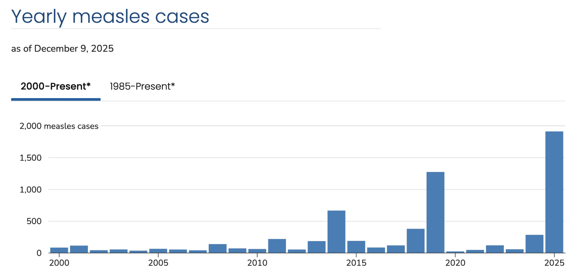
Even as a column chart, this visualization shows so much more context. It appears that the number of measles cases fluctuates around a relatively low average. But there are years with spikes, such as 2014, 2019, and 2025.
The spikes are getting increasingly large.
The chart tells us that, but the chart alone (or any metrics) won't answer the question of “Why did the spikes occur?”
You need to understand the system you're measuring the output of, whether that's production volumes out of a factory or the number of hospital patients who acquire infections.
A recurring system pattern
Across the past two decades, U.S. measles spikes have followed a consistent pattern: measles is imported through international travel, enters pockets of low vaccination coverage, spreads rapidly within close-knit or under-immunized communities, and is eventually contained through public health intervention. What differs from year to year is not the pattern itself, but the scale, duration, and context of each outbreak.
2014 Spike: A Warning Shot
In 2014, the U.S. reported 667 measles cases–the highest number since elimination was declared in 2000. While the underlying outbreak pattern was familiar, what made 2014 notable was the visibility and geographic spread of cases.
A large outbreak in an unvaccinated Ohio community accounted for 138 cases, while early cases in California–linked to international travel–set the stage for the high-profile Disneyland outbreak that began later that year. The year served as an early signal that localized immunity gaps could still produce national consequences.
What changed vs. baseline: visibility, multi-state spread, public attention.
2019 Spike: Prolonged Community Transmission
The 2019 spike, with 1,282 cases, was different in both scale and persistence. Roughly three-quarters of cases were tied to two prolonged outbreaks in under-immunized Orthodox Jewish communities in New York.
Unlike 2014, these outbreaks continued for months, pushing the U.S. close to losing its measles elimination status. The response required mandatory vaccination orders and sustained public health effort, highlighting how deep immunity gaps can overwhelm routine containment strategies.
What changed vs. 2014: duration, concentration, threat to elimination status.
2025 Spike: A System Under Strain
As of December 2025, the U.S. has reported 1,912 confirmed measles cases–the highest annual total since the early 1990s. While the outbreak pattern remains familiar, the frequency and magnitude of outbreaks are not.
With 49 outbreaks reported and the vast majority of cases occurring among unvaccinated or unknown-status individuals, 2025 suggests a broader system issue: declining routine vaccination coverage has increased the number and size of susceptible communities. Unlike earlier spikes, this raises the risk of sustained transmission, threatening the country's elimination status.
What changed vs. 2019: scale, number of outbreaks, system-level erosion.
The pattern hasn't changed–but the system's ability to absorb it has.
Using Process Behavior Charts
The column chart makes the three spikes very apparent. But how do we know if those numbers are statistically meaningful? Are those numbers worth understanding, reacting to, and learning from?
Every data set has a “highest number in X years,” but that doesn't mean it's statistically meaningful.
A “Process Behavior Chart” (another term for a “control chart”) combines the visual nature of a line chart with three calculated lines:
- Average
- Lower Limit
- Upper Limit
When the output of a system is “in control,” we see an absence of “signals,” meaning the data points would all be described as “noise.”
The two main signals we look for:
- Any data point outside the calculated limits
- 8 or more consecutive data points on the same side of the average
Any signal means the system has changed significantly. Any single “noise” data point cannot be explained as to why that data point is different.
A signal is worth understanding, explaining, and reacting to.
How create a Process Behavior Chart via the video below (or this handout).
I often use my own spreadsheet template to create a PBC, but I used the handy (and free) XmRit.com tool.
Here is the baseline X Chart that uses all of the data points to calculate the average and limits. That's our first test that answers the question of:
“Is this a single stable system over time that's just fluctuating around a stable average?”
The answer is “no.”
How to read this chart: dots = annual cases; dashed line = average; limits = expected range of variation in a stable system.

The chart makes it very clear that 2019 and 2025 are signals — they are statistical outliers. The 2014 year is not above the upper limit. But look now at the blue data points from 2000 to 2013. That's XmRit flagging all of those consecutive points below the average — another signal.
What these charts can — and can't — tell us:
Process Behavior Charts don't explain why measles cases rise or fall. They don't identify root causes, assign blame, or prescribe solutions. What they do tell us is when the performance of a system has changed in a statistically meaningful way. Once we see a signal, then it becomes appropriate to ask causal questions using other data and methods.
So I could use the XmRit tool to add a divider between 2013 and 2014. A new average and limits are calculated after that.

This isn't a trend line bending upward; it's evidence of a redesigned (and now degrading) system.
If this way of thinking feels familiar, it's because the same principles apply far beyond public health. In my book Measures of Success, I explore how leaders can use Process Behavior Charts to stop overreacting to noise, ask better questions of data, and make decisions that actually improve systems over time.
Zooming in on just 2000 to 2013 makes this clearer, as cases fluctuated around an average of 88.5 cases per year. In 2011, with 220 cases, it was close to the upper limit but not a signal.
Therefore, it wouldn't be a good use of time to explain the ups and downs between 2000 and 2013.

Zooming Out to 1985
The CDC also offered data going back to 1985… so why not look?
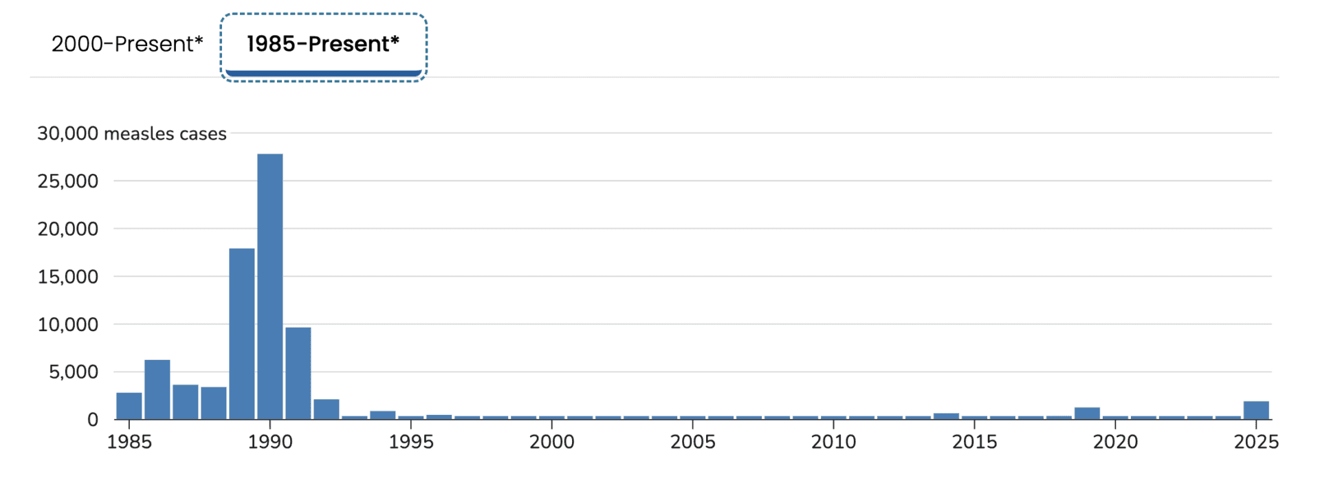
Whoa! That shows a very different picture. And it shows why measles wasn't “eradicated” until 2000.
The late 80s and early 90s represent the tail end of a fundamentally different public health system–one in which measles vaccination existed, but population immunity was not yet reliably engineered into routine care.
Historical context helps explain why measles declined so sharply after the early 1990s:
At the time, the national strategy relied mainly on a single dose of measles-containing vaccine, which left a predictable fraction of children unprotected due to primary vaccine failure. Compounding this, vaccination coverage was uneven, particularly among preschool-aged children. The outbreak disproportionately affected urban, low-income communities, where access to primary care, insurance coverage, and consistent well-child visits was limited. This was less about ideological resistance and more about systemic gaps in delivery and follow-through.
The epidemic exposed these weaknesses clearly enough to drive structural change, not just exhortation. In response, public health leaders implemented a two-dose MMR recommendation, strengthened school-entry vaccination requirements, and expanded federal support for childhood immunization programs, most notably the Vaccines for Children program in 1994. The result was a true process redesign: measles incidence collapsed, leading to U.S. measles elimination by 2000. In retrospect, 1989-1991 marks both the failure point of the old system and the catalyst for a far more robust one.
The key point isn't the details of any single policy, but that sustained improvement followed a deliberate redesign of the system itself.
There's a clear cause-and-effect connection — the differences between “old system” and “new system.

Unfortunately, the country seems to be sliding into a “new system” as vaccination rates drop. How much have they dropped? That would be another data set to chart and evaluate–getting beyond headlines into real math and better analysis.
Headlines:
Kindergarten Routine Vaccination Rates Continue to Decline
Investigation: Big drop in MMR vaccinations at area schools
Data investigation: Childhood vaccination rates are backsliding across the U.S.
I'm going to have to leave that for a future post.
For leaders, the lesson is familiar: reacting to isolated data points leads to overreaction, while understanding system behavior enables better decisions.
Before reacting to a spike, it's worth asking whether the system actually changed–or whether the data are simply doing what they always have.
Separating Signal from Noise
How understanding system behavior leads to better decisions
This isn't about measles alone–it's about how we decide what deserves our attention.
When headlines focus on a single year-to-year comparison, they invite reaction rather than understanding. Time-series data tell a more useful story: not every increase is meaningful, and not every spike represents a new trend. Process Behavior Charts help separate signal from noise, allowing us to see when a system has truly changed–and when it has not.
Viewed this way, the U.S. measles data show three important lessons. First, long periods of apparent stability can mask underlying fragility. Second, true system changes–like those that followed the late-1980s epidemic–produce sustained improvement, not just temporary drops. And third, today's large spikes are signals worth understanding, not because they are shocking, but because they suggest the system is no longer performing as it once did.
Good decisions depend on more than dramatic numbers. They require context, history, and the discipline to ask better questions of our data. Whether we're looking at public health, manufacturing, or healthcare delivery, the principle is the same: react less to noise, learn more from signals, and focus improvement efforts where they actually matter.
When leaders react to noise, they chase symptoms. When they study signals, they redesign systems.