

Workplace Deaths by Age: Why Counts and Rates Tell Different Stories
A pitch from a personal injury law firm showed up in my inbox. The subject line was about older workers dying on the job. The numbers were real. I checked them against the Bureau of Labor Statistics' Census of Fatal Occupational Injuries.
The problem is the story the firm wrapped around those numbers. It points toward a conclusion that the data do not support. Here is the case they made:
In 2024, workers aged 55 to 64 had 1,031 fatal work injuries, more than any other age group. Workers 65 and older added 824 more. Together, workers 55 and up accounted for 1,855 deaths, about 36.6 percent of the 5,070 people who died on the job that year.
The firm called the years before retirement a “danger decade.” The framing was that an aging workforce creates a growing risk, with a note that older workers take longer to recover when they get hurt.
A reader could easily take that framing to mean that employing fewer older workers would reduce the risk.
That could amount to illegal age discrimination. It would also miss the point.
Counts and Rates Answer Different Questions
Start with the numbers themselves.
The pitch leads with counts, and counts answer one question: How many people in a group died?
They do not tell you how dangerous the work is for the people doing it. For that, you need a rate, which divides the number of deaths by the number of workers or by the hours they worked.
BLS publishes both. The pitch used the counts. The rates reveal what the counts leave out.
Here are the 2024 rates, measured in deaths per 100,000 full-time equivalent workers:
- Workers aged 25 to 34: 2.5
- Workers aged 45 to 54: 3.1
- Workers aged 55 to 64: 4.1
- Workers aged 65 and older: 9.1
The 65-and-older group had fewer deaths than the 55-to-64 group–824 compared with 1,031–but its rate was more than twice as high and nearly three times the national average of 3.3.
The count was lower because workers 65 and older represented far fewer full-time-equivalent workers. A smaller denominator can produce fewer deaths even when the fatality rate is much higher.
Calling ages 55 to 64 the “danger decade” is driven largely by the count. The 55-to-64 group combines a large working population of that age with an elevated fatality rate. But the rate points to a much more serious problem among workers 65 and older.
The pitch's own line–that the danger does not stop at 65–understates the difference by a wide margin. The fatality rate for workers 65 and older was more than twice the rate for workers 55 to 64.
That distinction disappears when we look only at counts.
I want to be fair about this because it is an easy mistake and a common one.
Counts feel like the real number. They are concrete, and they land harder than a rate does. They also spare you the work of finding a denominator, which a rate always demands. So the count is what gets reached for, both in a law firm's summary and in plenty of internal safety reviews.
But leaders need both measures.
The count shows the total burden of harm. The rate shows how the risk differs across groups.
There is also an important limitation in the age-specific rates. They tell us that risk differs by age, but they do not tell us why.
Older workers may be distributed differently across occupations, industries, employment arrangements, schedules, and types of work. The rates do not prove that age caused the difference. They tell us where to investigate.
That is a reason to study the jobs and hazards behind the rate, not to treat age as the hazard.
One Year Is Not a Trend
The same pitch treated 2024 as “good news” because the national total fell from 5,283 deaths in 2023 to 5,070. The overall fatality rate also fell, from 3.5 to 3.3.
Maybe that reflects meaningful improvement. But comparing one year with the year before gives us two points. Two points cannot tell us whether the underlying system changed or whether we are seeing routine year-to-year variation.
So I plotted the rates on XmR charts, a form of Process Behavior Charts.
Five annual observations make for a very short baseline, especially because BLS publishes the rates rounded to one decimal place. The calculated limits should therefore be treated as provisional. I am not using these charts to declare either system stable. I am using them to make a narrower point: neither 2024 value provides convincing evidence that the underlying system changed.
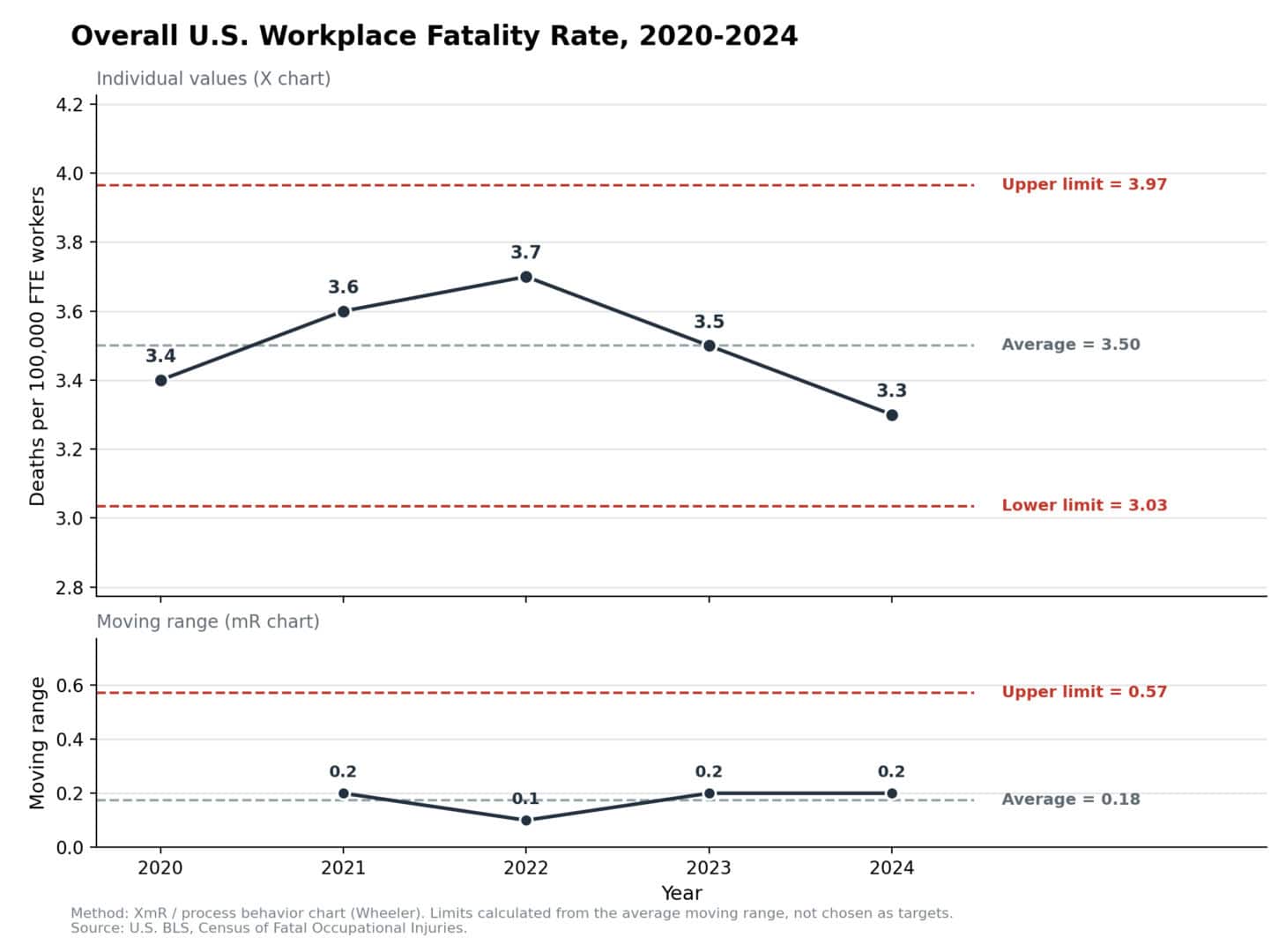
The overall rate averaged 3.5 from 2020 through 2024. The provisional natural process limits are 3.03 and 3.97. The 2024 rate of 3.3 falls within those limits.
That does not prove long-term stability. It does mean that the change from 3.5 to 3.3 is not enough, by itself, to demonstrate that workplace safety broadly improved.
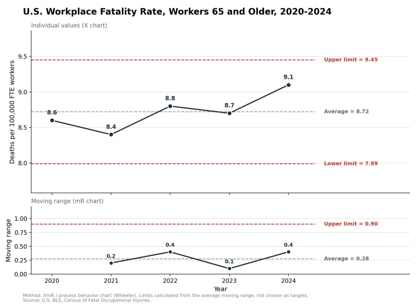
The rate for workers 65 and older tells a similar story. The 2024 rate of 9.1 is the highest of the five values, but it remains below the provisional upper limit of 9.45.
“The highest in five years” can make a compelling headline. It does not make a signal. Every five-point data set has a highest point.
BLS also identified a specific contributor to the decline in total deaths. On-the-job drug and alcohol overdose deaths fell from 512 to 410. That reduction of 102 deaths accounted for almost half of the total decline of 213. It is a real and welcome improvement in one category. It does not, by itself, establish broad improvement across workplace safety.
The Rate Should Change the Question
The higher rate among older workers is not a reason to employ younger people. It is a reason to investigate and improve the work.
Which occupations account for the difference? Which hazards, schedules, physical demands, and working conditions are involved? How much of the difference comes from falls, transportation incidents, violence, exposure, or other causes?
Those are questions leaders can act on.
Age may affect reaction time, injury severity, and recovery. But leaders still control many features of the work: how heavy the lifting is, how long the shifts run, how much the pace punishes a momentary lapse, how equipment and workstations are designed, and how quickly help arrives when something goes wrong.
Those are design choices, not fixed facts about older people.
The recovery point leads to the same conclusion.
Travelers reported from its own claims data that injured workers 60 and older missed approximately 97 days of work, compared with an average of 80 days across the claims it analyzed.
That is one insurer's claims experience, not a national estimate. The finding may not be representative of every workplace.
An injury late in a career may end that career. That points toward designing the work so the injury does not happen.
Managing older workers out does the opposite. It keeps the hazard and removes the person.
Fatalities Are the Last Signal You Get
A fatality is about as lagging as a safety measure gets. By the time one appears in the data, every opportunity to prevent that death has already passed.
The earlier signals are the near misses, unsafe conditions, equipment problems, and workarounds. Those signals reach leaders only when someone notices them and believes it is both safe and worthwhile to speak up.
The absence of reported problems is not proof that the system is working. It may mean the system failed to detect them–or that people decided there was no point in speaking up.
A workplace that studies fatalities is studying the worst outcome after the fact. A stronger system detects the conditions that can produce a fatality while there is still time to act.
The pitch put the spotlight on older workers. The rates should put it on the hazards and the design of the work.
A fatality rate of 9.1 for workers 65 and older is not a verdict about those workers. It is a reason to ask which occupations, exposures, and working conditions are producing that result–and what employers can change.
That investigation begins by looking beyond the count.