

Every Metric Has Variation – What Can We Learn from NCAA Football Attendance?
TL;DR: Comparing two data points (like year-over-year attendance) can be misleading. Run charts are better, but Process Behavior Charts are best because they help distinguish signal from noise. NCAA football attendance data shows why understanding variation matters–and why leaders should react less and learn more from their metrics.
Organizations rely on metrics to guide decisions, but many struggle to interpret data correctly. Comparing one data point to another–last year versus this year, this month versus last month–often leads to misleading conclusions and overreaction. By understanding variation and looking at data over time, leaders can make better decisions and avoid responding to noise.
A recent example involving NCAA football attendance highlights why this distinction matters. This is why understanding variation in metrics is essential for making better decisions.
One of the biggest challenges I see in organizations isn't a lack of data–it's how that data is interpreted. Metrics are often used to justify quick reactions instead of thoughtful learning. Without an understanding of variation, even well-intentioned leaders can end up responding to noise, not meaningful change.
Once you learn how to “understand variation” (h/t to Don Wheeler), you don't look at data–or news headlines–the same way again.
That dynamic showed up recently when I saw a headline about a drop in NCAA college football attendance.
A Familiar Metrics Problem: Snapshot Comparisons
I wasn't satisfied with the two data-point comparisons or the other written descriptions of the metrics. I wanted to see data. SHOW ME THE DATA, JERRY! (with apologies to “Jerry Maguire”). I wanted to see a chart. So, I found the data on to NCAA website and created “Process Behavior Charts” that tell you much more about the data than text numbers ever could.
Three Ways Leaders Commonly Look at Data
Bad, Better, and Best Ways to Look at NCAA Football Attendance Numbers
As I summarized:
- Bad: Two data point comparisons and lists of numbers
- Better: A “run chart” that visualizes the data
- Best: A “Process Behavior Chart” that helps us make better decisions
How do our organizations treat metrics?
The Bad: Tables and Two-Point Comparisons
Does your organization show tables of numbers with comparisons to last year or last month?

Do you just put numbers in a grid or a “bowling chart?”
Does a table or a list of numbers really help you see trends?
Better: Run Charts That Show Data Over Time
Better is making a run chart – plot the dots!
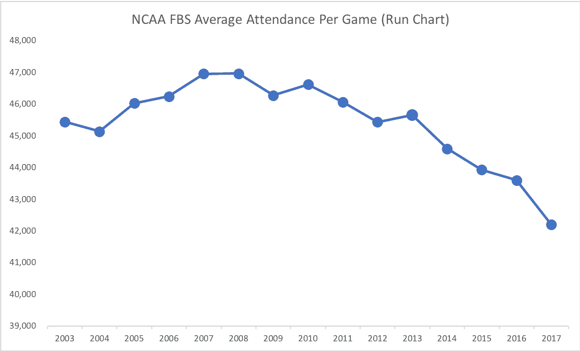
Now, that's starting to really tell you something about attendance numbers (although the impact is less pronounced if the Y-axis goes from zero to 50,000.
Best: Process Behavior Charts and the Voice of the Process
I still think the “Process Behavior Chart” (PBC) is the gold standard for looking at metrics and data.
Here is the PBC for FBS attendance:
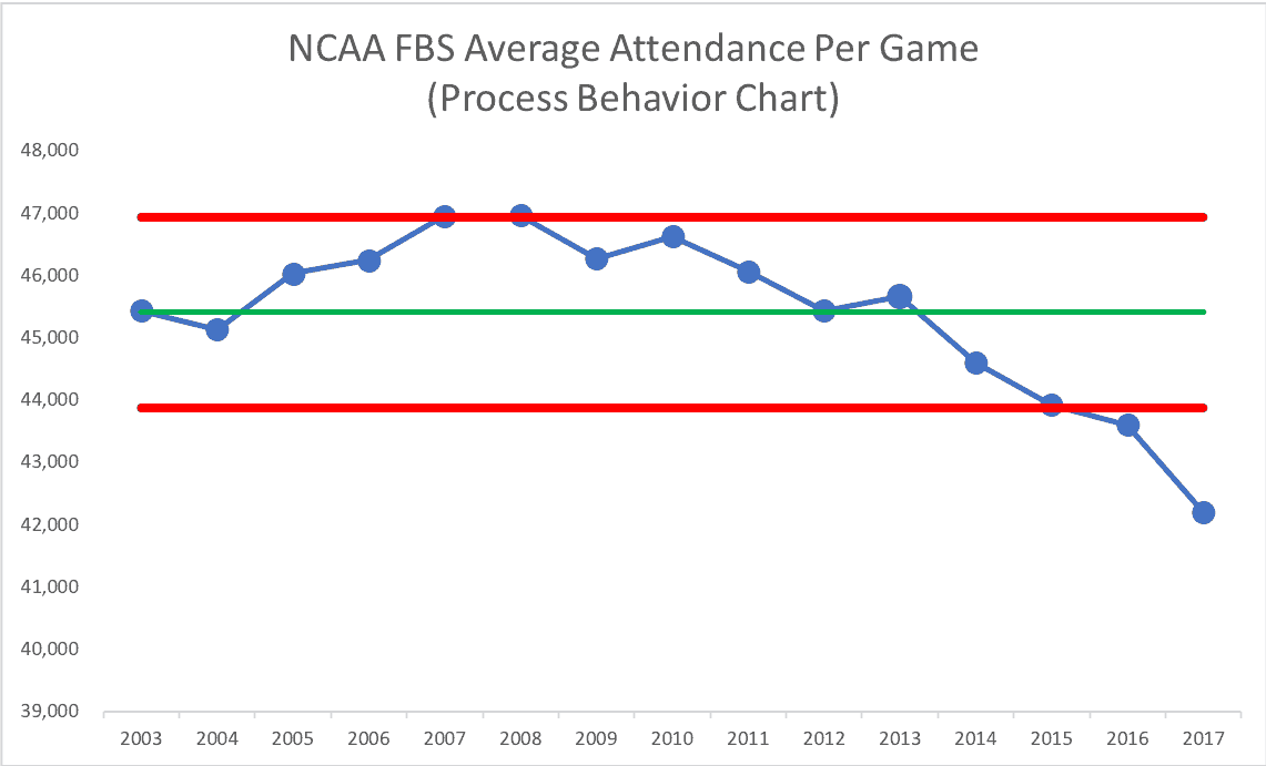
It's not what we'd call a stable and predictable system.
Looking Deeper: Conferences and Individual Programs
What about Big Ten attendance at the conference level?
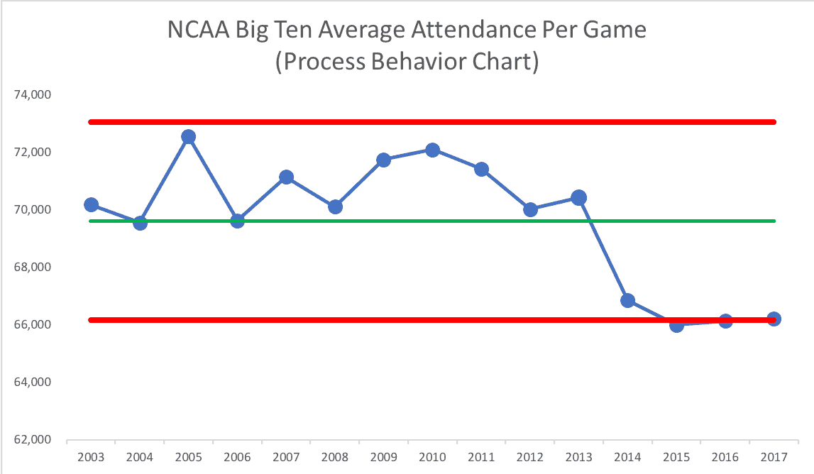
As I mentioned in a comment on the article, there's a clear and understandable special cause for that drop (the addition of Rutgers and Maryland to the conference).
Northwestern: A System with Shifting Averages
And what about my alma mater, Northwestern?
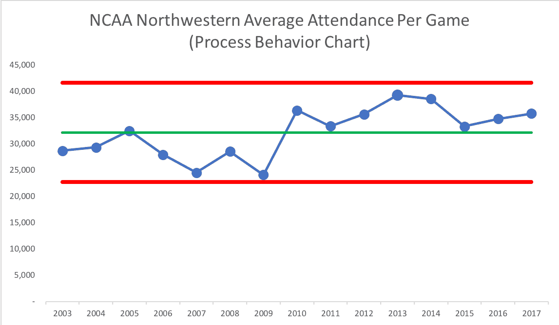
Instead of asking “why did attendance go up in 2013” (which could be described as “the highest in recent history,” this looks like two systems with two averages and sets of limits over time:
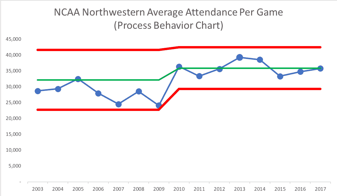
We could predict that 2018 attendance would be between 29,367 and 42,515 unless something changes in the system.
Alabama: Stability, Capacity Changes, and Special Causes
Is football attendance down at Alabama? No! And the chart shows the years when they expanded the capacity of their stadium — special causes!
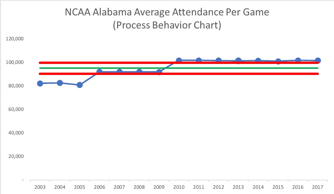
If we charted just the years 2010 to 2017, that's a very stable and predictable process (or there's actually three such processes with three averages over time). Here's a run chart with three averages (the green line):
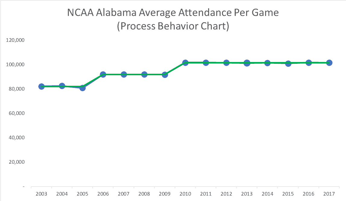
There's far less variation than there is in Northwestern's attendance.
Here's a PBC for the seasons with the newest, highest stadium capacity:
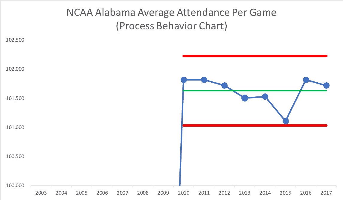
For 2018, we could predict that Alabama's average attendance will be between 101,034 and 102,231. The listed capacity, though, is 101,821 and that was the average in 2010, 2011, and 2016. That's the real “upper limit,” I suppose.
The real lesson here isn't about football attendance–it's about what happens when leaders slow down, look at data over time, and let the system speak.
What Data Would You Examine in Your Organization?
Here's a Google Doc Process Behavior Chart template (or Excel template) if you'd like to download data for your favorite conference or team. What does the voice of the process tell you? I'd love to see your charts and what you see – what conclusions do you draw?
What This Data Teaches Us About Leadership and Metrics
Organizations rely on metrics to guide decisions, but this example shows how easily those metrics can mislead us when they're taken out of context. When we compare one point in time to another, it's tempting to draw conclusions and take action–even when the data is mostly noise.
Looking at attendance data over time tells a different story. It reminds us that variation is always present and that not every change requires a response. When leaders learn to distinguish signal from noise, metrics stop driving overreaction and start supporting better decisions.
That shift–from reacting to learning–doesn't come from having more data. It comes from interpreting data differently. And that's what understanding variation ultimately changes: not just how we look at charts, but how we lead.
Frequently Asked Questions About Metrics, Variation, and Attendance Data
Why are year-over-year comparisons misleading for attendance metrics?
Because comparing one year to the next ignores normal variation in the system. Attendance naturally goes up and down due to many factors. A single increase or decrease doesn't tell leaders whether anything meaningful has changed or if they're just seeing routine fluctuation.
What does “understanding variation” mean in practice?
Understanding variation means recognizing that every metric fluctuates over time and learning how to distinguish routine noise from meaningful signals. Instead of reacting to each change, leaders look at patterns over time to decide when a response is actually warranted.
Why are run charts better than tables of numbers?
Run charts visualize data over time, making trends and patterns easier to see than tables or lists. While run charts don't tell the full statistical story, they are far more informative than snapshot comparisons like “this year vs. last year.”
What makes Process Behavior Charts better than run charts?
Process Behavior Charts add statistically calculated averages and natural process limits to time-series data. This allows leaders to determine whether a change is likely due to random variation or a real shift in the underlying system.
Does a drop in attendance always mean there's a problem?
No. A drop may simply be part of normal variation. Without looking at attendance data over time, leaders risk overreacting to noise and implementing changes that don't actually improve the system.
What is the “voice of the process”?
The voice of the process describes how a system behaves over time, including its average performance and natural variation. Process Behavior Charts help leaders listen to the system instead of imposing assumptions based on short-term changes.
How does this apply outside of college football?
The same principles apply to healthcare, manufacturing, software, education, and any organization that uses metrics. Attendance data is just an example of how easy it is to misinterpret numbers when variation isn't understood.
What should leaders do differently when reviewing metrics?
Leaders should slow down, look at data over time, and ask whether a change represents signal or noise before reacting. This reduces wasted effort, improves decision-making, and supports a healthier improvement culture.
How can organizations learn to use Process Behavior Charts effectively?
Leaders and improvement teams can start by plotting their own data over time and learning basic signal-detection rules. These methods are explained step-by-step in Measures of Success: React Less, Lead Better, Improve More.