Tag: PBC Case Studies

Process Behavior Chart Case Studies: Separating Signal from Noise

These posts use real-world case studies to show how Process Behavior Charts (PBCs) help leaders distinguish meaningful change from routine variation. Drawing from sports, business metrics, healthcare, media ratings, and experiments, each example demonstrates how common reactions to “up” or “down” numbers often reflect noise—not improvement or decline.

Many of these case studies align with the ideas in my book Measures of Success: reacting less to data, asking better questions, and improving systems instead of blaming people. The goal isn’t better charts—it’s better decisions.

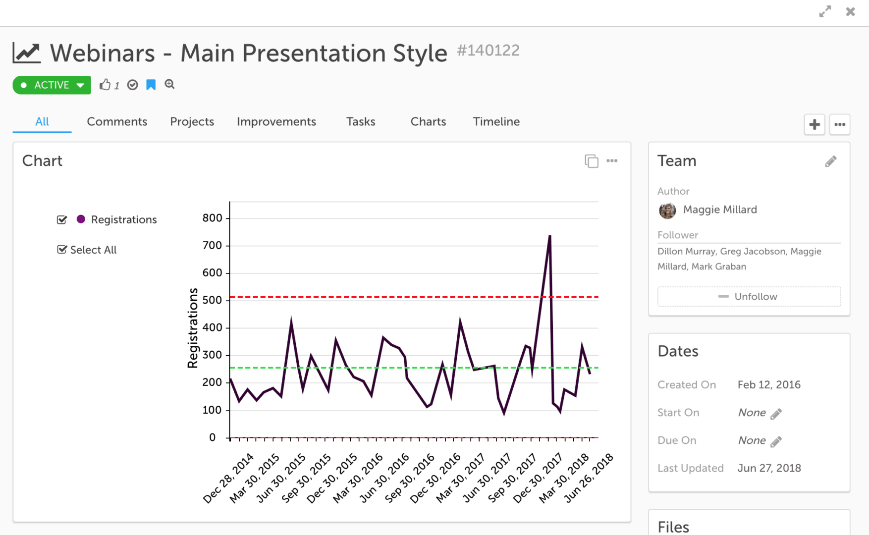
How Authors Can Stress Less Over Their Metrics [Webinar Recording]

0
I published this over on LinkedIn yesterday... you can also read it on Medium.com: How Authors Can Stress Less Over Their Metrics When I started writing...

Don’t Overexplain College Football Playoff TV Ratings Being at “An All-Time...

3
TL;DR: Headlines calling College Football Playoff ratings "all-time lows" are technically true but misleading. When viewed with Process Behavior Charts, the ratings show routine...

Using Process Behavior Charts to Compare Red Bead Game “Willing Workers”...

0
TL;DR: Process behavior charts show when apparent performance differences are driven by the system rather than individual skill. Comparing individuals without this context often...

Using Process Behavior Charts to Compare Knee Surgeons and Complication Rates

2
Process behavior charts can be used for more than tracking performance over time. In this post, I apply PBCs to compare knee surgeons' complication...

Using Process Behavior Charts to Compare Organizations (Without Ranking or Blame)

2
TL;DR:Process behavior charts help leaders compare hospitals (or any organizations) without overreacting to rankings or small differences. By separating signal from noise, they show...

How to Tell the Difference Between Signal and Noise in Voter...

0
Here is a new article that I posted on LinkedIn... don't worry, it's not political, but it does look at recent voter turnout rates through a statistical lens. And I think it's a lens that's helpful for looking at metrics in our own organizations: "How to Tell the Difference Between ‘Signal’ and ‘Noise’ in Voter Turnout Numbers or Your Organization’s Metrics"

How Process Behavior Charts Improve the Way We Interpret Business Metrics

5
This content originally appeared in a post about my Halloween metrics webinar, but I decided to carve it out (not like a pumpkin) into its own post. A reader asked: "Should we be using financial statements in that way or is there a better approach given our knowledge about different types of variation? Or am I completely off track?"

Lean Daily Management Boards: Moving Beyond Red-Green Metrics to Process Behavior...

9
The other day, I saw a post on Twitter that included a few photos related to what's often called Lean Daily Management practices in a hospital. The spirit of my post is not meant to come across as "they're doing it wrong" but more in the spirit of "they're doing a lot of great things, but it would be better if..." If Lean Daily Management is supposed to be, at its core, about identifying opportunities for improvement, I'd hope they wouldn't be offended by my recommendations, but I also don't want to link to the Twitter post or call them out by name. I will pass along private feedback through a channel I have. But, I'm writing a post because what I see here is VERY common in different organizations (not just healthcare).

How Process Behavior Charts Explain Baseball Home Run Outliers

2
If you're not a baseball fan, I apologize for a second baseball-themed post this week. Baseball has a lot of historical time-series data to work with and analyze. If you're not interested in "Process Behavior Charts" or similar methods, I guess I will apologize for this post again too. Next, I'll be apologizing for apologizing. But, I am at Dr. Wheeler's four-day workshop on "Understanding Statistical Process Control" as I blogged about on Monday. It's great to learn from Dr. Wheeler in person and I'll be sharing reflections on the class in a later post (and I'm posting a few things on LinkedIn along the way). In Chapter 1 of Understanding Variation, Dr. Wheeler points out how charts or graphs are far superior to tables or lists of numbers. He uses a baseball example:

Are MLB Batting Averages Really Declining? A Process Behavior Chart View

9
I recently saw this headline: Baseball on pace for lowest batting average since 1972 Just because it's the lowest average in 48 years... it doesn't mean that this year's MLB-wide batting average is low in a way that's statistically meaningful.

Podcasts, Videos, and Some Measures for “Measures of Success”

0
Here are a few items and thoughts related to "Process Behavior Charts" and my book Measures of Success. I'll share some charts related to sales of my book about charts and management. I'll also share an updated article of mine and two podcasts that had me on to talk about the book.

TWI and Kata: Coaching Skills That Make Continuous Improvement Stick

0
Here is a recorded webinar... I played host (along with KaiNexus) for this webinar that was held Tuesday, August 14 at 1 pm ET.
An AI that won't just give you the answer. That's what makes it useful.Free Demo -- Learn More
+ +