
As you might recall from an earlier post, I'm presented a free webinar on December 18 (hosted by KaiNexus) titled:
How to Use Process Behavior Charts to Improve: Case Studies
One topic I'm including — something I haven't blogged about before — is:
- Apply Process Behavior Charts to situations where individuals or organizations are being ranked in performance
I didn't include this topic in Measures of Success, but maybe I should have. It's something that Don Wheeler covered in his four-day workshop.
People love ranking individuals in organizations:
- Salespeople and their sales $
- Surgeons and their infection rates
- Surgeons and their operating room turnaround times
I'm sure you can think of other situations like that in your own industry or organization.
People also love to rank departments or organizations in a broader context:
- Factories and their labor productivity
- Hospital departments and their hand hygiene compliance rates
- Hospitals and their patient satisfaction scores
When you study the work of W. Edwards Deming, Wheeler, and others, an important point gets introduced and reinforced:
- A vast majority of performance is driven by the system, not by individual skill, effort, attention, etc.
When we use Process Behavior Charts to look at time-series data, we learn to filter out “noise” in the metric (the routine variation that's always in our system and the metric) versus any “signals” that might appear. A signal is an indication that a significant and non-random change has occurred in the system and our results.
Recently, somebody sent me a link to a quality measurement program at the U.S. Veteran's Health Administration:
Strategic Analytics for Improvement and Learning (SAIL)
That's a good name. I've long said that measures should be used for improvement, not for punishment (and learning is a good thing to add. What is SAIL?
Strategic Analytics for Improvement and Learning Value Model or SAIL, is a system for summarizing hospital system performance within Veterans Health Administration (VHA). SAIL assesses 25 Quality measures in areas such as death rate, complications, and patient satisfaction, as well as overall efficiency and physician capacity at individual VA Medical Centers (VAMCs). Below you can download or view the data in spreadsheets listed by facility. SAIL data tables are updated every quarter.
We can use data like this to evaluate one hospital's performance over time. The SAIL website doesn't make this easy, as I couldn't find time-series data. I could just find a spreadsheet summary of a hospital… a different file for each quarter.
That “scorecard” looks like this and is full of comparisons against the average, the benchmark, the 10th percentile, the 90th percentile:
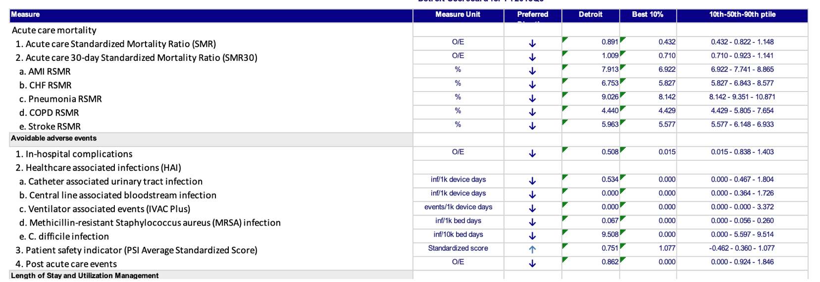
Those comparisons might be interesting, but how do we know if one hospital's performance (in this case, Detroit, near my hometown) is an outlier or if it's part of the statistical noise in the middle of the pack.
Before we try to compare Detroit to other hospitals, let's first look at performance over time in the “Acute care Standardized Mortality Ratio (SMR)” metric. Some say it's a bad measure of hospital quality, but that's a different post for another day.
I had to download multiple spreadsheets from multiple URLs.
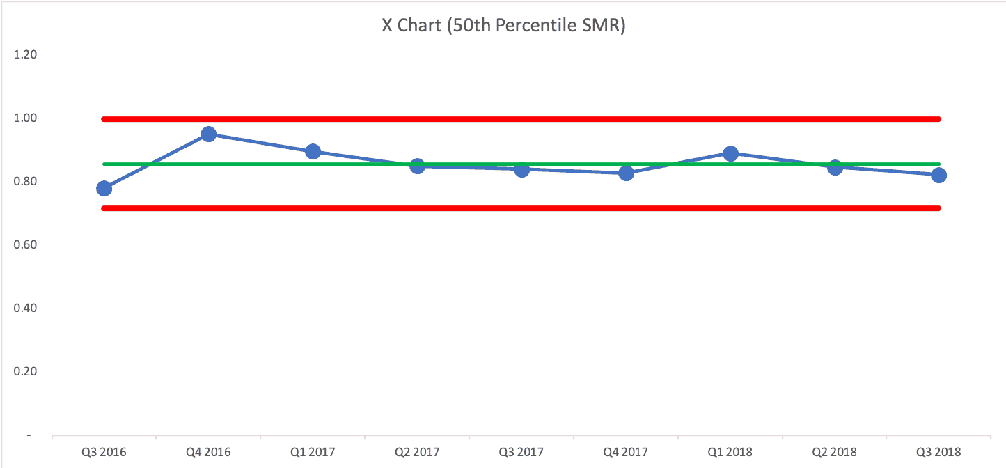
Here is the Process Behavior Chart that shows Detroit's performance over the past nine quarters (that's the data I had access to):

The Process Behavior Chart tells us that the Ratio is fluctuating around an average of 0.86. There's no evidence that it's improving, nor is it getting worse. It's just fluctuating and future quarters' numbers will fall between the calculated Natural Process Limits of 0.67 and 1.05 unless there's a significant change in the system.
If somebody were to claim (or if a headline were to trumpet) that mortality “improved” in Q3, since the ratio fell from 0.989 to 0.891, I wouldn't believe them. The randomness and routine variation is similar to the “margin of error” in political polling. If the poll numbers change within the margin of error, they haven't necessarily changed at all.
So, the Detroit VA shouldn't overreact any of those data points. Some are above the Detroit average and some are below average.
How Does Detroit Compare to Other VA Cities in the Region?
How can we tell if Detroit is significantly better or significantly worse than other hospitals in the region? The SAIL snapshot comparing Detroit to the average in that particular quarter isn't a huge help:
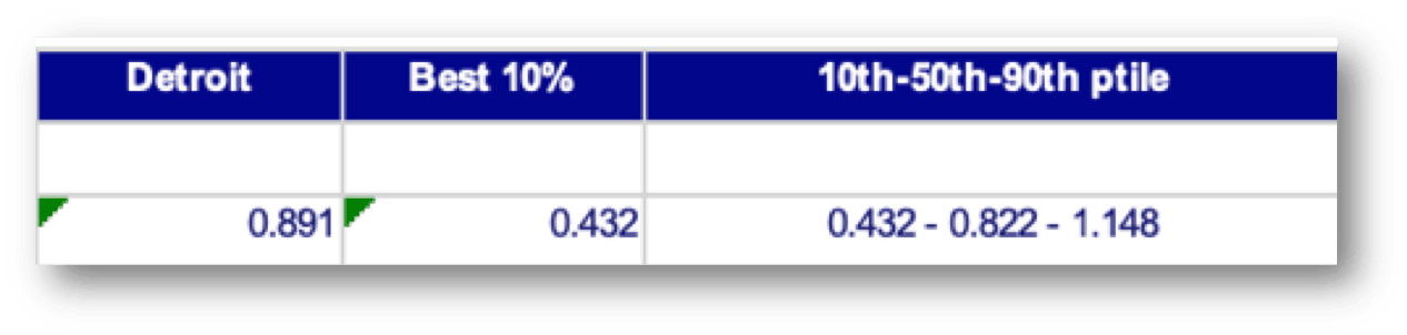
Detroit is a little bit higher than the 50th percentile score in Q3 2018.
Does that mean it's a “bad” hospital or that it's “underperforming?” Should leaders be criticized or punished? Maybe not.
The 50th percentile score also fluctuates somewhat randomly over time:
And if we overlay the Detroit run chart with the 50th percentile, what would we see?
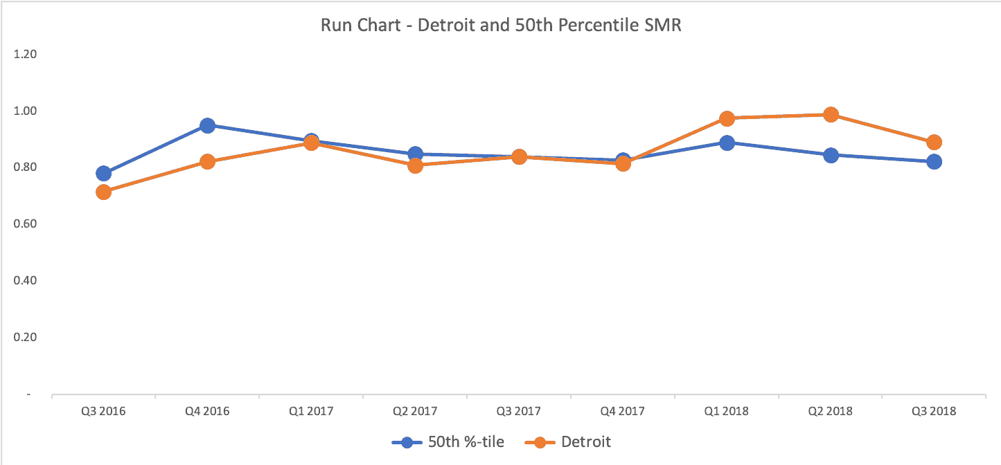
Detroit (in orange) is better than 50th percentile for 3 quarters, about exactly the same as 50th percentile for three quarters, and it's been worse than 50th percentile for the last three quarters. Either that's a bad trend or it's all just fluctuating and it's not worth drawing too many conclusions about any quarter.
What Detroit could do is work to improve the system in the hope of improving performance over time. The answer to “how do we improve the system?” probably isn't going to be found in asking “why was last quarter worse/bad?”
A Process Behavior Chart Comparing City Hospitals
As I've learned from Don Wheeler, we can use a Process Behavior Chart for data that's not a time series. What if we plotted all of the hospital's SMR scores for a particular quarter on a Process Behavior Chart?
Wheeler says can “use any arbitrary ordering of the data to create an XmR chart.” He adds:
“While such a chart may end up being slightly less sensitive than a chart based on the time-order sequence, any signals you find with an arbitrary ordering are still likely to be real.
The only ordering to avoid is a rank ordering where the data are arranged according to their numerical values prior to placing them on the XmR chart. When the data are rank-ordered the method of successive differences breaks down, the moving ranges will not capture the routine variation, and the XmR chart will not work as intended.”
Donald J. Wheeler, Ph.D.
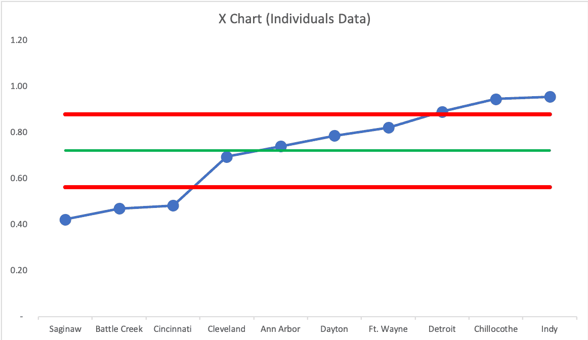
So, we can put the hospitals in alphabetical order. Or we can randomize it. The only thing we shouldn't do is put them in order of low to high or high to low.
We can look for signals, but the only rule we'd use is to look for any data point that's above the Upper Natural Process Limit or below the Lower Natural Process Limit (I call this Rule 1 in Measures of Success). Other rules for finding a signal don't apply without a time-series order.
But, a Process Behavior Chart of this type is incredibly helpful in filtering out noise, which helps us find signals — we can think of signals as an organization that's truly an outlier, as it's not in the realm of the routine fluctuation of getting better, then worse — or being better than others, then worse.
If we look at a table of numbers, do some hospitals look better than others? Well, some numbers are higher than others. But that's a far too deterministic view of the world. There's always variation in a metric and we shouldn't draw major conclusions from minor variation.
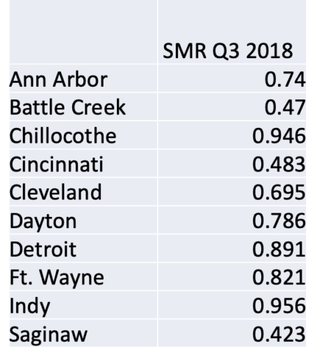
The Battle Creek rate being about half of the the Chillocothe number (in that quarter) doesn't mean that the Chillocothe hospital is significantly worse than Battle Creek. A Process Behavior Chart tells us if any of those differences are statistically meaningful.
The Process Behavior Chart methodology tells us that ALL of those hospitals are operating, essentially in the same range of performance. There is no “signal” (meaning an SMR above the calculated upper limit of 1.42).
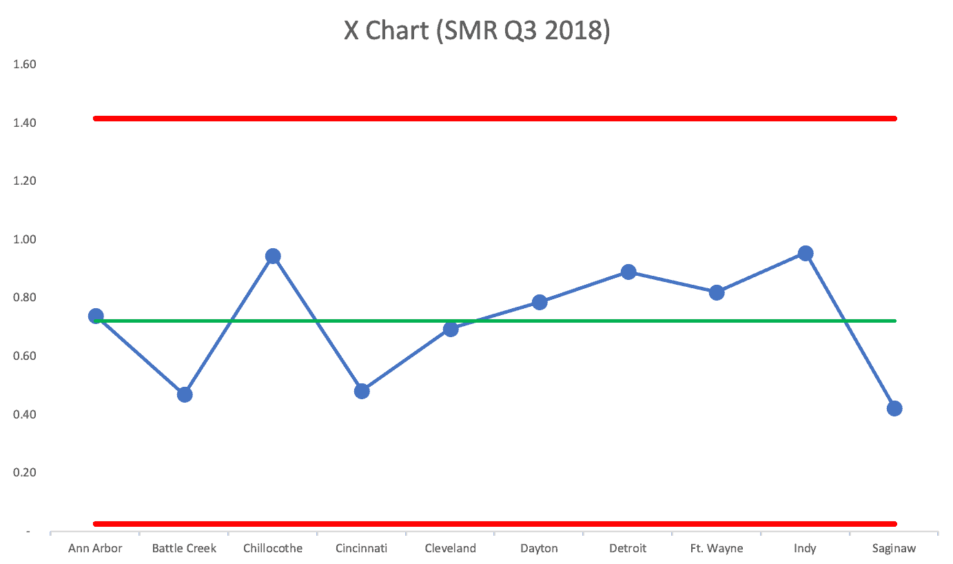
If we use a random order of cities, does the chart tell the same “voice of the process” story? YES! See the next two charts:
The Upper Natural Process Limit changes a bit, but the story is the same… these hospitals are all basically performing about the same. They're all part of the same larger, broader, system, so that's probably not surprising.
It's probably not a good use of time to go explaining the variation between hospitals — because it's just NOISE. We shouldn't praise, reward, threaten, or punish leaders or doctors (or anybody) in those hospitals.
We should work to systemically improve the system instead.
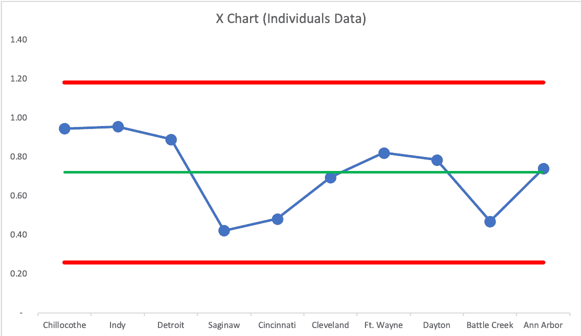
What happens if we do a rank ordering from low to high, against Wheeler's advice? We get false signals:
In a future blog post, I'll share some examples from the sports world that use this method to compare baseball teams within a season. When is a team just “above average” and when are they historically and unusually great? Process Behavior Charts can show us how.
Oh, and I'll share another example from healthcare, comparing surgeons and their knee-replacement complication rates.
And don't forget to sign up for my webinar.
Here's the next post in the series — on the surgeons:
Using Process Behavior Charts to Compare Knee Surgeons and Complication Rates
Check out all of the posts in the series.
What do you think? Please scroll down (or click) to post a comment. Or please share the post with your thoughts on LinkedIn – and follow me or connect with me there.
Did you like this post? Make sure you don't miss a post or podcast — Subscribe to get notified about posts via email daily or weekly.
Check out my latest book, The Mistakes That Make Us: Cultivating a Culture of Learning and Innovation:


Wow. Thanks for highlighting the fact that the data on a PBC doesn’t even need to be time-series. I guess it just means the scope of the analysis changes. If you have time-series data, the “system” you’re looking at is each individual hospital over time. Without time-series data, the “system” becomes VA hospitals in general during the quarter of the snapshot. It’s nice to know they are so flexible.
Thanks for reading… and be sure to check out all of the posts in the series.