


This post is a continuation of my last post that introduced the idea of using Process Behavior Charts (PBCs) for something other than time-series data (a metric or performance measure over time):
Using Process Behavior Charts to Compare Organizations (Like VA Healthcare Sites)
And be sure to check out my free webinar on December 18 (hosted by KaiNexus) titled:
How to Use Process Behavior Charts to Improve: Case Studies
In my last post, I used PBCs to compare different VA hospitals in a region. Today, I'll look at some data that compares the complication rates for different knee surgeons at two different hospitals in the Dallas / Fort Worth area.
This data is from the ProPublica Surgeon Scorecard site.
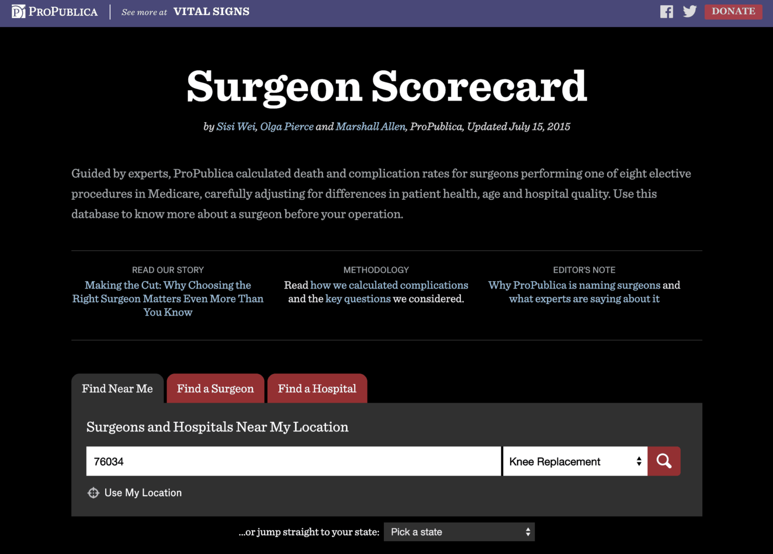
The site tries to show the distribution of surgeons (and their complication rate performance) within a hospital with a visualization that might not really give a definitive answer, as colorful as it is:

Each black vertical line is a surgeon. The visualization implies that most of the surgeons at this one hospital have “medium” complication rates and two are in the red, which says they have “high” complication rates.
Does that mean you should stay away from the “red surgeons?”
I don't know. The Low / Medium / High distinctions seem somewhat arbitrary.
And, each surgeon's adjusted complication rate isn't a specific hard number. It's more like political polling numbers, where there's a +/- margin of error with each number.
That's actually illustrated for each surgeon on the website:
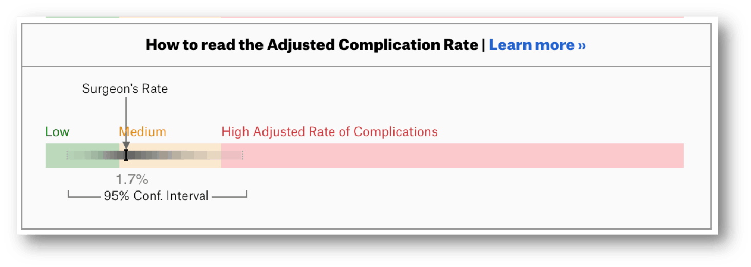
The “confidence interval” for a surgeon shows they are yellow… but also possibly green and possibly red. Again, that doesn't seem super helpful or very fair to the surgeons who get labeled red.
I'd want to know if the differences in complication rates are meaningfully different or if they're just relatively small variations in performance. I'll compare the surgeons at a single hospital first since they are performing surgery in the same system… the same O.R.s, the same support staff, the same instrumental sterilization team, etc.
If we show the surgeons and their performance as a list of numbers (which doesn't show the confidence interval range), it might be hard to see if there's a meaningful difference (just as it was hard to see a difference in the VA hospitals last time).
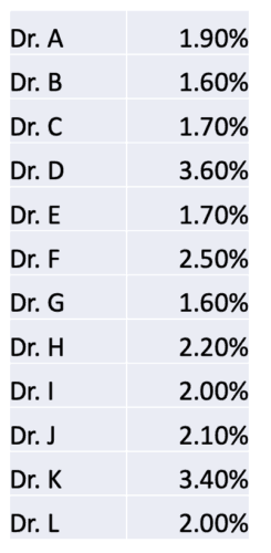
A Process Behavior Chart does a better job of separating signal from noise. I've alphabetized the list and replaced the surgeons' names with letters. A PBC can be helpful if we have any random order of surgeons here.
Dr. K has a rate that appears to be double that of Dr. C. Does that mean we should avoid Dr. K? Let's let the PBC tell us:
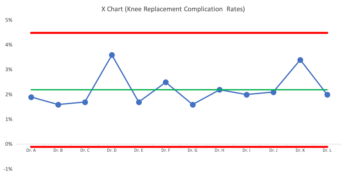
The PBC tells us that the difference between surgeons is just noise. There are no signals that indicate any surgeon's complication rates are outside of the norm of what that system is going to produce.
There's no point in praising or punishing different surgeons here. The differences in performance aren't indicative of a big difference in individual performance.
You might say, “But some complication rates are higher! They are clearly doing a bad job!”
It's sort of like the difference between a $13 glass of wine and a $12 glass of wine at a restaurant. The $13 glass is clearly more expensive… but it's not a significant price difference. And, it doesn't mean it's a better glass of wine (although “better” in that context is more subjective than surgical complications).
But, if you read about the ProPublica methodology, there's some amount of estimating going on. That's why there's a confidence interval.
I looked next at surgeons at another hospital in the DFW area. Their average complication rate for that hospital was almost exactly the same as the first (they are working in part of the broader “system” that is “healthcare in the DFW area”).
There's slightly less variation from surgeon to surgeon, but it also seems like there are no outliers amongst the surgeons at that hospital either:
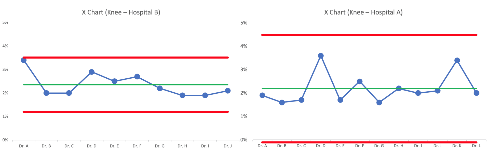
Dr. A at Hospital B is almost an outlier in their system. Should that surgeon be avoided? Maybe?
If we randomize the order of the surgeons, the chart might look like this:
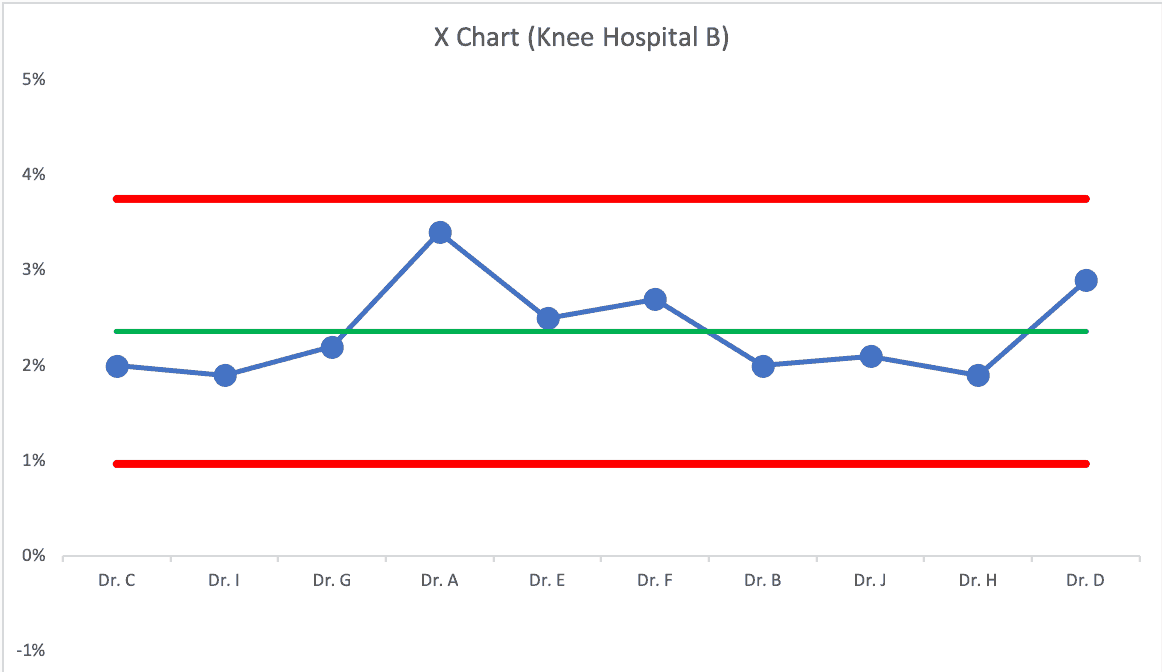
Dr. A probably isn't significantly worse than the other surgeons.
If the average complication rate is about 2.2%, can it (should it) be improved? Sure!
But the answer won't be found in asking “why is that surgeon performing badly?” We need to improve the system — the system they all work in — the system that has a bigger impact on the results than individual skill or performance.
Process Behavior Charts filter out the noise, so we can find signals of meaningful difference — whether that's a time series metric or a comparison of hospitals or surgeons.
In the next post in this series, I'll share an example of a comparison that DOES have a signal… and a clear historical reason why there was a signal.
What do you think of this approach? Do you have data from your organization that you could apply a PBC to? What will you learn?
Without a methodology that considers variation and the impact of the system, there's a real risk that surgeons will get rewarded or punished based on randomness. How often is so-called “pay for performance” really more like a “lottery,” as W. Edwards Deming might have referred to this?
Check out all of the posts in the series.
Please scroll down (or click) to post a comment. Connect with me on LinkedIn.
Let’s work together to build a culture of continuous improvement and psychological safety. If you're a leader looking to create lasting change—not just projects—I help organizations:
- Engage people at all levels in sustainable improvement
- Shift from fear of mistakes to learning from them
- Apply Lean thinking in practical, people-centered ways
Interested in coaching or a keynote talk? Let’s start a conversation.


The LinkedIn discussion:
The ProPublica approach is about as bulletproof as anything I’ve come across. It would be interesting to run a chi-sq on the complication rate by surgeon to see if it actually is statistically significant