
How to Tell the Difference Between Signal and Noise in Voter Turnout Data (and Business Metrics)
TL;DR: Headlines often mislead by comparing just two data points and calling routine fluctuation a “trend.” Using Process Behavior Charts, this post shows how to distinguish real signals from noise in voter turnout data–and why the same statistical thinking helps leaders avoid overreacting to everyday ups and downs in business metrics.
Headlines often celebrate “record highs” or panic over “historic lows,” but most of those claims collapse under basic statistical scrutiny. By looking at voter turnout through Process Behavior Charts, we can see what actually changed, what didn't–and why the same thinking applies directly to business and organizational metrics.
Here is a new article that I posted on LinkedIn… don't worry, it's not political, but it does look at recent voter turnout rates through a statistical lens. And I think it's a lens that's helpful for looking at metrics in our own organizations:
“How to Tell the Difference Between ‘Signal' and ‘Noise' in Voter Turnout Numbers or Your Organization's Metrics”
The full article can also be found below…
Why Two-Point Comparisons Create Misleading Headlines
After the recent midterm elections, Americans have seen headlines that describe how voter turnout “soared” to over 49% and that the number of voters was a “50-year high.” That sounds impressive, but how can we put those numbers into the proper context? Articles published after the 2014 election said that year's 36.7% rate was ” lowest in 70 years” and added that it was lower than 2010 (41%).
Why Context Matters More Than Headlines
The problem with looking at just a data point or two is that we're missing a lot of context. How much does voter turnout typically fluctuate from election to election? A “run chart,” as shown below, is a visual that helps us better understand how the voting rate changes over time (data are from the United States Election Project).
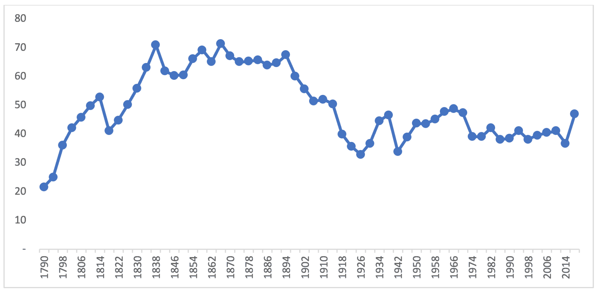
Yes, the 2018 turnout is higher than every year since 1974, but the number isn't higher than the time between WWII and Nixon's resignation. It would require a historian to explain why voter participation was so high in the 19th century and what caused it to fall in the 20th.
Much of the 19th century had voter turnout rates that fluctuated around an average of about 65%, while the 20th century rate fluctuated around a lower average of about 43%. Leaders in any organization or situation can learn to think about shifts in averages over time (taking the fluctuation into account) instead of relying on knee-jerk reactions to each data point.
Signal vs Noise: What Leaders Need to Know About Metrics
When looking at a measure over time, it's very beneficial to learn to distinguish between “signal” (a meaningful change) and “noise” (a small fluctuation). Sometimes an impressive sounding two-data-point comparison is really just noise (if the numbers typically fluctuate that much from period to period). We can use a method called “Process Behavior Charts,” as I describe in my book Measures of Success, to determine if a metric is merely fluctuating within a predictable range or if we see statistically-valid signals that tell us the underlying system has changed significantly. See more in this blog post and related webinar.
Using Process Behavior Charts to Interpret Voter Turnout
If we zoom in and look at the data from 1974 to 2014, a “Process Behavior Chart” shows that turnout is predictable, fluctuating around an average of 39.4% (shown as the green line). Using those 40 years as a baseline, we can also calculate the lower and upper “natural process limits” of 34% and 44.7%, respectively. The limits are referred to as “voice of the process” since they tell us how the process is behaving – whether we like the results or not.
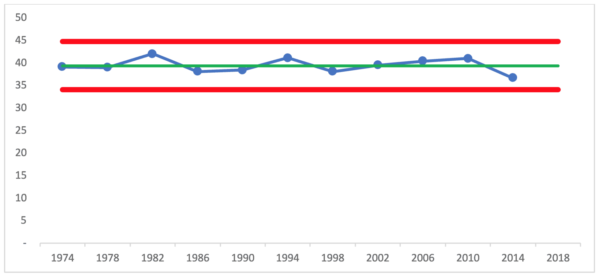
This chart and methodology show that every data point for those 11 elections is “noise”. There are no long runs above or below the average that would indicate the voter rate has shifted to fluctuate around a new average. There are no data points outside the limits that would indicate a significant short-term change.
Why Explaining Routine Variation Wastes Time
It would be a waste of time to ask why any single year was higher or lower than the previous election. There are people who make a career out of explaining every small change in political numbers and daily stock indices. It might be tempting to attribute the higher 1994 number to the Newt Gingrich-led Republican revolution, but that year isn't significantly higher than 1990 or 1998. There's likewise no root cause for the decrease from 2010 to 2014. Just because a number is the lowest in 40 years doesn't make it significantly different than the rest.
Businesses and organizations of all kinds also make these kinds of errors when reporting, for example, that “sales this quarter were the highest in five years.” That sounds good, especially for managers who want to paint a picture of growth and success. Listen to how much effort financial commentators make to explain why the Dow Jones Industrial Average closed 8 points lower for the day (a minuscule change). Now, an 8 percent change would be worth understanding and explaining, since that's a signal, not noise.
When a Metric Actually Sends a Signal
The Process Behavior Chart from 2014 predicts that 2018 voter turnout would have fallen between those limits of 34 and 44.7%, unless the system changed significantly. Any single number in that range would have been noise, therefore not worth overexplaining or overreacting to. But if people deem the average performance (and the predicted range) a problem, they can take steps to improve the system (by learning how to better motivate people to get to the polls). Some propose Saturday voting as a systemic change expected to increase average voter turnout, but turnout will still fluctuate.
Since the currently estimated 2018 turnout rate of 49.1% is higher than the upper limit of 44.7%, we can say definitively that the 2018 turnout is higher than would have been predicted by the last 40 years. It's a signal.
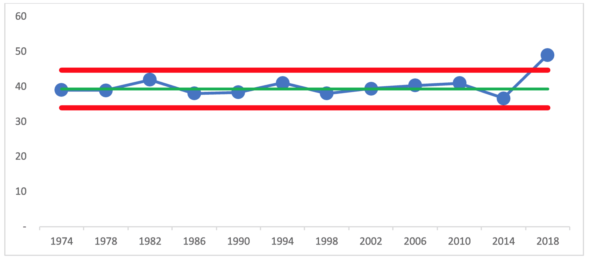
A Process Behavior Chart tells us that something has changed, but it doesn't tell us what changed. In the case of the 2018 election, I'll defer to the political experts to explain the higher turnout (or you can propose your own theory). If this were a workplace metric, leaders should want to understand why the number is higher so we can work to sustain performance at that higher level.
What This Means for Business and Organizational Metrics
In the case of business metrics, we can likewise learn not to overexplain the noise. When we filter out noise and react only to signals, we can use our precious time more effectively. For example, I taught the CEO and marketing director at the startup software company KaiNexus to stop overexplaining each month's change in the marketing metrics. We created charts that showed most of these changes were just noise.
Having a metric that's just fluctuating doesn't mean we do nothing. That time that's saved by not cooking up explanations for the noise can be better spent on improving the business systems that would lead to a significant change or a shift in the metrics that matter to our organization. If we have five core business metrics and just one shows a signal, we should focus our efforts on understanding what happened there, rather than spreading our attention across explaining the noise in the other four metrics.
I hope the reader of this piece is prompted to be more skeptical when presented with a comparison of two data points – in the news or at work. You could ask to see (or create) a run chart with at least a dozen data points. Better yet, use a Process Behavior Chart to help you determine what is signal and what is noise – it's better than guessing. When you react less, you can lead better, and improve more.
Leaders don't improve performance by reacting faster–they improve it by reacting smarter. When metrics fluctuate within predictable limits, explanations add little value and often distract from real improvement work. Process Behavior Charts provide a practical way to distinguish signal from noise, allowing leaders to focus their attention where it matters most: improving systems, not narrating randomness.