Search Results for "process behavior chart"

What We Learned from Touring Toyota’s San Antonio Plant
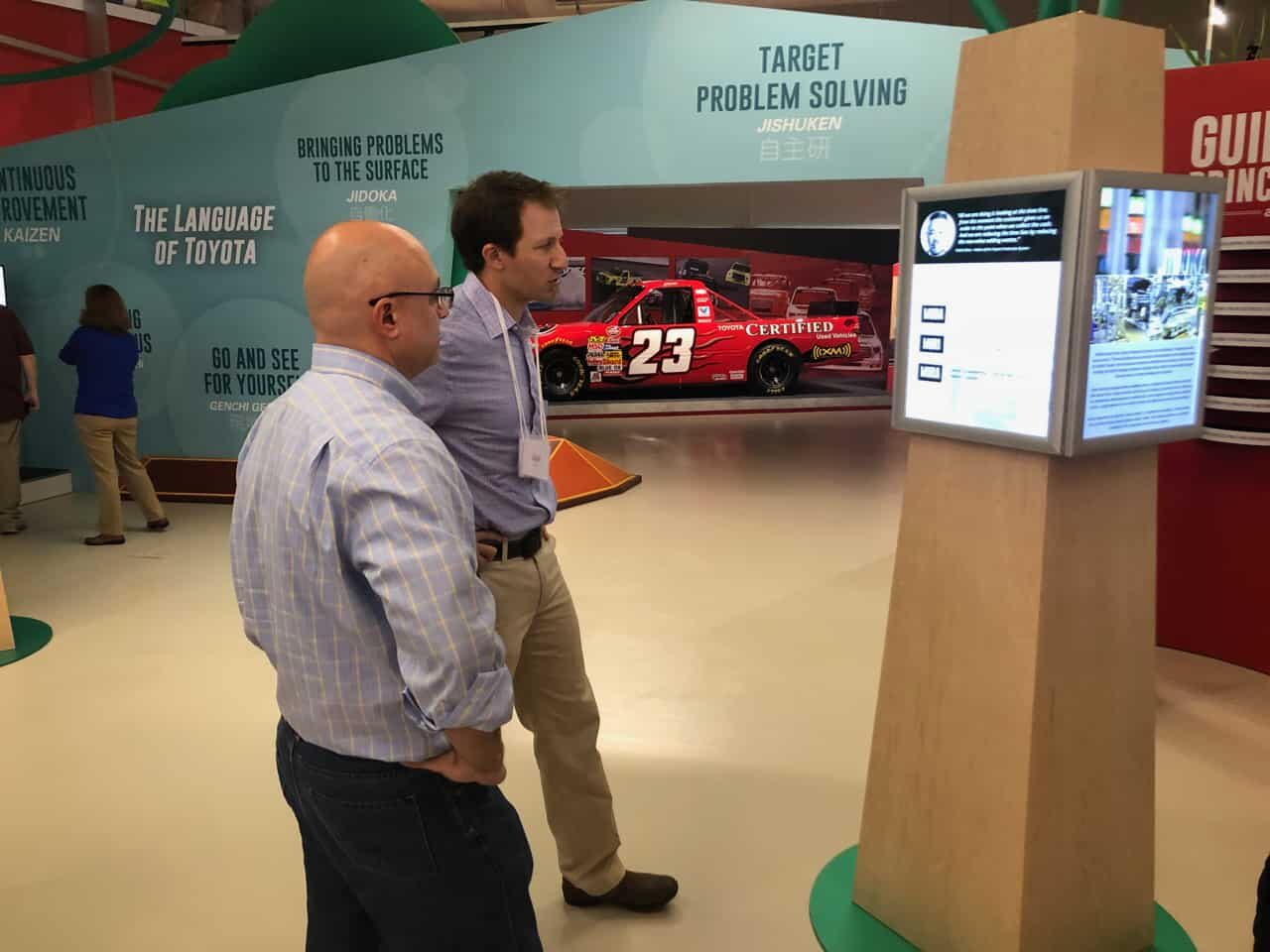
Last week was our first "Symposium on Learning Organizations" where we brought together 40 people with diverse backgrounds in manufacturing, healthcare, IT, government, and other industries or professions together to learn from each other in a "PowerPoint-free zone."

In this post, I'll share some photos and reflections on our tour of the Toyota truck plant in San Antonio (TMMTX). The visitor center has been completely revamped from my last visit, just as the one visitor center I saw in Japan back in March had been redone.


Mark Graban on Measures of Success: Understanding Variation, Reacting Less, and Leading Better

Jamie Flinchbaugh and Mark Graban

oday's episode is the second time that friend and podcast guest Jamie Flinchbaugh has turned the tables by playing host to interview me about my new book, Measures of Success: React Less, Lead Better, Improve More, which has recently been the #1 best selling book in Amazon's Total Quality Management category.

Jamie is very knowledgeable on these topics, so he was a great person to interview me and to have more of a conversation about choosing the right metrics and then managing them the right way. I hope you enjoy the conversation and future podcasts will return to the usual format where I interview guests and try to let them do most of the talking.

My Article for the LEI “Lean Post”: React Less and Improve More…

It's been a while since I've contributed something to the Lean Enterprise Institute's online publication, The Lean Post (see past articles).

Today, they're allowing me to introduce some ideas from my book Measures of Success. Many "Lean thinkers" just haven't been exposed to these ideas. Many haven't read Deming or Wheeler... it's not their fault for not knowing of Process Behavior Charts and methods like this.

But, I hope this post helps people see that "bowling charts" and "red/green" analysis are not the only way (or the best way) to look at metrics.

My article:

"React Less and Improve More by Using SPC More Effectively"

A Stomach Bug, the Emergency Room “Gemba,” and Charts, Charts, Charts

Here's a reprieve from posts about my new book Measures of Success: React Less, Lead Better, Improve More. Although I will mention that the book should be available very soon in the Apple iBooks store. And today's post is on themes from the book.

Unfortunately, I've had two trips to the emergency room within the past year, due to stomach flu problems. Or, it was possible food poisoning. In cases like these, the doctors aren't really worried about the exact root cause, because the treatment is the same either way. They're treating symptoms.

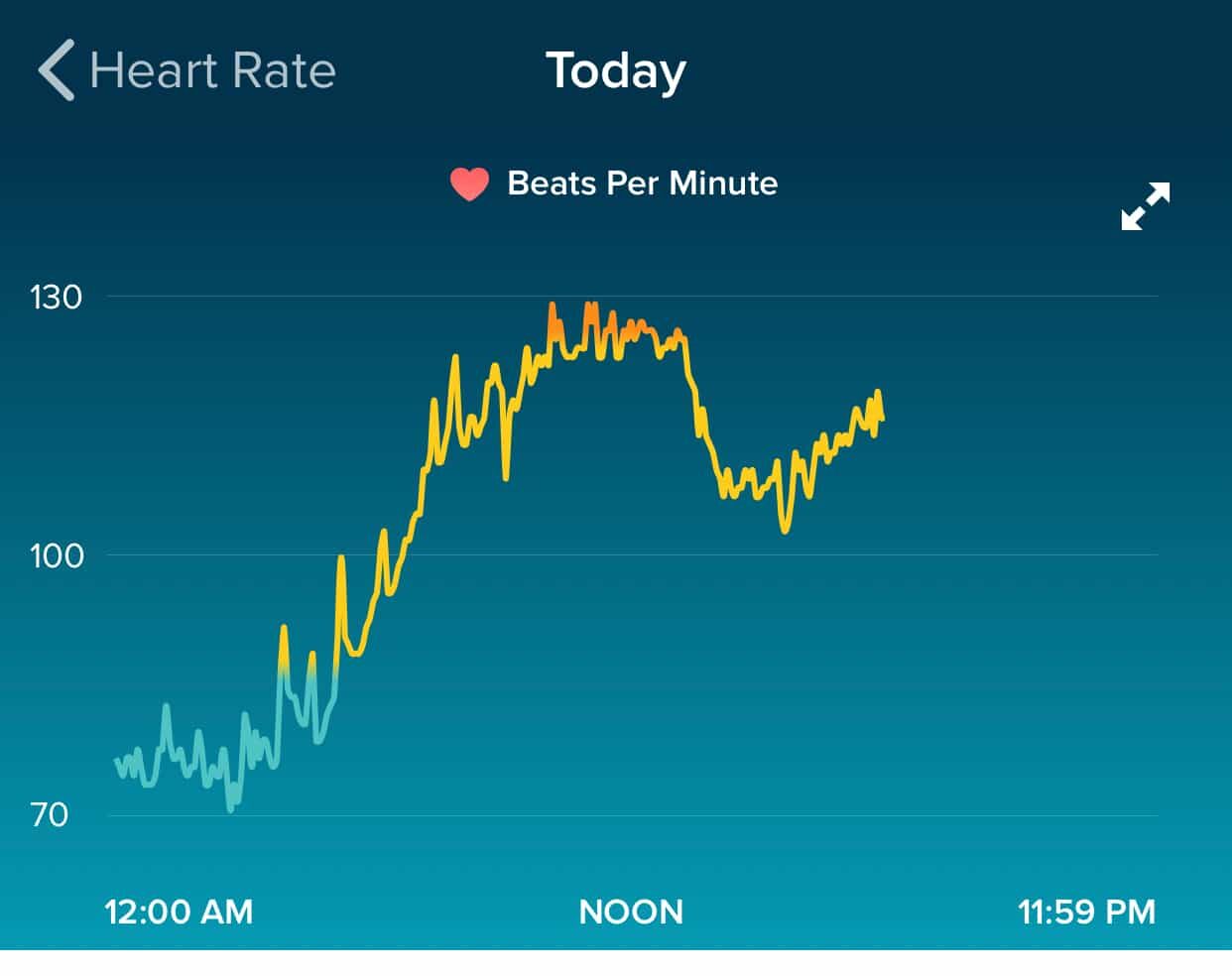
Last Wednesday morning, I woke up early and I was sick. Stomach issues. Fever. I noticed on my Fitbit that my heart rate was elevated above normal levels. I was working from home that day, so I stayed in bed, slept, and rested. I wasn't really able to eat anything and it was hard to get liquids down...

How Lean Leaders Mistake Random Variation for Improvement

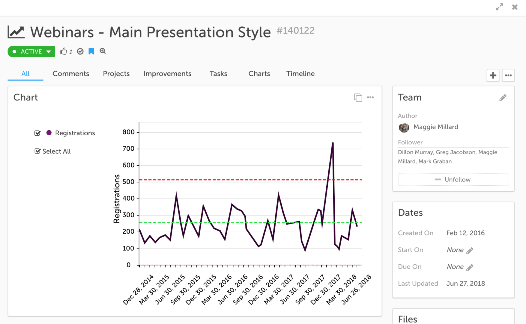
Here is a chart from a team in San Antonio, where I teach a class on Lean for quality and patient safety twice a year. This team was basically using the “A3” improvement methodology to look at a problem that really impacted patients. My understanding is that a contaminated blood culture bottle leads to false positive results that indicate that a patient has a bloodstream infection when they really don't.

“ER wait times down, but only slightly” or ER wait times are virtually the same?

This article was sent by a friend and blog reader from Winnipeg the other day:

"ER wait times down, but only slightly"
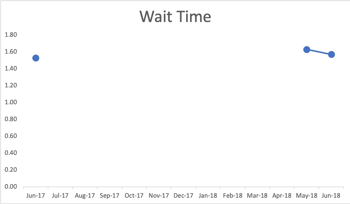
Oh good, the waiting times are down. But what does "only slightly" mean? Have ER wait times gone down in a meaningful way? Or are they just comparing two data points? Is this "down" a matter a signal or is it just noise in the system?

These are the types of questions that can be answered by methods in my new book Measures of Success: React Less, Lead Better, Improve More.

Why Unchanging Metrics Can Be a Warning Sign

1. Nurse in green scrubs drawing blood from a patient's arm with a syringe.

Today's post is some material that I wrote for my book Measures of Success but cut due to length. I've modified the material a bit to hopefully be fine as a standalone post.

There's a somewhat humorous, if not scary, story from a book (This is Going to Hurt) written by a former "junior doctor" in the British National Health Services (NHS) -- the equivalent of a "resident" in the American medical education system.