


I'll be teaching my “Better Metrics” workshop (aka “Measures of Success,” the title of my book) twice in June:
- Cambridge Investments – Open for Public Registration (Fairfield, Iowa) — June 5
- Lean Healthcare Transformation Summit (Chicago) — June 13
After facilitating the Red Bead Experiment in the workshop, one other way I've found to simulate variation is an online simulation that's available, of all places, on the BBC website:
Can chance make you a killer?
In the simulation, you are a hospital that is going to be ranked and judged by the government based on your post-op death rates.
Each patient at each hospital has a random X% chance of dying (the X is adjustable from 1 to 15%). This isn't realistic, but it makes each surgical outcome the equivalent of a “bead,” if you will.
When I've facilitated debrief discussions after the Red Bead Experiment, I always ask, “What are the ‘red beads' in your work?”
In one session, the Chief Medical Officer of a large academic medical center said, “I think all of our patient safety measures are ‘red beads.'” Sometimes those numbers are higher and sometimes they are lower. There is variation in the outcome of all work. Every metric will show variation, even when the same people are doing the same work the same way. So, think about the multiple causes of variation in real work!
The helpful use of what Donald J. Wheeler, Ph.D. calls “Process Behavior Charts” (a form of “control chart” or “statistical process control chart”) is to understand how much period-to-period variation is routine in a system (and a metric). This allows us to better separate “signal” from “noise” in a metric. If we spend too much time reacting (overreacting, really) to the routine variation, we waste time looking for root causes that aren't there.
Back to the simulation, it looks at 100 hospitals each doing 100 operations. The government has decided that underperforming hospitals must be held accountable.
They establish a guideline:
“The government, meanwhile, says death rates 60% worse than the norm are unacceptable (in red)”
“60% worse than the norm” is very arbitrary. With the initial death rate set to 5%, any hospital with eight or more deaths gets put on the list of “unacceptable” hospitals.
As you run the simulation multiple times, you see how the performance of any one hospital can fluctuate wildly from acceptable to unacceptable ranges. The number of unacceptable hospitals will vary as well since we're not picking the X worst or something, it's those that 60% worse than the average.
Let's say we run it once, we'll see where our hospital (with the box around our “X”) shows up (the box is a bit small):
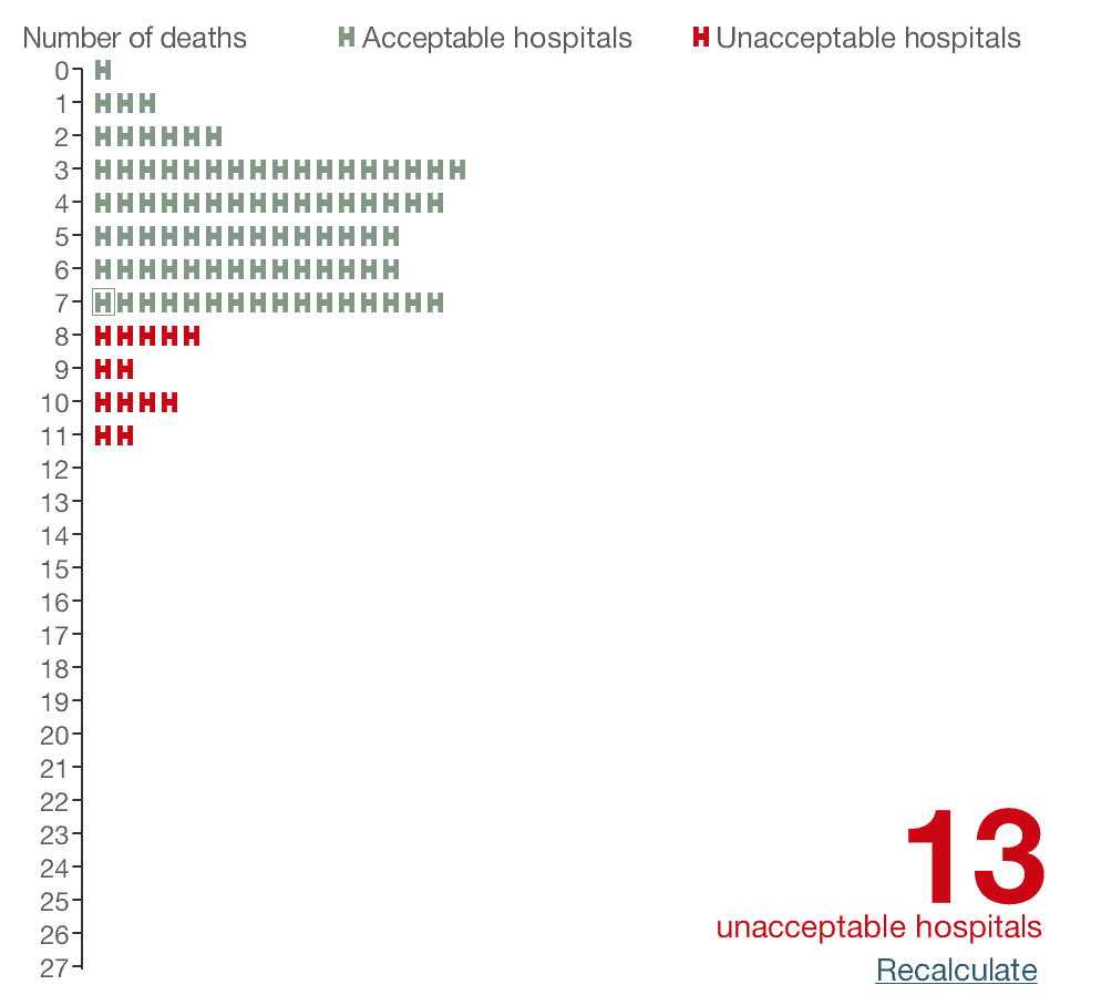
We had 7 deaths, just barely better than the threshold. 13 are unacceptable.
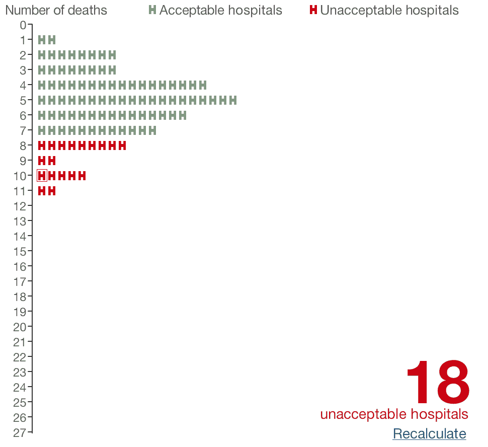
When we hit “recalculate,” we're now one of the 18 unacceptable hospitals
since we have 10 deaths.
What happens to our infection rates over time? I ran the simulation 22 more times and here is what the Process Behavior Chart looked like:
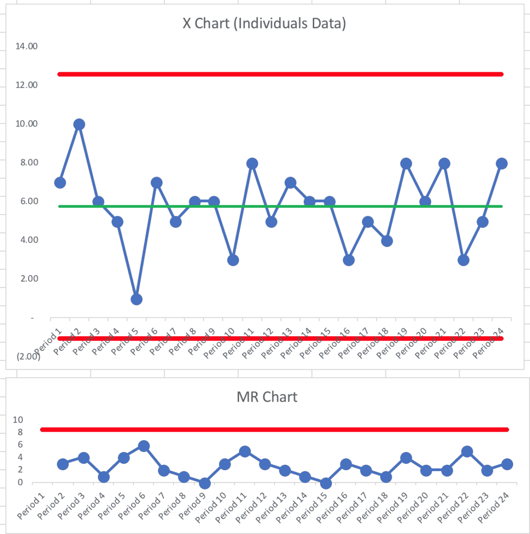
Not surprisingly, it's a “predictable system.”
We can't predict that we'll always have five deaths. Every system and metric has natural variation.
This Process Behavior Chart tells us that we can predict that the number of deaths will be between zero and 12. Our calculated limits are -1.07 and 12.57, but we can't have a negative number of deaths and the count is always an integer, our limits essentially become zero and 12.
Learn how to calculate the limits in this blog post or in the early edition of my book Measures of Success.
One lesson that comes from seeing a predictable system in a Process Behavior Chart is that we learn not to ask why there were 10 deaths in Period 2. Asking “what happened?” is most likely a waste of time. The same system that produced 10 deaths also produced just one death in Period 5. Nothing changed. It's a perfectly random system. There are no “lessons learned” to be found from Period 5. Nothing. Changed.
But, in organizations, people go chasing non-existent root causes all the time. We should be asking “how can we improve the system?” instead of asking “what happened that period?” when there are no “signals” in the chart.
A signal tells us that something has changed in the underlying system. Any single data point outside of the calculated limits would be a signal of a change. Eight consecutive data points above or below the average would also indicate that something has changed.
But, we see no signals here… not surprising, since nothing changed.
The government, in this simulation, has decided that eight deaths or more means your performance is unacceptable.
It could actually mean that your hospital is unlucky that period. That stable and predictable system is, sometimes, going to randomly produce death rates that are 60% worse than the average.
Is that any basis for rewarding or punishing hospitals or surgeons?
Governments around the world do a lot of this… ranking and judging people based on differences that could be nothing more than randomness or noise in the system. There's not necessarily a difference in method, skill, or process. Judging people based on common cause variation is reallly unfair and it's bound to be discouraging.
I do encourage you to check out the BBC article. You can play with the simulation itself. If you play around long enough, you'll get a single data point that's higher than the upper limit in our Process Behavior Chart. That just goes to show that you'll occasionally get a “false signal” since the limits that filter out signal from noise are based on probabilities that balance the risk of a “false signal” and a “missed signal.”
Please scroll down (or click) to post a comment. Connect with me on LinkedIn.
Let’s work together to build a culture of continuous improvement and psychological safety. If you're a leader looking to create lasting change—not just projects—I help organizations:
- Engage people at all levels in sustainable improvement
- Shift from fear of mistakes to learning from them
- Apply Lean thinking in practical, people-centered ways
Interested in coaching or a keynote talk? Let’s start a conversation.


