


As I blogged about yesterday, things went well at the Oscars… or, at least, no errors were made in the announcements. But the thing that didn't go well was the TV ratings.
Two Data Points Are Not a Trend
The headlines I saw had a lot of two-data-point comparisons. Headlines sometimes gave the percentage decrease in viewers or how many million fewer viewers there were. Many talked about “record low” but if you're tracking a metric “record low” or “all-time high” doesn't mean there's a “special cause.” That “record low” could still be noise in the system.
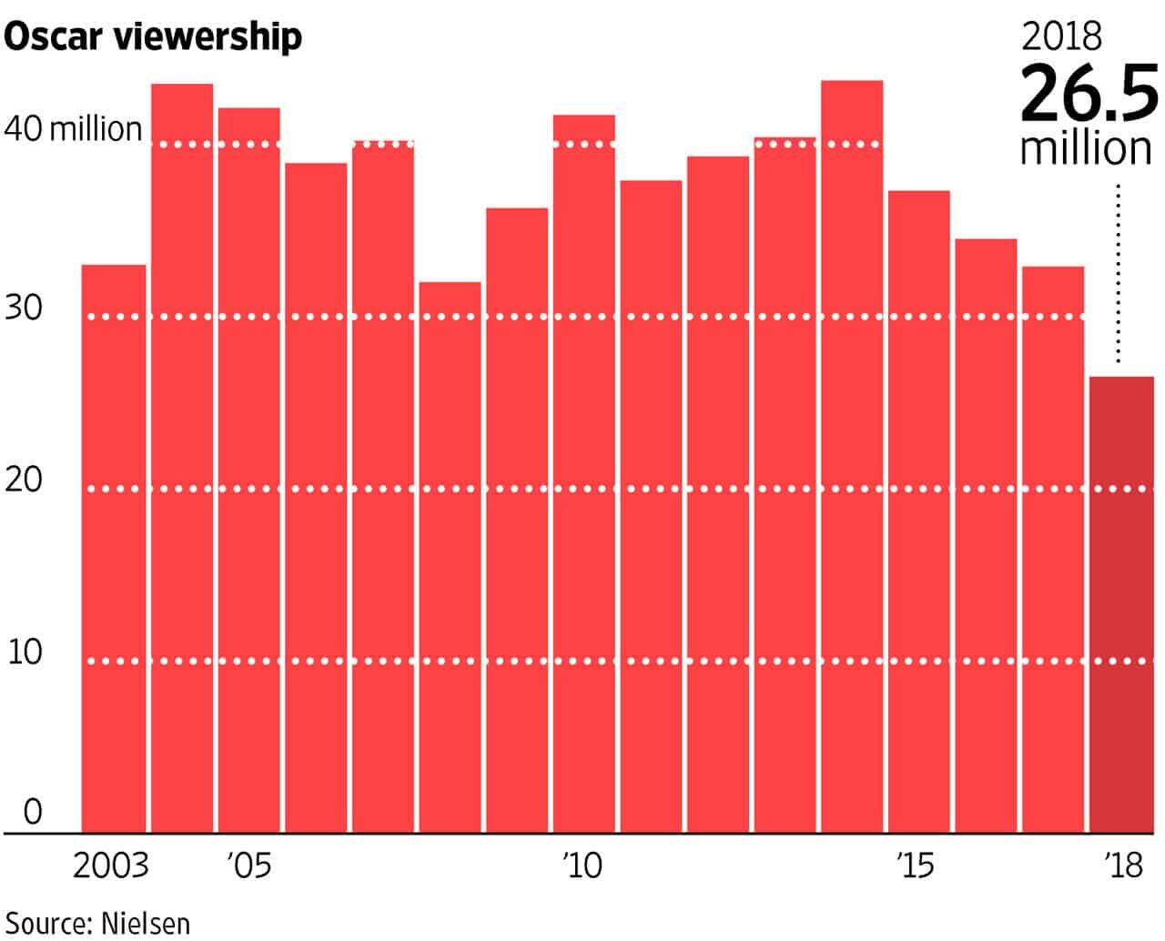
The Wall Street Journal confused the “ratings” number (percentage of households with TVs) with the number of viewers.
Academy Awards Pull In Record-Low Ratings
Television audience for Oscars on ABC falls 19% to 26.5 million
To their credit, the WSJ had a chart that shows more data and context. Many outlets don't show the chart; they just show text descriptions, such as “down 19% from last year's 32.9 million viewers, a nine-year low.”
The number of viewers was an all-time low, whereas the ratings percentage was merely a nine-year low (2008 was the lowest year in recent history by a small margin).
A chart is helpful, but I wish the WSJ had not used a column chart. A line chart is better for time-series data). The WSJ sometimes uses line charts (aka run charts) but not always. Sometimes they use line charts and column charts side by side for the same article.
A Process Behavior Chart is Better
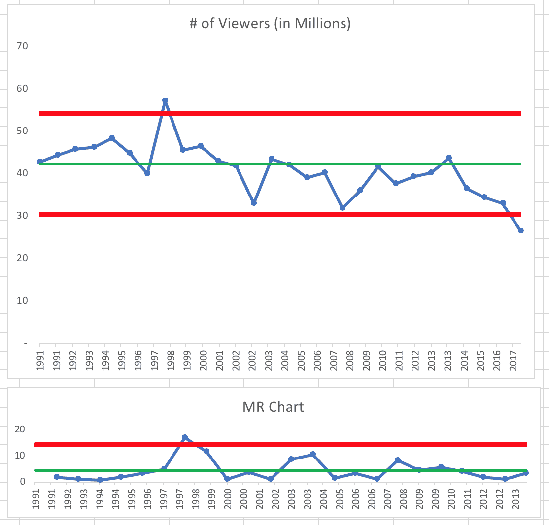
Here is a “process behavior chart” that I created using data that goes back to 1991 (see this post and this tutorial about the charts — and my book Measures of Success). Or, read the classic book Understanding Variation by Don Wheeler.
The “X chart” and its pair the “MR chart” tell us the “voice of the process.” The process behavior chart helps us separate out signal from noise in the data. As Wheeler says:
“While every data set contains noise, some data sets may contain signals. Before you can detect a signal within any given data set, you must first filter out the noise.”
And process behavior charts are the method that filters out essentially all of the noise.
The green line in the first chart below is the average of the first 24 data points and the red lines are the calculated upper and lower limits (also using that same baseline of the first 24 data points).
The chart below tells us the number of viewers is not a stable and predictable process over this time frame. We would not be able to predict future viewership numbers since this chart doesn't reflect a single system over time. The system has changed.
You can see the data and the formulas in the four tabs of this spreadsheet. You can double check my work too, since the spreadsheet, like last year's ceremony, is not perfectly mistake proofed.
The process behavior chart:
We see signals of changes in the overall system:
- One data point above the calculated upper limit (1998 – the special cause is alleged to be the popularity of the movie “Titanic”)
- Eight consecutive data points below the baseline average (2006 to 2013)
- One data point below the calculated lower limit (2018)
- One MR data point above that chart's calculated upper limit (same year as Titanic)
When we have a signal, it's appropriate to ask “Why?” to look for the special cause. It's a waste of time to ask “Why was that year down?” if the single data point isn't below the limit. I've marked the three signals from the “X chart” below:
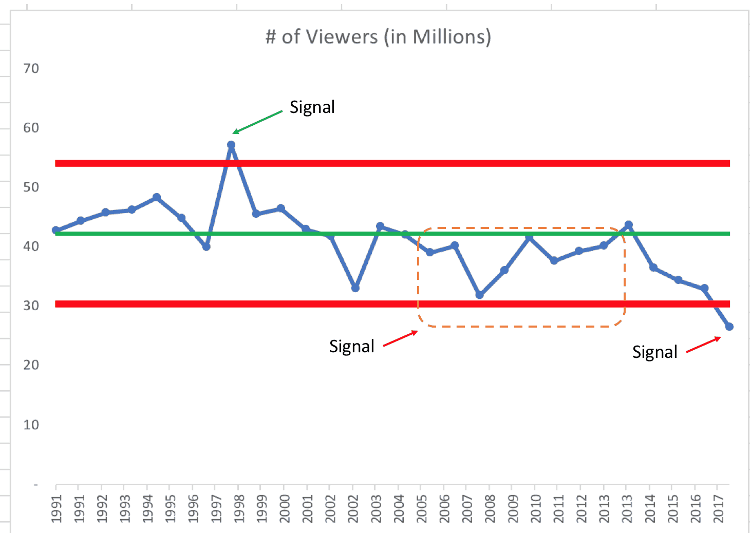
After the eighth year, when the signal would have been detected, was anybody at the Academy asking “why did ratings stay below average those eight years?”
Or were they just reacting to each up and down in the metric? Most organizations are guilty of this overreaction to the up and down, as I've blogged about.
If the number of viewers was just fluctuating around an average, then it's unlikely to randomly have eight consecutive points above or below the average. The 8th data point (not the 6th or the 7th) is a signal that something has changed.
A Slightly Different Look at the Data
My pal Dan Markovitz (@danmarkovitz on Twitter) saw yesterday's post and, after having read my past blog posts on this subject and Wheeler's book, created his own process behavior chart, which I'm sharing with his permission:
Notice that Dan used a different time frame: 1998 to 2018. He used those 21 data points to calculate the average and the limits for the X Chart.
It's interesting to me that, with the average of 39.6 million over that time frame, the only two signals are 1998 (above the upper limit) and 2018 (below the lower limit). Every single other data point is noise since we don't have runs above or below the average (and we don't have clusters near the limits).
I guess it does go to show that the process behavior chart methodology can be somewhat sensitive to the timeframes we choose for calculating our average and limits. We shouldn't intentionally manipulate the data to prove a point that we want to make. My choice of timeframe for the data was as arbitrary as Dan's. I'm surprised that the voice of the process was that much different for him.
Overexplaining the Noise?
This older article asks how ratings could increase for 2012, which is maybe an indication that the industry suspected there was a problem). The now-disgraced Harvey Weinstein was blamed by some for the ratings decline because he started the trend of pushing smaller, less popular “indie films” for Best Picture and other awards.
So maybe the key to high ratings is to just nominate the most popular movies as Best Picture?
The article attempts to analyze (if not over explain) every up and down from 1998 on, saying:
“The Academy of Motion Picture Arts and Sciences has scrambled to address the ratings woes in a myriad of ways…”
Dr. W. Edwards Deming might have used the term “tampering” to describe that scrambling around for solutions. He'd say that tampering with a stable system would generally increase variation in the system and the metric. Instead of making thoughtful changes based on knowledge of the system, the Academy might be trying random “solutions” that just lead to more random fluctuation… which then causes them to draw the wrong conclusions about what works and what doesn't.
The article also identifies systemic changes like “the exploding cable TV universe.”
A systemic change like that could explain the signal of eight consecutive points below the average — and the longer term trend. The number of TV channels seems to only be increasing. That trend isn't going away.
It makes sense why Titanic was the special cause for the huge ratings that one year. But the studios can only wish to have a Titanic every year. It was a one-off special cause that went away. It didn't lead to a sustained shift upward in the number of viewers
Many of the things the Academy does, such as changing hosts or increasing the number of nominated Best Picture films from five to ten might not have a meaningful impact on the ratings numbers. Jimmy Kimmel was the host for the second year in a row. Maybe he'll be blamed for the drop and ratings will fluctuate up a bit next year (which might happen if they keep Kimmel).
“[In 2004], Peter Jackson's Return of the King and the return of Crystal as host did the trick as the show broke a three-year losing streak in terms of viewership.”
Even if any metric was just fluctuating around an average, a “three-year losing streak” could randomly occur without it being part of a continued trend.
The authors seemed surprised that ratings would increase in 2007 with a larger group of indie films… but again sometimes the number is just fluctuating as part of the noise in the data.
“2007 — Viewership improved even though Academy voters once again nominated smaller films like Little Miss Sunshine, Babel and The Queen. “
Other supposed explanations for ups and downs in the chart include:
- Changing the show from Monday to Sunday
- Viewers getting used to it being on Sunday
- The hit show “Survivor” was on at the same time
- 9/11
- Other world events
- New producers
Some point this year to the politicization of the Oscars, but maybe the biggest cause of the decline in viewership has more to do with the 500 channels that are available to us. I don't watch as much TV as I used to and I've never really been an Oscars watcher.
Examining My Process Behavior Chart
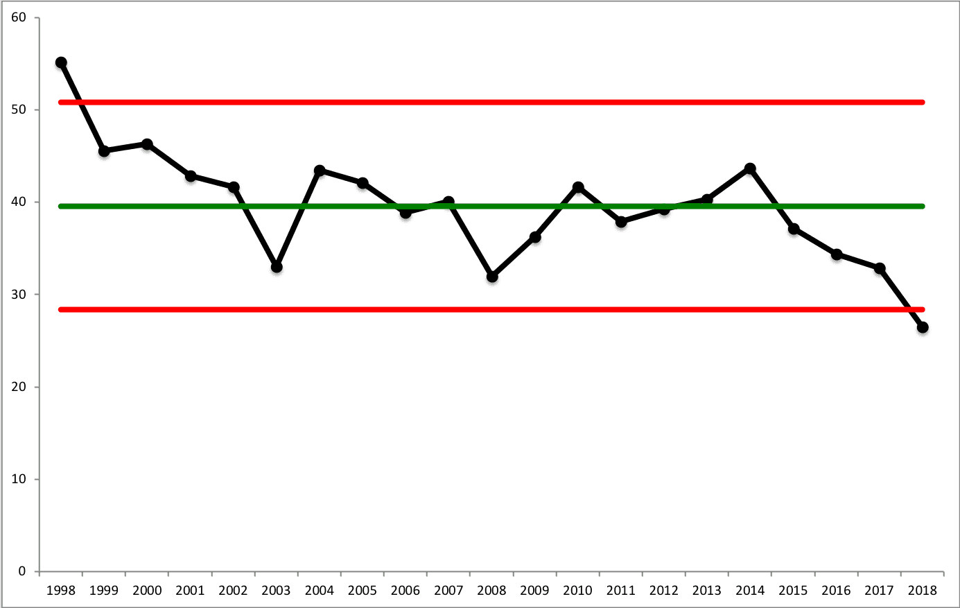
Back to my chart… It's tempting to think in terms of linear trend lines (which often wrongly imply that ratings will drop forever. Instead of looking at a linear trend, I redrew the process behavior chart to show where a shift seemed to occur in 2003.
The number of viewers used to fluctuate around an average of 45.52 million viewers (and we'd expect the number of viewers to fall between the limits of 33.8 and 57.23 million viewers) unless something changed in the system – as a one-time event (Titanic) or a technology shift (hundreds of TV channels).
If the Academy spends too much time focusing on the question of “why were ratings low in 2018?” they might just continue tampering with the system. They might come up with a countermeasure that won't really help.
Instead, the Academy should ask something like “what changed in 2003 or so that caused the average viewership to drop to 37.41 million viewers?” What is the special cause of that sustained shift downward? Focus on the shift (a signal), not the noise. This second chart shows how the average fell and things are basically just fluctuating around the new average. We might bet that the number of viewers might “regress to the mean” next year.
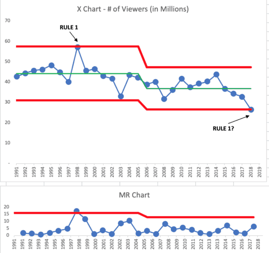
It looks like we have a stable and predictable system has existed since 2003. We had one system from 1991 to 2002, then a new system was established. As it fluctuates, sometimes the number is above average, sometimes it's below average. That happens in a system or with a metric.
We are currently in the fourth consecutive year below the average. It's possible this is the beginning of ANOTHER shift (some say it's due to the rise of Netflix this time).
But, the four data points are not a signal. Note that the 2018 ratings are slightly higher (26.5) than the lower limit of the new system (26.4) so 2018's data point alone suggests there is not a special cause, regardless of what the headlines say and the blame game that is played.
If we have four more years below 37.4 million viewers or if the number falls below 26.4 in 2019 (or any other future year), we'd have evidence of a signal and the Academy and ABC should want to know what the cause was (and to do something about it, if that's possible). We'll never go back to a day of having just seven or eight channels available, as I had growing up in a house without cable.
Should We Chart Ratings% Instead of # of Viewers?
Many of the articles talked about the NUMBER of viewers. The ratings percentage number, indicative of the percentage of households watching the Oscars, might be more meaningful. Since the U.S. population has grown by 20 million in the last ten years, the same number of viewers might mean the Oscars are LESS popular, relatively speaking.
The process behavior chart for the ratings percentage tells basically the same story as the chart for the number of viewers did.
There was a significant shift in 2002 or so and the ratings percentage has been stable and predictable since 2002 or so. In cases like this, it's hard to know EXACTLY when the shift in the average occurred, but there clearly was a shift.
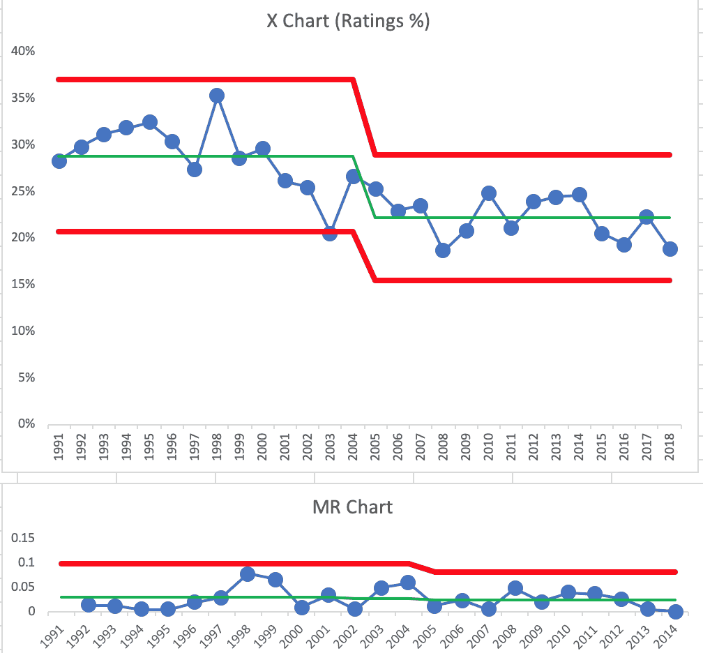
Going forward, I'd be able to use this chart to predict that the future ratings will fall between the limits (between 15% and 30%) – unless the system changes.
You can see that every point from 1998 on is below the old baseline average… hence the shift (I chose not to show the chart without the shift here in the post, but it's in the spreadsheet, tab “ratings pct”).
What Lessons Can You Use at Work?
Does this analysis help? Does it make sense?
What are the lessons you could apply to the metrics that your organization tracks over time, on a daily, weekly, monthly, quarterly, or annual basis? How can you look for meaningful shifts in average performance instead of overreacting to every up and down in the metric or instead of using dubious linear trend lines?
Again, check out pre-order information for my upcoming book Measures of Success if you're interested in this topic.
Please scroll down (or click) to post a comment. Connect with me on LinkedIn.
Let’s work together to build a culture of continuous improvement and psychological safety. If you're a leader looking to create lasting change—not just projects—I help organizations:
- Engage people at all levels in sustainable improvement
- Shift from fear of mistakes to learning from them
- Apply Lean thinking in practical, people-centered ways
Interested in coaching or a keynote talk? Let’s start a conversation.


Question: how do you decide that a process shift has occurred? In a traditional process (manufacturing), you’d expect a shift when you made a deliberate change to the process. You’re actually looking for the data to validate that your improvement created a shift. But in something like this, where you’re observing an emergent trend, is there a definition of what constitutes a shift?
Hi Andy –
I’ve seen there are two times when there might be a shift:
1) When it’s the result of an intentional change (seeing the shift confirms the hypothesis that a change would lead to a meaningful and sustained shift in performance) — usually evidenced by 8 consecutive points better than the old average.
2) When it’s emergent and something that’s discovered… generally, the 8 consecutive points signifies there’s a shift. Knowing *exactly* when the shift occurred might not be known. Knowing *why* it shifted might not be obvious (the chart won’t tell you why… the chart just says a shift occurred).
It seems both situations (planned change and emergent change) could occur in just about any industry with performance metrics, right?
Does that help?
And how they’ve announced some potential countermeasures to the decline in ratings… and many are not happy. They question if the main goal is the number of viewers…