I received another reader question (submit yours here) and it's about statistics, “daily Lean management,” and visualizing performance data.
Hey Mark: I like your posts about control charts and data. Our health system is rolling out a “Daily Lean Management” system and the charts / metrics we get generated for some of the units seem to not be really clear. Can you help me make the case for shifting from our current format to something more like SPC? How would a different chart format help? Thanks!
The reader sent two charts from a unit that I found to be a bit confusing at first glance.
Since the charts didn't have much data on them (which is part of the problem, I guess), I just recreated the charts in Excel so there was no organizational branding visible.
The first chart was for “c. diff hospital acquired infection rates,” where a lower rate is better, of course.
The original chart was unclear about whether it was the unit's rate or the hospital's rate. In the context of Lean management, strategy deployment, or daily Lean management, you might want to see local metrics AND overall metrics. Is local infection rate data driven by the department's processes and systems? If so, can the local team drive improvement activity that affects those rates? That's part of the hypothesis we'd be looking to test. Posting just a hospital-wide metric might be discouraging to staff or they might not be able to see a clear cause-and-effect relationship between their improvement work and the metric.
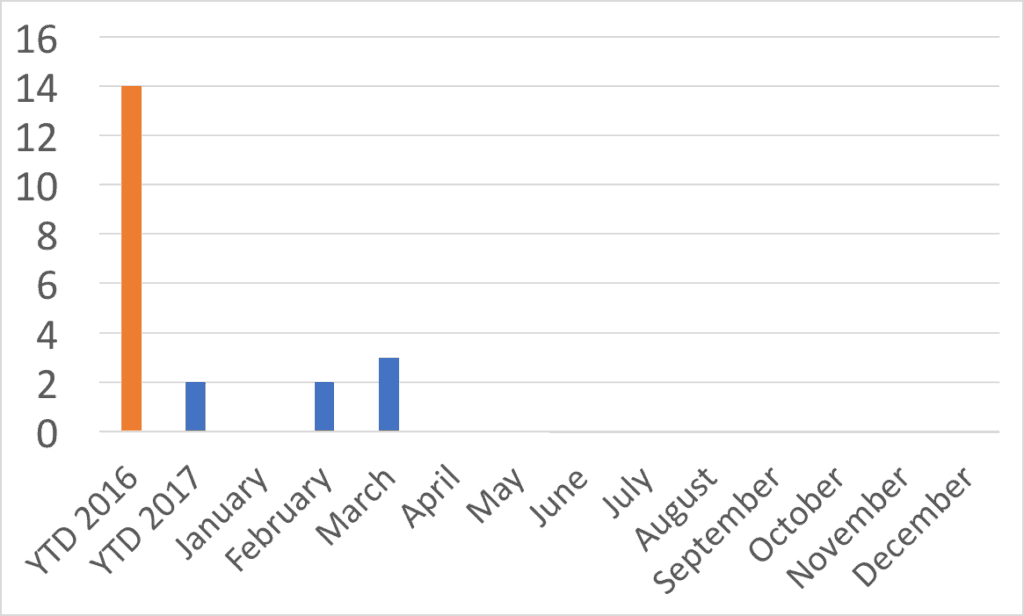
Here is my recreation of the chart, which should give you the gist of it:
There are a few things I would question about the chart:
Lagging Data
Why is the data lagging? It was May 23 when this chart was sent to me. Why is the April data not available or not displayed yet? It's really hard to improve when there's a lag in the data. I asked the reader if they posted any daily or weekly hand-drawn check sheet or any manual data collection method as I see at some hospitals… no. Monthly metrics that lag a month or two behind make it hard to see if your improvement activity is driving measurable improvement. Ideally, we'd want faster cycles of data and improvement. Could the chart be weekly data?
YTD Comparisons
The other thing that's confusing with the reader's chart above is the “YTD” numbers. When I first looked at the chart, I thought things were improving. Maybe that was the intent of the chart creator :-)
Are we making performance look better than it is? Or is the chart just confusing matters?
“YTD” or “Year to Date” for 2016 is, I presume, the entire year…. 12 months. The chart shows 14 infections in 12 months. The 2017 YTD covers just three months? But the YTD number is 2, but there were 2 infections in February and 3 in March. So YTD is 5? Something's wrong with the data, which might make me just tune out a chart like this as visual wallpaper if it were hanging in my area. The YTD columns are misleading because it's not an apples-to-apples comparison.
Using Run Charts
I don't like “column charts” for time series data. I find “run charts” to be more clear from a visual standpoint. The book Meaningful Graphs: Converting Data into Informative Excel Charts, by James M. Smith, PhD, makes this point:
- “Column charts are primarily used to convey data on discrete categories (hospitals, wards, clinics, etc). They can also be used to display data over time periods but only for a limited number of time periods [up to 8].”
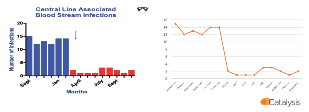
I think column charts (sometimes call bar charts) draw the eye to the middle of the bar instead of the data point… the actually data is at the top of the column. I normally prefer to have the data point be a DOT instead of the edge of a bar. Run charts are what Excel would call “line charts” and I think those distort the data and trends less. You're more likely to have an accurate view of the data, which I think is important.
This is a point I have made in workshops before. Which visualization is more clear to you in the example below? I prefer the run / line chart to the right. It's the same data presented two different ways:
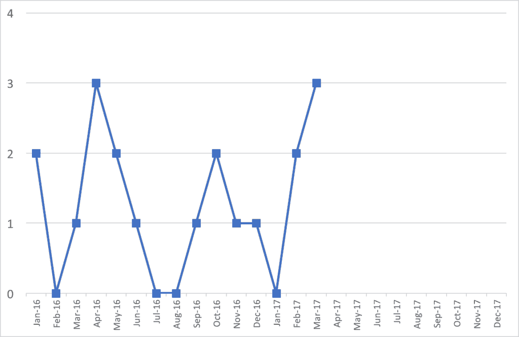
For many reasons, I'd find a run chart to be more helpful. We should have at least 15 data points from 2016 and 2017. I don't have the organization's actual monthly data, but what if it looked like this? The 2016 annual number is still 14.
The run chart gives you a better ability to see if there are trends. A “Statistical Process Control” chart (or a “Control Chart” or “Process Behavior Chart”) might help you make better determinations. See past posts about this.
It's better to show historical data. I don't understand why organizations start a new year and start with a BLANK chart showing no data. Show the 2016 data (and even some 2015). I'd rather have 20 or 30 data points on a chart so I can see trends. January of a new year is a most likely a continuation of the previous year's system. The chart should reflect that.
From the above run chart and my made-up monthly data, it looks like there is normal fluctuation…. “common cause variation,” if you will. I don't see any real trends one way or another. We're not improving, but not getting worse?
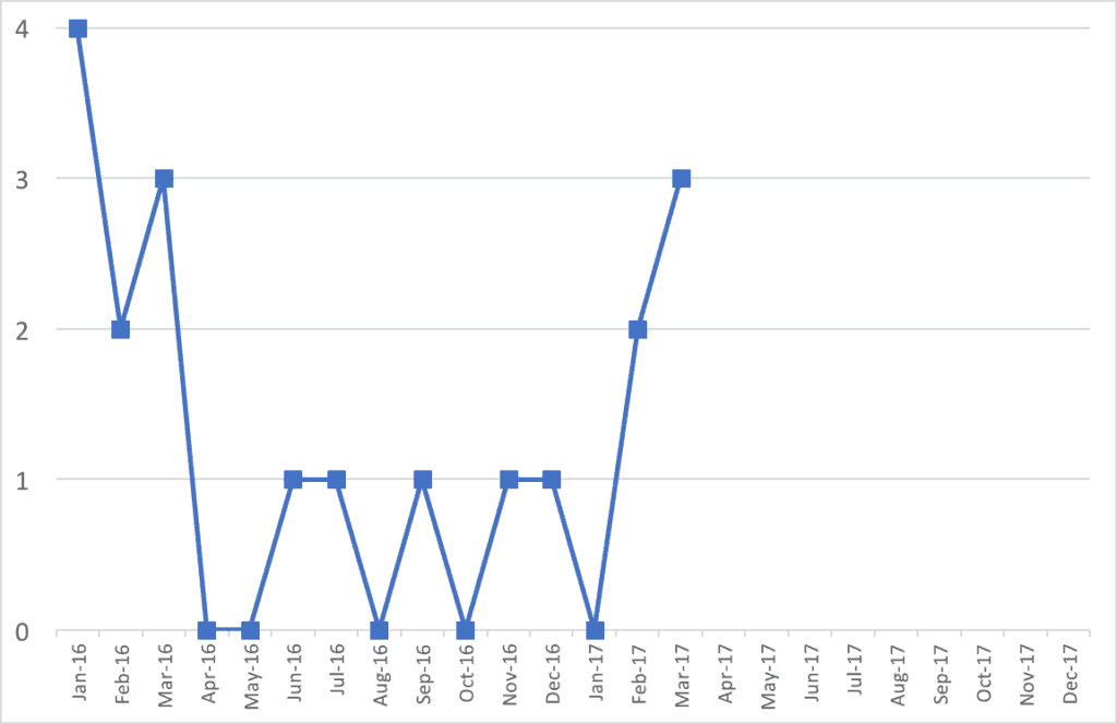
What if the monthly data from 2016 looked like this instead, still having 14 infections for the year?
Does this data and this chart tell a different story? Were infection rates higher at the start of 2016? Was this also the case in 2015? Then, infection rates got lower for a while? Then, things have gotten worse in recent months?
Drawing the Right Conclusions
Is that all a meaningful statistical difference? Are we looking at signal or noise in the data?
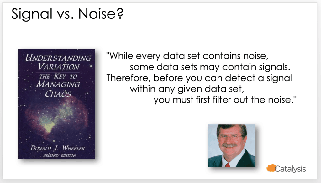
As Donald J. Wheeler says:
He is the author of a great book called Understanding Variation: The Key to Managing Chaos.
What he calls “Process Behavior Charts” help filter out noise so we can see if there's a signal.
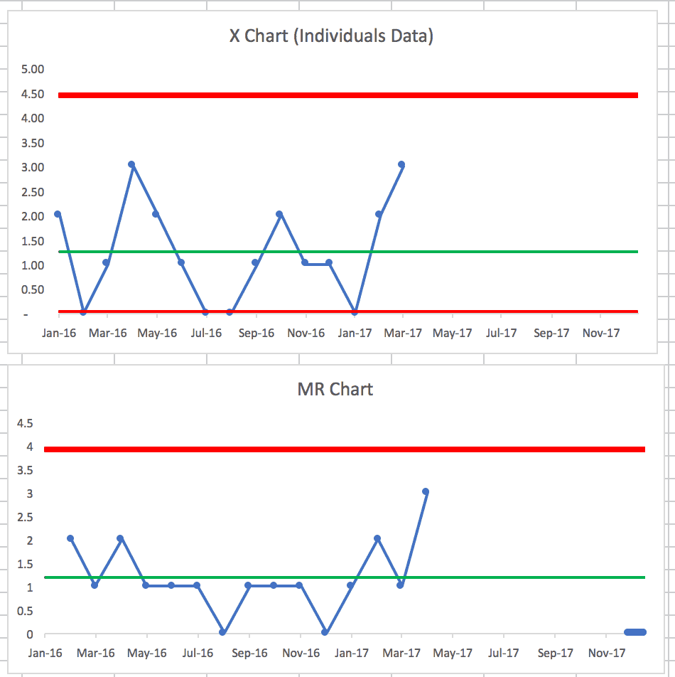
Creating that Process Behavior Chart from the first run chart shows this (learn how to make these charts):
The X-chart of the data itself appears to be stable and predictable. Again, I guess the good news is things aren't getting worse… the bad news is there's no evidence of any reduction in c.diff rates. If you're not doing anything system to improve rates through better practice, maybe that's not surprising.
The companion “MR-bar” chart shows a period where the Moving Range (the difference between data points) is below the average (the MR-bar) for 9 data points. Was something in the system different that led to slightly less variation over that period? Maybe we can't determine that at this point… which does to show why timely data is helpful.
If your attempts to improve involve reviewing a chart each month and asking why the number of infections went up or why it went down (or why it's above average) might sort of be an exercise in futility. We need to ask how to improve the system instead of just reacting (or overreacting) to every data point.
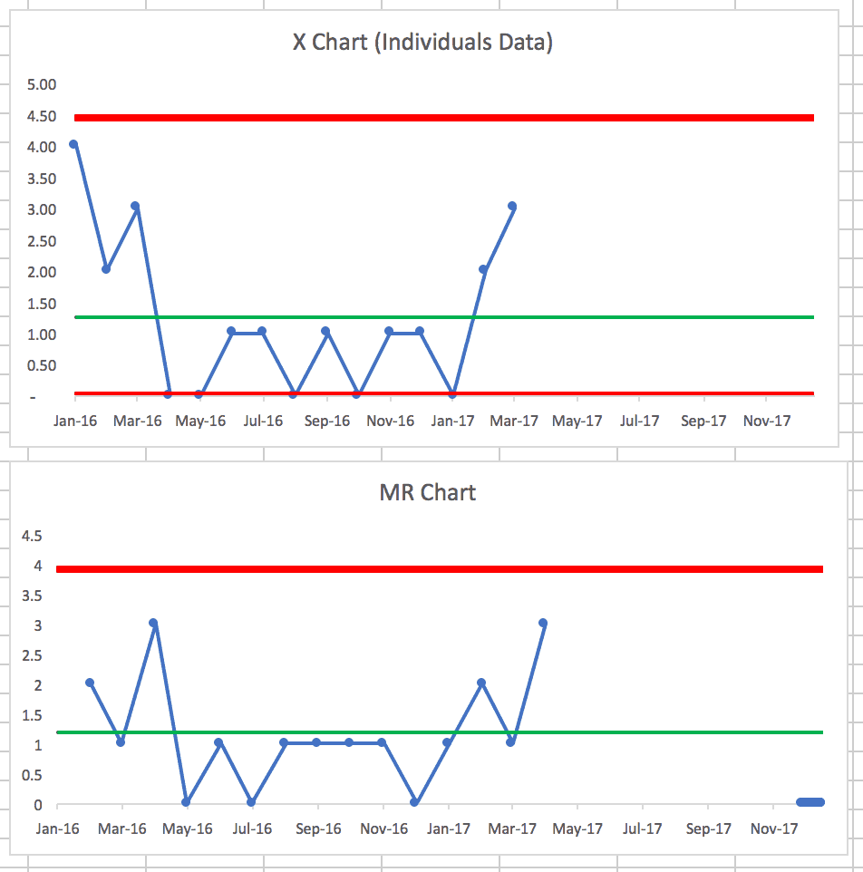
The second run chart shows, as we suspected, that it's not a stable and predictable system over time.
There are many data points below the average c.diff rate, indicating that something changed in the system. And, it appears we didn't lock in the gains… why was that? What happened? Why did infection rates go down? Why have they gone back up?
Final Summary
But, if SPC (with calculated upper and lower “control limits”) is too complex for an organization, I still think run charts tell a clearer story.
So my suggestions for the reader and their organization would be:
- Convert from column charts to line charts
- Don't show the misleading YTD comparisons… show actual monthly data when you have it
- Reduce the delay in getting the most recent data posted
What do you think? What would your organization do? What would be most helpful for discussions around improvement?
Please scroll down (or click) to post a comment. Connect with me on LinkedIn.
Let’s work together to build a culture of continuous improvement and psychological safety. If you're a leader looking to create lasting change—not just projects—I help organizations:
- Engage people at all levels in sustainable improvement
- Shift from fear of mistakes to learning from them
- Apply Lean thinking in practical, people-centered ways
Interested in coaching or a keynote talk? Let’s start a conversation.




In addition to what you outlined above, many of the things that are being measured at a local department level in a hospital are things that should occur rarely (c-diff infections, CAUTI, CLABSI, Falls, etc.) so even a line chart or X chart can be misleading or difficult to interpret. For these more rare (hopefully) event, instead a G-chart (measuring non-defectives between defects) or T-charts (measuring the time between events) and putting that on a control chart can be helpful in seeing a trend up, down, or something outside of normal variation.
I think Don Wheeler (or somebody else I respect… it was probably Wheeler) who said that measuring and plotting the number of days between rare events was a good control chart measure.
Either way, I think a run chart beats that weird YTD column chart (or a red/green “dashboard”) any day.
I truly appreciate your thoughtful and nuanced analysis and agree with your perspective on charting data. Although, I believe tracking “C.diff hospital acquired infections” is an important metric at the macro level, I do not believe it is effective for daily Lean management.
My reasoning for this is, metrics used for daily Lean management must relate to something within the sphere of control and influence of the unit, otherwise the results will serve no purpose and may be counter productive.
Many patients entering the hospital have dormant C.diff spores colonizing their colon that are held in check by good bacteria. If a heavy antibiotic regimen is prescribed then it is likely the normal flora will be killed, unleashing an active case of C.diff, this will appear as a statistic on your chart, but has no relationship to the unit’s practices.
I think it is most effective for daily Lean management to focus on in-process measures, that you can do something about, such as metrics related to reducing transmission and susceptibility to C.diff (i.e. screening on admission, adherence to contact precautions and judicious use of antibiotics). This will help to create clarity for the healthcare team, as their actions will be linked to meaningful statistical results.
Thanks for the comment, Tiffany. I’ve heard others make that point about c.diff. I figured that was a bit out of scope for my discussion, but I’m glad you brought that up. It’s important to have the “right” metrics, not just to look at those metrics in the right way.
You’re right that it’s a good practice to make sure “Lean Daily Management” (or whatever we call it) helps staff make the connection between local metrics and their own improvement activity.
Great suggestion about the “in process” metrics where the hypothesis is that improving that in process metric will flow through to reducing c.diff rates.
Thanks for your helpful response to this reader’s question, Mark. In my experience looking at variation in healthcare processes, there isn’t one more variable than the process for using and displaying healthcare data like this. What an opportunity. I’ve worked in systems that make a point of teaching this skill as part of improvement curriculum and plan to do the same with my employer, Franciscan Childrens. I’m far from expert myself in these skills, but have learned and found the use of basic run charts and run chart rules for identifying trends and shifts to be easier to learn and teach than the range of special-use control charts.
Thanks for the comment. I think I’m accurate in paraphrasing Don Wheeler in saying to use the simplest method possible. Rather than arguing about p-charts or whatever, run charts and basic “process behavior chart” methods (X and MR-bar charts) are useful even if not 100% technically correct. Almost anything is a huge leap from simplistic red/green comparisons to goals, dense tables of numbers incorrectly called “dashboards,” etc.