


I've written a lot about the idea that two data points don't make a trend.
TL;DR: Comparing one year to the previous year doesn't tell you whether anything actually changed. Looking at data over time helps leaders distinguish signal from noise and avoid overreaction.
This is why two data points don't make a trend when leaders are trying to understand performance.
The Trap of Two-Point Comparisons
But many organizations and leaders fall into the trap of just comparing a data point against the last time period or comparing it to a year before. The news media does a lot of these overly simplistic comparisons, as I recently saw in this headline about San Antonio, a city that used to be home for three years, a city that I really love (and there's more to love than the Riverwalk:
A Headline That Sounds Like Good News
“San Antonio Homicide Rate Drops In 2017“
On the surface, that sounds like good news and something to celebrate. But, as Don Wheeler teaches (and I've shared), data without context have no meaning. That headline implies two data points.
When Headlines Jump to Cause and Effect
The article includes a “cause and effect” claim from the city:
“The drop is credited to a multi-agency task force created to tackle violent crime.”
Signal vs. Noise: What Two Data Points Can't Tell Us
When analyzing data for improvement, we need to have some knowledge about the system that generates data and results. It's not enough to say that a metric dropped. If it's in the range of “common cause variation,” it could just be a fluctuation that doesn't really have a specific cause.
With only two data points, several explanations are possible:
- The task force led to a meaningful reduction in the homicide rate
- The task force existed, but the drop was simply part of normal year-to-year fluctuation
- The 2016 number was unusually high, making 2017 look better by comparison
With just two data points, it's impossible to know whether the 2017 decrease reflects a real change in the system or is simply common cause variation.
The article text provides a bit more data and context (an important reason to read beyond the headline):
“…2016 was one of San Antonio's most violent years with nearly 150 homicides. That number dropped in 2017 by about 16 percent to 125.”
This implies that 150 was higher than usual. How much so?
What we still don't know:
- How much the homicide rate typically fluctuates year to year
- Whether 2016 was unusually high or within the normal range
- Whether a 16% drop is meaningful or just noise
The article also tells us:
“After an average of 90 homicides annually between 2011 and 2015…”
So 2016 and 2017 were both “above average” from the baseline years of 2011 to 2015. That's still not quite enough information to draw a “Process Behavior Chart” to help answer whether 2016 or 2017 are “signals” or “noise” in the data. We would need the data points for each year from 2011 to 2015 (or, better yet, more data) to be able to calculate the upper and lower process behavior limits for the chart.
It's possible that 2016 and 2017 are noise… It's possible that 2016 was a signal.
Looking at the Data Over Time
I went online to try to find the actual data.
This headline doesn't answer the question about signal vs. noise either:
“Homicides in S.A. hit a 21-year high. Why?“
The fact that 2016 was a “21-year high” doesn't automatically mean that it's a signal or that there's a special cause answer to the question of “why?”
There could be, possibly, a stable and predictable system that generates a “21-year high” that's still within the calculated process behavior limits. If that's the case, reducing the homicide rate would require more systemic analysis and problem solving that probably won't come from asking “why was last year's number high?” in a reactive way.
That article does add some context:
“That's a stunning 61 percent increase over 2015.”
But, again, we don't know how much the homicide rate fluctuates normally from year to year. Had there been a stunning decrease from 2014? Is “stunning” the same as “statistically significant?”
The City of San Antonio provides data on their website. That data only goes back to 2011.
Starting with the annual data, the Process Behavior Chart would look like what you see below (with a recognition that seven data points doesn't create the most reliable limits — having 20 to 25 data points to start is more valid, statistically).
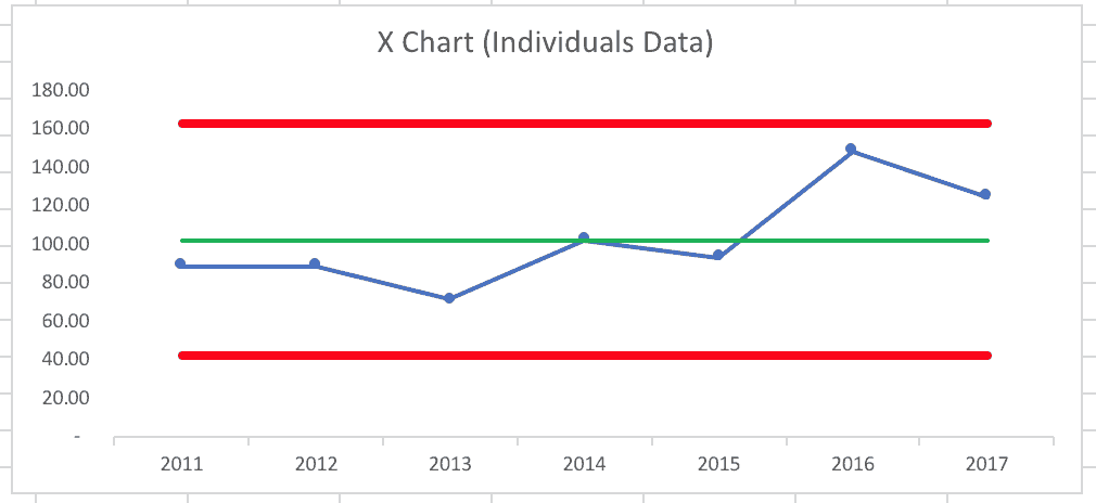
This Process Behavior Chart, created with the data from 2011 to 2017 implies that every data point is “noise.” It implies the same system is leading to variation in the data from year to year.
There's no likely explanation for why 2016 had a higher homicide rate other than “it's higher some years than others.” We might not like to see an average of 100 homicides per year. But this chart suggests that we'd expect to see between 40 and 160 homicides in 2018 if nothing changes in the system.
Why Baseline Data Matters
Digging deeper (meaning more Google searches) brought me data from before 2010. The San Antonio Express-News has data from 2007 that's different than the City of San Antonio data. So, I made another Process Behavior Chart using their data through 2015:
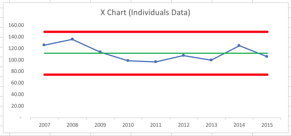
Again, that looks like a classic “in control” or “stable and predictable system” – with the caveat, again, that the baseline for the average and the limits is based on just nine data points. Four points are above average and five are below – not unusual. There didn't appear to be any trend or “special cause” or “signal” in those years. Some years, there are more homicides than others.
With this baseline data, the calculated process behavior limits were at 75 and 150, meaning we would predict, at the start of 2016, that the year would bring anywhere between 75 and 150 homicides unless something changed in the “system” of life there.
As 2016 played out, the 149 homicides reported is just below the calculated limit of 149.57 (to be more precise). That tells us it's likely there were 149 homicides as part of “noise” in the data — it's within the expected range for a stable, predictable system. It doesn't mean anything necessarily changed in 2016. But, when we're close to one of the limits, it's possible that the data point is a signal and that there's a special cause behind it.
A quick but important note: I don't mean to dehumanize the homicide victims and their families by treating them as data. The Express-News site has the stories of these victims.
There were 136 homicides back in 2008, so 149 in 2016 doesn't seem completely out of line with the past. And a decrease to 125 in 2017 (if it's due to the task force or not) is still a relatively high homicide rate compared to the past decade and the average of 110 or so.
Again, just because the Process Behavior Chart shows an expected average and range, that doesn't mean San Antonio has to accept that. They can work to improve the system (through task forces or other means) rather than just being reactive and looking at any one or two data points.
I found data going back to 2002 from City-data.com, so I created a Process Behavior Chart using 2002 to 2017 data points as the baseline for the average and the limits that are calculated from this data:
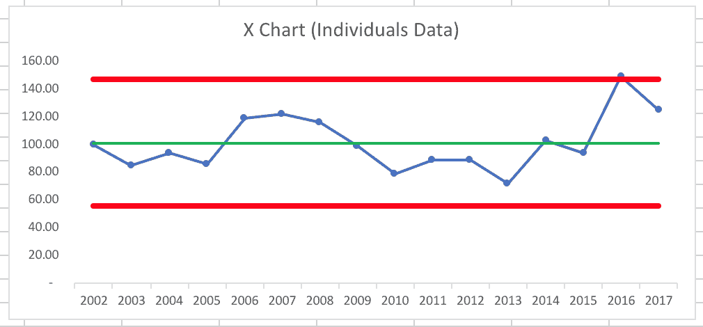
The average and limits are lower because 2002 to 2005 were all “below average” years compared to the longer-term average.
In this scenario, 2016 does appear to be higher than the upper process behavior limit, which suggests it is an outlier or a signal and that suggests there is likely a “special cause” for that data point. It would be, then, worthwhile to ask “what was different about 2016?”
Is 2016 a signal or not? It depends on the baseline data that was used. More on this in my summary at the end of the post.
Using Monthly Data to Detect Change Faster
We can also create a Process Behavior Chart based on monthly data (from the City of San Antonio), which provides more data points to work with (while recognizing there is bound to be more month-to-month variation than we'd see in year-to-year data). Sure, there's a different number of days in each month, but let's see what the data tell us when viewed monthly. I used the first 25 data points to calculate an average and the limits… here is the Process Behavior Chart:
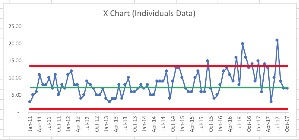
Using the “Western Electric Rules,” the main things we're looking for include:
- A single data point above or below the limits
- 8 consecutive data points above or below the average
In October and November 14, we see a different “Western Electric Rule” being triggered:
- 2 out of 3 consecutive data points near the limit
That's a signal, which would trigger us to ask “what happened in October and November 2014?”
We see a single data point above the limit in September 2015. What happened?
Then, starting in January 2016, we see a run of well more than eight consecutive data points above the average. This isn't surprising since the annual 2016 data point was very high.
Was there a new “system” established in February 2016 or so? If I create a new average and new limits, it looks like this (using February 2016 to October 2017 for the new baseline):
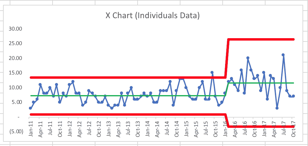
What we see, unfortunately, is that the average monthly homicide rate increased from 7.28 to 11.7. Why is that? Also, the variation increased, so going forward, San Antonio would expect to see between zero (the lower limit can't be negative here, even if that's what the calculation says) and 26.5 homicides each month.
If the city's task force and other efforts are going to bring the homicide rate back down, I'd first look for eight consecutive months below this new average of 11.7. There were three data points there already (August, September, and October 2017). I'm not sure what the November or December monthly data showed.
I hope that average will come back down and that San Antonio can find ways to reduce the average even more.
You can download and view the spreadsheet I used to create these various charts.
What Leaders Should Learn from This Example
I hope this analysis makes sense and that I'm explaining this clearly (as I practice explaining concepts for my next book Measures of Success). The book will, of course, contain details about how to create these charts and how to calculate the limits (as explained here).
Point 1: Don't accept simple two-data-point comparisons in your workplace. This time of year, you'll hear a lot of reports about how some organizational performance metric was higher or lower in 2017 compared to 2016. Ask for more data points. Plot the dots. Look for statistically valid trends (such as eight or more consecutive points above or below the average).
Point 2: Yes, the Process Behavior Charts and limits are somewhat sensitive to the timeframe you choose as the baseline. I'd suggest not manipulating the methodology by selectively choosing a baseline timeframe that leads to the answer you want to see. Try to look at the “voice of the process” honestly. Use 20 to 25 baseline data points when you can.
Point 3: Sometimes “rolling up” data into annual buckets can mask variation in the monthly or weekly data. We should consider the timeframes that we use in charting our metrics. When using monthly metrics, we can detect signals more quickly, allowing us to investigate causes sooner.
Point 4: As always, one helpful benefit of Process Behavior Charts is that it can help us avoid overreacting to every up and down in the data. We sometimes have to improve by using more systematic methods than just asking “what went wrong last year?”
What do you think about this type of analysis? Would this be helpful for your organization?
Why Two Data Points Are a Leadership Trap
It's tempting to react when a metric goes up or down, especially when a headline tells a simple story about cause and effect. But this example shows why leaders need to be cautious. Two data points–no matter how dramatic the change appears–don't tell us whether anything in the system actually changed.
Looking at data over time helps us separate signal from noise. It helps us decide when to ask deeper questions, when to take action, and when to resist the urge to react at all. That discipline matters, because overreacting to noise can waste time, misdirect effort, and distract from the real work of improving systems.
The takeaway isn't to ignore data or wait endlessly for perfect information. It's to use better thinking when interpreting metrics. When leaders understand variation and look beyond snapshots, metrics become a tool for learning–not a trigger for blame, celebration, or knee-jerk decisions.
Learning More About Better Metrics
If you're interested in applying these ideas in your own organization, my book Measures of Success: React Less, Lead Better, Improve More dives deeper into how leaders can use data wisely–reacting less to noise and improving systems more effectively.


LinkedIn comment:
Sabrina Butcher:
Thanks, Sabrina Butcher. Good point about not getting into what many call “analysis paralysis.” The San Antonio police and community can work to improve the system (whatever actions they think might reduce the homicide rate) without waiting for more data. But, sometimes we have to wait for more data to see if we’re getting the results we predicted from our system changes.
A couple of comments, on top of thanks Mark for continuing this vein of work on interpreting performance data. First, building on the above comments, would you agree that one doesn’t have to look at the decision making using these data as a binary one — yes or no, is this a signal or not and therefore should we put any effort into fixing whatever problem is going on? There’s an in between, isn’t there — data points near the limits could trigger helpful discussion about what might be going on if anything, before actually taking action. Also, if this type of data is reviewed in context of various other performance measures for a system, then we might spend a bit more time on the ones that show points closer to the limits, vs. others that appear to be more stable (closer to average). Is this dangerous thinking, or reasonable? I mean, if I’m reviewing 10 metrics of system performance at the end of a period, these charts provide great grounding statistically for discussion and decisions, but by themselves don’t necessarily generate an “all’s well” even if the recent data for all 10 are within control limits.
The other comment or question I have is when to think of converting this type of data into a rate metric (per capita) since the # of murders could reasonably rise based on a population increase without any other systemic factors affecting the outcome? And if we convert this to a rate, does that also mean using a different control chart vs. this X chart? I’m curious what this would show … sorry I don’t mean to give you more homework Mark:).
Thanks for the comment, Tom.
I don’t mean to imply, in any of my writing on this subject, that a system that only exhibits “common cause variation” shouldn’t be or can’t be improved. It’s a matter of HOW to improve it. The point I try to make is that we rarely improve a stable system through reactive questions of “What went wrong last year?” Asking questions about improving the system tend to fit more of what you’d recognize as an A3 problem solving approach.
You’re right that a single point “near” the limit could signify a signal, just as a point just outside the limits doesn’t have a special cause associated. There’s some grey area around the limits because the limits are calculated with some statistical assumptions that filter out MOST, but not ALL noise.
I don’t think it’s “dangerous” to focus on metrics that are closer to the limits. If there are 2 out 3 points near the limit, that’s usually considered a signal. What’s a waste of time is treating all ups and downs the same, treating all “worse than average” data points as something to react to.
Good question about using the homicide rate per capita. San Antonio is a fast-growing city.
I should run the numbers that way. I’d still use this same process behavior chart methodology. Some disagree with him on this, but Wheeler advocates not worrying about which specific time of control chart to use. I think keeping it simple and using the process behavior chart methodology is valid and certainly better than not using any form of control chart and this sort of thinking about variation.
I taught a workshop last year where a Master Black Belt thanked me for “keeping it simple.” He said his executives’ eyes glaze over when he tries talking about different types of control charts. It’s a big enough challenge to get people to consider the process behavior chart method… one I’d call slightly “simplified” not “dumbed down.”
Looking at the homicide rate (from city-data.com), it suggests that 2016’s rate is not a signal (because it’s adjusting for population increase) when the the original chart of the number of homicides did show a signal.
I’ve updated the spreadsheet that I’ve linked to by adding a tab and here is the chart:
We almost had 8 consecutive points below the average, which would have been a signal…
I would be wary about treating a single point close to but inside a control limit as a signal. Consider that a stable process will on rare occasions generate values outside the control limits. But, the rarity is enough to warrant a check of the process/system to see if it has changed. Points inside the limits are not rare. So treating them as potential signal is problematic. What is close enough to the control limit?
The Western Electric rules are a great standard to use in detecting potential signals. I would avoid deviating from them and creating your own rule. (If you do create your own rule, make sure you base it on sound statistical theory, so it’s replicable.)
On a separate note, great point about the area of opportunity for each data point. When you plot raw count, it assumes that the area of opportunity for the values is equal i.e. the population is the same from period to period. It’s why plotting rates is more meaningful, I think. Also, a great point that the XmR chart is universally useful. It is effective with raw count or with rates.
Hi Shrikant –
My point about being close to the limit is that these control chart limits (aka “natural process behavior limits” as Wheeler calls them) are probabilistic. There’s a chance that something above the upper limit is not a signal. There’s a chance that a point just inside the limits is indeed the result of a special cause. The limits are set in a way to balance the errors of missing signals vs. overreacting.
If somebody wants to investigate a data point that’s just inside the limits, that’s less likely to be a waste of time than investigating a point that’s just above average or halfway between the average and the 3-sigma limit. There’s some grey area and “art” to this, not just hard calculations. If somebody investigates and learns something about their system that leads to systemic improvement, that’s good and it sometimes might be a risk worth taking.
I’m not creating my own rules, just recognizing the “fuzziness” of the calculations not being 100% iron clad.
Doesn’t that open the door to variation in what is investigated and what isn’t by who does it? My determination of closeness will be different than yours leading to different decisions about what to investigate and what not to, no?
I can see a worker investigating every point between 2.9-sigma and 3-sigma and occasionally finding a point is a signal and getting kudos versus one that adheres to WE rules.
I feel that however you decide to mark a data point as a signal, it should be operationally defined so that such variation in decision from person to person doesn’t happen. The WE rules are such operational definitions.
There’s always going to be variation in approach. Is that variation harmful? Some of that variation (investigating a point at 2.9 or 2.85 sigma) might indeed be a waste of time, unless they discover something in their investigation that allows them to then improve in more of a common-cause mode.
I’d rather see people use anything close to the Wheeler methods and I’d be so happy to see it that I probably wouldn’t be in the mood to nitpick over minor details.
What time frame would you use to analyze Press Gainey patient satisfaction scores. How do we know what we are doing makes a difference?
Hi Sandra –
Thanks for your question. I’d love to help you with this and would keep your data and everything confidential.
The same rules and guidelines would apply for deciding if there is a “signal” in your data, including:
– a single data point that’s higher than the upper natural process limit that’s calculated from the baseline data (ideally, you’d have 20 or 25 data points from the past to establish the baseline)
– 8 consecutive data points above your baseline average
If this is only measured monthly, you’d have to, perhaps, wait 8 months to see that trend.
Two data points don’t make a trend, keep that in mind.
You can contact me and we can exchange emails if you’re willing to share data that way.
Mark
Mark,
Do you feel that in characterizing data as signal or noise we may be at risk of being dismissive of data that is “noise?” Is there a better way to speak of such data as coming from a stable system reflecting natural system variation? That we can influence it and changing stable performance requires modification to the system itself?
I feel that when we characterize data as noise, we somewhere implicitly suggest or assume we can ignore it or that we don’t have a means of improving it. How do you feel?
Shrikant Kalegaonkar
Good question. I’m trying to figure out, for the book I’m working on (yes, I’ve been writing), what the best language is that resonates with people.
I’ve gotten feedback that “signal” vs. “noise” resonates better than “special cause” and “common cause.” I’ll continue to get feedback from people (including you).
Whether it’s call “noise” or “common cause variation,” the key thing to try to get across is that people CAN do something to improve the system. It’s just more like to come through a more systematic A3-type approach rather than coming from the reactive “what went long last week?” question that people tend to ask. People out there seem to treat everything like special cause.
Filtering out even 90% of that overreaction, I think, would free up a lot of time and capacity for real in-depth problem solving and systematic improvement.