

Visualizing Metrics & Managing Improvement Properly: Webinar Registration Numbers
We've hosted a few really great webinars in the past few months at KaiNexus, including presentations by leaders from Rona Consulting Group, Catalysis, and Big Change Agency on themes of improvement, leadership and culture.
Since I manage these webinars, one of the metrics I monitor is the number of people who register for each webinar. That number might be a bit of a “vanity metric” since KaiNexus doesn't directly make money on these webinars (they are free). We're trying to provide content that's helpful for people and we also use the webinars as a way of introducing people to KaiNexus or strengthening our relationship with them. More meaningful metrics to the company are the number of leads and the number of new customers we sign up.
That said, I look at the “number of registrations” as a bit of a “process metric” that (we think) leads to some results at the end — in addition to sharing great content and being a part of the continuous improvement community (there are intangible and indirect long-term, less measurable benefits to doing these webinars).
Each time we do a webinar, I enter the number into our KaiNexus software (which we use to run and improve our own business, of course).
A table of numbers never provides much insight, whether it's in KaiNexus, Excel, or Minitab. It's really difficult to make sense of trends. It's very hard to distinguish between “signal” and “noise” in the data.

As I've blogged about before, simple run charts or, better yet, “Process Behavior Charts” are valuable methods we can use to see more in our data, which then allows us to manage more effectively.
Before I show what that version of chart looks like, I want to compare it to the type of chart I see often in hospitals (and I presume they're used in other organizations).
This chart method isn't as good as Process Behavior Charts for a number of reasons.
For one, it utilizes what Excel calls a “column chart” (commonly called a “bar chart”). I've blogged about this before. Column charts should be used for comparisons in a single point in time. Time series data are better represented by a “run chart” (or “line chart”) because they are easier to interpret visually (they are less misleading):
I'm not sure what this chart is called, but another problem is that it shows a CUMULATIVE measure throughout the year. In our case, we want webinar registrations to increase over time. Charting a cumulative metric (registrations so far this year) can be misleading in that it always creates a chart that looks good, going “up and to the right” as Eric Ries and the Lean Startup people say.
I saw a hospital that had charted medication errors on this chart. If we're trying to drive that number DOWN, I think a cumulative chart is much harder to interpret than just charting the number each month. Why make people do mental gymnastics when looking at a chart? Just plot the number.
This chart style also tries to compare to LAST YEAR'S performance by overlaying that, but doing so as a run chart. I guess this makes it easy to compare this July's performance to last July's, but that's a two-data point comparison. We see more and learn more when we just look at the trends by putting those 24 points into a single run chart. I think that's more helpful.
Charts like this often have a “target” line drawn on them.
So, this chart format (the one I do NOT like) would look like this:

We sometimes do more than one webinar per month, so instead of a monthly metric, I've basically charted the last 12 webinars and compared to the previous 12.
A chart like this shows we were ahead of the previous pace for a while, and then fell behind, and then caught up. The most recently 12 webinars had a slightly higher registration total than the previous 12, but not by much. And we're behind the “goal” number. That wasn't really a goal I had, but this charting methodology almost always has a goal. So we're also comparing performance to the goal.
Comparing our performance to the previous year is a 2-data point comparison, same as with comparing to a target. Making our status “red or green” doesn't do much to answer the question of “are we improving?”
There are two questions we should ask:
- Are we meeting our goal? — Keeping in mind we should try to avoid the dysfunctions of arbitrary goals
- Are we improving? — Or are we getting worse? Or is performance just fluctuating?
A Process Behavior Chart (with a goal or target line added) can answer those questions much more clearly.
KaiNexus customers can create run charts or control charts in our software. The green line is the average and the red line is the “upper process behavior limit.” 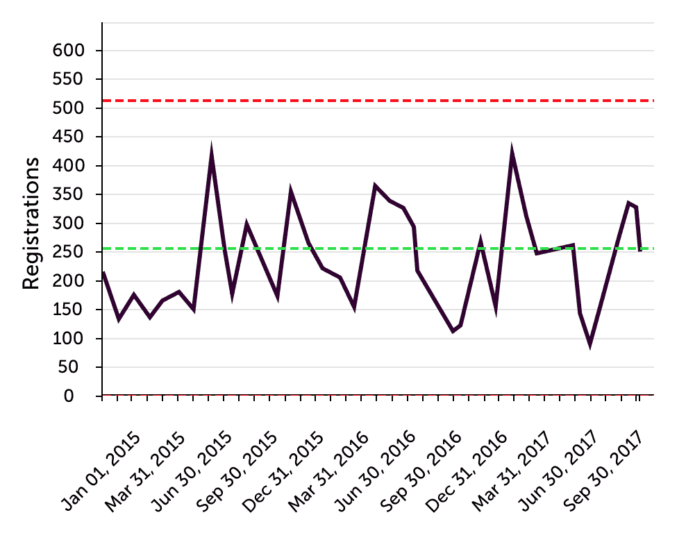
The chart more clearly shows that the webinars were less popular in early 2015 (an average of about 175) before it jumped up and has remained pretty stable since them. A Process Behavior Chart can show more than 24 data points, which is the most you'd ever see in that annual / cumulative chart format. We can update Process Behavior Charts to, for example, only show the 30 most recent data points. Too many organizations will start January 2018 with a lot of blank charts, losing the context of past data. That's a blog post I should write in January.
If our goal was 250 registrations per webinar, the run chart shows more clearly that we're probably going to hit that about half of the time, given the “common cause variation” that creates noise in the data. It's hard to know exactly why some webinars attract a bigger audience than others.
Causes of common cause variation could include:
- The title and if it's appealing
- The topic and if it's appealing
- The breadth of the webinar (does it seem geared toward just a single industry?)
- The day of the week (we generally do Tuesday, Wednesday or Thursday)
- The time of day (we generally do 1 pm ET, but it sometimes varies)
- The profile and fame of the presenter
- Is it an outsider presenter or somebody from the KaiNexus team?
Edit: As I discuss in the comments… “common cause variation” is always there. The different causes of variation interact with each other. We don't know the exact effect of each common cause, but it's there. A signal in the data suggests there is a “special cause” that is new or unusual that is affecting performance.
What the Process Behavior Chart tells me is:
- There's some natural level of variation that occurs – some webinars are just more popular than others.
- The webinar aren't getting more popular… but they're not getting less popular either
- We're sometimes hitting the goal and sometimes not
In a situation like this, reactive questions of “what happened last month?” aren't necessarily helpful. If we had a “signal” (a webinar with registrations greater than the upper limit or eight in a row above the average), then we should ask “what was different?” and “what could we repeat in the future?”
If we had, for example, Malcolm Gladwell do a webinar, we would probably get an enormous audience. But, the “special cause” of the “signal” in the data would be his fame. That wouldn't be a meaningful shift in our normal process or system.
Within the KaiNexus team, we ask more systematic questions about how to improve the system. How can we improve the AVERAGE performance of the system? How can we shift the mean upward?
Of course, this is all discussion about a vanity metric. We also have discussion about how to generate more leads and more customers.
What do you think of that combined column/line cumulative chart format? Do you see that being used in your organization? Does it help people improve?


LinkedIn Comments:
Alan Wikler:
My reply:
There are many underlying causes of common cause variation. They all interact and are always there. There’s no single “special cause.”
I appreciate how you make metrics more understandable, especially the idea of common vs special cause. Your simple, clear examples illustrate your points very nicely.
Thanks, Ruth!
LinkedIn comment by Keith Dorricott:
My reply:
An arbitrary target as the sum of arbitrary monthly targets. I guess that’s somewhat useful information in most organizations.
But, having a target line each month and comparing that to actual performance can be done on a run chart or a process behavior chart.
My biggest issue with the cumulative chart is that it makes it hard to answer the question of “are we improving?” I’d argue that’s a more important question than “are we hitting the target?”
There’s a misunderstanding about control charts or process behavior charts — the idea that you ONLY react to special cause variation. Yes, you should investigate special causes, but when you have a system that’s nothing but common cause variation, the challenge is understanding and improving the system so that you improve the average performance and/or reduce variation (which reduces the limits that predict future performance).
The managers are wrong in thinking there’s nothing you can do to improve a stable system with wide limits. There’s a lot you can do. But that involves systemic problem solving and improvement that’s not likely to be found when reacting to a single data point.