


tl;dr summary: This post examines the trend of Tommy John surgeries in MLB and MiLB using Process Behavior Charts, revealing that the perceived surge in injuries is within historical variation. The data suggests shifts in patterns rather than a sudden increase, emphasizing the importance of contextual data analysis.
Is there a “spike” or a “rash” of Tommy John surgeries in Major League Baseball this year? Statistically speaking, NO.
I've seen a rash of articles about Major League Baseball pitchers who are now out for the season because they've hurt their elbow and need “Tommy John surgery.” This includes some big names like former Cy Young Award winner Shane Bieber of the Cleveland Guardians.
My favorite player, Shohei Ohtani, isn't pitching this season after having his second Tommy John surgery (thankfully, he can still play as the Designated Hitter).
Headlines include:
“MLB pitching injuries 2024: Key culprits in baseball's elbow epidemic“
People are trying to ascribe causes to this, but is it an “epidemic”?? How would we quantify that?
My problem-solving coaches, former Toyota leaders, taught me to look at something like this situation as “a big vague concern.” Is it really a problem? How would we define it? Is it a problem worth running some root cause analysis on? We need data.
Another article jumps to causal analysis:
“Why are MLB pitching injuries on the rise? Four possible causes from pitch clock to changes at amateur level”
How is “on the rise” defined? How is a “rash of injuries” defined?
We could have that same conversation about metrics in our business. Do we have “a rash of customer complaints,” and are they “on the rise” in a statistically meaningful sense?
Each upset customer matters. Each injured pitcher matters. But the numbers matter too.
I saw this headline recently:
“Clayton Kershaw doesn't have answers for spate of MLB pitching injuries: ‘Nobody knows‘”
What's the operational definition of “a spate” of injuries? Maybe there's no single root cause or set of root causes. Maybe the year-to-year fluctuation is in the range of “common cause variation” or “noise” in the data.
One Way to Visualize the Data
It's not ideal, but at least this article had a chart and additional data points going back to the year 2000:
“There's no Tommy John surge this spring. (It's always this bad)“
I do love that there's data. I don't love that we get bar charts instead of a line chart (a.k.a. run chart) going from left to right.
The visualization also requires some mental gymnastics to figure out that:
- MLB surgeries are the grey bar
- Total “Pro” surgeries (including minor and major leagues) are a color coded number
- Minor League Baseball (MiLB) surgeries are the Pro number minus the MLB number for a year.

Now, if you look at just the last two years (and each year is the “first 100 days of the year,” so we're not comparing a full year to a partial), there's what some might call “a huge jump in surgeries from two to nine.” That's also accurately described as “350% increase from 2023!!!!”
Yeah, add exclamation points.
That 3.5x jump would ask people to ask “what happened this year?” when that's not the right question to ask, when we look at the data in context.
Surgeries are UP in MLB. But they are DOWN in MiLB, from 21 to seven.
So the problem is both getting worse (MLB) but also also getting better MiLB).
Better: Look at Line Charts Instead
Rather than co-mingling the MilB and MLB data into a “pro” list of numbers, I'd draw separate line charts for MLB, MiLB, and maybe for the total “pro” number.
You could even put them on the same chart:
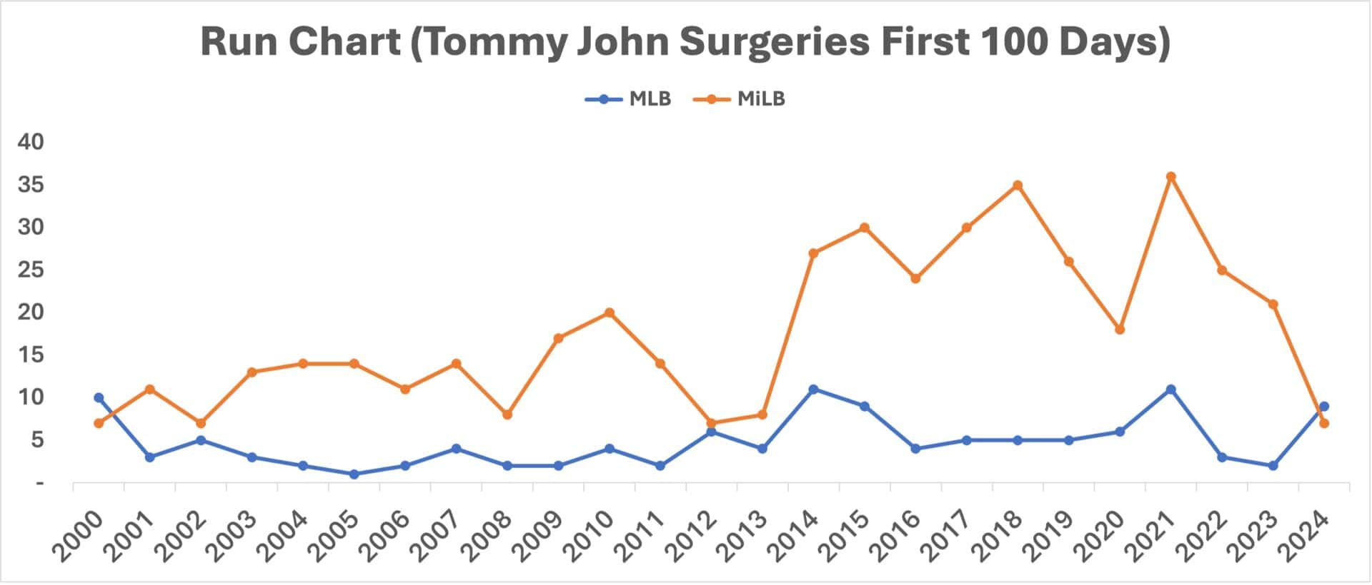
Doesn't this view tell us so much more??? For all of the concern about MLB surgeries, 2024 isn't an unprecedented number (look at the years 2000, 2014, 2015, and 2021).
For those who want to blame the MLB pitch clock for the supposed increase in elbow injuries (a clock that was added to the major leagues in 2023), why did injuries FALL in 2023 compared to 2022?
In the minor leagues, pitch clocks were generally introduced for the 2015 season, but there was an apparently large increase in elbow injuries requiring Tommy John surgery in the 2014 season.
So maybe something else is going on? But is there really a “special cause” (such as a change in rules or policies) that affected the number of injuries.
Best: Use Process Behavior Charts
The best approach would be to use “Process Behavior Charts” (as I write about in my book Measures of Success: React Less, Lead Better, Improve More).
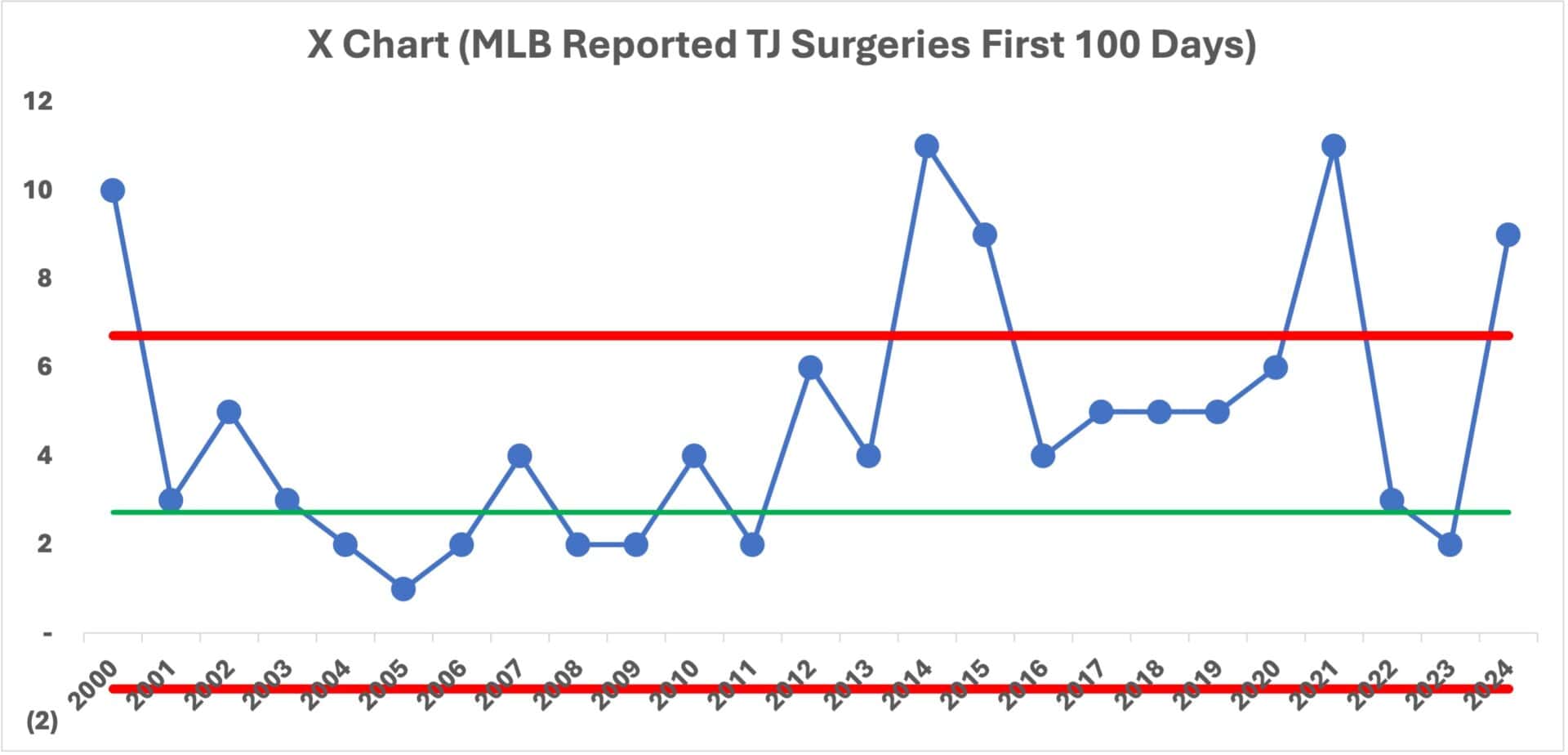
I created separate charts for Major League Baseball and Minor League Baseball. Each chart starts with a calculated average (the green line), and for an initial baseline, I'd use all of the data points from 2000 to 2024. Then, I calculate the Lower Limit and Upper Limit (shown in red lines).
If you're unfamiliar with the calculations, you can find a detailed how-to in my book or in this blog post that I wrote for KaiNexus.
Major League Chart:
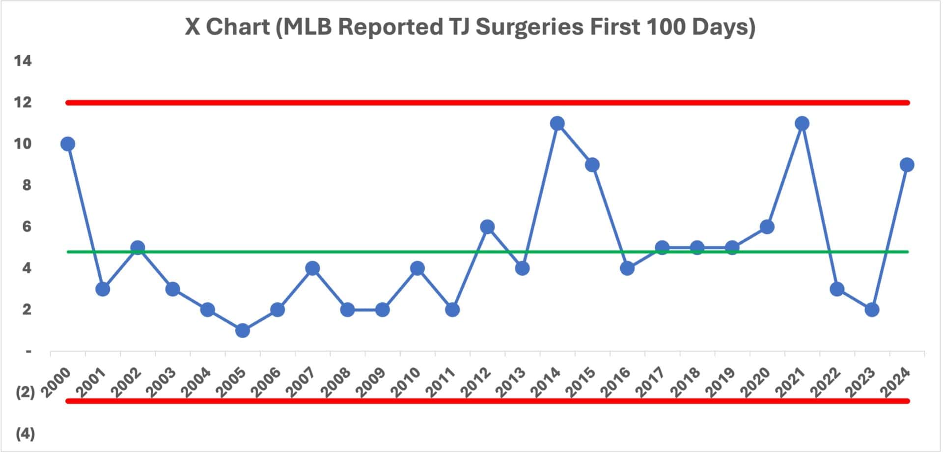
Is there any meaningful change in 2024? Have there been any significant changes over time?
To answer those questions, we use the main three rules for detecting a “signal” — an indication that the system has changed so, therefore, there is a “special cause” to identify.
The three rules are:
- Any single data point outside of the limits? No
- 8 or more consecutive data points above or below the limits? YES
- 3 of 4 (or 3 consecutive) data points closer to a limit than the average? No
The only signal we see is a run of below-average data points from 2003 to 2011. This indicates that there hasn't been a “single consistent system” over time. Things have changed… but apparently not in 2024.
So I agree with that headline that concludes “There's no Tommy John surge this spring. (It's always this bad)“
But is it “ALWAYS this bad”? Not really.
Here's a version of that chart that highlights the signal:
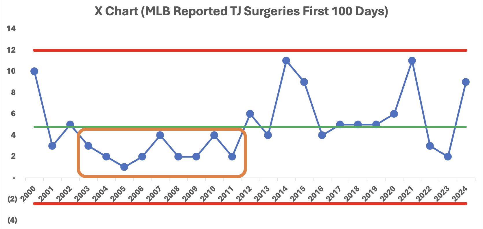
To me, the implication is that it appears there was a shift upward in Tommy John surgeries starting in 2012. What changed then? Were there more injuries? Or were players (and teams and surgeons) more willing to treat injuries with this procedure?
There's a bit of an art to this, but I'm going to re-do the chart using 2001 to 2011 as the baseline for calculating the average and limits.
Starting in 2012, we see signals galore. The year 2012 is the first of 11 consecutive data points above that baseline average. Then the year 2014 is the first of a number of years above the baseline upper limit. As was the year 2000.
What changed in 2012? My next iteration on the chart is using 2012 to 2024 to calculate a new average and new limits.
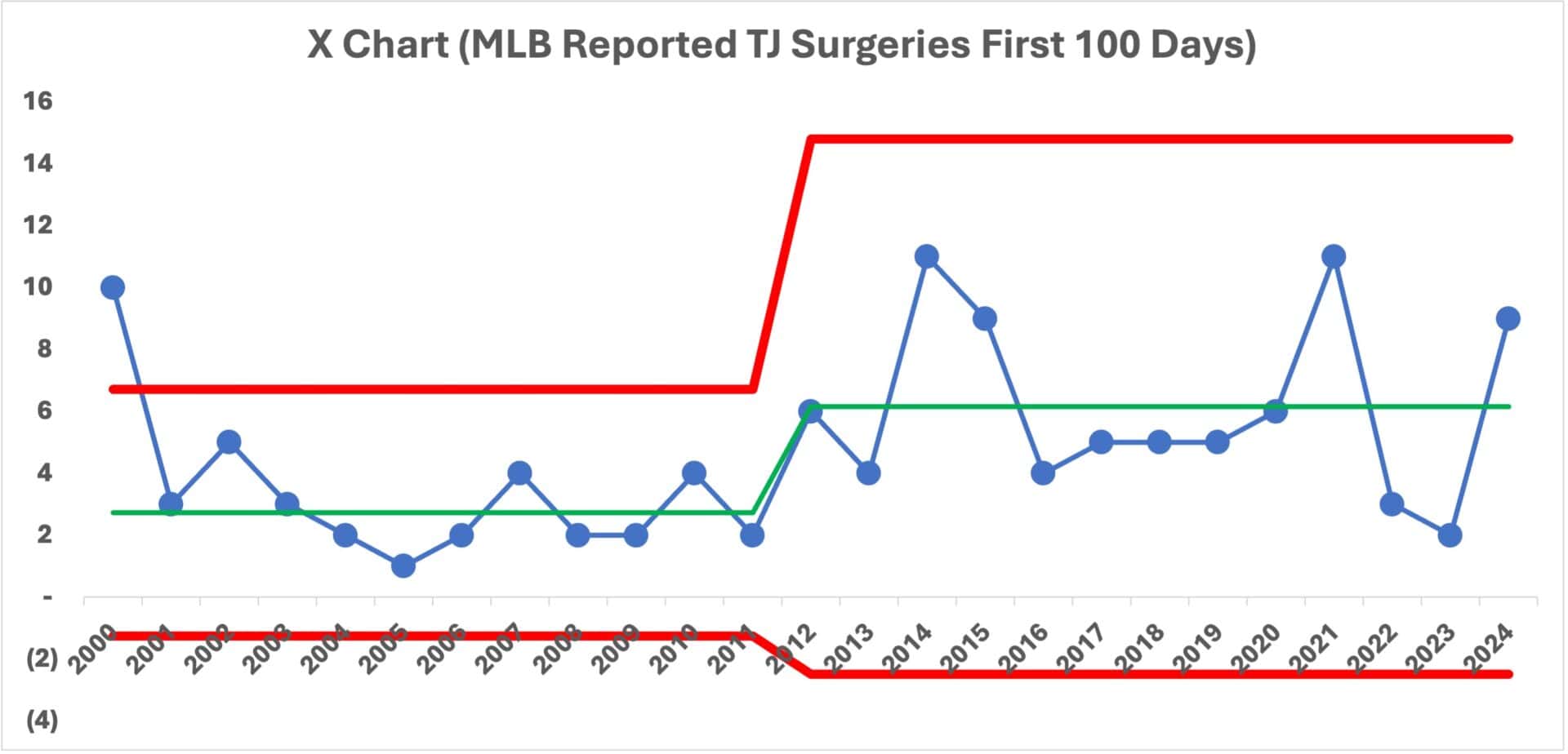
What are my conclusions from this chart?
- 2024 is not an outlier that should be (or can be) explained
- 2024 is “noise” in the new system that was apparently established in 2012
- Starting in 2012, the average number of Tommy John surgeries more than doubled, from 2.7 to 6.2
- The year-to-year variation also increased started in 2012
Why are there more surgeries in some years compared to others? It's basically randomness.
Why is the number higher in 2024? We don't know. There's no special cause reason.
Why was the number lower in 2022 and 2023? We also don't know. There's no special cause reason.
Trying to explain those data points in isolation is a waste of time.
Some attribute the increase in injuries to pitchers throwing harder than they have before, which includes a commons strategy of throwing every pitch as hard as you can instead of pacing yourself. Pitchers aren't expected to throw a complete game (or last a minimum of seven innings) like they were through the 1980s.
This 2024 article by an MLB expert reporter, Tom Verducci explores this:
“There's a Clear Root to the Injury Issues Plaguing Pitchers“
He writes, “The quest to increase velocity has come at too high of a cost: health. It must change.”
Verducci rightfully scolds the MLB players' union chief, Tony Clark, for politicizing a single data point.
Another expert chimes in:
“Essentially the UCL is being pushed beyond what it can take,” says Glenn Fleisig, Biomechanics Research Director of the American Sports Medicine Institute, a leader in his field and a consultant to MLB. “We've developed a situation through mad science where we are pushing the body beyond what the ligament can handle.”
Did this push start in 2012?? Or around then?
Verducci uses a line chart (I love it), looking at the average 4-seam fastball velocity. I just wish the chart started before 2012. The number of surgeries isn't quite going up linearly the way pitch speeds are.
Be warned, the scale of the Y-axis is a little bit visually misleading.
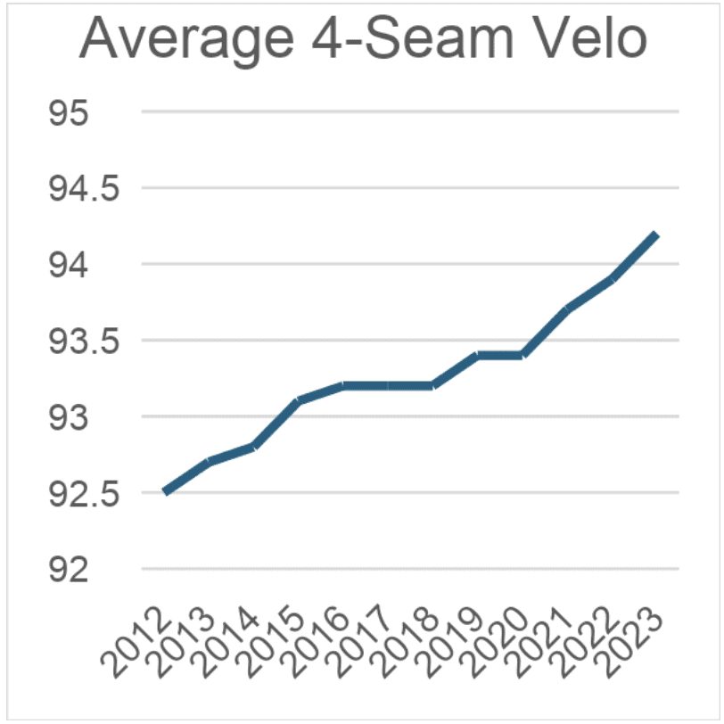
But I think the point is the same. It seems that the increase in surgeries lines up with the impact of pitching at full-bore speeds on the elbow and the UCL ligament.
This article looks at average pitch speeds over the decades. The analysis is complicated because the technologies and methods for measuring speed have changed. Pitch speed used to be measured at 50 feet from home plate and now it's measured at point the ball is released (a higher speed because air drag hasn't slowed the ball yet). In the 1970s and 80s, pitch speed was measured much closer to home plate.
This Reddit post has data going back to 2002 and a chart.
As Verducci writes, THAT is the issue to look at, not the pitch clock.
Minor League Baseball Charts
Now let's look at the PBCs for MiLB. My baseline chart using all years for the average and limits:
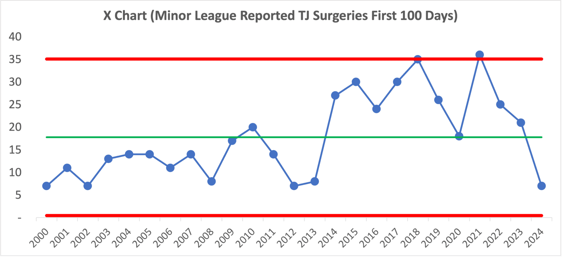
It seems like there's a similar jump, but this time starting about 2014 in the minor leagues. We see signals including eight points below the average, eight points above, and a data point above the upper limit. It's clearly not a single system over those 24 years. Something changed.
So, I'll redraw the averages and limits to show that shift:
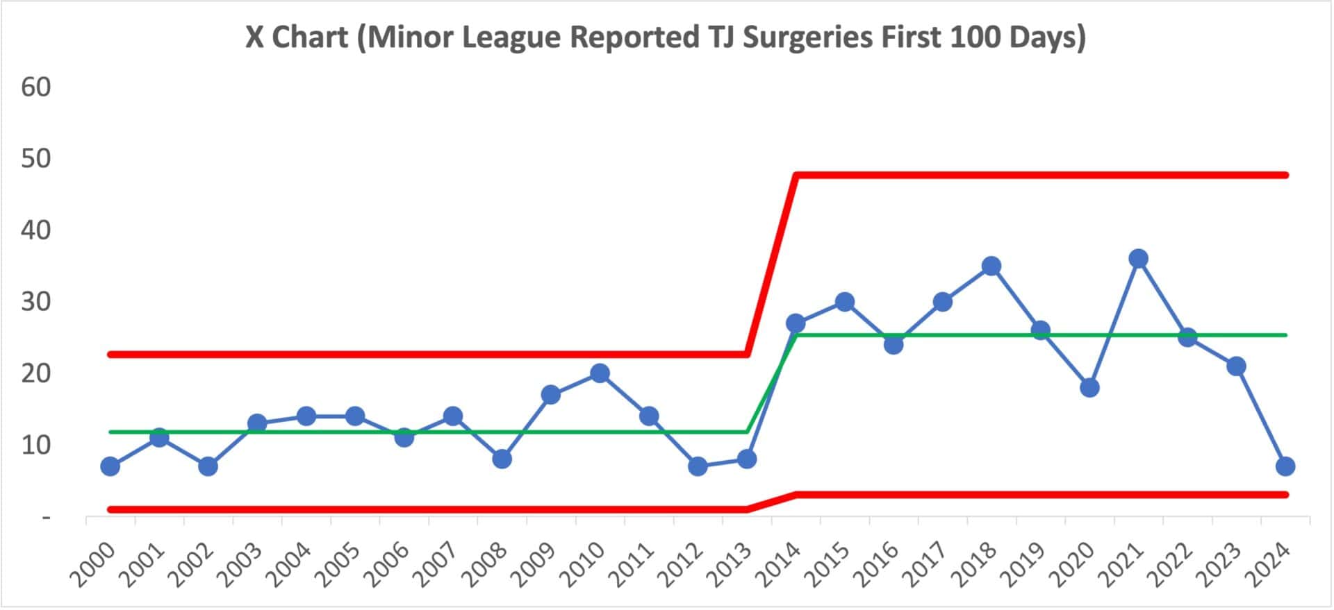
I'd almost expect to see headlines asking, “Why are Tommy John Surgeries Down So Much in the Minors?”
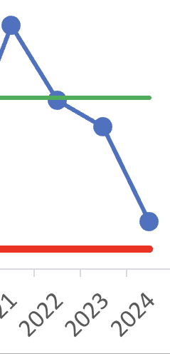
Think of how misleading the analysis would be with just two data points (“MiLB Tommy John Surgeries Down Two Thirds From Last Year”) or just four (“MiLB Tommy John Surgeries Down 81% Since 2021!”)
A partial graph would be totally misleading:
The 2024 minor league data point isn't a signal worth explaining. Neither is the 2024 major league data point either.
Post-Game Commentary
When we look at the full context, the data does not support the idea of a sudden 2024 surge in Tommy John surgeries. Statistically, nothing this year is a curveball or a wild pitch. Both MLB and MiLB numbers stay well within the strike zone of expected variation. The real game-changing moments happened more than a decade ago: around 2012 in MLB and 2014 in MiLB. Those shifts reset the scoreboard, and everything since then, including 2024, is simply routine inning-to-inning fluctuation.
The urge to explain a single year's bump up or down is understandable. But without a statistical signal, those explanations are not analysis; they are swinging at shadows. And swinging at shadows rarely produces hard contact.
A more productive question is not “What happened this year?” but “What changed when the system actually shifted?” The long-term rise in velocity is one plausible factor, and biomechanics research suggests the UCL has been pushed close to its limits. Regardless of the cause, the charts point to a broader leadership lesson: do not chase every hop in the data as if it is a bad bounce. Wait for a real signal before you start running the bases.
This applies far beyond baseball. Whether you are leading a team, a hospital, a factory, or a bullpen, separating signal from noise prevents overreaction to normal variation and keeps you from throwing good effort after bad. It focuses attention on the true system changes, the ones worth stepping up to the plate for.
The conversation about pitcher health is important, but the data tells a more nuanced story than the headlines. To make real improvements, in sports or in business, we need to resist the urge to explain every blip, keep our eye on the ball, and let the system's behavior guide what we swing at next.
Please scroll down (or click) to post a comment. Connect with me on LinkedIn.
If you’re working to build a culture where people feel safe to speak up, solve problems, and improve every day, I’d be glad to help. Let’s talk about how to strengthen Psychological Safety and Continuous Improvement in your organization.


Join the discussion on LinkedIn:
Joe Sawyer wrote:
“2020 had only 50 games. Injuries due to use may lag a year or two. 2022 2023 dip due to less use. special cause? Great article.”
I replied:
“That’s a great point about 2020 being a Covid-shortened season. Even though the data in the chart is the first 100 days of the year, your point about lagging a year or two is a good one. And the entire minor league season was canceled in 2020.
Both MLB and MiLB saw an increase in 2021 and then a decrease in 2022.
Since there are roughly four times as many MiLB teams as there are MLB teams, I should probably have also normalized the data to be more like “Tommy John Surgeries per Total Innings Pitched” at each level?”
Joe said:
“One other wonky fact on the innings pitched in minor leagues. 25 % reduction in affiliated/minor league teams after 2020.”
I replied:
“Yes, that’s true also… it will be interesting to see what happens to the pitchers (and the data) with that system change. Back to your question of “special cause?” The chart doesn’t show a signal (or at least yet). “
If the pitch clock is supposedly the cause of a supposed increased in MLB surgeries, why does it seem that surgeries are DOWN a bit in the minor leagues, when they’ve had the pitch clock longer?
Is that because velocities are lower (probably?) in the minors??
Thanks to Christopher Chapman for his analysis of my analysis which adds a lot of great thoughts and additional context:
https://digestibledeming.substack.com/p/mini-case-study-are-tommy-john-surgeries?utm_campaign=email-half-post&r=2hcr2&utm_source=substack&utm_medium=email
[…] high speeds and more spin rate affect the world of baseball when it comes to Tommy John Surgeries. Looking at data, there really is no rhyme or reason for increases and decreases of surgeries per year. In 2000, […]
Comments are closed.