


Last night was the first night of Monday Night Football (MNF) on ESPN. I didn't tune in until the last five minutes of the Saints / Texans games (and what a wild finish that was!)
Earlier in the night, ESPN had debuted some new graphics for the bottom of the screen, where they show the score and other details.
Twitter was not happy…
If you can't see the embedded tweet and image, there were many, many complaints about the “down and distance” indicator in the lower right. The problem was it being newly colored as yellow. Well, really it was a neon green maybe, as shown below:
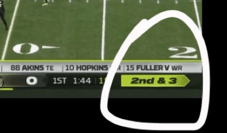
In recent years, fans have been conditioned to know that yellow in the score box indicates that a penalty has been called.
Yellow… neon yellow… anyway, Twitter is the place where people go to be angry — yes, I am guilty of doing that with American Airlines. My tweets are, hopefully, meant to drive improvement. Or, I'm just blowing off steam.
But, ESPN apparently heard the voice of the customer and they changed the box to be black and white, as shown in this tweet from an ESPN executive:
A photo:
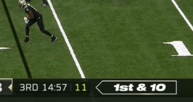
Ironically, the actual “flag” graphic was noticeably less yellow than the original down and distance graphic:
These are clearly “first world problems,” but articles were written about this:
ESPN quickly fixed the yellow ‘Monday Night Football' graphic after viewers freaked out
and
NFL fans immediately hated ESPN's confusing MNF scoreboard graphic
A tweet from one of my favorite sports Twitter follows summarized my thoughts:
“I really have no idea how multiple people looked at that and approved it.”
There are two sides to this coin:
- ESPN tested something and responded quickly to customer feedback in a Plan-Do-Study-Adjust cycle. Good for them. At least they weren't stubborn about it — OR —
- ESPN clearly screwed up because they seem to have not gotten input from regular fans. Couldn't they have done a focus group? Showed it to their uncle in Nebraska? Did they hire designers who don't watch football? Shame on them — they should have done better.
Which is right? Can both 1 and 2 be correct?
I've written about this before:
American Airlines had unveiled some new digital signage that was more pretty than it was helpful. They finally made adjustments to make the destination city and other key info easier to see — bigger and bolder fonts. So, good for them that they adjusted… but who gave the go ahead for signs that were nearly impossible to read from a distance?
While it's good to have rapid cycle improvements, there's also something to be said for planning and getting input BEFORE going live with a change, whether that's ESPN, American Airlines, or a hospital.
On the other hand, as much as you plan and get input, you'll never have something perfect at launch (like a book or a piece of software), so the important thing is being responsive and flexible.
I can see both sides.
When I was helping with a recent healthcare improvement project, a group of us were working on some process changes. We got input from as many people as we could — talking to staff members from many functions. Our plans changes and the new process was better at it's launch because of that input. We weren't working in a vacuum.
We launched the new process and the internal project leader who I was coaching said that she was “90% confident” about the launch. This wasn't a rocket ship launch where you'd want to be closer to 100% confident. We talked about things that could go wrong and the risks. “What's the worst that could happen?”
In this case, it was nothing life or death. A patient or employee might be annoyed with something not being perfect, but we felt confident we could adjust and adapt because we weren't going to be stubborn.
In the case of ESPN's MNF, the worst that could happen is getting a bunch of angry tweets. Life goes on — learn, adjust, adapt, move on. Keep getting better.
Back to my healthcare scenario… even though we launched with a well thought out plan… Plan, Do, Study, Adjust. The team starting “doing” with the new process and things were pretty good. But, they found ways to tweak and refine that new process in the first few hours. Great!
We felt better about that Study and Adjust engagement than we felt bad about not having it perfect. Sometimes, you can't anticipate everything. So it goes. That said, ESPN probably could have anticipated that the yellow/green might confuse viewers.
Oh, and the healthcare team continued to find small refinements (or “kaizen” opportunities) almost every day. It was a great example of relatively large changes helping inspire continued refinement and more PDSA cycles.
So, hooray for ESPN… and shame on ESPN? Mostly hooray?
Please scroll down (or click) to post a comment. Connect with me on LinkedIn.
Let’s work together to build a culture of continuous improvement and psychological safety. If you're a leader looking to create lasting change—not just projects—I help organizations:
- Engage people at all levels in sustainable improvement
- Shift from fear of mistakes to learning from them
- Apply Lean thinking in practical, people-centered ways
Interested in coaching or a keynote talk? Let’s start a conversation.


Here’s an example of bad design that is NOT being improved. I’m at a car dealer’s service department and it’s a relatively new location for this brand (it opened a year ago, maybe).
It’s nice that they provide coffee with this fancy machine, but you stand there and it seems like there are no coffee cups. Are they dispensed by the machine?
An employee saw me looking confused and said, “Sorry, the cups are there to the left.”
I had to crouch down a bit to see, sure enough, there they are. A person of my height or taller would NOT see this, unless you saw it as you approached the machine.
I wasn’t the only one. As I sat nearby, that same employee had to explain to two different customers where the cups are.
Their little metal sign isn’t proving to be a good countermeasure.
I wonder why they don’t fix this or change where the cups are stored?
Bad design… and no iteration based on observing customer behavior. No, this isn’t a Toyota dealership. I’m not sure the Toyota dealers are any better…
Funny, as a fairly avid football fan, and frequent TV game watcher, I apparently hadn’t noticed the yellow flag visual indicating a thrown penalty flag. So ESPN’s new yellow visual for the down-distance info didn’t bother me. I liked that they were trying to make it stand out, easier to find on the screen. To each his own, I guess. Who is more representative of ESPN’s audience, me or those who were annoyed by the yellow conflicting with the penalty flag visual? When we design for our customers, how we gather customer input affects these decisions.There are parallels to this dynamic in hospitals, that sometimes concern me. For example….
We’re in the process of implementing new patient room white boards to improve communication of patient care plan information across Nursing and clinical specialty staff, expanding on a successful trial between Nursing and Physical Therapy, to now as many as 10 specialties. Here’s where design came in. Pre-printing new, formatted white boards is a costly investment, so we wanted the design format to have lots of staff input before purchase. We went through a few cycles of prototype, feedback, re-design, and got very close to a finished design, with lots of input. I’d say most staff were fatigued by the process but satisfied with the output. But a few additional changes were suggested by just a few staff. They were not insignificant, formatting (not content) changes. As a coach, I wanted to encourage refinements by staff, but was concerned that these new ideas might not accepted by the larger group. A senior manager made the decision to accept the late changes without rigorously confirming broader agreement, so that we could move to purchasing.
We’re now just about ready to install the new boards, introduce them to staff, and develop standard usage. I hope the feedback will be all positive, but I won’t be surprised if we hear rumblings of discontent here and there. “Why did they put the Family Feedback box over there, instead of over here?”. “This isn’t enough space to fit in the daily care plan and appointments”. It’s not that we didn’t ask staff for, or use their input. But in the end, certain staff may have had more impact on the design than others. We won’t be able to change them on the fly like ESPN did. There were ways we considered to avoid the permanence of pre-printed boards, such as new clear glass boards, but the higher cost made this option infeasible.
Thanks for the story and the example, Tom.
I guess my first reaction and question is, “Why would you want permanent markings on the boards?”
Second reaction to “A senior manager made the decision to accept the late changes without rigorously confirming broader agreement, so that we could move to purchasing” is “What was their rush??”
Since nothing is ever perfect at launch, and you might want to improve it (or would need to change it over time), why have permanent markings?
The argument I’ve heard is, “Well, it looks more professional.” But, I’ve seen far too many professionally permanently lined huddle boards or status boards on the walls that aren’t being used…
Mark, good question on the permanence. I think the pre-lined formatted boards have been a standard for a while. The permanence is a big weakness but it’s offset by the much cleaner look and consistency, as well as less labor that would be required to hand-format 50 boards and update them when change is needed. The best alternative I’ve seen is the new glass boards, with a printed poster behind it. They erase better and far easier to update later, pretty much unlimited on that. But there are downsides. Of course they’re more costly, but actually the biggest concern here with the glass boards, which I failed to mention earlier, was the risk of falling off the wall and breaking apart on the floor in a patient’s room. There was also a perception based on some staff’s prior use, that they don’t actually erase well, which made them look messy and unprofessional (I don’t understand how that could happen, but it’s hard to argue with perception). If it were my decision, I’d have tried to work more on mitigation of those risks. A variety of factors, I won’t get into them but you can probably imagine, contributed to the decision being made when it was, rather than do the additional product research, mitigation planning, and problem solving.
We’re looking forward to using the new boards, engaging staff in developing standard use and learning from it.
No, not in our organization, as we haven’t been using them. But I’ve the pre-printed approach to be the most common while visiting other hospitals and looking around online for patient room white boards.
I also frequently see the pre-printed boards but I don’t think that makes it a “standard” yet alone a “best practice.” Too many of those boards are just stagnant and unused. That might not be BECAUSE they are pre-printed, but it doesn’t help. Copying a widespread bad idea doesn’t make it a good idea… but I’ll get off that soapbox.
Tom – Also to your point about you not noticing or caring about the flag box… I think it goes to show that not all customers feel the same and the “voice of one customer” or the voice of many might not necessarily be generalized as “the voice of THE customer.”
I think this is a ‘Hurray” for ESPN. This was a relatively low risk activity that didn’t work that they quickly improved. The cost to them was minimal, the impact to the customer was just a mild level of annoyance, and it generated some free publicity about their product.
I am an avid football fan and that is what caught my eye. I noticed this too when watching the game and I saw twitter go up in flames. I really liked how you elaborated on the Plan-Do-Study-Adjust cycle. It is interesting how some organizations dedicate different efforts to this cycle. In ESPN’s case they implemented a change immediately, while other organizations may take weeks to implement a change. I have seen this at different places where I have worked and some places do not make changes unless its pivotal for the company. I think that actions for an organization should be routinely evaluated and changed if needed. Customers like to see when companies make changes that will benefit them and make their experience seamless and efficient.
Thanks for the comment, Mohamed. I’m curious who (at what level) of ESPN’s production team or leadership was empowered to make that adjustment during the game? I haven’t seen that elaborated on, have you?
Mark,
No I have not seen anything, but it makes sense that the person who controls ESPN’s social media site was in direct contact with the production team to make the immediate change. Thats just my opinion!