


I forget what hospital these charts are even from, but it doesn't really matter. It's become more common, in my gemba visits, to see hospital departments charting metrics. They are often part of “huddle boards” that teams gather around on a daily basis (or, ideally, each shift).
It's good to see daily metrics, as opposed to monthly averages, since it's better to have something closer to “real time” data — if you react and respond appropriately.
It's also good to see simple, handwritten charts… that's often part of what makes daily cycles possible as opposed to waiting for computer reports and fancy charts being printed out by somebody.
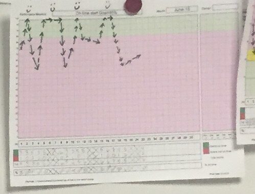
Below is an example of a chart with a daily average being plotted. 100% is ideal and a higher number is better.
As we learn from Dr. Deming, his Red Bead Experiment, and a general understanding of variation in a system, a stable and consistent process will usually result in variation in outcomes measures.
In the chart, days with 100% are rewarded with a smiley face.

The low points in the chart don't have accompanying frowny faces.
That's probably well and good, because this looks like a pretty stable system to me. To my eye, without drawing a formal SPC chart, the average performance of the system is about half way between the top and bottom points in the chart. About half of the points are above average and half are below average, which is no surprise.
Below is the graph with my estimated average/mean in the blue dashed line:
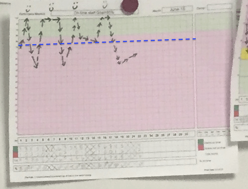
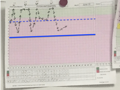
In a stable system, we'd expect daily performance to fall between 100% and a calculated “lower control limit,” which I've estimated and drawn with a darker blue line.
SPC tells us that any random day would produce a result between 100% and the LCL. It's all the same system. A smiley face on the good day probably doesn't really reinforce anything positive, since it seems that people are basically doing their jobs the same every day. There's likely not any better effort on good days than there is on bad days.
Factors that prevents a 100% performance level are systemic. It's not as simple as asking “why did we have a good day today?” or “why did we have a bad day today?” It's all the same system. We can improve that system, and should, but that's different than troubleshooting or looking for a root cause on any particular single day with “bad” performance.
This organization has, like many, set a goal for what they consider to be “good” or “acceptable” performance. Here, they have already color coded green as a good day and red as a bad day (which doesn't help if you're color blind).
Note that the average appears to be in the red zone, so they are going to, ON AVERAGE, have a “bad day.” Asking “what went wrong?” on a bad day or having to explain each of those individual days is the wrong approach.
Asking “what went wrong that day?” is looking for a “special cause” when the system's variation appears to be driven by “common cause” variation. A better question would be, “how can we improve the system?”
This same department had a second chart hanging right next to the first, see below. In this chart, down is better and the ideal performance would be zero.
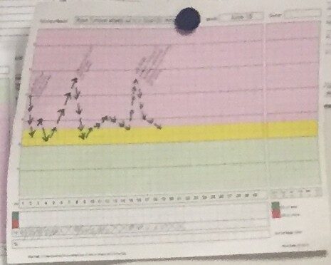
This chart has many of the same dynamics. It appears to be a stable system that has an average and control limits as I've estimated and drawn below:
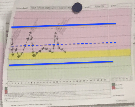
The higher points on the chart had explanations written down on the chart.
Those points don't appear to be “special causes,” as they don't appear to fall outside of control limits. Therefore, there's no “reason why” we had a bad day… it just happens. It's chance. It's common cause variation.
It's like a participant in the Red Bead game drawing 16 red beads instead of 9. It's noise in the system.
We often don't want to admit or recognize that there's randomness in system performance and measures. But, it's as real as the gravity that would make that chart fall to the floor if the magnet were removed.
This chart has the same problem of the red and green. Again, the typical, expected, average performance is red. This system is not capable of consistently meeting the goal set by management. The system is set up to “fail,” as are the people working in it.
That can't feel good… every single day huddling around a chart that's just as likely to be red as it is green.
I'm not suggesting changing the target. That's just putting a happy face on things. I'm suggesting that the team should focus on improving the system and continuously improving (I hear Dr. Deming suggesting that).
I asked about the YELLOW zone. Why is there a yellow zone?
I was told that there had been too many data points in the red zone. Yeah, if that yellow zone were also red, almost every single day would be in the red.
The person said, “We're not supposed to have yellow zones, but it was demoralizing to always be red… so we added the yellow for that chart.”
Instead of spending time on all of that, what if the time were spent actually improving the system? It's puzzling that leaders will spend so much time on things like that… what's the goal? What's the color coding? But, those same leaders might say, “We don't have time for improvement.”
Yeah, you do. Use your time differently. Lead differently.
I highly recommend the book Understanding Variation by Donald Wheeler, which is where I really learning these concepts. The book is life changing. Check it out.
And, I hope my book Measures of Success: React Less, Lead Better, Improve More (with a foreword written by Dr. Wheeler) helps too.
Please scroll down (or click) to post a comment. Connect with me on LinkedIn.
Let’s work together to build a culture of continuous improvement and psychological safety. If you're a leader looking to create lasting change—not just projects—I help organizations:
- Engage people at all levels in sustainable improvement
- Shift from fear of mistakes to learning from them
- Apply Lean thinking in practical, people-centered ways
Interested in coaching or a keynote talk? Let’s start a conversation.


Thanks Mark. Great simple explanation
Thanks, George. I hope those ideas are applicable for you and your workplace.
There seems to be a connection between “understanding variation” and “psychology” (Deming’s system of profound knowledge). When there is fear, there will always be problems with the numbers. You know, we could have all sorts of colors (a rainbow) between the upper and lower control limits. It would not make one iota of difference. It’s the same as ranking and rating people on a distribution. We give one color an “A”, another “B”, another “C”, another “D” and another “F” and it would not make a bit of difference. The variation comes from the system and if you don’t like what the system is producing, you need to change the system Treating different categories within the distribution (yellow, orange, blue, green) is not improving the system, and will not make the future numbers and better. Management by results (creating an arbitrary numerical target) leads to waste and demoralization when people are asked to explain why their performance did not hit the target. When there is fear, creating a “getting better zone” (yellow) makes perfect sense (psychologically), even though it makes no sense statistically.
I’d say the problem is not so much the people who add extra colors on their chart, I think the real culprit is top management that has apparently produced the fear.
Thanks for the additional thoughts, Mike.
There’s too much fear, even in organizations that would say they are “getting Lean.”
We have to be able to speak up honestly. Leaders need to lead in the right way.
Otherwise, just copying a board and the mechanics of a huddle might not be helpful. People are often copying the wrong things…. as I blogged about in this old GM story and as you mentioned in your excellent post.
Hello Mark,
Really, I would think there are only 2 worthwhile points to a chart like that. One is clarifying that the system as it stands now is stable; the other is that when we are charting it, it could become a good opportunity for a 60 second group “idea float” on how we could improve the system. What do you think?
Regards,
Lynn Whitney
I agree Lynn. Instead of explaining each day or overreacting to every “above average” or “below average” point, the chart shows exactly that…
1) It’s a stable system
2) It’s not capable of meeting the goal every day
Now, if the goal is meaningful, that’s one thing. Often, the goal is completely arbitrary or based on last year’s performance (which might be the same as this year, given a stable system!).
Yes, having daily huddles and an ongoing continuous improvement or Kaizen approach can help us improve the system… as could a larger Rapid Improvement Event or such.
Ouch, yes. “It’s not capable of meeting the goal every day” and “if the goal is meaningful”
A double dose of reality-check to swallow! :) Even if today happens to be a 100% smiley face day!
Thanks!
Hi Mark,
Though I agree completely that 1) there is going to be regularly distributed variation in most processes and 2) obsessing over every peak and valley in a chart is unhelpful, I don’t think it’s helpful to dismiss the error present in a process model as ‘random variation’ — this implies that it is inherently uncontrollable (when in reality it is more frequently controllable than not) and it discourages people from seeking better models that more completely account for what is going on in the process.
Before you can ask ‘How can we improve the system?’ you have to be able to answer ‘How good is my model?’.
It might make people uncomfortable to describe common cause as “random,” but I think that’s pretty correct.
It’s not “random” in the sense of a random number generator being perfectly random, but more along the lines of the other dictionary definition of the word:
“proceeding, made, or occurring without definite aim, reason, or pattern”
It’s not meant to discourage people from understanding and improving the system. It’s meant to discourage them from looking for explanations for each data point or blaming people.
Dr. Deming said this about the red bead exercise:
X + [XY] = # of Red Beads
Where X is the impact of the worker and Y is the impact of the system.
As he said, you can’t solve for two variables in a single equation. I think that’s also a helpful model.
[…] as well, as for instance Mark Graban rightfully wrote about last August in his blog when discussing the use of charts. You can also read more on correctly interpreting data on charts using Statistical Process Control […]
[…] But, organizations do this all of the time. I visit hospitals and hear managers complain about being asked to explain a day’s productivity number that was just slightly higher than average. See this post for examples of an organization overreacting to every time a chart is above or below some arbitrary line: “What’s Demoralizing? The Colors on a Chart or Not Improving the System?” […]