


Given the title of this post, this is NOT advice related to driving and traffic (or other transportation situations where red lights mean “stop”).
I'm writing about how people react to “red” data points in their workplace metrics. As the practice of “Lean Daily Management” has spread–in factories, hospitals, and beyond–I frequently encounter a common “rule of thumb” that has, I'm sorry to say, NO valid basis when it comes to statistics.
Sorry, not sorry.
A rule of thumb being easy to remember–and easy to execute–doesn't mean it's valid.
Being written and published in books doesn't mean it's valid.
Whether you're a Lean leader, a data-minded executive, or a frontline team manager, understanding how to properly react to performance data is essential.
What's the Rule of Thumb We Should Ignore?
That invalid rule of thumb is often stated as:
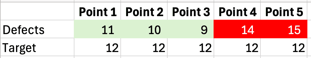
“React when you have two consecutive data points that are worse than your target (they are red).”
It's often stated that the reaction to these two consecutive reds should be “root cause analysis” (often in the form of an “A3”). This is quite frequently (if not most always) a waste of time and effort.
Sorry, not sorry.
I realize I need to back this up with some examples and statistical truths. The data points are often discovered by the ongoing reading of a “bowler” (a.k.a. “bowling chart”), as shown below. For this example, we're counting something like defects, where lower is better. For whatever reason, the goal or target is set to 12. So 12 or lower gets a GREEN color coding, and 13 or higher is RED for missing the target.
I'll give this rule of thumb approach credit — it's better than reacting to every red with root cause analysis.
Being “red” doesn't mean that the data points are statistical outliers. Yes, they're above the target. However, the data points might not be statistically meaningful. In other words, being red doesn't mean that the system has changed in a way that's significant enough for a “root cause” to even exist.
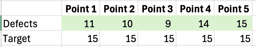
If the target was 15, we wouldn't have any reds yet. Would we look for the root cause of anything there? Nope.
The reds could be part of a system's “common cause” variation. Unfortunately, most managers don't know about this concept–they aren't taught this in their MBA or MHA programs, and they're not taught this by most senior leaders.
How do we know if any of the data points represent “special cause” variation–which means the system changed, which means we might be able to find a root cause?
Process Behavior Charts Are Actually Valid
Create a “Process Behavior Chart (PBC).” These are also known as “control charts” or “Statistical Process Control (SPC) Charts.” They were created by a legendary statistician, Walter Shewhart, just over a century ago. That doesn't make them outdated–not at all.
Here's a video that shows you how to create the charts (a version made by Shewhart in the 1940s), but we can skip that detail for now.
Let's focus first on how to use them and how to learn from them. You can also learn much more in my book Measures of Success (get a free preview).
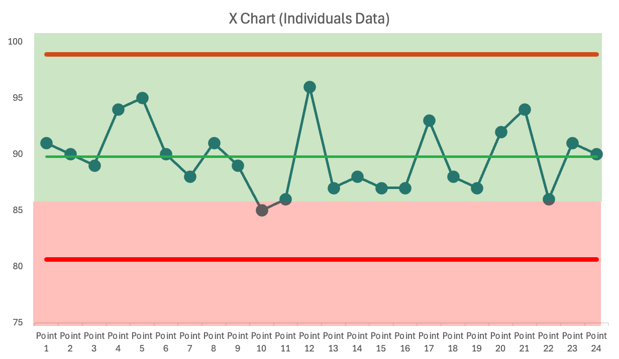
Below is a PBC that I created after 24 data points, well after the two reds. In this case, no root cause analysis was attempted after the two reds appeared. The process kept chugging along and fluctuated pretty consistently around a stable average of 9.75 defects.
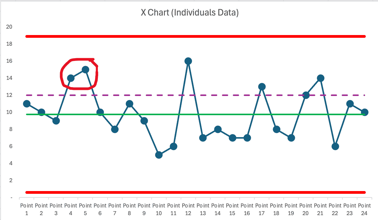
The target is shown by the purple dashed line. People sometimes use color coding like this:
The color coding doesn't make the rule of thumb any more correct, either.
What might have happened in a typical workplace?
- The boss sees two reds
- Boss tells team to do a Root Cause Analysis or an A3
- The team meets
- Team struggles to find anything that has changed
- Either nothing happens or the team says they've found the root cause
- Nothing is really changed in the process by said team
Then… performance goes back into the green.
- Boss congratulates the team for their great improvement work
- Boss might celebrate a “downward trend”
- Then a single red appears
- Boss might get upset…
Either way, performance then goes back to green.
This tends to happen (fluctuating between red and green) when our target is relatively close to the average performance level.
What does the Process Behavior Chart tell us?
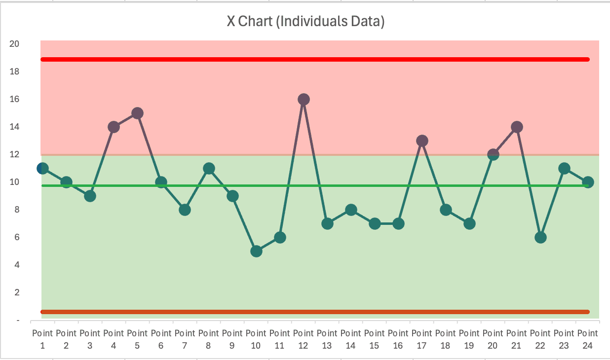
It tells us, quite clearly, that NONE of those data points are statistical outliers, or signals. Every data point falls between the calculated red lines–the lower and upper limits, as they're called.
While our target is chosen, the lower and upper limits are calculated from the data (or a previous baseline period).
The PBC mindset tells us we should only react when one of three “statistical signals” are found:
- Any data point outside the limits
- 8 or more consecutive data points on the same side of the average
- 3 of 3 or (3 of 4) consecutive data points that are closer to the limit than they are to the average
Notice that “two consecutive reds” is not one of the valid rules that the statisticians like Walter Shewhart, W. Edwards Deming, or Donald J. Wheeler have determined, validated, or shared.
“Two reds” is very much dependent on the arbitrary goals that are set by management, the customers, or others in authority. It's not a valid reason to react. The three signal rules ARE.
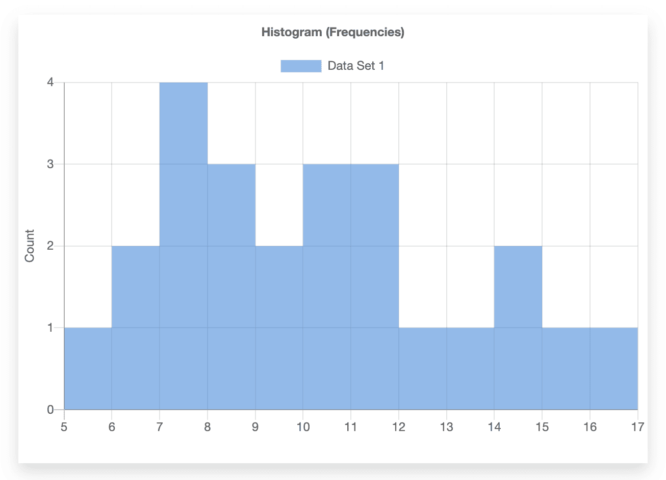
Going back to the basis for that data — it's not made-up data. It's actually data from a time I facilitated the famed “Red Bead Experiment/Game” with a group. Each data point is quite simply the number of red beads that appear on a paddle with 50 holes after the paddle has been dipped into a container.
That container has pretty close to 20% beads. It was exactly 20% when I bought the kit about 20 years ago. I've most certainly lost a bead or two.
When we keep dipping that paddle into the container (after returning the 50 beads back into the container each time), we would expect a long-term average of 10 red beads. That never trips people up. 50 x 0.20 = 10.
But the resulting number is rarely exactly 10. It's easy to predict the average number of red beads. What's difficult (if not impossible) is predicting the range of variation that will occur. Will the number vary between 8 and 12? Or 5 and 15? We don't know until we play the game and collect data.
The PBC is incredibly helpful in that if we keep playing the game, we'd expect the number of red beads to fall between 1 and 19.
If we predicted that the histogram would be a bell curve… we'd be wrong (at least in the short term). That's difficult to predict, as well.
The same thinking applies to a similar metric where higher is better — with a max of 100. The goal here is set to 86.
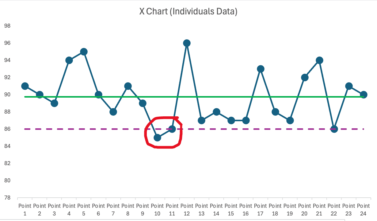
Again, we see two consecutive reds. Again, that's not a statistically valid reason to react. Although a manager might have chewed out the team… only to see that “big increase” right afterward. The manager might draw a faulty cause-and-effect conclusion that yelling leads to improved performance.
They might then also “learn” that the effect is short lived that performance must have dropped because the team “slacked off” or “took their eye off the ball” or such.
Again, a PBC shows us all of these data points–yes, ALL of them– are part of the common cause variation of a stable system.
Comparing the Methods
| Two Reds Rule | Process Behavior Charts |
|---|---|
| Based on targets | Based on statistical limits |
| Arbitrary | Evidence-based |
| Often misleading | Actionable signals |
The Hidden Costs of Overreacting to Metrics
When leaders misuse metrics–especially by reacting to noise instead of true signals–it doesn't just waste time. It slowly erodes the very culture we're trying to build through Lean.
Teams get frustrated: “Why are we doing another root cause analysis when nothing's really changed?” Leaders unintentionally send the message that they don't understand the system or the data, which chips away at credibility. Over time, people may disengage entirely–believing improvement work is performative rather than purposeful.
That's why reacting to common cause variation isn't just a statistical misstep–it's a leadership and culture problem.
What to Stop Doing
Stop reacting to noise. Stop asking for root cause analysis when no signals exist.
STOP using the “two consecutive reds” rule of thumb.
Stop getting too excited or too upset about data points that are in the bounds of “common cause” variation.”s
So What SHOULD We Do?
I'm glad you asked.
If you're unsatisfied with the average level of performance or the range of variation, you CAN work to improve the system.
Study the system and how the work is done. Look at the inputs to the process, the standardized work – and the variation that might exist in that.
Improve the system in systematic ways instead of being reactive. That's a better use of your time.
In these examples, reacting to two reds would have wasted time. The PBC showed no signals–only noise. That's the power of using data wisely.
As the subtitle of my book, Measures of Success, says: React Less, Lead Better, Improve More. Get a free preview of the book here.
A Challenge — and an Invitation
If you think I've cherry-picked easy examples to make my point, I welcome the opportunity to prove otherwise.
Do you have a real-world performance chart–maybe a bowler or line graph–that shows “two consecutive reds”? I'd love to take a look. If you're willing to share the data (anonymously, of course), I'll review it and offer feedback on whether the variation is meaningful–or just noise.
You'll get a private analysis and a learning opportunity. And with your permission, I may share your anonymized example in a future blog post or video to help others learn too.
Just email me or connect through my contact page. Let's move past red-reacting and toward real understanding that helps people manage more effectively.
And if you'd like to learn more (and play the Red Bead Game yourself), come be part of my June 17th workshop in Cincinnati:
Please scroll down (or click) to post a comment. Connect with me on LinkedIn.
Let’s build a culture of continuous improvement and psychological safety—together. If you're a leader aiming for lasting change (not just more projects), I help organizations:
- Engage people at all levels in sustainable improvement
- Shift from fear of mistakes to learning from them
- Apply Lean thinking in practical, people-centered ways
Interested in coaching or a keynote talk? Let’s talk.
Join me for a Lean Healthcare Accelerator Trip to Japan! Learn More


