


I was pointed to this tweet late last year:
Here is the chart in question:
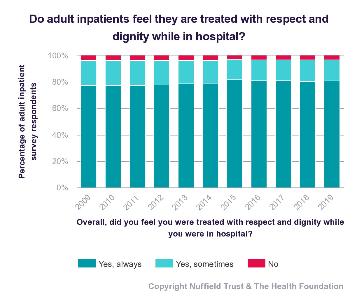
It's an important question from the British NHS — of course, we'd want patients be be treated with dignity and respect while in the hospital.
The tweet makes a claim that the percentage of respondents saying “Yes, always” had “increased slightly” from 2009 to 2019.
Now, I do appreciate that they've provided 11 data points — that's far better than a two-data-point comparison.
I look at that chart and, with my statistical training and experience, draw a different conclusion. My conclusion is, “That might just be fluctuating around an average.”
I'm not sure if there's really evidence of an increase.
How could I tell? By using a “process behavior chart,” as I write about in my book Measures of Success: React Less, Lead Better, Improve More.
When I mouse over the chart that's on the Trust website, it shows the data for each year down to one data point.
Here are those numbers:
| Data | |
| 2009 | 77.6% |
| 2010 | 77.3% |
| 2011 | 77.6% |
| 2012 | 77.8% |
| 2013 | 78.6% |
| 2014 | 79.0% |
| 2015 | 81.7% |
| 2016 | 81.3% |
| 2017 | 81.5% |
| 2018 | 80.5% |
| 2019 | 80.9% |
Even without charting it yet, you see there's not much variation in the first five years… then it seems to jump upward.
We could learn a lot from a simple Run Chart:
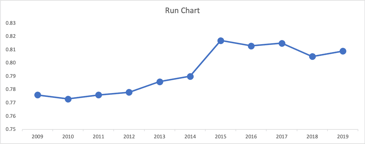
Hmmm… there's the jump ward starting in 2015. So things are better… but it's probably not as simple as “2019 is better than 2009.”
We could say “performance has been better between 2015 and 2019 than it was between 2009 and 2014.”
However, notice the Y-axis. It might be a statistically-meaningful improvement, but are patients really THAT much happier? Does the Trust understand what they are doing better? Do they understand the cause-and-effect relationships between actions and results?
Here is my first attempt at a Process Behavior Chart, using all data for the baseline (calculating the average and the limits):
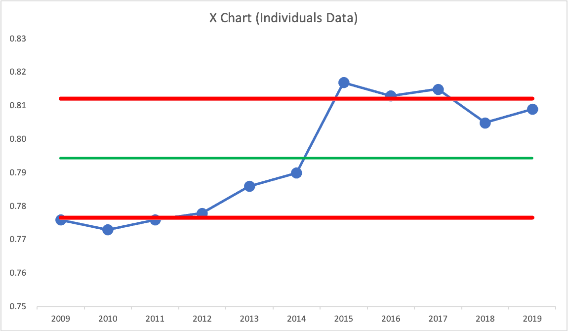
Seeing data points below the Lower Limit and above Upper Limit tells us, quite definitively, that the chart does not represent a single system over time. The system changed (apparently in 2015).
I can try again by using the first six data points to calculate the average and the limits, giving me this:
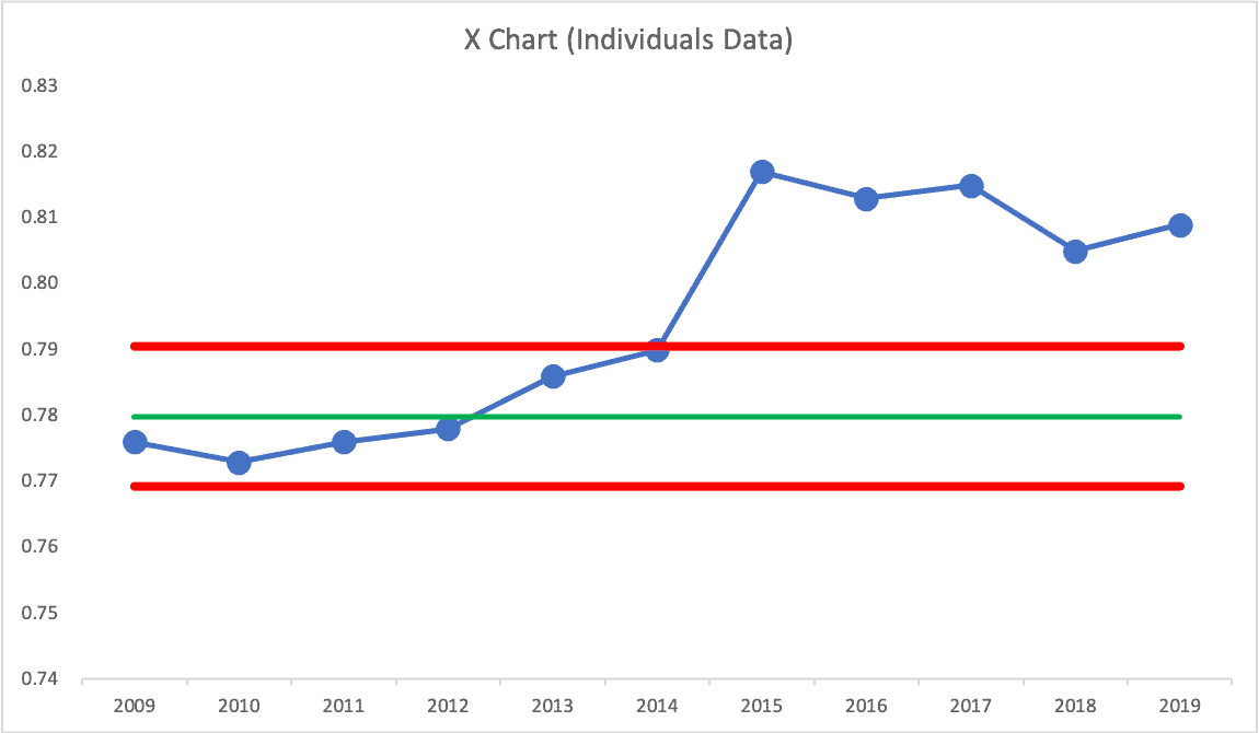
2014 was almost at the Upper Limit… but then there is clearly a shift upward. So, I can calculate a new average and limits for 2015 to 2019…
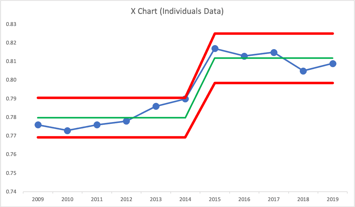
My conclusion would be that performance DID improve. But, it's now been fluctuating around a new average. I wouldn't ask, “Why was 2019 higher than 2018?” or “Why was 2019 lower than 2015?”
I also wouldn't ask, “Why was 2019 higher than 2009?”
I would ask, “Why did it shift upward in 2015?”
I think the Process Behavior Chart shows this so much more clearly than the stacked column chart does. When we compress the Y-axis, to not show zero to 100%, we do have to be careful that we're not misleading anyone.
The % saying “Yes, always” had been fluctuating around an average of 78.0% Now it's fluctuating around an average of 81.2%.”
That's nice… but it shows that there is still room for improvement. What improvements come next?
Please scroll down (or click) to post a comment. Connect with me on LinkedIn.
Let’s work together to build a culture of continuous improvement and psychological safety. If you're a leader looking to create lasting change—not just projects—I help organizations:
- Engage people at all levels in sustainable improvement
- Shift from fear of mistakes to learning from them
- Apply Lean thinking in practical, people-centered ways
Interested in coaching or a keynote talk? Let’s start a conversation.


