


One of the things I do with KaiNexus is manage our webinar series. That means lining up presenters, playing the role of host and moderator, and sometimes being the presenter, as I did again the other day.
One of our measures is the number of people who register for each webinar. Our goal isn't to be popular and to maximize registration numbers no matter what. However, we aim to serve as many people as possible by providing helpful and thought-provoking content. Our webinar attendees are a mix of our existing KaiNexus customers and others who are just a part of our continuous improvement-loving community.
What's the Mission? Will it Get Distorted?
Keep in mind I don't have any specific target for webinar registrations and there is not any sort of incentive compensation. That removes any incentive for me to artificially boost the numbers in some way that wouldn't help the company. I'm not tempted to do webinars on popular, but off-topic, topics — is there such thing as a “clickbait webinar”? I'm certainly not tempted to go online and “buy” attendees (which is probably something that could be done, just as people, unfortunately, buy social media “likes” or positive reviews on Amazon).
The mission is to provide good content and to build community. We want to help our existing customers and provide a good experience for those who are considering being customers. Our director of marketing is also looking to get “new contacts” through the webinar promotion — and that's a contributor to the marketing and sales pipeline that could lead to more “qualified leads” and, eventually, more customers.
Back to the Numbers
People often report single numbers in a way that makes things look good.
For example, regarding the November webinar, I could report:
“We had 575 registrations, the second highest in our history.”
If I were angling for an end-of-year performance review, I'd trumpet that number and that fact. Numbers don't lie… but a single number misses context.
As I mentioned, I presented a webinar the other day, I could brag that the 498 registrations was the third highest in our history. But, if somebody were trying to make the situation look worse, they could factually report:
“Registrations for December were down 13.4% from the previous month.”
That would be factually correct, but we're again missing context. Would that decline mean a negative impact on the annual review (a review that, again, I don't formally get)? Would recency bias lead a manager to say, “Well, your performance trailed off a bit, so you don't get the top evaluation or pay increase this year”?
Organizations often compare annual averages against each other. If one data point (or two) doesn't tell us much, comparing two averages usually doesn't help us much either.
I could report:
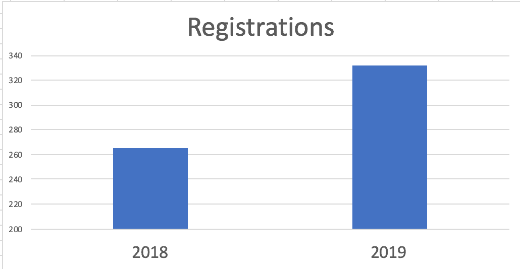
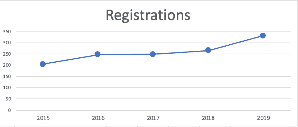
“Average webinar registrations in 2019 (332) were up 25% from 2018 (264 per webinar).”
Again, that's factually correct, but what does that tell us? What does that say about my performance as a webinar leader? Does that mean I've chosen better speakers and more attractive topics? But what about quality? Does “more attractive” mean “better” or “more helpful”?
Maybe registrations are up because the KaiNexus user base is higher than it was before, as the company grows and adds new customers. More users means more people to promote the webinars to. If I measured something like, “the number of webinar registrations as a percentage of KaiNexus users,” maybe the webinars are relatively less popular? Would I expect the percentage of people who are interested enough to register to be consistent over time?
Oh, I could also report the increase as a column chart. One version might be a bit misleading due to the Y-axis:
I could add an arrow to emphasize the success story I'm trying to tell:
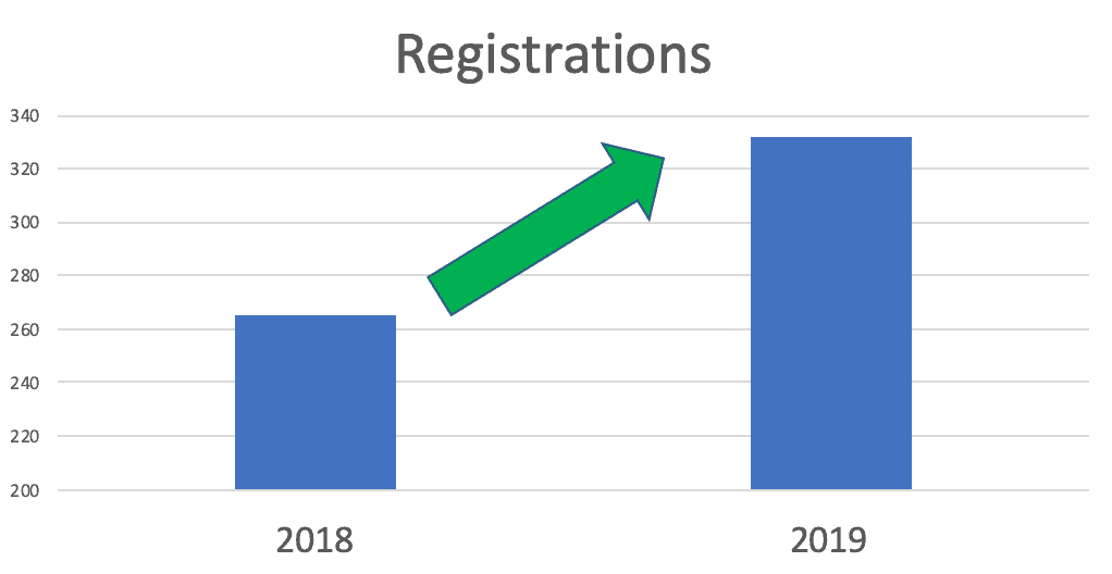
Do you see charts like that on metrics boards, A3s, or conference poster presentations? Do two data points really help us evaluate things properly?
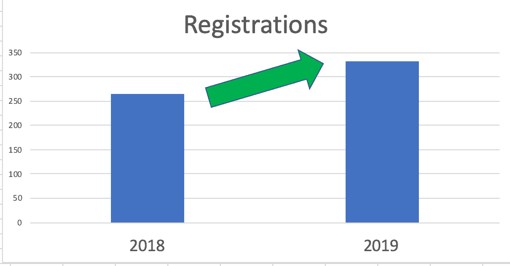
Or, a Y-axis that starts as zero might make the increase look less dramatic:
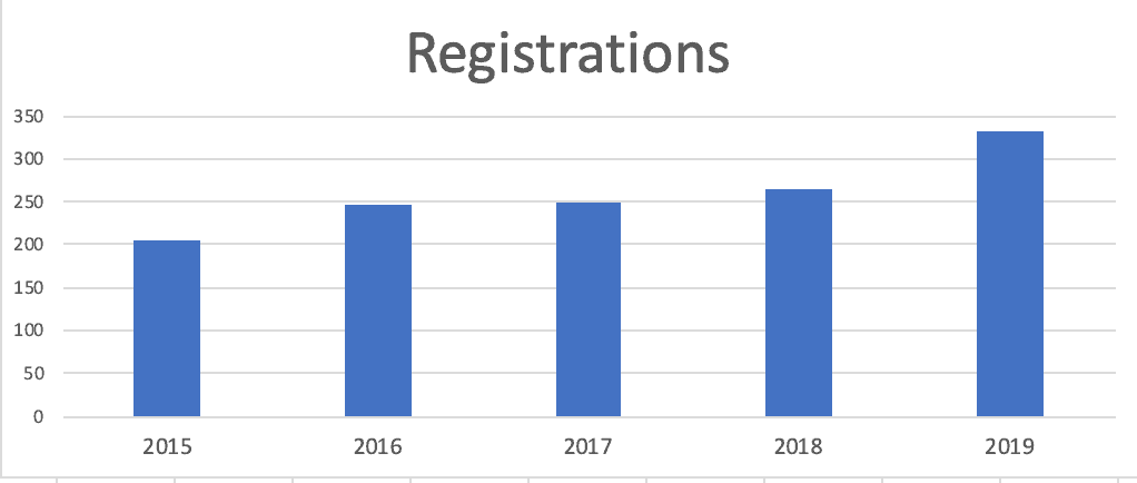
What if I made a column chart that included the averages of more years?
It's a fact to say:
“Webinar numbers increased for the fourth consecutive year.”
OK, so what? Is it constant growth? Or does 2019's performance and growth look different (better) than years past?
Again, we only have five data points, which makes it tough to know for sure.
Here's a run chart of those five years — I prefer run charts (line charts) to column charts for time-series data:
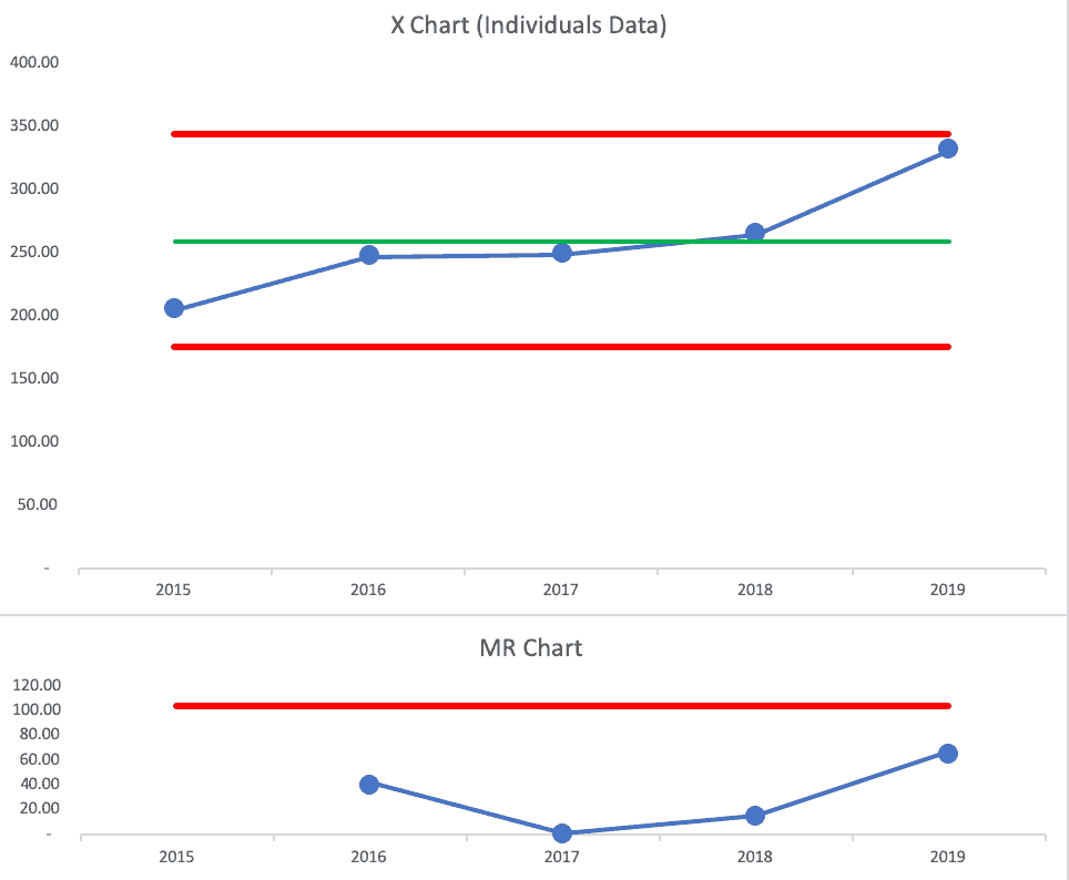
Now, this might be controversial to some, but we can make a “Process Behavior Chart” here, although I don't think it's the best approach to use just the five annual averages.
- It's possible to create a PBC with just five data points, although the Lower and Upper Limits won't be as valid as if we had 15 or 20 data points
- It's also OK to create a chart based on averages (read more here)
If we look at the X Chart and the MR Chart, we see 2019's data point is not quite a “signal.”
Since the Process Behavior Chart (aka the “XmR Chart”) is also known as the “Individuals Control Chart,” I think a better PBC would be one that plots each webinar as its own data point.
Here is that data, first, as a run chart (something that's helpful even without adding the average and limits):
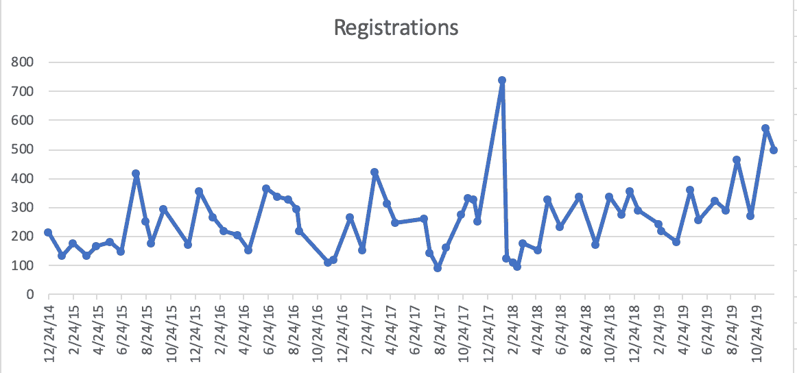
Does it look like there's a trend? Fluctuation over time? There's what looks like an outlier in early 2018 (the highest number ever of 738).
A run chart is helpful, but a PBC is even better.
I track this data in the “control chart” functionality that's part of the KaiNexus system (note, this is functionality that's currently being improved and expanded upon for future releases):
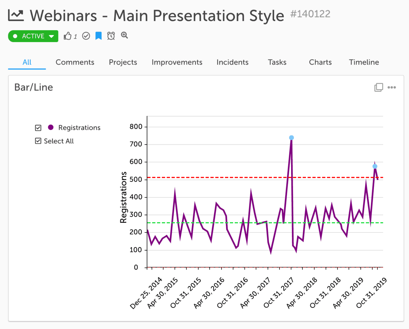
From a baseline time period, the chart has a calculated average of about 250 and an Upper Limit of just over 500.
The chart shows three “signals”:
- January 2018 webinar is above the upper limit
- November 2019 webinar is also above the upper limit
- Three of the last four webinars in 2019 are closer to the upper limit than they are to the average
We almost have a run of eight consecutive webinars with above-average registrations. It seems like the number of registrations is no longer simply fluctuating around that average. It's close to showing a sustained upward shift… or at least there are signals that show the system isn't just predictably fluctuating there.
Here's how the PBC looks in the Excel template I normally use. I'm using the first 24 data points as the baseline for calculating the average and the limits. This is apparently different than the control chart in KaiNexus, as the average is 227 and the upper limit is 439.
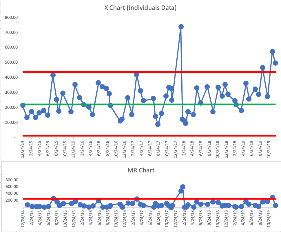
This shows three of the last four webinars being above the upper limit. We also see eight in a row above the upper limit.
I'm not trying to selectively choose a baseline period that would make a stronger case. I think my original baseline average used fewer initial data points and there was really no reason to revise the average and limits unless I saw a signal.
Since I see this sustained increase — proof that 2019 webinar registrations are higher than the past in a meaningful way, I could shift the average and the limits.
In the past, I would have predicted that webinars would get about 250 registrations and probably no more than 500.
Getting 500 registrations is meaningful because that's the point where we start getting more than 100 people trying to sign in live. The limit on our GoToWebinar account is 100, so then we risk angering people because they can't get in. Bumping up to the next tier of the GoToWebinar subscription costs more. But maybe that's just a cost of growth and it's worth it to not anger customers and prospects.
Here is the revised X Chart:
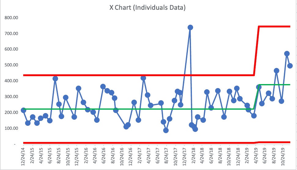
One purpose of a Process Behavior Chart is to predict future performance. Going forward into 2020, I'd predict that the average webinar registration is likely to be about 380 and the upper limit is about 750. We'll use this data to have the discussion about upgrading our GoToWebinar account.
There's where I think data like this is useful for understanding trends or shifts in performance (or finding outliers). Again, we're not using this data to evaluate, reward, or punish me at KaiNexus… and that's OK.
Please scroll down (or click) to post a comment. Connect with me on LinkedIn.
Let’s work together to build a culture of continuous improvement and psychological safety. If you're a leader looking to create lasting change—not just projects—I help organizations:
- Engage people at all levels in sustainable improvement
- Shift from fear of mistakes to learning from them
- Apply Lean thinking in practical, people-centered ways
Interested in coaching or a keynote talk? Let’s start a conversation.


