

Control Charts at an IHI National Forum: Why Process Behavior Charts Beat Before-and-After Metrics
TL;DR: Before-and-after comparisons hide variation and invite overreaction. Control charts–especially Process Behavior Charts–show whether a system has truly changed, help leaders distinguish noise from signals, and provide clearer evidence of sustained improvement.
I attended the IHI National Forum a few times, in 2010 and 2011, I think.
I recently stumbled across a few photos from my archives that I'll share here. I always love it when conference posters show “control charts” instead of a simplistic before-and-after comparison.
My book, Measures of Success: React Less, Lead Better, Improve More, shares a methodology for a particular type of control chart that works well for workplace metrics — the “Process Behavior Chart” (a.k.a, the “XmR Chart” or the “Individuals and Moving Range Chart”). What a mouthful, eh?
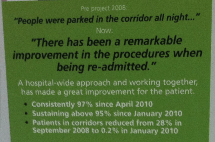
One poster talked about reducing “Emergency Center” (EC) length of stay. They first gave a summary of the improvement:
“Remarkable” and “great” are, of course, very subjective words.
Reducing “patients in corridors” from 28% to just 0.2% does sound impressive, though. And “sustaining” and “consistently” sound like good things to achieve.
But, I always want to see more than a single number, more than a two-data-point comparison.
They set targets and worked together, using the A3 problem-solving methodology to help guide their improvement. They reached their targets, as they described:

“Are we hitting our target?” is just one question. I also want to see a Process Behavior Chart since that helps tell us if we'll sometimes hit that target, or do so always.
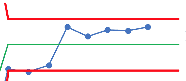
It's a bit blurry, but I think you can get the gist of it (click for a larger view):
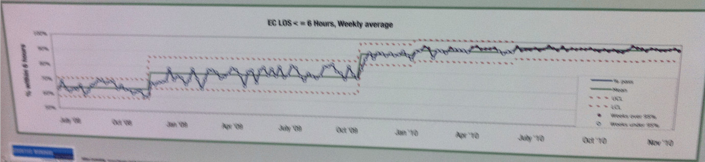
The PBC shows four or five shifts upward in the average level of performance over time.
They are plotting the weekly average of the percentage of patients who waited less than six hours. “Six hours” is sort of arbitrary (as is the 95% target). I wonder how performance would look if they plotted the average or median waiting times? Would we see, in that case, a decrease and shifts over time?
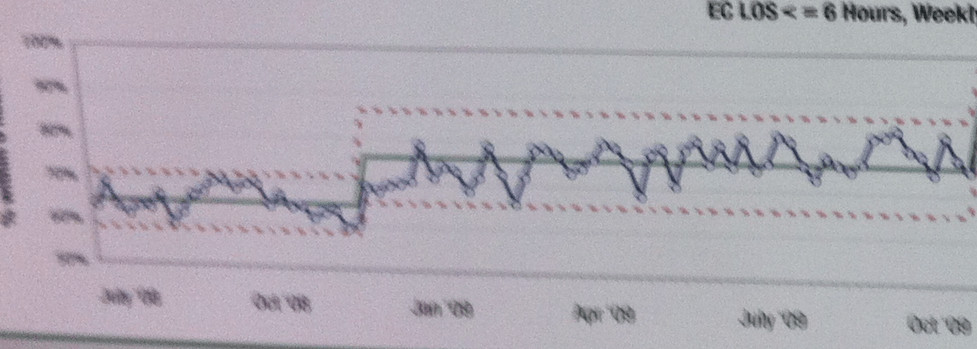
The first shift is pretty pronounced, as we see eight consecutive data points above the baseline average, which is a signal that says the system has changed in a meaningful way. We also start seeing data points above the baseline “upper limit.” See this zoomed in portion:
Hopefully, they knew the cause-and-effect relationship… what did they do that lead to the increase in flow?
As time marched on, there were additional signals of upward movement in the metric… and by the end, it's fluctuating in a much tighter range around an average of about 97% or so. They're beating the target each week, it seems.
The shifts upward get smaller as they approach 100%. I wonder if the next step in their improvement journey would be seeing how many patients only have to wait four hours?
Their conclusion read:
“In October 2010, the process was formally signed off as being achieved in a sustainable way.”
The PBC shows us that very definitively.
I'd still look for signals of any degradation in the system and the metric, mainly:
- Any data point below the lower limit
- Eight consecutive data points below the average
- 3 out of 3 (or 3 out of 4) data points that are closer to the lower limit than they are to the average
Any of those signals would tell us that the process or system has degraded — it's time to stop and ask why. When we see “noise” or routine fluctuation, we wouldn't take the time to ask “why?” since there's no root cause for noise. There is a “special cause” or root cause for a signal.
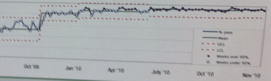
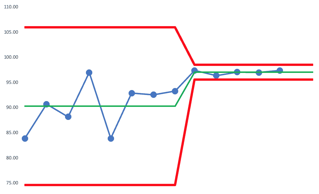
Here's the very end part of that chart, in a clearer view:

At this point, the upper limit is capped at 100% (it would be calculated as being higher). The lower limit is about 90%.
So, any single data point below 90% would be cause for alarm. Eight consecutive data points below 97% or so would also be a signal. And 3 out of 3 (or 3 out of 4) that are lower than about 93.5% would be a signal, meaning that it's unlikely to be randomly fluctuating to that level that many times in a row.
When we stop overreacting to noise, we can focus more on reacting to signals and/or improving the system in a systematic way.
As an aside, I had a great conversation with a book reader the other day, and she said:
“Your book is making me look really smart at work!”
And it was helping her team better see the connections between improvement efforts and results.
Two Projects with Run Charts
This project had a run chart that showed a reduction:
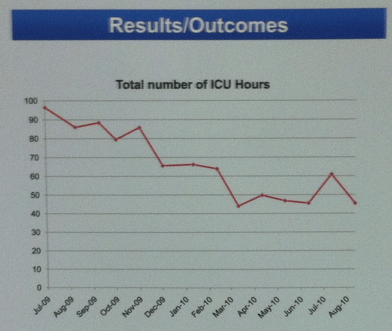
But how to we describe the reduction? Do we use the first and last data points to say it fell from about 97 to 45 or so?
When was the process change made? Let's look at a Process Behavior Chart that I made with approximations of this data:
If we try using all data points for the baseline, we see this (as the X Chart… I'm not showing the companion “MR Charts” here):
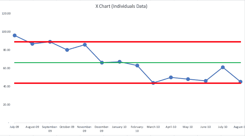
We see that it's not a single, predictable system over time (which is good, since the metric has gone down). We see clusters of data points at or above the upper limit. then at or below the lower limit.
This looks like it might have become one system that shifted to a new system.
This might show a better illustration of a shift downward from an average of 87.6 to an average of 54.4):

There's always variation in a metric… and that's true even with their improvement. There's no reason to explain that second to the last data point that's above average.
Of course, where I've drawn the “start of the new system” (starting with the 6th data point) is somewhat of a guess. If I were involved in this project, I'd know WHEN the new process changes were put in place and that would be the start of my new average and limits.
It could be that the new system started in March 2010, so the chart would look like this:
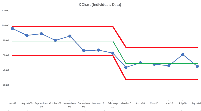
Both charts tell basically the same story… performance has gotten better in a somewhat sustained way. I think the PBCs tell the story in a clearer way than a Run Chart did.
Another project had this summary:

But what does a Run Chart tell us:

And what about a PBC (X Chart):
I see seven consecutive data points above the average. Three of them are just barely above. That's not quite as conclusive in terms of evidence of improvement.
If the next data point was above average, we'd see that signal of eight consecutive points and we could say performance has shifted… and variation has also decreased significantly, so the new limits are narrower:
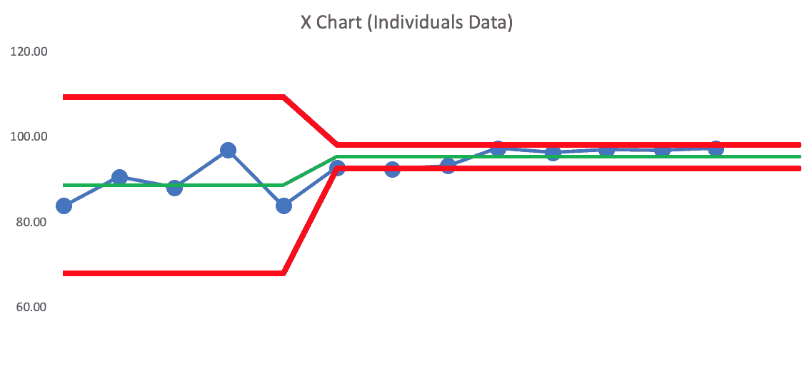
Zooming in on that last section, we see this:
It begs the question of “when did the system change?” and “did it change for just those last 5 data points? Again, I'd want to use knowledge of the system, not my guesses… it's possible this is a better visualization of reality and improvement:
The average is higher and there's much less variation — a good result, it seems.
With Process Behavior Charts… it's not about building the charts… it's about hopefully understanding and showing a clearer cause-and-effect around what we did, when we did it, and what the effects where.
I wish the IHI posters clearly marked “here's where the new process began” — which is a reason why I recommend doing so in my book.
What Control Charts Let Leaders See That Summaries Hide
Before-and-after comparisons and run charts can tell a reassuring story, but they often hide what leaders most need to know: whether the system has truly changed. Process Behavior Charts make variation visible, distinguish noise from signals, and show when improvement is real and sustained. That's why they are so valuable at conferences like the IHI National Forum–and why they belong in daily management, not just on posters.
Conclusion: From Celebrating Results to Learning From Systems
The IHI posters were strongest where they showed the behavior of the process over time, not just target achievement. Process Behavior Charts help leaders stop overreacting to routine fluctuation and start asking better questions about systems, cause and effect, and sustainability. When we rely on these charts, improvement becomes less about celebrating isolated wins and more about learning–clearly, calmly, and continuously–from the systems we are responsible for improving.


Here’s a great example that somebody posted on LinkedIn today…