


I got a message from a reader of my book Measures of Success: React Less, Lead Better, Improve More.
The questions were:
“I entered data from Press Ganey patient satisfaction responses (12-month running totals) and since the numbers were so close to each other, the PBC showed a bunch of data points outside the upper/lower process limits.
When I changed the limits to +- 3 sigma, this issue disappeared. Have you run into this issue before? Can you help me to understand the difference and its impact on analysis using the PBC?”
Edit: “12-month running totals” means 12-month moving averages, as I later clarified. I'd rather plot each month's actual data and then use a Process Behavior Chart to filter out “noise” in the data. I've made some up some data to create a situation where we have actual monthly data that creates the same moving averages as shown below.
Run Chart of the Moving Average
A simple run chart, which looks like this, is made from the moving-average patient satisfaction data. There is a pronounced downward trend (although the Y-axis scale goes only from 91 to 94, so please don't be misled by that):
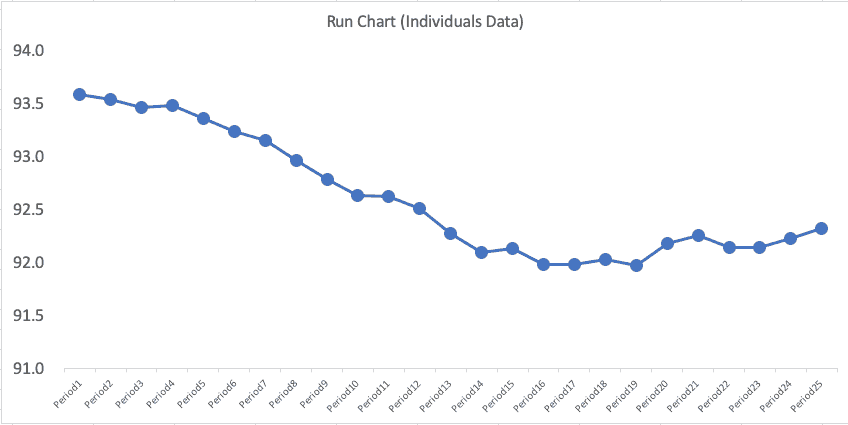
A falling moving-average implies that patient satisfaction is getting worse… but is it getting significantly worse or not? This requires a lot of mental gymnastics, which is why I think it's better to just plot each month's data point.
Process Behavior Chart of the Moving Average
Mathematically, we can do this, but I don't think it's a good idea.
His initial Process Behavior Chart for the moving average numbers looked like this:
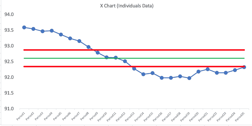
If you know the PBC methodology, that chart looks troubling, right? This is what concerned the reader.
But, again, maybe we shouldn't be plotting the moving average numbers… he was plotting what was given to him, but I suggested he push back and try to get actual monthly numbers.
Plotting the Actual Data
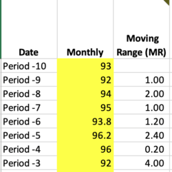
Since the reader gave me 25 data points of the “moving average” number (25 months of moving averages), I had to create dummy data for 11 months prior… which led to a total of 36 data points.
I created monthly numbers in a way that led to the moving average numbers being the same as what the reader provided. Periods -10 through Period 0 are made up data for the purposes of illustration.
| Date | Monthly # | 12-Month Moving Average |
| Period -10 | 93 | |
| Period -9 | 92 | |
| Period -8 | 94 | |
| Period -7 | 95 | |
| Period -6 | 93.8 | |
| Period -5 | 96.2 | |
| Period -4 | 96 | |
| Period -3 | 92 | |
| Period -2 | 94 | |
| Period -1 | 92 | |
| Period 0 | 91 | |
| Period1 | 94 | 93.58 |
| Period2 | 90.5 | 93.54 |
| Period3 | 91.1 | 93.47 |
| Period4 | 93.3 | 93.49 |
| Period5 | 93.4 | 93.36 |
| Period6 | 93.6 | 93.24 |
| Period7 | 95.9 | 93.15 |
| Period8 | 93.8 | 92.97 |
| Period9 | 92.9 | 92.79 |
| Period10 | 93.2 | 92.64 |
| Period11 | 88.7 | 92.62 |
| Period12 | 89.7 | 92.51 |
| Period13 | 91.3 | 92.28 |
| Period14 | 92 | 92.10 |
| Period15 | 88 | 92.14 |
| Period16 | 91.3 | 91.99 |
| Period17 | 93.4 | 91.99 |
| Period18 | 94.1 | 92.03 |
| Period19 | 95.2 | 91.97 |
| Period20 | 96.5 | 92.18 |
| Period21 | 93.6 | 92.26 |
| Period22 | 92 | 92.15 |
| Period23 | 88.7 | 92.15 |
| Period24 | 90.5 | 92.23 |
| Period25 | 92.5 | 92.32 |
A run chart of the actual monthly data (not the moving average) might look like the chart below. I've had Excel create a 12-month moving average (shown in red) so you can check my work (or the spreadsheet is here).
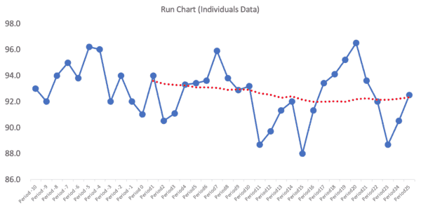
The moving average line smooths out variation, but it makes it look things were getting worse because the moving average was declining for a while before flattening out… but the actual data might just be fluctuating. I wonder how many managers would react to that moving average “trend” and demand an explanation?
Now, we need a Process Behavior Chart to tell us if this is all routine variation or if there's any signals to be found.
A Process Behavior Chart for the Monthly Data
We can use the first 25 data points as a baseline for calculating the average and the “lower and upper natural process limits” to see the hypothesis or question of “is this a metric that's fluctuating around the average in a predictable way?”
The formulas for the lower and upper limits are
= AVERAGE +/- 3 * MR-bar / 1.128
The MR-bar is the average of the “moving ranges” or the absolute values between each of the consecutive data points, as shown partially below:
It's 3 Sigma, not 2.66 Sigma
The formula for the limits is an approximation of +/- 3 sigma… but we're using the MR-bar and the statistical constant of 1.128 to estimate this instead of using a calculated standard deviation.
The formula for the limits can be simplified as:
= AVERAGE +/- 2.66 * MR-bar
And that sometimes gets confused with being “2.66 sigma” which is not the case. So, to the second part of the question (which was based on his Process Behavior Chart of the moving average):
“When I changed the limits to +- 3 sigma, this issue [with the moving range PBC] disappeared.”
I wrote back to the reader and explained that the limits were already +/- 3 sigma, so no adjustment was necessary (nor would that be appropriate).
Back to the Monthly Process Behavior Chart
So, let's look at the PBC (X Chart and MR Chart) that's based on the baseline of the 25 monthly data points:
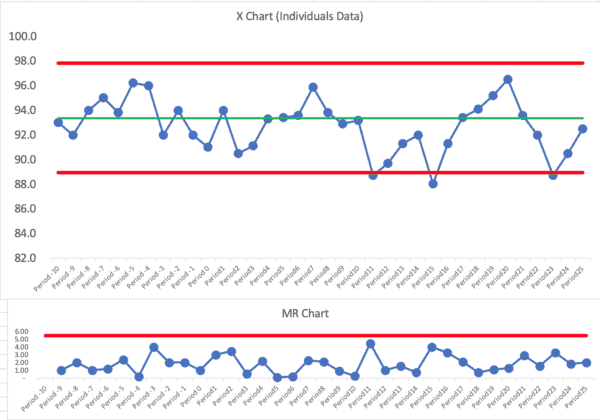
This is clearly not a single predictable system over time… using our three main rules for finding signals, there are signals galore:
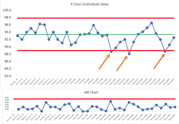
Let's mark those signals (all Rule 1 signals below the ldower limit):
I don't see any Rule 2 or Rule 3 signals.
We have three months in which the patient satisfaction score was below the lower limit. Other than those three months, it looks like a “predictable system” that's just fluctuating around an average of 93.
We could ask, “Why was patient satisfaction lower those three months?” The organization should find “special causes” for those data points (or it's the same special cause each month, perhaps).
We shouldn't ask for explanations of other individual months that are not signals.
The organization still might want to form a hypothesis around “how can we improve patient satisfaction?” Notice that's a different question than “how can we improve the scores?”
We'd want to improve actual satisfaction (although our measure is, at best, an estimate of that) and not just distort the numbers (for example, by starting a campaign to ask patients to give better scores whether they are deserved or not).
So, in conclusion, the Process Behavior Chart will help us characterize a system as being:
- Predictable or
- Not predictable
And we can do so in a somewhat binary way. When we have a predictable system, it's not a good use of time to ask for or look for an explanation to every up and down in the metric. Don't react to noise… DO react to signals and DO work to improve the system… react less, lead better, and improve more.
Again, Plot the Actual Numbers
I think another conclusion is, when in doubt, plot the actual numbers, not the moving average. The reader said that Press-Ganey provided the moving average number because the number of surveys is small.
I'd still rather see the actual numbers. If there's a lot of noise because of the small sample sizes, the chart will adjust for that by showing wider limits. We can use the PBC to distinguish between signal and noise.
The reader pointed out, in an additional exchange, that plotting the moving average means that the effect of any change we make NOW on patient satisfaction will take a while to show in the moving average chart. That's another argument for plotting the actual numbers.
Please scroll down (or click) to post a comment. Connect with me on LinkedIn.
Let’s work together to build a culture of continuous improvement and psychological safety. If you're a leader looking to create lasting change—not just projects—I help organizations:
- Engage people at all levels in sustainable improvement
- Shift from fear of mistakes to learning from them
- Apply Lean thinking in practical, people-centered ways
Interested in coaching or a keynote talk? Let’s start a conversation.


What did they mean by “12-month running totals”?
I’ll have to ask. I hope they weren’t plotting a moving average. If so, I’d advice them to plot the actual data.
Rob – Yes, they are plotting a 12-month moving average…
Hi Mark..This looks like a moving avrarage chart where intention is to find even a small shift in the mean…For all practical purposes if you see from Hospital perspective is the patient satisfaction score is stuck between 92 to 93. 5..Need to understand the root causes…Is Hospital happy with the scores? What is the cost of poor quality for a one point decrease in patient sat scores..Ideally improvement has to start when the process is under common causes…and predictable within 3 Sigma..
Good questions. If the chart has become “predictable” (meaning there are no signals in the recent data points — it’s fluctuating between +/- 3 sigma around the average), then the hospital can still look to improve the system and, therefore, results.
I’d still prefer to look at the actual data points. The actual data will be “noisy” but Process Behavior Charts filter out that noise.
Linkedin discussion:
At the start the question asked is “Can you help me to understand the difference and its impact on analysis using the PBC?” (meaning between control chart “sigma” limits and the generic “statistics class” standard deviation).
One discussion is here: https://www.spcpress.com/pdf/DJW260.pdf – for the first time reader it isn’t easy, but the distinction in this paper is all about one of the key foundations of the SPC control chart.
Perhaps a discussion for a future post? Why can we never use the generic, global standard deviation for effective control charting (process behavior chart)… (Is there a risk that people take your book Measures of Success, enthusiastically develop their own PBC chart template in Excel, but screw everything up by using the wrong SD in their calculation of the process limits?)
Thanks, Scott.
When we say the PBC is +- 3 sigma, the “sigma” is estimated by 3*MR-bar/1.126.
You’re right that using a calculated standard deviation is a poor estimate of sigma for these purposes. I’ve seen people make that mistake after reading my book and I’ve tried correcting them when I see that.
That said, using the “wrong” control chart formula is still better than not using control charts at all, I’d say :-)
I point to Wheeler and his teaching that the Six Sigma control charts (also used a lot in medicine) — the p-chart, u-chart, np-chart, and c-chart are not really valid in the real world.
I see a p-chart in an article right now about the percentage of patients who wait longer than some certain arbitrary time. A p-chart makes a bad assumption that EVERY single patient has the EXACT SAME chance of waiting a long time. Queuing theory and the real reality would make it easy to show that assumption is a very bad one.
Therefore, use the XmR / PBC / individuals and MR chart (whatever you want to call it) and the chart is FAR more robust in the real world…
I’ve significantly edited and updated this post, everyone.
I think that plotting the 12-month moving average was causing a lot of problems.
I, instead, plotted monthly-data points (made up and extrapolated from the actual moving averages) to re-do the post using analysis of a Process Behavior Chart that’s based on monthly numbers. It tells a different, more accurate, story.
The “voice of the process” was garbled by the moving average.
I’m not sure you’d get anything out of a control chart in this case. The odds of going 2 years without significant enough process changes impacting patient sat that would necessitate recalculating your control limits at least once is pretty low. So your control chart/ control limits really aren’t telling you anything that a standard time series plot would. Even if they did, it wouldn’t necessarily be actionable. Multiple box plots stratified by key variables (age group, payor type, gender, specialty, etc) will tell you a lot more in a much shorter time period. I like control charts, but doing them for the sake of doing them won’t inform performance decisions.
Who is “doing them for the sake of doing them?” A control chart helps answer the question of “Has the metric changed significantly, or is it just fluctuating around an average?”
Many hospitals try MANY countermeasures that don’t have any real effect on patient satisfaction or their metric.
Could you take a deeper dive with other statistical methods? Of course.
Would you want or expect Patient Satisfaction to be in statistical control? I’d guess that it would be preferable to have a continuous improving trend that resulted in a violation of the Nelson Rules than it would be table-topped process performance resulting in the tight control limits that we might want to see in other processes. And conversely, data points falling inside control limits that are artificially wide because of historical high variation in process performance isn’t really a good thing either.
I’m just not sure what control limits would tell you that a standard time-series plot wouldn’t from an actionable data perspective.
The first thing a Process Behavior Chart does is tell you IF it’s in statistical control. I’d expect it to be in statistical control if the hospital isn’t making major efforts to improve… that, by definition, sounds like a stable system.
Yes, continual improvement would be preferred and, as you said, the chart would be “out of control” in a good way — it would show evidence of improvement.
Here’s a run chart showing the % of survey respondents who gave an overall hospital rating of 9 or 10 (this is a very imperfect measure of true patient satisfaction, and I don’t know why they don’t just plot the average or median score instead of this percentage):
Does that chart imply that:
1) The number isn’t as high as you’d like or want it to be?
2) It’s just fluctuating around an average?
Many hospitals don’t even look at a run chart. They report the LAST number with a COMPARISON (up or down) from the month before. They get caught in the endless cycle of “hooray we got better!” and “Oh no, what happened?” That’s all just a waste of time.
The run chart view is helpful IF people understand variation. They might draw a dubious linear trend line that suggests the number will continue to get better if they do nothing. They might still react to every up and down.
I’d still much rather see a control chart with calculated limits:
The limits and the rules help me make sure I have a better understanding of the cause-and-effect of improvement attempts. If I make an attempt to change the system and the score blips upward a bit, but is still within the limits, I shouldn’t declare victory or that improvement has really occurred. Again, we don’t do charts just to do them… they help us better understand our improvement efforts.
Here is a good testimonial about the use of control chart (XmR Charts):