


In reviewing the excellent “Making Data Count” publication from NHS Improvement, I noticed some articles that they reference.
One, in particular, caught my attention (and not just because it's free):
“The problem with red, amber, green: the need to avoid distraction by random variation in organisational performance measures“

They are blunt in their assessment (and I agree with them):
“However, we do not at all welcome the widespread use of red, amber, green approaches to data analysis that is everywhere in our organisation.
By ‘red, amber, green', we are referring to graphical data displays that use colour coding of individual data values based on whether this value is on the right (green) or wrong (red) side of a target value. Often amber or yellow is used to indicate data values that are somewhere between ‘right' and ‘wrong'.
The problem with red, amber, green management is that at best is it useless, at worst it is harmful.“
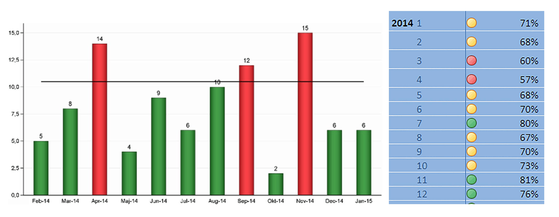
The authors show, through an example, two different ways of visualizing data that beg leaders to react to the “red” data points that are worse than the target of 10. I'm showing those figures side by side, below:
“We believe that red, amber, green (mis)management is pointless, potentially harmful and responsible for much of the improvement fatigue that is present in our and many other healthcare organisations.”
Again, I agree. I have similar illustrations in my book and workshop, showing the popular “bowling chart” format:
It's really hard, if not impossible to detect “signals” in a bowling chart. You can either make knee-jerk reactions:
- Red is bad! Investigate!
- The number got worse! Explain!
When we ask people to come up with “special cause” explanations of “common cause variation,” we're asking them to waste time. That's why the subtitle of my book says “react less, lead better, improve more.”
Back to the BMJ article… they “plot the dots” using a c-chart methodology, which some of you might have learned about in statistics class or Six Sigma training. It looks like this:
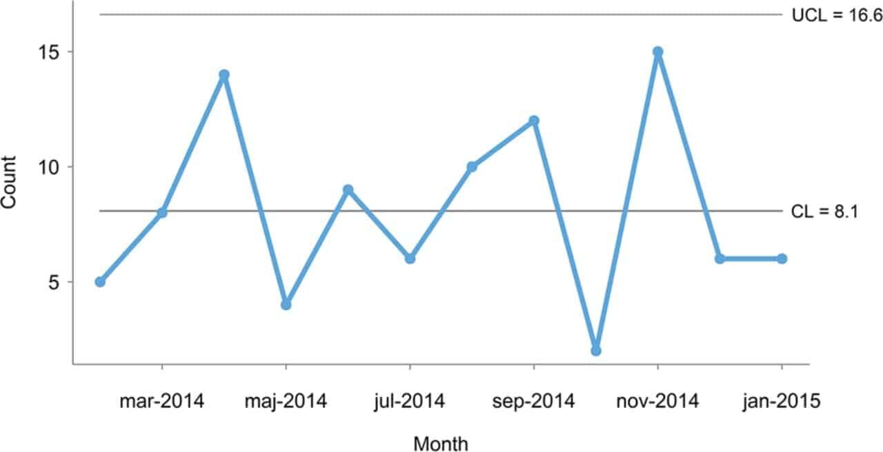
The authors correctly point out that all of those data points are below the “upper limit” so every data point is produced by the same system that has randomness or variation in its output. Asking for an explanation or a root cause mistakes “noise” for a “signal.” We need to avoid that mistake and control charts help us do that. Instead of reacting and explaining, we can focus efforts on improving the system (as we did at KaiNexus):
My quibble is in the choice of the c-chart. This is a minor nitpick… yet it's an important point. OK, I contradicted myself.
I'd rather see people use the “wrong” control chart than not use one at all.
But, we can greatly simplify our professional lives by just about always using the “XmR-Chart” a.k.a. the “Process Behavior Chart.”
The chart above is a count of “a certain type of unwanted incident in mental healthcare.”
As Don Wheeler writes about here, the c-chart makes a very bad assumption that says EVERY patient has the EXACT same chance of having that bad event happen (whatever it is). It seems VERY unlikely that the assumption would hold true… so the “Poisson” distribution that's inherent in the c-chart breaks down.
We're better off using the Process Behavior Chart. I made one and it looks like this… with the companion X Chart and MR Chart both being shown:
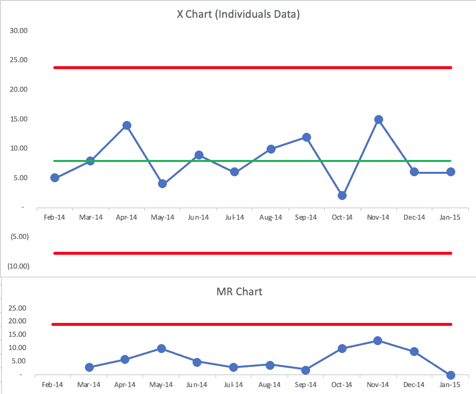
The BMJ authors' upper limit was 16.6. My chart has a calculated upper limit of 23.8.
Both charts tell the same story — the “voice of the process” is the same. Both charts show us that every data point is noise. I'd also use a Process Behavior Chart in place of the p-chart that also appears in the article.
So, good, both the c-chart and the Process Behavior Chart would drive the same action… or they'd tell us to NOT react to any individual data point. We could, instead, work to improve the system in a less-reactive, more-systematic way.
So, nitpicking aside, I like what the authors wrote, including this:
“It strikes us as curious that harmful red, amber, green displays are so popular.”
I'd say the same about “bowling charts.”
I can appreciate this conversation since I've heard it too:
“When talking to managers, we often get responses like this: we appreciate control charts for specialist purposes, but they are too complicated for us, and all we really need to know is how our measures compare with our targets so we can take action when targets are not met.”
Then, they get cheeky:
“…control charts are considered too complex to be used by healthcare managers, when really they were developed and successfully used to help unschooled assembly line workers control production processes in the 1920s.”
It's funny (or sad?) that many people in healthcare look down their noses at manufacturing… yet they won't embrace a method that's been used in factories for almost a century by those who are less educated?
And, if that old habit of “barking at the reds” really worked, healthcare would be better off today, right?
Process Behavior Charts are visual. The math isn't hard. Managers don't even have to do the math… they just have to learn a different reason to react (signals instead of red).
The authors say:
“It is no more complicated to tell special from common cause variation than it is to tell red from amber and green.”
It's not complicated, it's just different. I've heard that said about Lean too (David Mann).
Overreactions to red, yellow, and green (or just red and green) are counterproductive in my experience. But, it's hard to get people to consider a new method when “the way we've always managed” seems to work fine for them…
That's why the change management layer of all of this is FAR more complicated than the technical method itself.
Please scroll down (or click) to post a comment. Connect with me on LinkedIn.
Let’s work together to build a culture of continuous improvement and psychological safety. If you're a leader looking to create lasting change—not just projects—I help organizations:
- Engage people at all levels in sustainable improvement
- Shift from fear of mistakes to learning from them
- Apply Lean thinking in practical, people-centered ways
Interested in coaching or a keynote talk? Let’s start a conversation.


At the risk of being even more nitpicky I would suggest that both the c-chart and XmR-chart are both imprecise because they just look at counts. In this example I would encourage the use of an u-Chart since it accounts for both the count of events and the potential variation in sample sizes.
XmR charts don’t just look at counts.
Charts like c-charts and u-charts make bad probabilistic assumptions that don’t play out in the real world. That’s why Don Wheeler recommends using the XmR charts in almost every situation involving metrics.
https://www.measuresofsuccessbook.com/question-other-types-of-control-charts/