


Over the past year, I've heard about the “OKRs” methodology that is used in tech companies like Google. OKRs stands for Objectives & Key Results.
The approach (along with examples and case studies) are laid out in the book by venture capitalist John Doerr, Measure What Matters: How Google, Bono, and the Gates Foundation Rock the World with OKRs.
There are some similarities to the Lean practice of “Strategy Deployment,” or at least some of the goals are the same, as Doerr writes:
“A management methodology that helps to ensure that the company focuses efforts on the same important issues throughout the organization.”
Strategy Deployment (SD) works to align the organization around the “true north” direction of the company, a small number of metrics and goals, and the initiatives or large projects that will help an organization close measurable gaps in performance. Both SD and OKR seem to focus on prioritizing our goals and activities… realizing the reality that we can't do it all, or we can't do it all at once.
Hear Mark read this post — subscribe to Lean Blog Audio
An OKR objective is the what:
“An OBJECTIVE , I explained, is simply WHAT is to be achieved, no more and no less. By definition, objectives are significant, concrete, action oriented, and (ideally) inspirational. When properly designed and deployed, they're a vaccine against fuzzy thinking–and fuzzy execution.”
An Objective, for a hospital, might be something like “zero patient harm.” That seems to fit each piece of the OKR approach.
Key Results are the measures or the how:
“KEY RESULTS benchmark and monitor HOW we get to the objective. Effective KRs are specific and time-bound, aggressive yet realistic. Most of all, they are measurable and verifiable.”
In the examples given in the book, “key results” are sometimes more of a “to do” list than they are a metric. But, they're important contributors to the objective.
As with SD, OKR works to create alignment through the cascade of objectives and key results. In a Lean culture, the SD process tends to be collaborative bi-directional discussion, not just a top-down “goal deployment” as we might have seen in more traditional companies.
I'd be a bit concerned if OKRs were mandated in a top-down way. Thankfully, Doerr writes:
“To avoid compulsive, soul-killing overalignment, healthy organizations encourage some goals to emerge from the bottom up.”
Doerr writes about the dysfunction that can occur with goals, citing a 2009 HBR article, “Goals Gone Wild.”
There's a call out warning in the book:
If an organization sets unrealistic goals (see the VA and Wells Fargo), it's natural and to be expected that people might game their system if they're trying to avoid being punished or fired. We can't get alignment around an unrealistic goal.
Doerr does write about the need for managers to be coaches on an ongoing basis. He says to scrap the annual performance review — Dr. Deming and Professor Culbert would be proud.
“When companies replace–or at least augment–the annual review with ongoing conversations and real-time feedback, they're better able to make improvements throughout the year. Alignment and transparency become everyday imperatives. When employees are struggling, their managers don't sit and wait for some scheduled day of reckoning. They jump into tough discussions like firefighters, without hesitation.”
I think the main question coming out of the OKR approach is, “How exactly do we gauge progress against our goals? How do we know when we're on track or if course corrections are needed?”
As I teach in my Measures of Success book and workshop, there are three questions that come from Dr. Deming:
- What are we trying to accomplish?
- By what method?
- How will we know?
Doerr and the OKR approach seem to be strong on questions 1 and 2.
But, in the book (and examples I've found online), there seems to be a lot of Red/Yellow/Green (RYG) color coding or we see comparisons of “actual vs. target.” I see tables of numbers when run charts, or better yet, “Process Behavior Charts” would show a much richer picture of reality — allowing us to manage better with less waste.
Being “data-driven” doesn't necessarily mean managers will be making the right decisions with data.
Here is an example from Cleveland Clinic, where they are apparently using the OKR approach in conjunction with their “Cleveland Clinic Improvement Model” that includes Lean.
As with the OKR approach, there's a lot of good stuff here… but it could perhaps be better.
I see meaningful and measurable goals, which is good. One is the “number of falls per thousand patient days.” The 2018 result was 2.94 and the 2019 goal is 2.1.
Rolling up all of the 2018 performance into a single number hides a lot of context, unfortunately. Was 2.94 an average for the year? Was the number improving (and by what method?) or was the number just fluctuating around an average?
An SD methodology would have some prioritized initiatives and projects that would be expected to bring falls down. Does that mean reaching 2.1 by the end of the year or averaging 2.1 for the entire year of 2019? I'm sure the team and leadership clarifies that.
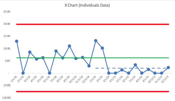
Here is an X Chart (the PBC chart that shows the data… the companion “MR (Moving Range) Chart” is not shown) where the 2018 average was 2.98 by the end of year (this is made-up data):
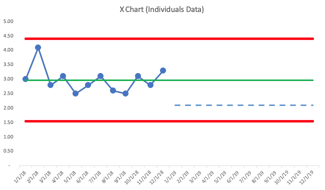
The PBC methodology has us draw a line for the average (the green line) and we also calculate, from these 12 baseline data points, the “lower and upper natural process limits”). See more about the calculations here (or it's in my book).
2018's data tells me that the metric is just fluctuating. We don't see any “signals” that the system has changed, based on three rules:
- Rule 1: Any single data point outside of the limits
- Rule 2: Eight consecutive points on the same side of the average
- Rule 3: 3 out of 3 (or 3 out of 4) points that are closer to the same limit than they are to the average
There are no “signals,” so all of those data points are “noise.” There's no “root cause” for any single data point in 2018 — those results are all generated by the same system. There's a level of natural variation that's in that metric.
Moving in 2019, I drew in the goal of 2.1 with a blue dashed line.
The PBC tells us that it's possible that we'd hit 2.1 for one month. But, to get that level of performance over multiple months will require improvements to the system. No amount of “We can do this!” will inspire anything more than incremental refinement of the existing system. Instead, leaders and employees need to work together to make more drastic improvements.
This is where the coaching approach of Lean or OKR enters the picture. In Toyota speak, having a “gap” in performance is just a rational fact. It's nothing to be upset about (and I'm sure that's how Cleveland Clinic manages things).
I've heard a sad story from a manager who left a now-former Lean healthcare organization where the culture under new leadership was described as, “Set aggressive targets and then yell at leaders and threaten their jobs… if you can't hit these targets, we'll find somebody who will.”
That's not Lean and that's not what OKR seems to be about either.
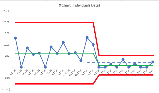
Let's say the 2018 numbers each month showed more variation and ended the year at a data point of 2.98… the X Chart would look like this:
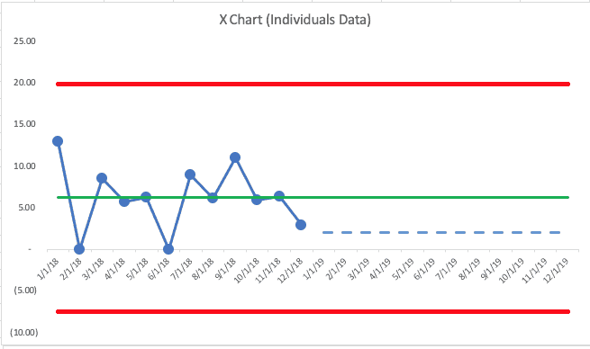
This chart shows an average (again, made up data) of 6.26 for the year. They had two months with zero falls… the last month was 2.98. Again, the chart shows nothing but “noise.”
In this second scenario, we'd expect future months to fall between zero (the lower limit can't really be negative here) and 20 falls per 1000 patient days. Again, this team could likely hit the goal of 2.1 some months, but to sustain performance there will require significant changes to the system, not better efforts.
In either scenario, the 12 months of 2018 have been used to establish a baseline — an average and the natural process limits. New 2019 data points can be evaluated against this baseline, using our three rules to look for signals.
The tweeted example shows some 2019 data points, which I've added to the chart below (with the second scenario). In the real world, we'd add a data point each month and we'd evaluate as we go (as the OKR and SD methodologies call for… we don't just wait until the end of the year to evaluate results.
This time, I'll show the full PBC — the X Chart and the MR Chart:
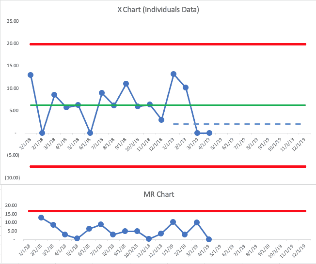
The first two months of 2019 were both above the baseline average. That's not an indication of a “signal.” We shouldn't get too upset about those data points — or we shouldn't look for a “root cause” since it's part of what we call “common cause variation.”
The next two points are at zero. Having two data points that are below average… or two data points that are both lower than the goal isn't evidence of a signal.
But, this is where we have to combine our PBC with our knowledge of our system and our improvement efforts. If there had been some major change to the system in late February 2019, I might start to be encouraged that maybe there's the start of a downward and sustainable shift in the number of falls.
Back to Deming's three questions:
- What are we trying to accomplish? Reducing or eliminating patient falls and harm
- By what method? I don't know… we've just been watching and talking about the metric
Wait, if that's what has happened, I'd think those two data points of “zero” might just be fluctuation. I wouldn't be surprised if the number jumped back up in May.
It's a rule of life that there is variation in every metric — it's a matter of “how much is normal?” A system defined as the same healthcare professionals treating the same type of patients in the same space with the same workflows and the same technology won't always generate the same number of falls. It's a fact of life.
Back to Deming's three questions yet again:
- What are we trying to accomplish? Reducing or eliminating patient falls and harm
- By what method? We implemented a “falls reduction bundle” in February that is based on a number of evidence-based practices
- How will we know? When we see eight consecutive below-average numbers in our metric
Ah, now there is some improvement work… we'd have a reasonable hypothesis that falls will go down, but we might not know how much. There might be a new way of doing things that merits a “Keep up the good work!” comment from the manager. If nothing had been implemented and those two zero months are just noise in the system, “Keep up the good work” might not be a helpful thing to say.
Let's say the data for the rest of the year looks like this:
We see a “Rule 2” signal — ten consecutive data points below the baseline average. If that seems like a slow way to prove that the system is better, a weekly chart would show us a signal more quickly.
Notice a few things about the last ten months:
- We seem to have a new system, a predictable system, with an average of 0.85 for the last 10 months of the year.
- Some data points will be above that new average and there's no reason to freak out and look for a “root cause” even after two consecutive zero months and it going back up.
- The last data point is 2.3, which is just above the goal of 2.1.
If I were an executive who was evaluating this team, I'd say “great job!” There's evidence of a sustained and significant improvement in the results… through a method.
I would NOT punish the leader for ending the year above the goal. That data point is noise. I heard a sad story during a recent workshop from a manager who had been beating her goal all year… but then missed the goal in the 12th month, so she didn't get a raise. How frustrating. She was going to try to find the data that would allow me to see if her last month of the fiscal year was a signal or if it was noise. She suspected it was noise.
We can draw a new average and limits for our PBC, showing the shift that occurred with the improved system in place.
Going into 2020, I'd predict that “falls per 1000 patient days” would be between zero and the new upper limit of 5.19. Any single data point above that number is “noise.”
That might be frustrating to a leader. It's undesirable, but it's the real reality of the situation… the system is not yet capable of hitting zero every month and it's not capable of being below the target of 2.1 every month. More improvement activity is required.
OK, so this post went into detail about Process Behavior Charts (PBCs) and how they can be incorporated into the practice of Objectives and Key Results (OKRs) in healthcare or any setting.
Process Behavior Charts tell us so much more than a single data point… or a list of multiple data points in a spreadsheet-like grid. When in doubt, “plot the dots.” See what the “voice of the process” is telling you…
Does your organization use OKRs? How do you evaluate progress or performance? Would you be willing to try PBCs?
Please scroll down (or click) to post a comment. Connect with me on LinkedIn.
Let’s work together to build a culture of continuous improvement and psychological safety. If you're a leader looking to create lasting change—not just projects—I help organizations:
- Engage people at all levels in sustainable improvement
- Shift from fear of mistakes to learning from them
- Apply Lean thinking in practical, people-centered ways
Interested in coaching or a keynote talk? Let’s start a conversation.


Discussion on LinkedIn:
One comment from Jeffrey Burger:
The [NHS] Trust I work at in the UK uses a Strategy Deployment approach but the objectives are set as targets, meaning the Divisional scorecards utilise a ‘red/green’ approach and of course this varies monthly!
The current process for performance review means that if there are targets that are consecutively red for a period of months, the responsible Division is expected to produce a Countermeasure summary to show what they are doing to improve; the problem being this is typically done without understanding the system and common/special cause variation.
Simple Run Charts are sometimes used within individual projects and I have begun to introduce the concept of control charts in the work I am directly involved in, however at a high level and therefore what is discussed, is the ‘red =bad’ and ‘green = good’!
I have heard anecdotally that discussions have been had about how to understand the variation better, but rather than view this in a control chart, the possible solution was to introduce an arbitrarily defined limit of ‘acceptable’ variation around the target which would then be coloured as Amber on the scorecard!
Thanks for your comment, Marco.
I agree that:
1) It’s not a good use of time to do a “countermeasures summary” for consecutive “reds” if those data points are in the realm of “noise”
2) It would be better for them to use control charts instead of arbitrary color-coded boundaries
Are they aware of the book “Making Data Count” from the NHS?
https://improvement.nhs.uk/resources/making-data-count/