


Two data points are not a trend. But, one data point can be a “signal” that a metric has changed enough to merit investigation — we can ask “what changed in the system?”
Far too often, leaders overreact to small fluctuations in a metric — what we could call “noise.” When we spend time trying to explain routine fluctuations, that wastes time that could be dedicated to real improvement efforts (hence the subtitle of my book Measures of Success: React Less, Lead Better, Improve More).
News headlines often scream about a percentage change from the previous year, quarter, or month. Our organizational metrics often do the same thing… or they compare just one data point to a target.
Yesterday, in the run up to the NCAA men's basketball championship game, I saw this headline:
Final Four ratings are a mixed bag for CBS: up from TBS numbers in 2018, but down from 2017
As Don Wheeler says, “Without context, data have no meaning.” So, the 2019 Final Four ratings are up 13% from last year?
The question we would need to ask is if a 13% change is a signal that implies that something is worth understanding or investigating — was there a meaningful change in the metric or is the number just fluctuating? We need more than two data points to know the answer.
One important piece of context is that last year's Final Four was on cable TV – the TBS network. Since not every home has access to TBS (it was about 82% in 2015), we'd expect the cable numbers (2018) to be lower than broadcast TV (2019).
The ratings are higher than 2018, but were lower than 2017 (the last time the games were on CBS).
But again, two data points are not a trend. Is the difference from 2017 meaningful or not?
One simple tool that's useful — in workplace metrics or basketball ratings — is a simple run chart. Since we have data going back to 1975, plotting the dots gives us more meaningful information than two or three points. The chart below shows the championship game numbers (last night's numbers are not available yet):
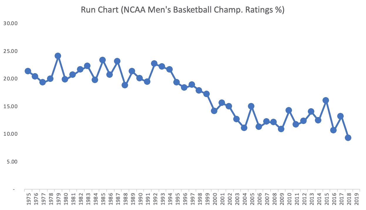
Instead of wondering about the ups and downs in recent years, there's an undeniable long-term downward trend. We might think that “March Madness” has gotten extremely popular in recent years, but it looks like there's been a real drop in ratings compared to the 1980s and 1990s. Remember, “ratings” is the percentage of TVs that are tuned into the game.
There are clearly more viewing options for people today. There are similar long-term downward trends in TV ratings for The Oscars and other events.
If we make two data point comparisons, the 2018 number is down 30% from the year before. Shocking! What happened? Let's explain!
Wait, the 2017 number was up 24.5% from the previous year. Hooray, give somebody a bonus!!
But, remember, the game was switching between CBS (2017) and TBS (2018). The 2016 game (CBS) was 33.8% lower than 2015 (also CBS). Maybe this metric just fluctuates this much year to year.
But, a headline like this wouldn't attract many eyeballs or clicks:
NCAA Ratings Fluctuating in Typical Range; No Explanation Required from CBS or Analysts
If we take the data going back to 2000, it seems to be fluctuating in a range that's pretty consistent. A run chart for just those years:
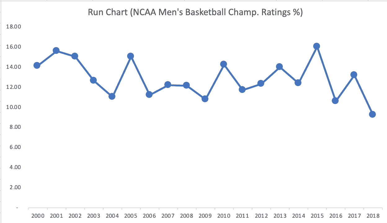
It appears that the ratings are just fluctuating around an average. So, we can create a “Process Behavior Chart” (as I explain in my book). The green line is the average (12.8 rating). We also then calculate the red lines, which we can think of as guardrails for the metric. The “lower natural process limit” is 6.64 and the upper limit is 18.96).
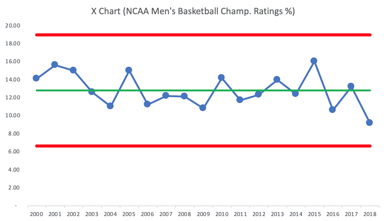
Process Behavior Charts filter out noise so we can find signals, if they exist.
We first look for any data point that's outside the limits… nope.
We can also look for eight consecutive points above or below the average… no.
We also look for three out of four data points that are closer to a limit than they are to the average.
There are no signals in that chart. The number is predictable and it's fluctuating.
There's no point in trying to explain any year's number… because that team was playing, or because it was a low-scoring game, or whatever.
The good news with a predictable metric is that we can… predict that the number will continue fluctuating unless there is a significant change to the underlying system.
We can predict that the 2019 ratings number will fall between the limits of 6.64 and 18.96. If the number is in that range, don't bother explaining it… it's just fluctuating. If the number is outside of the limits, then we should investigate, try to explain, and improve things if we can.
I'll update this post when the 2019 numbers are released (EDIT: See below):
The First Overnight Numbers
Here is the first article I've seen:
NCAA Title Game Ratings Not A Win For CBS Despite Historic Virginia Victory
“Going almost to midnight ET, the game scored a 12.4/22 for CBS in
metered market results, according to Nielsen.”
That 12.4 number is just a bit below the average number on the PBC. So, that's no real surprise.
Also not a surprise (due to the Turner / CBS dynamic), the number is up from last year and a bit lower from 2017. A 15% difference is not really meaningful, given how much year-to-year variation the metric shows.
While up 19% from the all-time NCAA championship game low of last year's Michigan and Villanova battle royale, the Virginia win is down 15% from the last time the tournament title game aired on CBS two years ago.
The journalist makes a questionable judgment:
“If you hark back to the last tie the NCAA men's tournament was on CBS back in 2017 …well, it's a whole different ballgame
ratingswise .”
Except it is NOT a whole different ballgame. The ratings are a continuation of the predictable fluctuation. Not surprisingly, the writer tries to assign a “special cause” to this “common cause” variation by writing:
“…the fact that the big draws like Duke went down earlier in the tour and two smaller schools ended up in the title game didn't help grab the small screen fans.”
Those facts do NOT mean there are cause-and-effect relationships there.
The article is correct in pointing out that the 2019 ratings number is preliminary and is subject to change.
Please scroll down (or click) to post a comment. Connect with me on LinkedIn.
Let’s work together to build a culture of continuous improvement and psychological safety. If you're a leader looking to create lasting change—not just projects—I help organizations:
- Engage people at all levels in sustainable improvement
- Shift from fear of mistakes to learning from them
- Apply Lean thinking in practical, people-centered ways
Interested in coaching or a keynote talk? Let’s start a conversation.


Here is another view, if we use 1975 to 1998 as the baseline for a Process Behavior Chart:
1995 is the start of 8+ consecutive data points below the baseline average.
2000 is the first data point below the initial Lower Natural Process Limit. It seems clear that there was a shift downward and the establishment of a new system. So, what changed?
Here is some LinkedIn discussion from before I wrote this post: