

A New “Measures of Success” Giveaway; Workshops & 3 Takeaways From the Book; A Chart I Don’t Like
First, an announcement… you can enter to win one of three eBook copies of Measures of Success: React Less, Lead Better, Improve More. Unlike the previous Amazon giveaway, this contest is open to everybody, regardless of your country. Thanks for your interest in the book! Click to enter.
I'm doing some workshops on the book's material in various cities in the coming months:
- Society for Health Systems (San Antonio) — February 21
- AME and Open Enrollment (San Franciso) — March 21
- Systems Thinking TO and Open Enrollment (Toronto) — March 26
- Dojo & Co and Open Enrollment (Minneapolis) — April 16
- Lean Healthcare Transformation Summit (Washington DC) — June 12
Nice Feedback on the Book
Speaking of the book, I got a very nice email from a healthcare professional who tried the “Process Behavior Charts” method from Measures of Success in the context of Toyota Kata style improvement. Her three key takeaways:
1) “It's important to have a good understanding of how the system is currently performing before making improvements. I see now why it's important to have at least 18-20 data points that represent the same system,
2) PBC Rules help us filter out the “noise” of normal variation in the process. We can stop reacting to every up and down, and instead look for signals that something has actually changed.
3) Connect what is actually happening (cause and effect) and record it somewhere. It's a lot easier if you have it written down, rather than relying on memory. One of the meta habits that came out of practicing Kata for me.”
I love hearing stories from readers who have put the book to good use!
Charts That Require Mental Gymnastics
The Wall Street Journal uses a lot of charts in their articles. Some, like those presented as “Run Charts” (aka “Line
I don't like a chart that requires a lot of mental gymnastics to figure out what's going on with the data or the metric. I'm not a fan of plotting “percentage change from previous year” numbers on a chart. That's a “derivative” of the actual data, thinking back to calculus. I like arithmetic better than calculus.
I'll share an example of a chart from a WSJ article about American car sales and inventory levels. First, here is the headline:
Car Dealer Lots Are Flush With Unsold Cars as Sales Are Expected to Drop
The changes in those numbers (inventory up, sales down) must be really significant for that to be so newsworthy, right?
The WSJ chart has two strikes against it to me:
- It's a Column Chart (I'm in the camp that prefers Run Charts for time-series data)
- It shows the % change instead of the actual data

Maybe a third strike is co-mingling two data sets into the same chart.
Better Charts
I think Run Charts of the actual data make it much more clear what's going on without having to think about it as much, as I've drawn here:
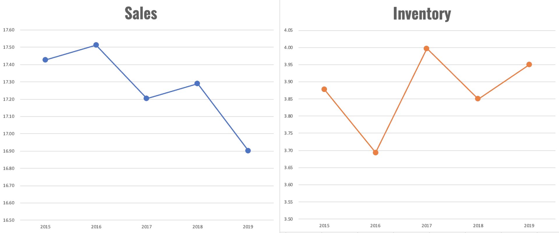
Even two simple Run Charts shows us sales appear to be going down (the increases in some aren't as great as the decreases on other years). Inventory, not surprisingly, is going in the other direction.
The Y-axis on those charts might make the changes seem more dramatic than they are, so here are the charts with the Y-axes starting at zero:

Are those drastic changes or just fluctuations around an average? Even with just five data points each, two Process Behavior Charts can help answer that question (having 15 data points or so would be even better).
Neither the X Chart (sales data) nor the companion “Moving Range Chart” show any evidence of a “signal.” The numbers appear to all be “noise,” just fluctuating around an average.

The same is true for inventory… it appears to just be fluctuating.

In the absence of any signals (such as any data point outside of the calculated Lower and Upper Natural Process Limits, there's nothing to explain. There's no “root cause” or “special cause” for any of the numbers in the charts. It's most likely a waste of time to overexplain this or any workplace metric that's fluctuating.
If we want to improve the system, the answer is likely not found in asking, “Why was that one data point different?” when the data points are all noise.
“Jonathan Smoke, an economist with Cox Automotive, said last year's strong results were lifted by sales to fleet buyers that aren't likely to be repeated again this year.”
Last year's “strong” sales results look to be average, quite literally, based on the last four years…
“With sales projected to weaken this year, analysts say
auto makers will be under pressure to trim factory production in order to avoid offering steeper discounts…”
Now there's the Lean concept of producing to demand. If sales drop, produce less instead of building more inventory. For some plants, that will mean reducing overtime (like the Toyota truck plant in San Antonio that worked 46 Saturdays last year, something they realize is unsustainable).
For some automakers, that might mean some short-term layoffs (but that's something Toyota has proven they will not do — see here):
Toyota will invest in people through training, cross-training, and continuous improvement work before they'll lay them off… I wish more hospitals would learn that lesson about Lean from Toyota… see more posts about that.
Thanks for reading! Don't forget the contest: click to enter.


Great article Mark. It made me realize how many times I’ve looked at data like that and not truly analyzed it. I’m certain I have reacted to this type of data when it was just a normal variation in a process.
It does make you wonder if a chart like that is intentionally made to create “panic” or is it just a lack of understanding.
Thanks for your insight.
Thanks, Scott. I had somebody point out recently that the media is in the business of attracting eyeballs. A headline about a two-data-point comparison, like “Super Bowl ratings plummet” will attract more readers than “ratings are just fluctuating.” So, some of it might be called “data sensationalism,” but we know people do that in organizations sometimes.
As to the WSJ chart here, I don’t know why somebody thought that visualization would be more clear, I just don’t. But charting “% change” creates a series of those two-data-point comparisons that we’re all so used to.https://www.leanblog.org/wp-admin/edit-comments.php?p=45413#comments-form