


Happy New Year! I hope you enjoyed the holidays and are excited for what's in store for you in 2018.
Last month, my wife and I had a chance for a week's vacation in Europe. As I've blogged about before, we enjoy doing some form of “gemba walk,” if you will, at wineries and distilleries.
During this trip, we had the chance to spend three days visiting Champagne houses and producers, which we love doing. We learn a lot, especially when we have a chance to talk with with owner and/or winemaker, and these gemba walks are tasty, too.
Pictured here is Jean-Baptiste Geoffroy, owner of Geoffroy Champagne (and also the winemaker):
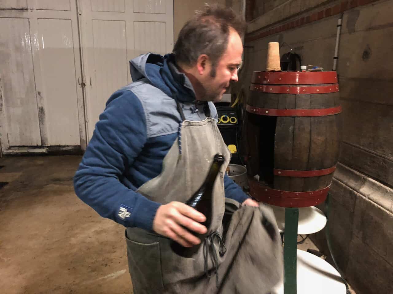
He took a break from working in the wine fermentation tank area to talk with us and share in the tasting (it was 5 o'clock somewhere, namely there). The insights on the art and the science (and the process) of winemaking and champagne making are incredible to hear.
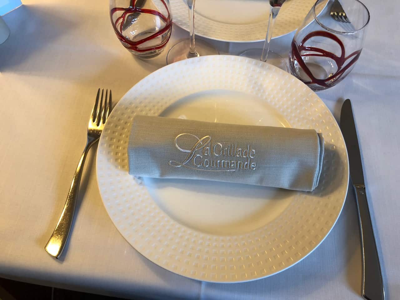
One day, we had a chance to revisit a restaurant we had enjoyed during a previous visit, La Grillade Gourmande, in the town of Epernay.
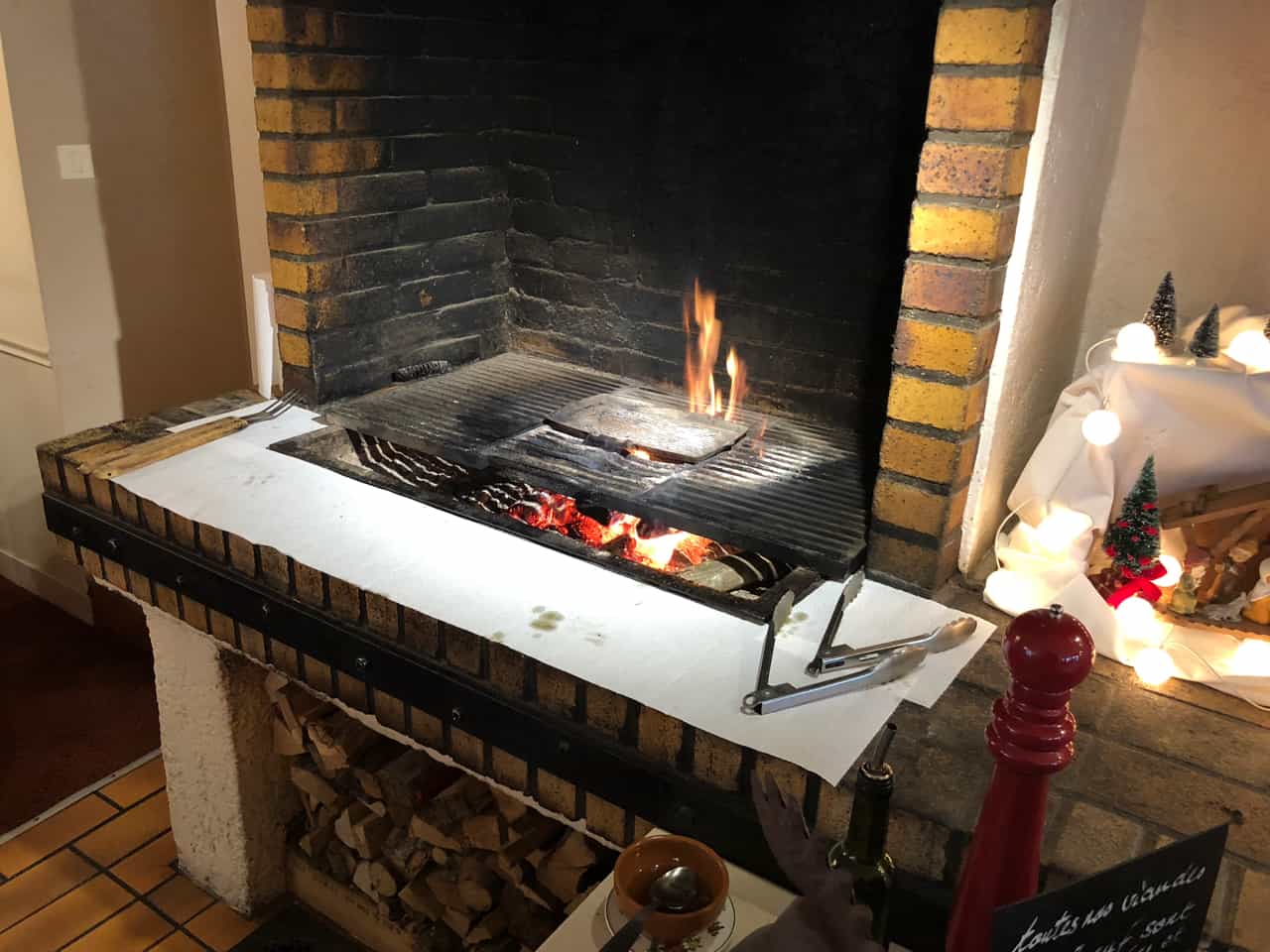
They are known for their grilled meats and that wood-fired grill is out on open display:
During the meal, I looked up above the grill and saw a lot of wine and champagne corks on display in glass cylinders.
My wife and I collect corks at home… I forget which comedian it was, but they commented that collecting corks apparently combines alcoholism with hoarding.
Anyway, this is what I saw:
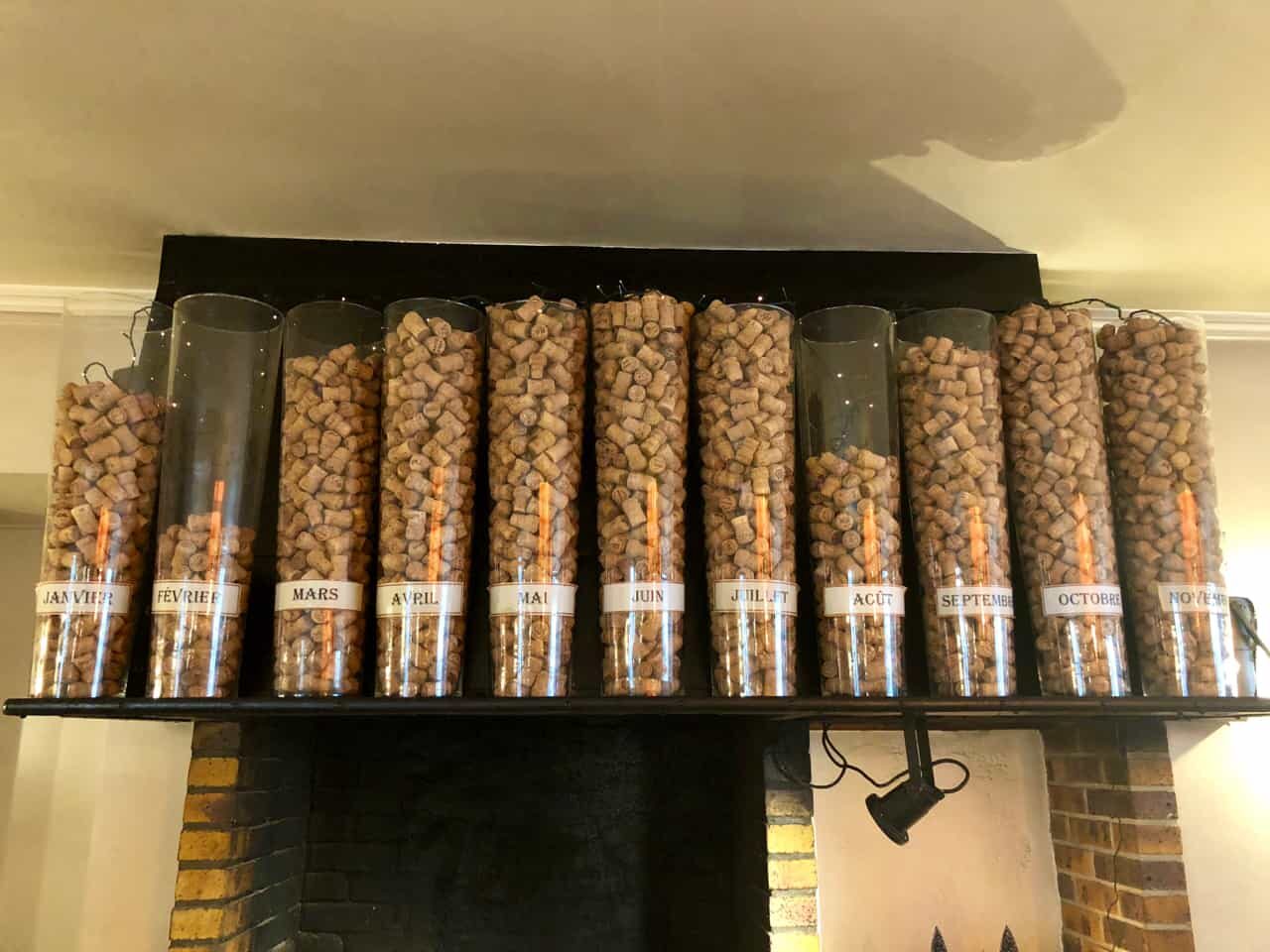
From a distance, I didn't quite get the context of the cylinders. But, then I walked up closer and saw one cylinder that was lower… and it was clearly labeled “Decembre.” I don't speak much French, unfortunately, but I can tell that means the month of December.
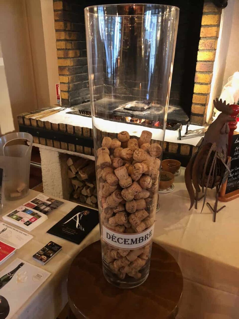
We were there on December 15th, half way through the month.
It finally clicked… the 11 cylinders above the grill represented a visualization for each month of 2017. I'm guessing it was the number of bottles of wine consumed by customers. Or, it was the number of corks left behind (maybe some of the diners are cork hoarders, if the French do that).
I thought this was very clever, using the corks as a visualization or a “column chart” as we might see in Excel or on our metrics boards at work.
Although I prefer line charts (aka run charts) for time series data like this, one advantage of column charts is that they can be “filled up” (drawn in by hand) as events we're tracking occur during a month in the workplace. See this image for an example.
I don't know if the restaurant is doing this merely for decoration or using it as a way to manage the business.
Looking at the “chart,” August was a low month. I'm guessing the restaurant might have been closed for two weeks in August as part of the annual vacation season there.
It's less clear to me why January was a bit lower and why February was much lower. There are fewer tourists in those months? The restaurant seemed to have mainly locals as customers.
As a general lesson, it's one thing to see the change in data… it's another thing to understand WHY there was a decrease.
I also wonder if some months had MORE corks than could fit into the container. If so, that would be a distortion of the data.
Based on my visual estimates of the containers (with the top of the container being “100”), here how the data would look as a “process behavior chart,” if you were wondering:
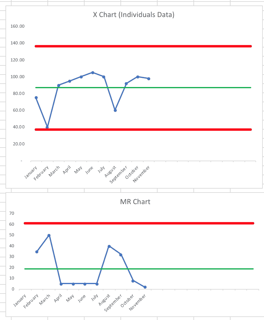
The February data point is just higher than the calculated lower limit, which suggests this is a stable and predictable
Unlike some process behavior charts, I'm not sure if this one would be incredibly useful. I bet there's a seasonal pattern that would continue again into 2018, as long as the economy remains relatively strong…
If you're wondering what I ate, here's my starter, grilled foie gras and lobster in a chestnut cream sauce (photo taken as the server poured that sauce/soup):
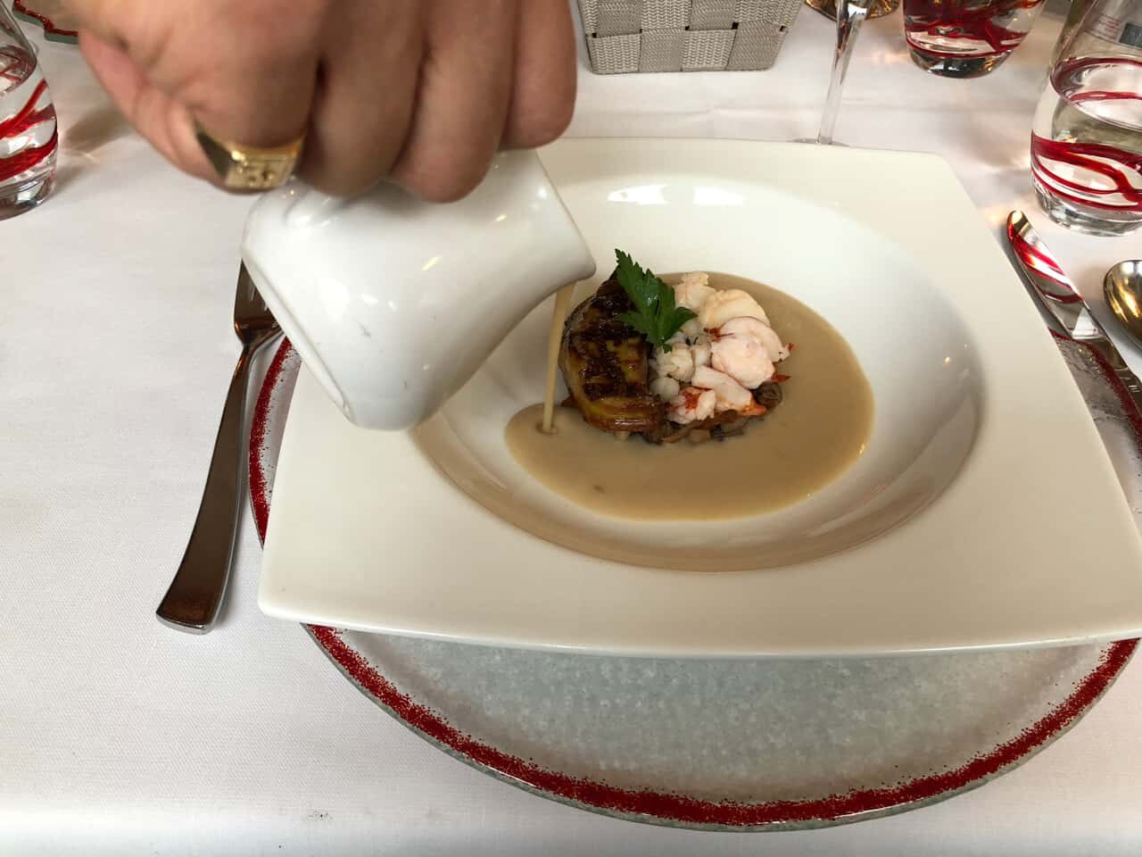
Yeah, it was pretty decadent. But, it was vacation…
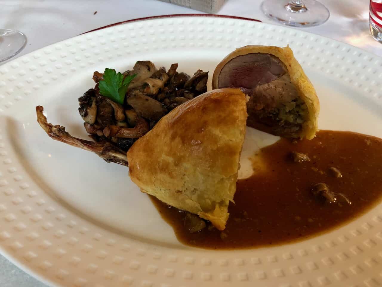
And my main dish, stuffed pigeon. I think this was my first time eating pigeon:
Please scroll down (or click) to post a comment. Connect with me on LinkedIn.
Let’s work together to build a culture of continuous improvement and psychological safety. If you're a leader looking to create lasting change—not just projects—I help organizations:
- Engage people at all levels in sustainable improvement
- Shift from fear of mistakes to learning from them
- Apply Lean thinking in practical, people-centered ways
Interested in coaching or a keynote talk? Let’s start a conversation.

")


