


Here's another post on the theme of performance metrics, as I'm talking about next week at Lean Startup Week (see yesterday's post or others in this series).
At the risk of becoming a broken record, it saddens me to see approaches labeled as “Lean Daily Management” (or similar phrases) that don't take good, simple, and valid statistical methods into account. When we overreact to “noise” in our performance measures, that leads to a lot of wasted motion and effort.
Lean is supposed to focus on REDUCING wasted motion, right?
The Planet Lean website (which has a lot of great content) recently published a post titled:
“How to create an effective daily management system.”
I have suggestions here that would lead to a MORE effective approach, both in the context of this article and other “daily Lean management system” type approaches.
The Planet Lean article says:
“… it is no surprise that [daily performance measures] are often below expectations.”
Well, if we have a stable system, in a factory, a hospital, or elsewhere, our performance is going to fluctuate. There's always some amount of variation in a system's performance. With this fluctuation, it's a good bet that many data points are going to be below average – maybe about half the time! This is especially true when “expectations” for our target is based on average past performance, as I often see.
The Planet Lean article is right to warn against “a finger pointing session” and they are right to recommend teamwork. But, we also need to guard against wasting time, especially in the context of Lean and Taiichi Ohno's admonition that activity is not the same as value? As Ohno said:
“
The only place that work and motion are the same thing is the zoo.”
We should prioritize our improvement efforts and reacting to every arbitrary “red” data point will consume time that prevents us from reacting to significant variation in our performance. I call these red points “arbitrary” because the goals and targets we use to evaluate red or green are usually quite arbitrary, by definition.
The Planet Lean authors warn:
“Rushed decisions are then made to fight the fires that seem to pop up everywhere in the organization and to alleviate the situation, which many times makes the situation even worse.”
Yeah, they're on the right track there.
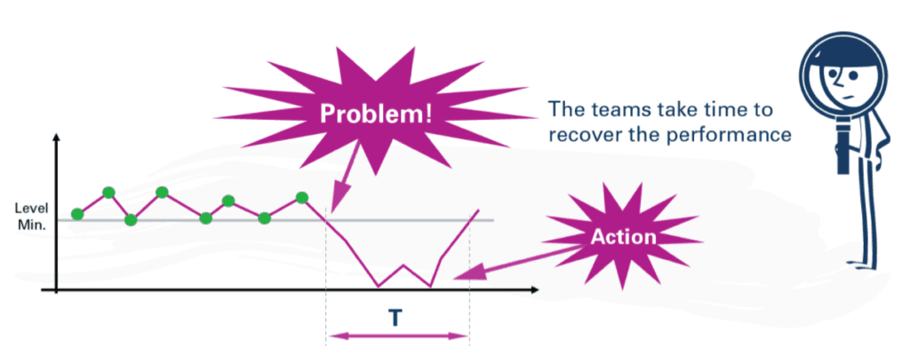
Ironically, though, the methods they recommend in the post (reacting to every red) might very well lead to “rushed decisions” and “firefighting”-style overreactions that might not really help. Some of this overreaction will distract leaders from solving problems that are more significant.
If we react to everything, we're prioritizing nothing.
They say we should ask the question, “But why are results not achieved?” I agree, but there are two different versions of this question that we might ask at different times:
- Why is our typical performance not at the levels we need? (looking at the average and typical range)
- Why was yesterday a bad day?
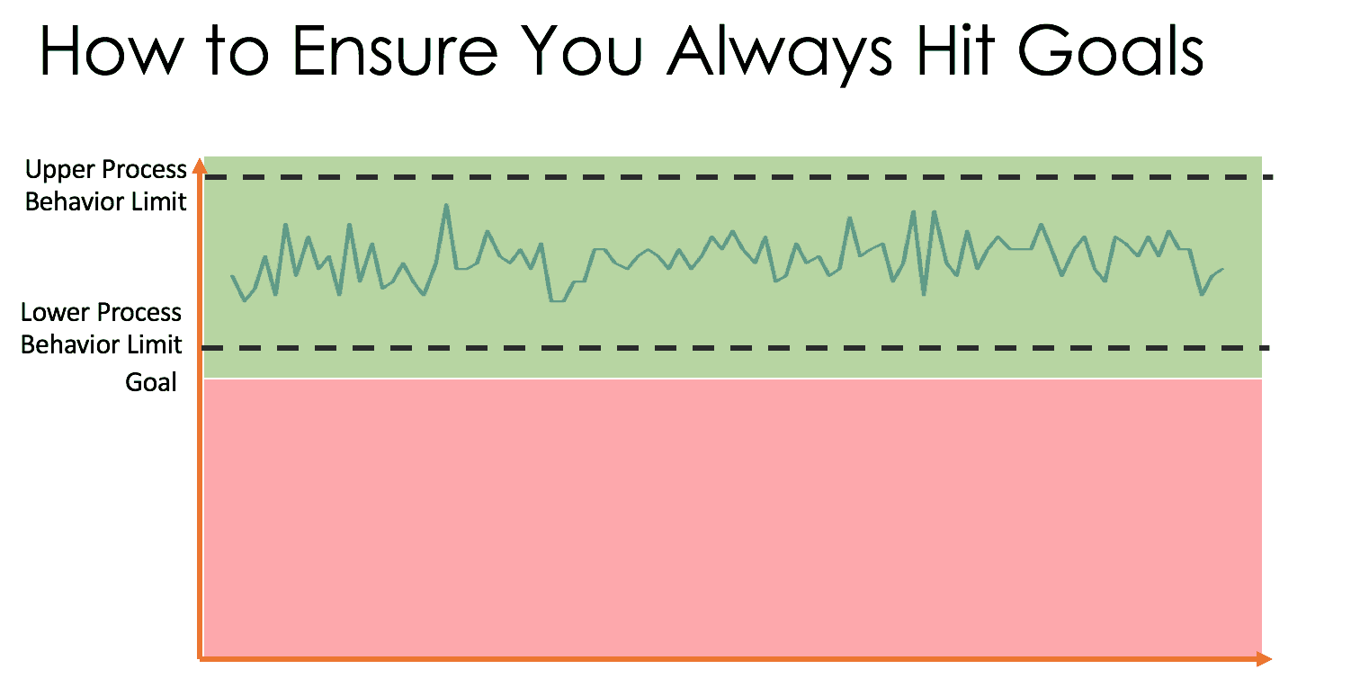
The first question allows us to work on common causes of performance, recognizing there is always variation and some days are going to be better than others. The same system will produce varying results, so we need to improve the system. We can compare our average performance and the ranges of our variation against the target or customer needs. The best system would have an average that's BETTER than the goal and tight variation that doesn't take performance to a point that's worse than the target level (as I've illustrated below):
Asking “what went wrong yesterday?” looks for a “special cause” or a “root cause” that might not be there. That “bad day” is probably produced by the same system that produced the previous “good day.” The answers to process improvement are found in studying the system, not in studying any single bad day.
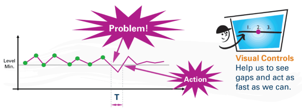
The article uses an example that, thankfully, has a run chart:
The “problem” should be not defined as a data point being below the “level min” or target. The green data points look like the varying outputs of a stable and predictable system.
There's no answer to the question of “what went wrong in the 3rd, 5th, or 7th, data points?” when those just happen to be a bit lower than the others. That looks like textbook “common cause variation.”
As an aside, having so many data points right at the “level min” (a production quota?) makes me a bit suspicious – is somebody afraid to report data points that are below the “level min?” Does that lead to a distortion of the system, or gaming of the numbers? Does that interfere with our understanding of the system and our ability to improve the system?
Better than a run chart is a “control chart” (the term that's been used the longest) a.k.a. a “process behavior chart” (PBC), a newer term from Donald J. Wheeler that I prefer these days.
We look at the average performance along with CALCULATED upper and lower control limits. These limits aren't targets and they aren't arbitrary. They tell us how the system is likely to perform based on a baseline level of performance and variation.
I approximated a PBC based on the first eight data points. Ideally, we'd establish a baseline with 20 data points, but 8 is OK for a start. It's valid enough.
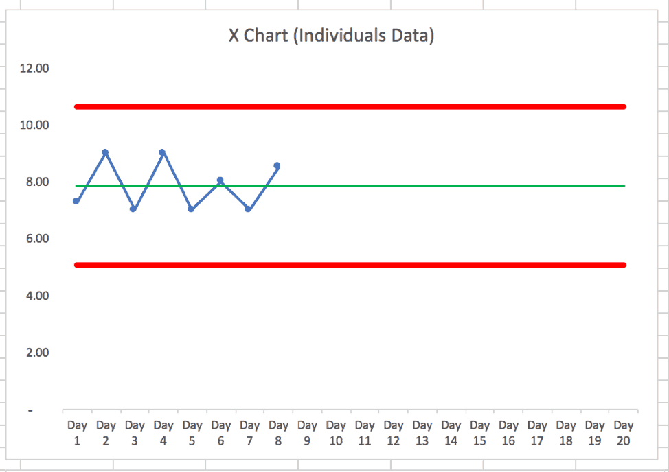
The calculated control limits (aka “process behavior limits”) predict that the next day's performance (if nothing changes in the system) will likely fall between 5 and 10.6. Any data point above 10.6 or below 5 would be a “signal” that something has changed in the system. That should trigger a useful investigation about what changed or “what happened that day?”
Any data point that's within that range of 5 to 10.6 doesn't have any particular explanation. If we want to increase the average from 8 to something higher, that requires more systematic process improvement efforts. Ideally, the lower PBC limit would end up at 7 or higher to ensure even the worse-performing days within the noise are still “acceptable” compared to the target.
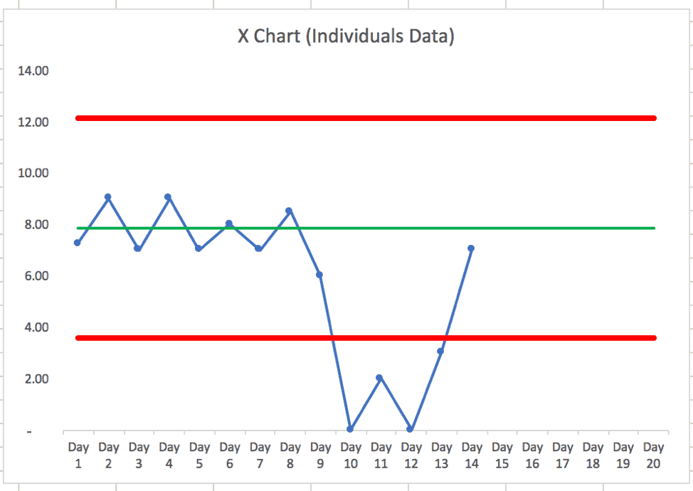
In the Planet Lean chart, it looks like the next purple data points are 6, 0, 2, 0, 3, and 7.
The FIRST time the data hits zero should be a trigger since that's lower than the lower PBC limit. Zero likely wouldn't have happened in the stable system. Something has likely changed. We should label that as a “problem.” The problem is not being below the “level min.” And we don't need more than one data point here to react.
Two data points aren't a trend, but one data point can be a signal.
Again, if the “level min” of 7 is a requirement for having a successful business, our ideal state would be a system in which the lower PBC limit is at 7 or greater. That means improving the system.
With the additional data points, the PBC looks like this:
In this case — if the organization didn't react and look for a “special cause” — did the system magically fix itself? Did the problem, such as a machine being down, go away? If the machine got fixed, it's not surprising that performance would recover and get back into the expected range.
I'd ask, “What did we learn from that event?” and “How can we prevent it in the future?”
If we have other production areas with similar charts and their daily performance was 6 (lower than the target, but within the control limits) having people do root cause analysis there drains resources that should be spent reacting to and learning from the special cause situation we see in this chart.
In their second chart, it appears that they are labeling noise or common cause variation as a “problem.”
What “action” was taken, I wonder? That one data point below the “level min” was higher than our lower PBC limit that was calculated from the baseline data (see my chart earlier in the post again). It appears to be part of the common cause variation. It's noise.
Again, we'll improve more if we ask “how can we improve our system so it boosts our average performance?” instead of asking “what went wrong that day?”
Again, that “bad day” is most like the same system that created the other acceptable days.
It's quite possible that the system “corrected itself” by regressing back to the mean. Or, somebody forgot to fudge the numbers that day if there had been distortion taking place.
Now, it looks like the last four data points in that chart have lower day-to-day variation than before. Is that because of a change that was made to the system?
When we have these “bad days,” it's quite common for this to happen:
- A manager demands to know “what went wrong”
- The team spends time investigating and can't find a meaningful difference
- Maybe the team cooks up an answer (“writing fiction” as Don Wheeler says)
- There's no meaningful action found or taken to “fix” the system
- Performance improves (which could be, again, just fluctuation and noise)
- The manager is happy and says “good job”
Isn't that all potentially a waste of time? That seems like “kabuki theater” in organizations where I've seen this.
“Visual controls” (better described as “charts and metrics”) might lead to overreaction and wasted effort. Acting “as fast as we can” isn't the goal – acting when we should is a better approach, I'd say.
A wise person, when pressured by their boss to explain common cause variation, knows not to sweat too much because things will inevitably regress back to the mean in a stable system. But, you want to give the APPEARANCE of working on improvement.
That kabuki theater effort robs us of time that COULD have been spent actually improving the system. Instead of explaining “the bad day,” work on improvements that would boost average performance or reduce day-to-day variation.
In a future post, I'll comment on a later part of their post that has the “red / green” comparisons and tables of numbers. We can do better than that in a Lean management system, too. See a previous blog post on this topic.
Please scroll down (or click) to post a comment. Connect with me on LinkedIn.
Let’s work together to build a culture of continuous improvement and psychological safety. If you're a leader looking to create lasting change—not just projects—I help organizations:
- Engage people at all levels in sustainable improvement
- Shift from fear of mistakes to learning from them
- Apply Lean thinking in practical, people-centered ways
Interested in coaching or a keynote talk? Let’s start a conversation.


Keep up the good work!
I don’t think you should have any expectation of universal acceptance of process behavior charts for routine use, hence you’ll need to keep sounding like a broken record for a long time to come… So, the rest of your career.
Good luck in the Workshop next week: If you get at least one company among your attendees that introduces this “understanding of variation” into their Systems it is a reasonable outcome.
Thanks – I hope to reach somebody and inspire them to try a new approach… my talk needs to be informative, but I also need to be super enthusiastic about these methods… I hope that helps.
I’m fairly certain I read Donald Wheeler’s book on variation after reading one of your previous blog posts. It has helped me try to focus on when I should react and when I shouldn’t overreact. From a leadership aspect, I think PBC helped me understand respect for people better. I realized that I was wasting people’s time so thanks for helping me see this waste.
Thanks, Jim. That makes me smile to hear you say that. I referenced your comment in today’s post.
Thanks, Mark. I’m honored to have made it to the top of the blog! It’s the small things in life that sometimes mean the most.
I recently grabbed a copy of Donald Wheeler’s book Understanding Variation: The Key to Managing Chaos after going through a workshop on Better Metrics with Mark. Good book, great workshop, and a key concept in our effort to get better at getting better! Coming from a manufacturing background, I must say that I really didn’t fully appreciate the value of SPC charts, mainly because it was just a way of life. Going from an industry where the concept of SPC was regularly used to healthcare where it isn’t (at least in my limited experience), has really opened my eyes to how much effort is wasted trying to explain drops in performance even though they are just a part of the normal variation of the process. Thanks for opening my eyes to this Mark – it has led to quite a bit of thought about how we present our quality metrics across the organization as well as how we use various metrics with Daily Visual Management.
Thanks for your comment, Cory.
By the way, readers can learn more about the workshop he mentioned here: https://www.markgraban.com/bettermetrics/
I’m glad that Wheeler’s ideas and my workshop have been helpful. I think there are indeed applications for the quality metrics and Lean daily management (or whatever term is used).
Waste less time by overreacting… spend more time on systemic improvement…
Great explanation, Mark. Thanks, i’ll be passing it around our organization.