


So many of our business metrics are reported in terms of two-data point comparisons. How much did the metric change from last week? Web site traffic is up 14% from last month. So that's good? Maybe. Two data points don't give much context. How do we know that a 14% increase is significant? Maybe it was down 20% the month before? Does the metric fluctuate that much normally?
Instead of using text or tables that compare this month to the previous month, or comparing this month to the same month last year, a run chart or, better yet, a “Process Behavior Chart” (or “control chart”) will give much more context that's useful for making better management decisions.
Do we tend to overreact or try to over-explain every up and down in performance metrics? I see that a lot, in many types of organizations, which is one of the themes of my Lean Startup Week talk on Friday.
Using run charts instead of 2-data point comparisons and not overreacting to noise are two of the many great lessons from Don Wheeler‘s book Understanding Variation. I hope to do the subject justice in my 15 minutes at Lean Startup Week.
The news media usually does a bad job of representing and explaining data. I'm not talking about “fake news.” We get a lot of two data point comparisons that don't have much context. As somebody with a statistical mindset, these comparisons usually leave me wanting more.
Here's one article I found during a Google News search:
“It is evident in the numbers reported for the real estate sector that we have past the
seasonal peak for 2017 home sales. Prices for sales closed during September are 1.6
percent lower and the number of closings are lower by 12.7 percent in the month-to-month comparison.
The year-over-year comparison, however, shows prices for closings during 2017 to be 3.2 percent higher compared to this time last year. The number of closings are lower by 0.4 percent in the year-over-year comparison.”
Prices for September are 1.6 percent lower than what? I think they mean lower than August.
Prices are lower than the previous month, but they're HIGHER than the previous year?
Confusion like this is why I'd want to see a run chart for home price data.
NBA Data Example
I saw an example of textual data and a chart in the New York Times the other day in this sports article:
“Another N.B.A. 7-Footer, Trying to Keep Up, Ventures Into 3-Point Land“
The text of the article includes this comparison:
Consider that 23 percent of all the field goals attempted by 7-footers through Wednesday's games were 3-pointers, an increase from 14.6 percent last season and 8.9 percent in 2015-16.
Is an increase from 14.6 to 23% meaningful? It's hard to tell just from two data points. Yes, one number is higher than the other, but is it just noise? The Times actually gives us three data points here… but three data points aren't necessarily a trend, either.
We get a bit more context:
Less than 1 percent of 7-footers' shots were 3-pointers as recently as 2000-1, according to N.B.A. Advanced Stats.
I grew up with an NBA of big men rarely taking 3-pointers (Bill Laimbeer from my Detroit Pistons was a notable exception). A jump from 1% to 23% does seem significant. Big men are taking more threes.
The New York Times included a simple run chart that makes the trend all the more visible. Charts are more powerful than text.
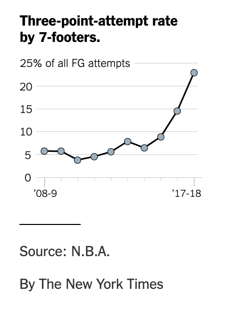
Those last two data points look significantly different.
Calculating control limits from this data confirms what our Process Behavior Chart intuition would tell us – this is not a “stable and predictable” system.” There's been a noticeable and meaningful change in the NBA “system.”

Even without the last two years, a Process Behavior Chart would have detected an increase that would have seemed statistically significant, if not newsworthy. Note that the upper and lower process behavior limits are different because they're based off of just eight baseline data points here:

Here is the spreadsheet I used. It's my approximation of the NBA data taken from the NY Times chart.
It would have been nice of the home sale price article had a similar type of chart, even a simple run chart.
LeanBlog.org Data Example
In an example from my Lean Startup Week talk, let's say there's an “uptick” on traffic here on my blog. From March 2017 to April 2017, traffic was up 40%. But, two data points don't make a trend.
If I show a run chart, I can make a more honest assessment of blog readership:
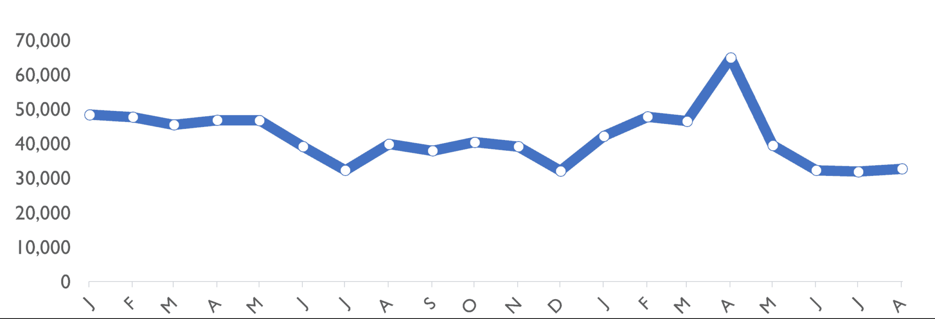
At least I don't need to play the “success theater” game because my blog doesn't have investors who hound me about traffic numbers. I don't need to “paint a picture” that shows traffic is increasing. I'm not trying to fool anybody into thinking that traffic is going up 40% each month.
There was a big uptick and traffic due to my popular post on United Airlines.That uptick didn't lead to a lot of new regular readers.
If I create a Process Behavior Chart (using the first 20 data points from January 2012 as the baseline), we see this:
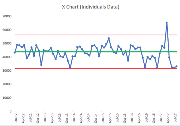
Over the long term, it's not exactly a “stable and predictable” system. There's a lot of “noise” in the data, but there are also some signals.
The most obvious signal is April 2017, that single data point above the upper process behavior limit. I know the “special cause” for that signal – the United Airlines post. That data point is example of a signal that's NOT indicative of a process shift to a new, higher average of blog readership.
Using the “Western Electric Rules,” I see what appear to be a number of signals in the metric – meaning these points or groups of data points aren't likely to be randomly occurring variation.
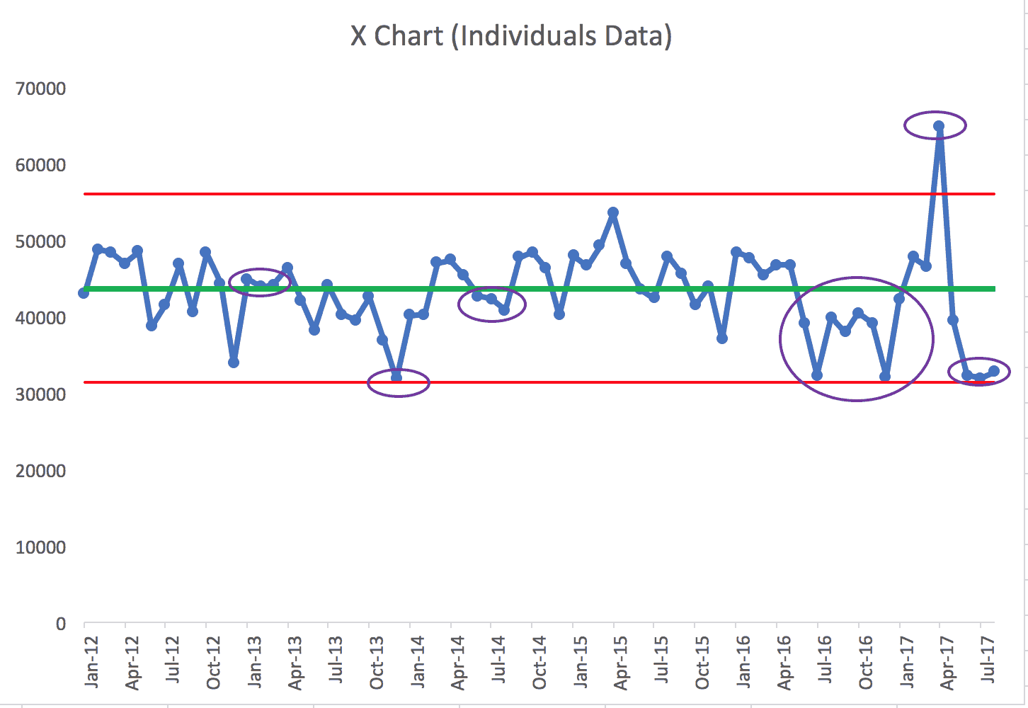
The first signal (the purple oval) is three consecutive data points between the average and the “1 sigma” upper limit (the red line is the 3 sigma limit). That clustering of data points is not predicted by the baseline data. But, I don't know the cause of that signal, especially going that far back in time.
The second oval: in December 2013, traffic was just barely above the lower limit. Strictly following the rules, it's not indicative of a signal. But remember, this Process Behavior Chart method and the calculation of the limits is meant to minimize false signals… it might be worthwhile to ask why traffic was so low. December is usually a relatively slow month due to holidays. I'm not sure what I can do about that other than expecting seasonality.
The third oval is another run of three consecutive points, this time between the average and the 1 sigma limit below the average. Again, I'm not sure what happened there.
Seeing a signal doesn't mean we always know the root cause.
But, this method helps me filter out times when I clearly shouldn't overreact. I shouldn't spend time asking why or looking for a root cause for every small fluctuation.
The four oval is a grouping of eight consecutive data points BELOW the baseline average. That's a strong signal that blog readership has really dropped. Knowing why is a different discussion.
The fifth oval is that single data point above the 3 sigma limit.
The sixth oval is a grouping of three data points that are really close to the lower limit.
So, even if I claimed, correctly, that blog traffic grew 40% from March to April 2017, the more accurate longer-term trend is that blog traffic is going down.
As they say in my favorite movie, “This is Spinal Tap:”
Marty: … I was just wondering, does this mean uh…the popularity of the group is waning?
Ian: Oh, no, no, no, no, no, no…no, no, not at all. I, I, I just think that the.. uh.. their appeal is becoming more selective.
Thanks for being here, dear readers :-)


Hi Mark
Thinking about that run of 8 below the mean, when did you change over from emailing out your total blog post to just providing a link?
Good question. I made that change in January 2017, after the 8 data points below the mean.
https://www.leanblog.org/2017/01/changes-improvements-way-youll-receive-leanblog-org-post-emails/