

Don’t Turn Your Performance Metrics into Success Theater
TL;DR: Cherry-picked metrics can make performance look better without actually improving it. Process Behavior Charts help leaders distinguish real improvement from noise, stop overreacting, and focus on improving the system instead of explaining fluctuations.
One of the phrases and concepts that I love from Eric Ries and The Lean Startup is the idea of “success theater,” which describes the efforts that we make to make things look good, even if actual performance isn't good or getting better. In the book, he defined it as “the work we do to make ourselves look successful” and “using the appearance of growth to make it seem that they are successful.”
Eric wrote:
“…many innovative teams engage in success theater, selectively finding data that support their vision rather than exposing the elements of the vision to true experiments…”
As he also wrote in his first book:
“Energy invested in success theater is energy that could have been used to help build a sustainable business.”
You could modify that quote to say “Energy invested in success theater is energy that could have been used to help IMPROVE a business.”
That would include not just startup businesses, but bigger companies (the focus on Eric's upcoming book The Startup Way) and healthcare organizations too.
I had an attendee in my “Better Metrics” workshop come in some data for the class, as requested. She wanted me to help her show that her hospital had reduced patient falls by 50%. Why 50%? That was the government mandate and target. She and her colleagues were making many efforts to improve… but were they improving 50%?
If the hypothesis was, “All of our actions and efforts will reduce falls 50%,” how is that playing out?
Are you trying to “paint a picture” (even if it's misleading) to prove some predetermined outcome or are you being a scientist who looks at real reality and is willing to have a hypothesis disproven?
It's easy to cherry pick any two numbers in a chart to “prove” improvement. That's possible even when those data points are all within the bounds of “common cause” variation, meaning the SAME system is generating different results.
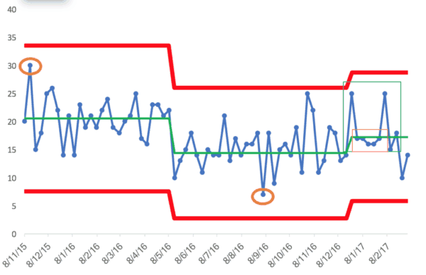
The nurse leader in my workshop was disappointed when a “Process Behavior Chart” that I helped her generate showed a statistically significant shift (an improvement) in average performance (from an original average to a new, lower average). But, she was disappointed that the new average wasn't 50% lower.
The chart shows that the average number of falls fell from about 20 to about 15. The evidence of this process shift is eight consecutive points below the old average.
That's a 25% reduction. Good… but there's more work to be done.
Oh, and then it the average went back up a bit. The evidence of this is the eight consecutive data points above the second average.

Instead of overreacting to any two data points, we should ask if we know WHY the process shifted. Was it because of our actions and process changes? Do we know why things got a little bit worse? We have to understand our systems… and having a proper, honest view of our metrics is a good and necessary start.
If you cherry pick two data points (circled in orange), we can create a dubious two-data point column chart that “proves” we improved. Don't abuse statistics like that :-)
In my talk at “Lean Startup Week,” I'm going to use an example from KaiNexus. We track the number of new leads.
An overly simplistic chart, like the one below, paints a picture to the management team and investors that things are great! We're getting better! See! By the way, the KaiNexus team is NOT guilty of this sort of thinking and bad charting, it's just an illustrative data set:

But, if we look at a run chart (a “Process Behavior Chart”) actually, we can see that the data points of 4 and 14 are all within the boundaries of noise or common cause variation:

Any single data point between 0 and 20 is likely due to “common cause variation.”
Instead of asking “why did the number of leads drop?” the better question would be “how do we improve the system so that the average number of leads is higher?”
In Eric's new book, The Startup Way, he writes about a “commitment to truth.”
Truth in metrics is the foundation for truth in improvement… because it leads to better improvement.
Instead of making things look good, focus on actually making things better! Improve systems instead of “writing fiction” about the change in any data point (to use Don Wheeler‘s phrase).
p.s. Yesterday, I recorded a podcast with Eric about this upcoming book. The podcast will be released next month when the book is released. Subscribe to the blog or the podcast to be notified.