


This Post in <50 Words: In this post, I look at the impact (or lack thereof) of targets, rankings, and incentives, when it comes to safe driving or PCI (angioplasty) procedures in a hospital cath lab. Are we improving? How do we know? How do we improve?
I was recently re-reading parts of the book Out of the Crisis by W. Edwards Deming.
See this recent post that was also prompted by something in Chapter 11 of the book, a chapter about “Common Causes and Special Causes of Improvement. Stable System.”
Later in the chapter, Deming tells a story from his associate, Heero Hacquebord (see a column he wrote for Quality Digest):
One problem with ranking or giving incentives (or penalties) to individuals is that it discounts the role of the system they work within.
Hear Mark read this post — subscribe to Lean Blog Audio
Sometimes, a person doing work (and the people working with them) can do everything right and still get a bad outcome, as we often see in medicine. But ranking, incentivizing, or punishing individual physicians and surgeons can cause a lot of dysfunction, as I'll discuss in an upcoming podcast with Tom Bouthillet, a fire captain and EMS professional.
Tom tweeted these references to journal articles that talk about a serious allegation… that cardiologists sometimes refuse to take some Code STEMI patients into the cath lab because the patient's death (through no fault of the docs) would be a “ding” on their publicly reported record in some states.
Ranking and incentivizing individuals SEEMS like the right thing to do. But, as Dan Pink writes about in Drive (and listen to my podcast with him), the problem with incentives is the side effects.
Back to driving… the car accidents story reminded me of a time when I worked for a company that rhymes with Bonson and Bonson. Since our consulting group was part of the sales organization, we each got a company fleet vehicle to drive.
So, thankfully, the company was concerned about our safety. The company made a big investment in defensive/safe driving courses and had strict “no device use” policies when driving (including talking hands-free). They were serious about safety.
But, there were some problems with the way they measured safety over time. I've been using this example in my “Better Metrics” workshop.
One year, when I was working there, we were given a presentation at a team meeting that said:
“Our current Accidents Per Million Miles (APMM) is at 4.58, well above our 2.80 goal.”
A simple comparison against a goal doesn't tell us much. A goal like 2.80 is a textbook example of an “arbitrary goal.” All we know from that statement is that the accident rate is higher than the goal.
A more important question would have been, “Are we improving?”
What if the goal had been 5.0? The safety performance would be better than goal… but we'd still want to improve, right? The ultimate goal for something safety related should be ZERO even if we're unlikely to ever reach zero.
If there had been 2.75 APMM that year (which could still mean that there was a fatality), would the driving safety specialist have been there talking to us?
What was more important — hitting the goal or us being safe? Sometimes, it felt like “not hitting the goal” was the primary problem (maybe it was for her… her annual review and $$$ probably depended on our safety). That's perhaps an unfair position to put her in.
They also told us:
“We have had 25 accidents year-to-date, and 7 accidents – almost 30% of year's total – have been in June alone.”
Again, context is missing from a statement like that. Is 25 accidents worse than before? June is one sixth of the first half of the year, or 16.7% of the year. What does it mean that 30% of the accidents occurred in June? Does that mean employees were being less safe? Was that just an “unlucky” month, meaning that the number of accidents (7) could have been due to common cause variation? Do drivers, generally, have more accidents in June because there are more drivers on the road or something?
As Donald J. Wheeler PhD writes and says, “Data without context have no meaning” (see blog posts about this).
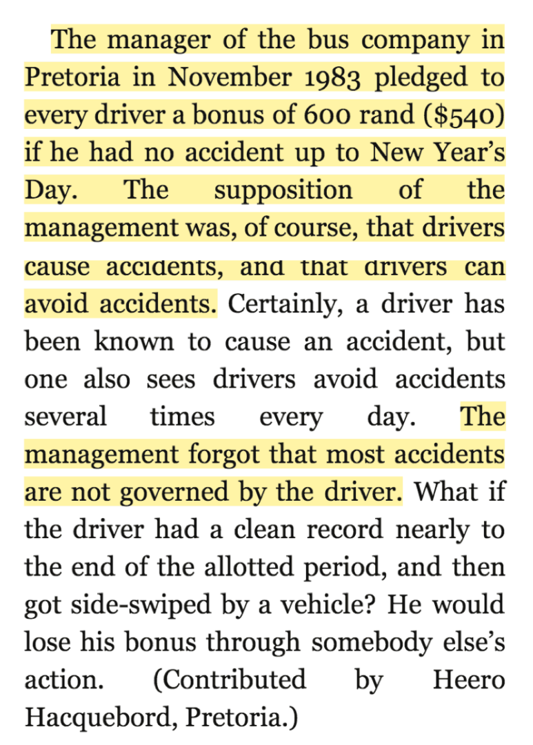
They showed us this chart:
The only thing the chart tells us is that there are a higher percentage of cars involved in accidents compared to the year before. It's a simplistic two-data point comparison. There's nothing to indicate if this is common cause variation (noise) or if it's a meaningful signal.
The same “system” — the same drivers being just as careful driving the same cars could create more accidents some years than others.
The data about 4% fewer cars than a year before isn't necessary since the main chart is the percentage of vehicles in an accident.
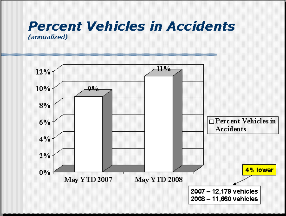
This chart was then shown:
The year to date number was more accidents. 10% more. Again, I was wondering if that was noise or signal.
Some months had fewer crashes than that same month the year before (things are safer?) but the overall number was higher (driving is less safe?).
I took the data that I had available (I was the team's representative on the safe-driving committee or whatever it was called) and I drew a run chart:
Putting in an Excel linear trend line makes it look like the number of crashes is going DOWN over time. But, as I wrote about here, linear trend lines are statistically dubious.
So, was our company driving track record getting BETTER or WORSE? Both are true?
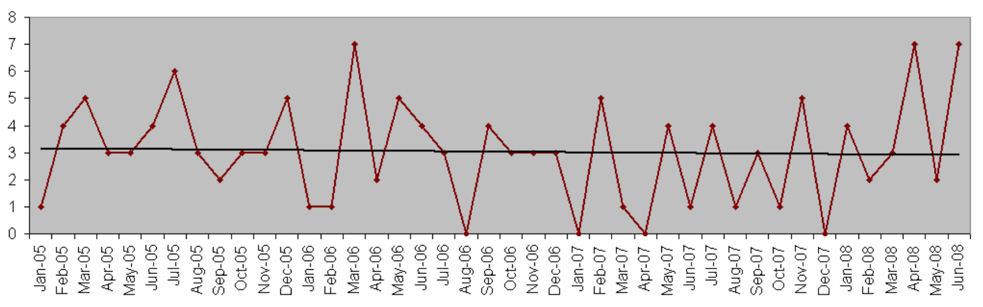
I took the data and drew a “control chart” or “process behavior chart” with 3-sigma upper and lower control limits (a better way of looking at the data):
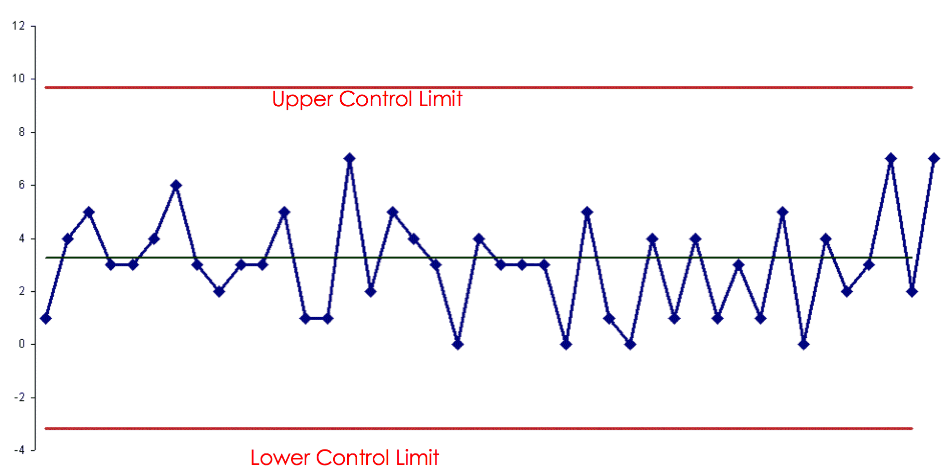
What do I see here? I see a stable system that's statistically in control.
It looks like the number of accidents each month is neither going up or going down.
The most accidents in a month was 7… and that had been two of the last three data points, but that was more than likely just noise in the data. The upper control limit of about 10 would indicate that any number of accidents of 9 or less would most likely be noise.
The lower control limit is really zero, in this case, since we can't have a negative number of accidents.
Instead of asking “why was the number of accidents higher last month?” or “why was the number of accidents above average?” a better question would be “what are we doing to improve the system?” or “what are we doing to improve driving safety over time?”
Maybe if the company did the safe driving training once a year instead of every three years? That would be a hypothesis… not sure how that would work out.
What if the company didn't allow employees to drive the company cars for personal use? That would reduce the number of miles driven and the number of accidents (but it probably wouldn't affect the Accidents Per Million Miles number), but employees would have been unhappy about losing a perk.
One of the key lessons here is to stop asking for a “special cause” explanation when we see “common cause” variation. Lecturing the employees or showing us that the APMM number was above the goal wasn't going to do any good. How did that help us drive more safely? It didn't. Could we “be more careful?” Maybe, but I wouldn't count on that as an improvement strategy.
As Wheeler writes:
“You need to live with this process, or start changing it. Looking for a root cause isn't going to do anything for you here. There's no assignable cause. Learn what your process is telling you.”
I tried bringing these points up in a constructive, “let me show you how to look at the data better” sort of way… and I was politely slapped down by my boss who told me not to criticize the program.
And so it goes.
How would we reduce patient mortality after PCI (angioplasty) procedures, or after any cardiology procedure? Does ranking physicians do anything to improve the system? Do financial penalties or incentives?
Don't we already think that cardiologists are doing the best they can, just as drivers at “B&B” were trying to avoid accidents, for our own safety?
What do you think?
Please scroll down (or click) to post a comment. Connect with me on LinkedIn.
Let’s work together to build a culture of continuous improvement and psychological safety. If you're a leader looking to create lasting change—not just projects—I help organizations:
- Engage people at all levels in sustainable improvement
- Shift from fear of mistakes to learning from them
- Apply Lean thinking in practical, people-centered ways
Interested in coaching or a keynote talk? Let’s start a conversation.


